
Diquan Kerr
Helping you build trust with strategic brand and web design
Ready for work
Diquan is ready for their next project!

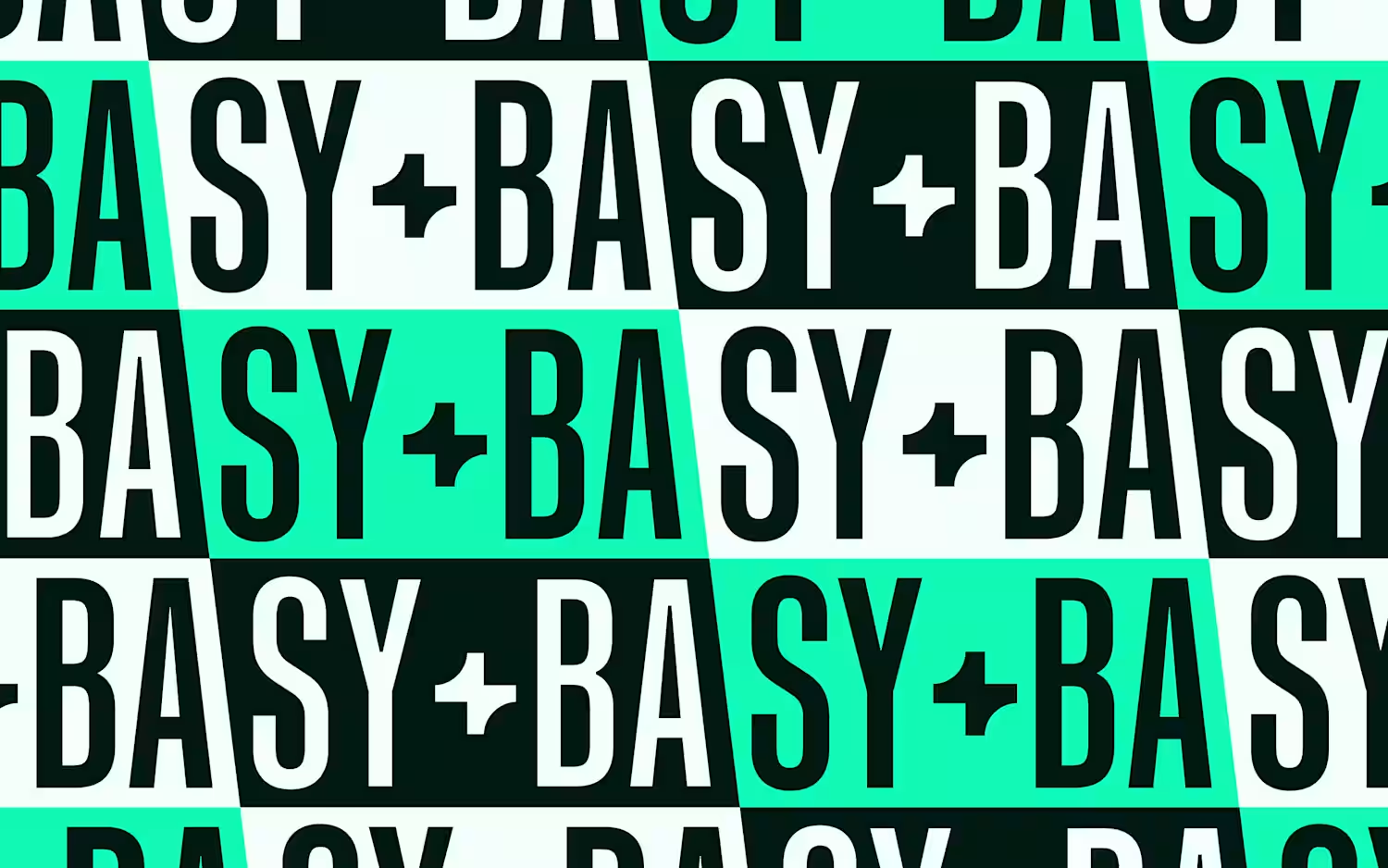
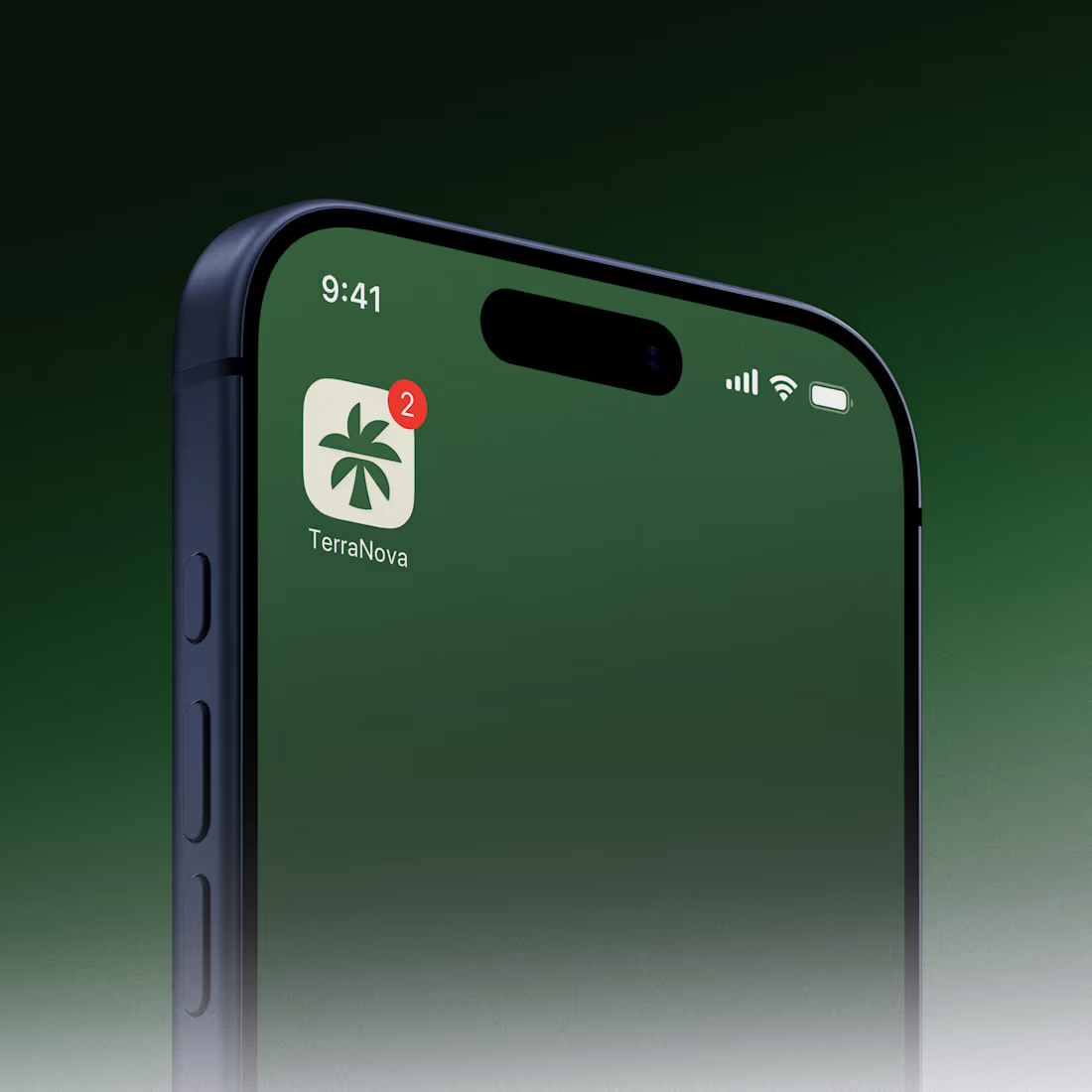
A carbon credit platform needed to build trust with enterprise customers, so I developed a compact brand identity concept: a palm tree logomark with a hidden "T" built into the fronds and trunk, paired with a custom wordmark. The palette leans towards being warm to soften the "carbon" association and reinforce trust, wh:ile the tree imagery ties directly to the climate mission. Delivered as part of a pitch, this is a good example of fast, targeted brand thinking for startups and scale-ups.
3
5
204
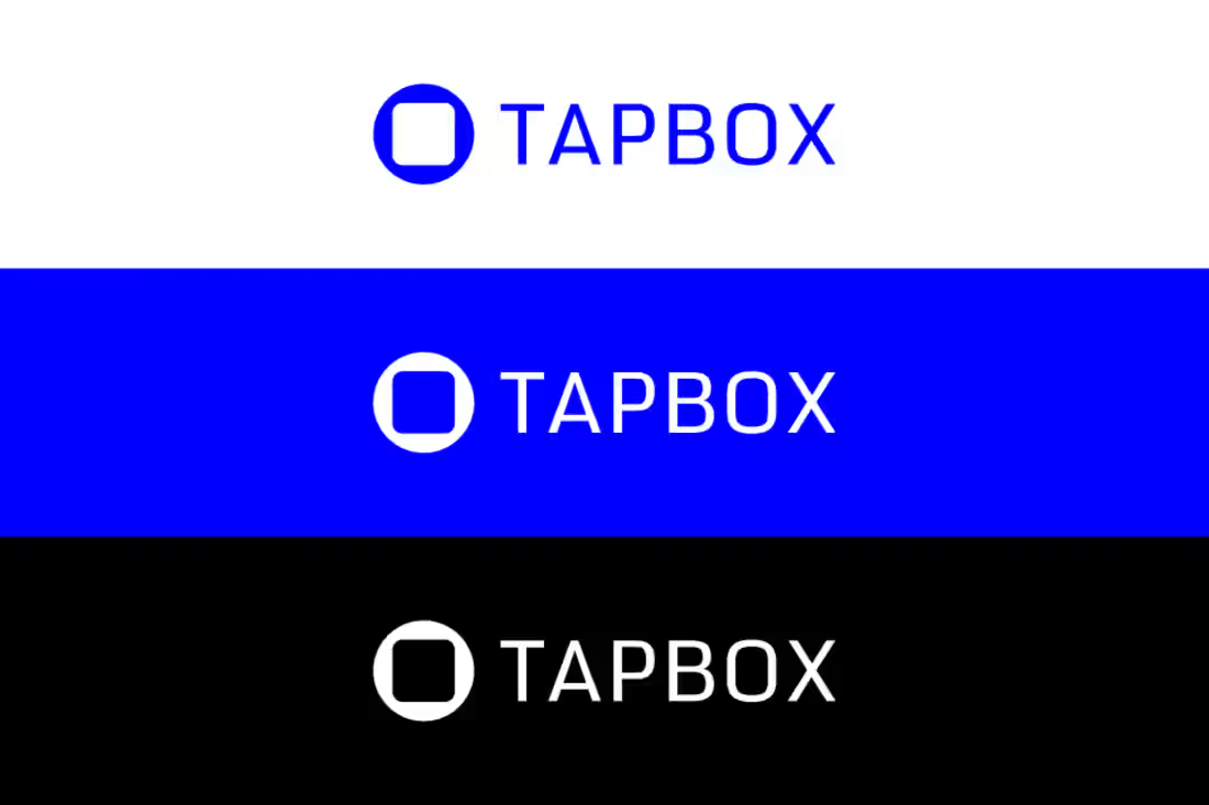
TapBox is a smart vending technology company preparing to launch into a competitive market. They needed a clear, professional brand that could work consistently across machines, vehicles, uniforms, website, and sales materials.
We designed a complete brand identity system and website that aligned every touchpoint into one recognisable visual language. The result positioned TapBox as a credible, tech led partner from day one and supported a confident market launch.
2
75
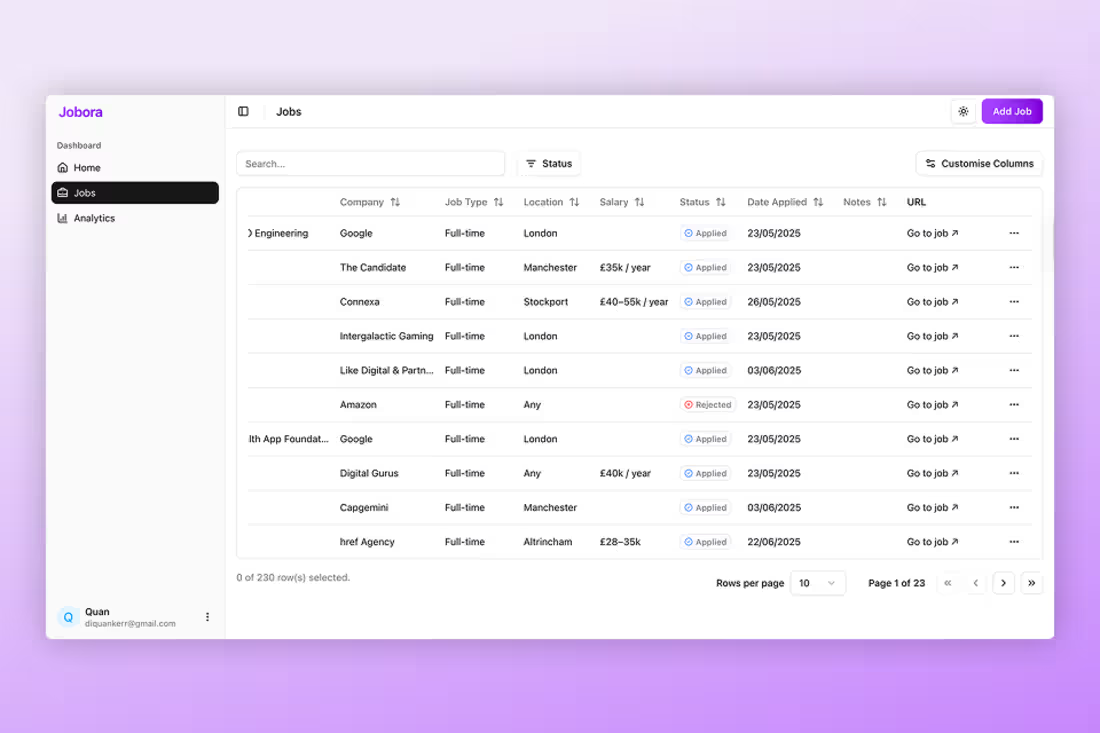
Jobora is a job application tracking SaaS with a strong product but low user discovery. In a crowded market, the brand lacked clear differentiation and the messaging did not speak directly to its intended audience, which slowed adoption.
We started with a full brand strategy process to clarify the target audience, positioning, and value. From there, we built a new identity system and designed a clearer landing page and dashboard, focused on simplicity and fast understanding.
After launch, Jobora saw increased user adoption and stronger early traction, supported by a clearer strategy and sharper product narrative.
0
64
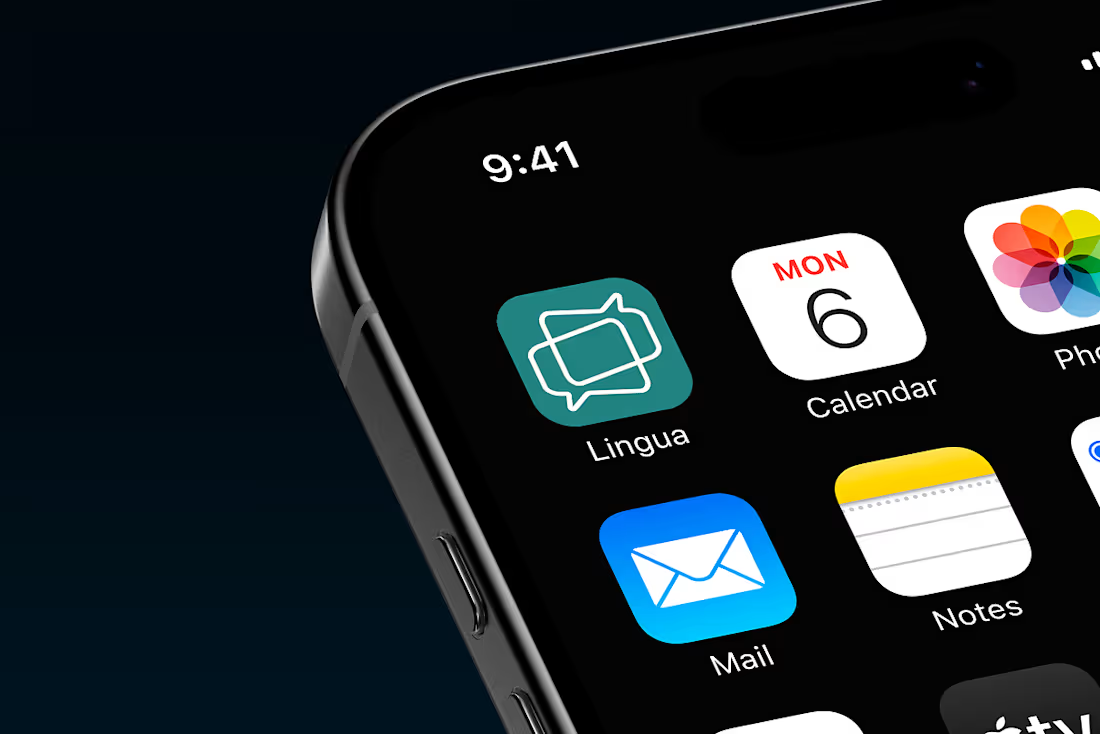
Lingua is an AI powered voice translation app designed to help people communicate naturally while travelling. Although the technology was advanced, the early brand felt too technical and intimidating.
We began with a full brand strategy sprint to define purpose, audience, and positioning, focusing on moments where users feel vulnerable in unfamiliar places. Using that strategy, we created a warm, human brand identity and website, including logo, colour palette, typography, and UI direction.
The result is a calm, approachable brand that positions Lingua around connection, not complexity.
0
70