
pro
Dhruvik Lathiya
Product & UI/UX Designer
Ready for work
Dhruvik is ready for their next project!
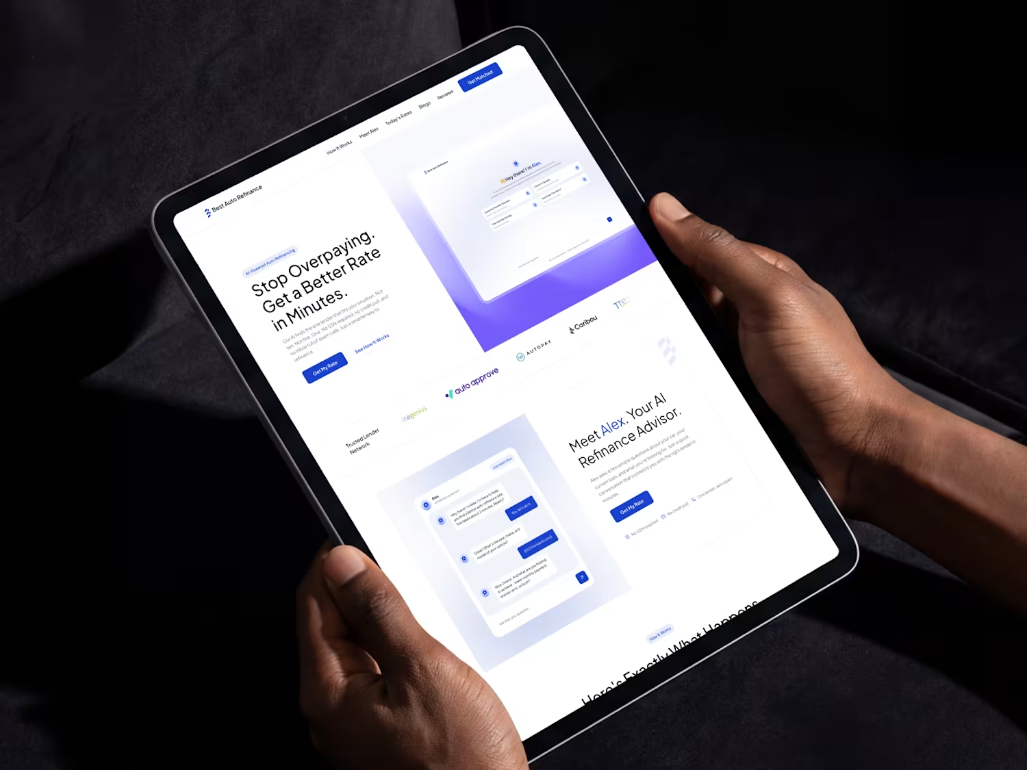
Playing around with motion for this website.
Kept it subtle, clean, and purposeful.
Love how animation brings static screens to life.
Tried to keep things simple and easy to follow.
Focused on flow, spacing, and small details.
Hope it feels calm and intuitive to use.

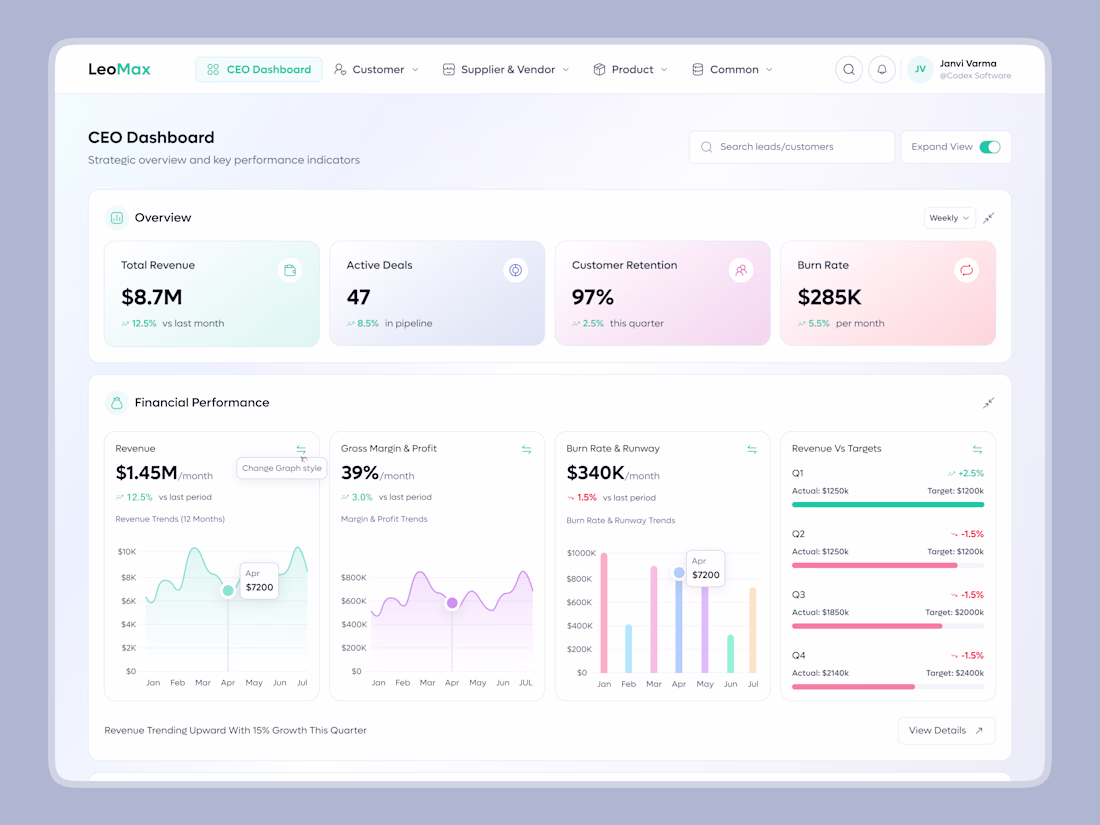
Designed a modern CEO Dashboard UI focused on clarity, decision-making, and real-time business insights.
From revenue and burn rate to retention and growth trends, every metric is structured for quick scanning and strategic action.
Clean visuals. Smart data hierarchy. Executive-ready UX.
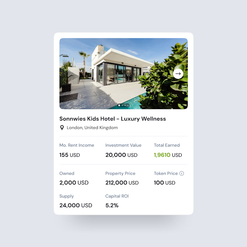
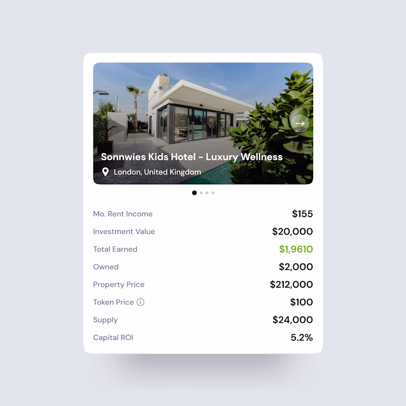
Exploring two ways to present property investment data
Both designs show the same information, but the layout & hierarchy tell very different stories.
One focuses on visual impact, the other on structured clarity.
Which one would you trust more as an investor?
Cast your vote 👇
2 voted
100%
0 voted
0%
2 votes
Closed