
Dhiraj Singh
Logo & Brand Identity Designer.
Ready for work
Dhiraj is ready for their next project!
This is just a proto concept.
0
33
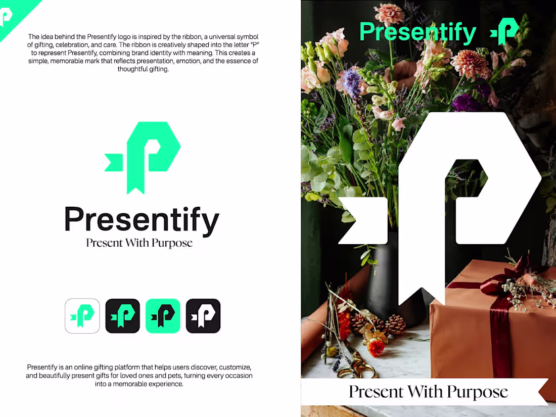
I created this visual identity for Presentify with the goal of designing a brand that feels thoughtful, modern, and emotionally connected to the idea of gifting. I wanted the identity to communicate warmth, creativity, and memorable experiences while still maintaining a clean and professional visual style.
The logo symbol combines a minimal geometric structure with soft flowing forms to create a unique and recognizable mark. The shape was designed to subtly represent gifting, presentation, and connection — reflecting the brand’s purpose of helping people express emotions through meaningful gifts and experiences.
I chose a vibrant green palette to give the identity a fresh, energetic, and modern personality while also symbolizing growth, positivity, and creativity. The typography was kept elegant and balanced to create a visual identity that feels both premium and approachable across digital and physical applications.
Throughout the process, I focused on building a branding system that feels expressive, memorable, and visually adaptable while keeping the overall aesthetic simple and modern.
I’d love to hear your honest thoughts on this project.😊
0
28
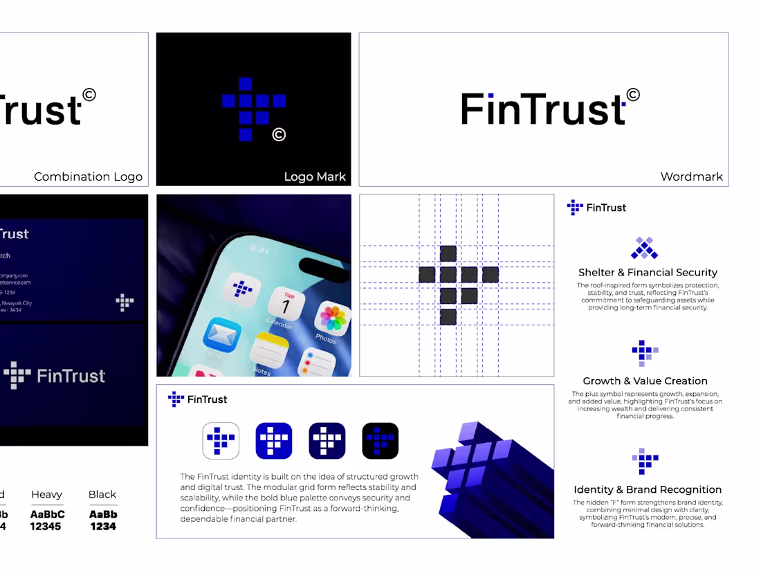
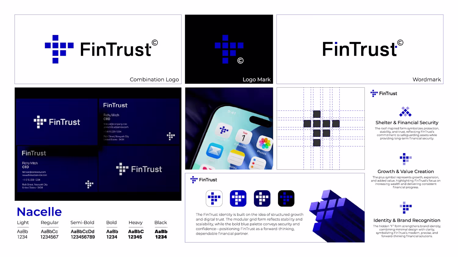
I created this visual identity for FinTrust with the goal of making finance feel modern, trustworthy, and approachable. I wanted the logo to have a clean minimalist structure while still feeling strong and professional enough for a financial brand.
The symbol is built using simple geometric blocks that come together to create a modern and recognizable mark, representing stability, growth, security, and connection. I focused on keeping the design minimal so it feels timeless and adaptable across digital and print platforms.
The blue color palette was carefully chosen to communicate trust, confidence, intelligence, and reliability — qualities people naturally look for in a financial company. I paired the symbol with a clean modern typeface to create a balanced identity that feels premium, professional, and easy to remember.
Throughout the process, I aimed to create more than just a logo — I wanted to build a visual identity that feels future-focused, scalable, and emotionally connected to the brand’s mission.
I’d genuinely love to hear honest feedback on this project — both from potential customers and fellow brand identity designers. I’m always looking to refine my work, improve my design thinking, and understand what emotions or impressions the identity creates for others. Whether it’s something you liked, something that could be improved, or small refinements you’d suggest, I’d truly appreciate your thoughts.😊
0
28