
Dhaval Gohil
Creative Director — Branding, UI/UX, Web & Social
- 1
- Followers


TIME: The Art of Erosion. ⏳
Time doesn't just pass. It leaves a mark.
An exploration of conceptual typography where letters slowly dissolve into sand, transforming an abstract idea into a tangible visual experience.
The concept represents the fragility of time, the inevitability of change, and the beauty of things that never remain the same.
A study in typography, material, and meaning.
#ConceptualTypography #TypographyDesign #VisualMetaphor #GraphicDesign #CreativeDirection #ExperimentalTypography #DesignPortfolio #AIArt
2
1
36
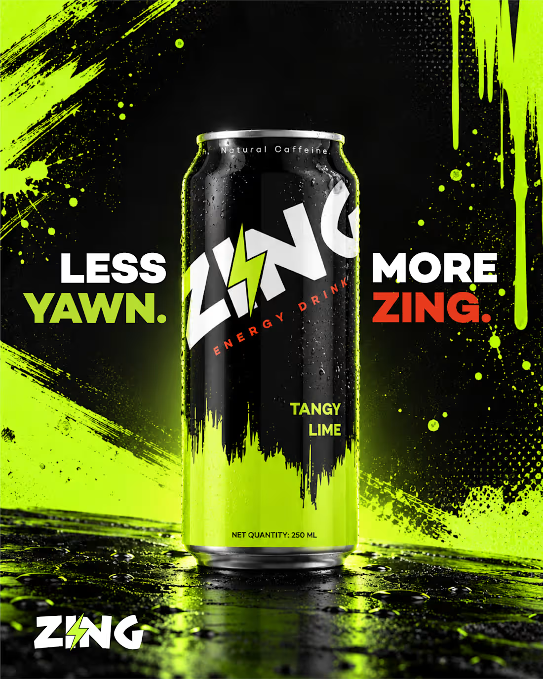
⚡ ZING — Less Yawn. More ZING.
A bold visual identity for a next-gen energy drink brand, designed to stand out and bring the energy. From the striking black and acid-lime palette to graffiti-inspired graphics and punchy typography, every element captures the fearless spirit of Gen Z.
The goal? Turn a simple product visual into a statement that grabs attention. 🔥
Project: Brand Concept & Social Media Ad Design
Industry: FMCG / Beverage
Creative Direction: Bold • Youthful • High-Energy
#BrandIdentity #PackagingDesign #SocialMediaDesign #AdCreative #GraphicDesign #ArtDirection #BeverageBrand #Portfolio
2
1
82
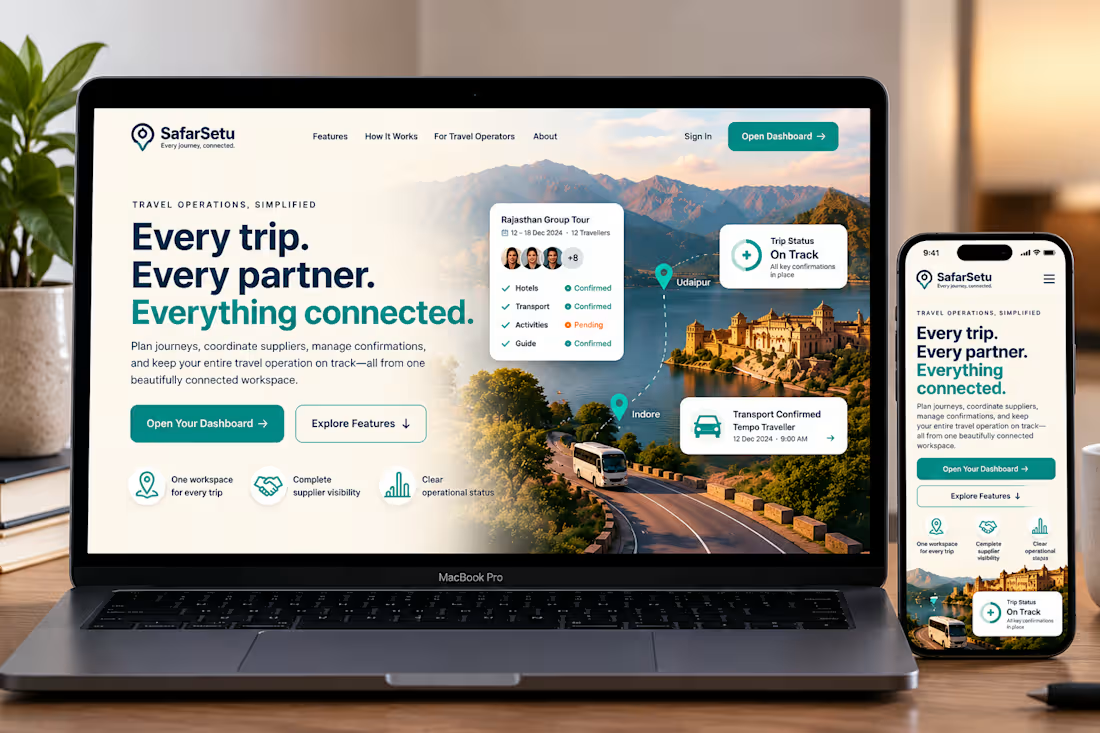
SafarSetu — Travel Tech Website Concept
Every journey. Every partner. Everything connected.
SafarSetu is a travel operations platform concept designed to help travel operators coordinate trips, manage supplier confirmations, and keep every moving part connected in one workspace.
For this concept, I explored a premium, modern visual direction that combines immersive travel photography with a clean SaaS interface. The hero section brings together the brand story, key product benefits, and a clear path into the dashboard.
Design highlights
A modern, responsive website hero for desktop and mobile
A refined colour palette of warm ivory, deep navy, and teal
Cinematic travel imagery inspired by India's landscapes
Floating UI cards showcasing trip status and booking confirmations
Clear calls to action and a consistent visual hierarchy
The goal was to bridge the emotion of travel with the clarity of a professional operations tool.
Project type: Website UI/UX concept
Focus: Visual design, responsive layouts, brand direction, and product storytelling
Status: Design concept and mockup
#WebDesign #UIDesign #UXDesign #SaaSDesign #TravelTech
2
1
59
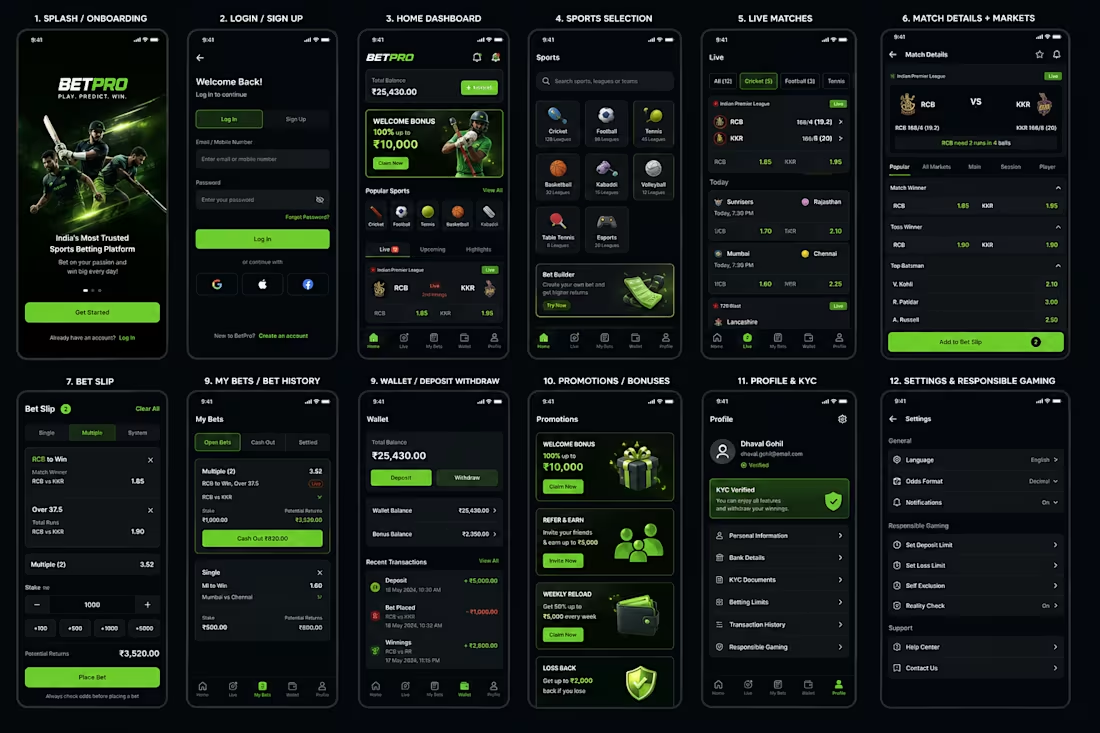
BetPro is a modern sports betting mobile application designed to provide users with a fast, intuitive, and engaging way to discover live sporting events, explore betting markets, place bets, and manage their accounts and wallet.
🎯 Project Objective
The goal was to simplify the sports-betting journey while creating a premium, trustworthy, and high-energy digital experience. The interface focuses on quick access to live matches, easy odds comparison, seamless bet placement, and transparent wallet management.
🎨 Visual Direction
The design uses a dark premium UI with electric green accents, creating a visual language associated with sports, energy, and technology.
Primary: Neon Green #31C24A
Background: Deep Navy / Black
Typography: Poppins
UI: Rounded cards, high contrast, subtle gradients
Design system: 8px spacing, reusable components, consistent states
Navigation: Bottom-tab navigation for quick access
⚡ Core UX Features
Live sports & real-time odds
Multiple betting markets
Single and multiple bets
Quick stake controls
Potential-return calculation
Live match tracking
Wallet & transaction management
Promotions and bonuses
KYC verification
Responsible-gaming controls
💡 UX Focus
The main UX principle is “Bet faster, understand more.”
The interface minimizes unnecessary steps between discovering a match → selecting odds → reviewing the bet → placing the bet, while keeping important information such as odds, stake, potential returns, and account balance highly visible.
0
53