
Timilehin .O
Excel Automation Specialist and BI Analysts
Profile in progress
Timilehin is building their profile!

I didn’t just build a dashboard… I solved a business problem.
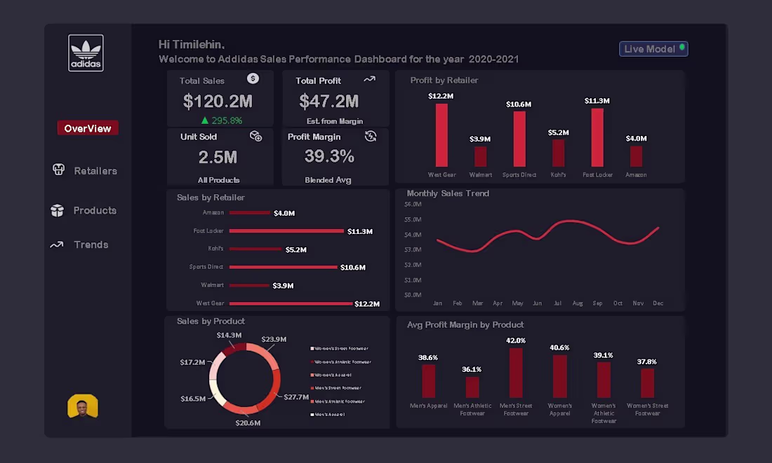
When I first got this Adidas sales dataset, it looked clean on the surface but the real story was buried in thousands of rows of raw numbers.
Sales figures. Retail performance. Product categories.
All scattered. No direction.
So I asked myself:
“If I were the decision-maker, what would I actually need to see?”
That question changed everything.
Using Excel, Power Pivot, and DAX, I transformed raw data into a decision-making tool:
• Built a data model to connect multiple tables seamlessly
• Created DAX measures to calculate Total Sales ($120.2M), Profit ($47.2M), and Margin (39.3%)
• Analyzed retailer performance to identify top contributors like West Gear and Foot Locker
• Tracked monthly sales trends to uncover seasonal patterns
• Broke down product-level profitability to highlight high-margin segments.
But here’s what really mattered…
This dashboard answers real business questions:
→ Which retailer drives the most profit?
→ Where are we losing margin?
→ What products should we double down on?
→ When should we push sales campaigns?
My goal wasn’t to “visualize data.”
It was to turn data into decisions.
And that’s exactly what I achieved.
This project reflects how I approach data analytics:
Not just tools…
But thinking, structuring, and solving problems that matter.
If you’re a business owner, brand, or team sitting on data but lacking clarity…
Let’s change that.
I help turn messy data into insights you can actually use.
#DataAnalytics #Excel #PowerPivot #DAX #BusinessIntelligence #DataVisualization #AnalyticsPortfolio #SQL #PowerBI #FreelanceDataAnalyst #OpenToWork
1
97
Most companies know their revenue.
Very few know where their profit actually comes from.
That gap is expensive.
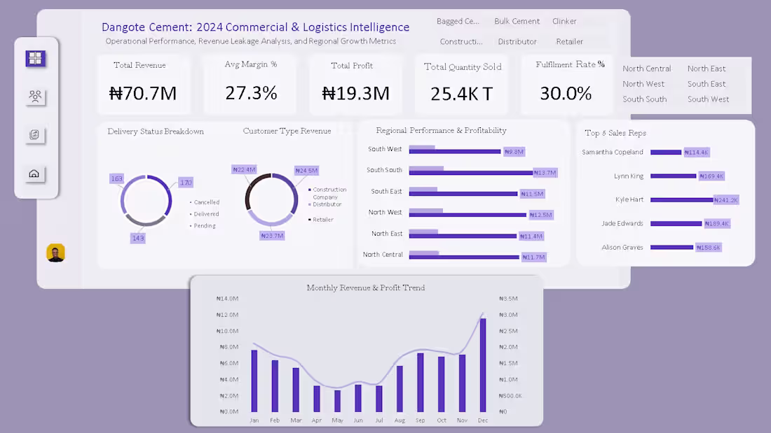
I recently analyzed a commercial & logistics dataset for a cement company and what I found underneath the surface numbers was the kind of insight that changes how a business makes decisions.
Here's the headline:
→ ₦70.7M total revenue
→ ₦19.3M total profit
→ 27.3% average profit margin
Clean numbers. But the real story started when I broke them down 👇
📍 Regional Profitability
The South South region didn't just generate revenue, it led in profitability. Not every region performs equally and treating them like they do is a costly assumption.
🧑🤝🧑 Customer Segment Analysis
Retail vs. Distributor customers showed clear differences in revenue contribution. Segment level visibility changes how you price, prioritize, and grow.
🚚 Delivery & Operational Efficiency
Deals were closing but delivery gaps were quietly leaking value before products even reached customers. Operational blind spots don't show up in revenue reports. They show up in margins.
🏅 Sales Rep Performance
A concentrated group of top performers was driving a disproportionate share of results. That's a talent insight, a succession risk, and a coaching opportunity all in one.
Reporting revenue is easy. Understanding what's driving it and what's quietly eroding it is where real business intelligence lives. That's the difference between a dashboard and a decision.
🛠️ Built with Microsoft Excel, Pivot Tables, Data Modelling, Dashboard Design
This is the kind of work I'm building my practice around:
✅ Sales & business performance analytics
✅ Financial analysis & margin optimisation
✅ Logistics, supply chain & operational data
✅ Risk analytics & data driven decision support
If your business is sitting on sales, logistics, or financial data without a clear view of what it's telling you, that's exactly the problem I solve.
📩 Currently open to Data Analyst, Business Analyst, and Risk Analyst opportunities, full time, contract, or freelance. Drop a comment, send a DM, or follow along. More projects like this coming soon.
#DataAnalytics (https://www.linkedin.com/search/results/all/?keywords=%23dataanalytics&origin=HASH_TAG_FROM_FEED) #BusinessIntelligence (https://www.linkedin.com/search/results/all/?keywords=%23businessintelligence&origin=HASH_TAG_FROM_FEED) #ExcelDashboard (https://www.linkedin.com/search/results/all/?keywords=%23exceldashboard&origin=HASH_TAG_FROM_FEED) #SalesAnalytics (https://www.linkedin.com/search/results/all/?keywords=%23salesanalytics&origin=HASH_TAG_FROM_FEED) #LogisticsData (https://www.linkedin.com/search/results/all/?keywords=%23logisticsdata&origin=HASH_TAG_FROM_FEED) #FinancialAnalytics (https://www.linkedin.com/search/results/all/?keywords=%23financialanalytics&origin=HASH_TAG_FROM_FEED) #ProfitabilityAnalysis (https://www.linkedin.com/search/results/all/?keywords=%23profitabilityanalysis&origin=HASH_TAG_FROM_FEED) #DataDriven (https://www.linkedin.com/search/results/all/?keywords=%23datadriven&origin=HASH_TAG_FROM_FEED) #RiskAnalytics (https://www.linkedin.com/search/results/all/?keywords=%23riskanalytics&origin=HASH_TAG_FROM_FEED) #OpenToWork (https://www.linkedin.com/search/results/all/?keywords=%23opentowork&origin=HASH_TAG_FROM_FEED) #DataAnalyst (https://www.linkedin.com/search/results/all/?keywords=%23dataanalyst&origin=HASH_TAG_FROM_FEED) #BusinessAnalyst (https://www.linkedin.com/search/results/all/?keywords=%23businessanalyst&origin=HASH_TAG_FROM_FEED) #AnalyticsPortfolio (https://www.linkedin.com/search/results/all/?keywords=%23analyticsportfolio&origin=HASH_TAG_FROM_FEED) #OperationalEfficiency (https://www.linkedin.com/search/results/all/?keywords=%23operationalefficiency&origin=HASH_TAG_FROM_FEED) #DataStorytelling (https://www.linkedin.com/search/results/all/?keywords=%23datastorytelling&origin=HASH_TAG_FROM_FEED)
1
2
150
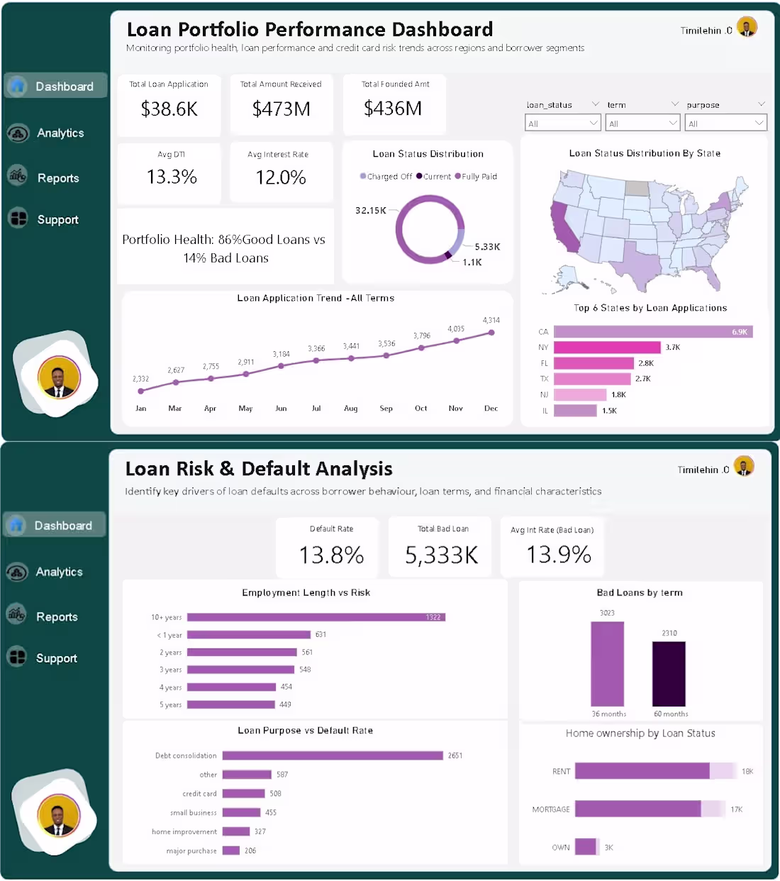
A loan portfolio can look profitable on paper… and still be quietly losing money.
That’s exactly what I noticed while working with this dataset.
Revenue was coming in.
Applications were increasing.
Performance looked “healthy.”
But something didn’t add up.
Why were defaults increasing in a system that looked like it was growing?
That question led me to build this Loan Portfolio & Risk Analysis Dashboard not to visualize data, but to uncover what’s quietly hurting performance.
Here’s what stood out after digging deeper:
1. Growth was hiding risk
Loan applications kept rising month after month.
On paper, that’s growth.
But when segmented, a portion of that growth was coming from higher-risk borrowers, not necessarily better-performing ones.
2. Portfolio health looked good… until you zoom in
At a glance:
86% good loans vs 14% bad loans.
Sounds healthy, right?
But that 14% is where the real story is
because that’s where losses live.
3. Loan terms were influencing default behavior
When I compared loan durations:
• 36-month loans performed better
• 60-month loans showed higher default concentration
Longer terms = more uncertainty = higher risk exposure.
4. Employment length revealed stability patterns
Borrowers with longer employment history showed lower default tendencies.
Short-term employment?
Higher risk.
This is the kind of insight that can improve credit scoring decisions immediately.
5. Loan purpose matters more than most people think
Not all loans behave the same.
Some categories consistently showed higher default rates, meaning:
👉 Risk isn’t just about who you lend to
👉 It’s also about why they’re borrowing
6. Geography tells a hidden story
Certain states contributed more to total applications.
But volume ≠ quality.
Some high-volume regions also showed higher bad loan concentration, which is a red flag for lenders expanding aggressively.
This project changed how I see “good dashboards.”
It’s not about fitting charts into a page.
It’s about asking:
“Where is the business losing money without realizing it?”
Because in finance, small unnoticed risks compound into big losses.
If you’re working with financial data, always go beyond totals.
Break it down. Segment it. Question it.
That’s where the real insights are.
I’m currently open to working on data analysis projects in finance, risk, and business performance.
Let’s build solutions that don’t just look good but actually drive decisions.
1
83
Fraud doesn’t always look suspicious, until you analyse the patterns.
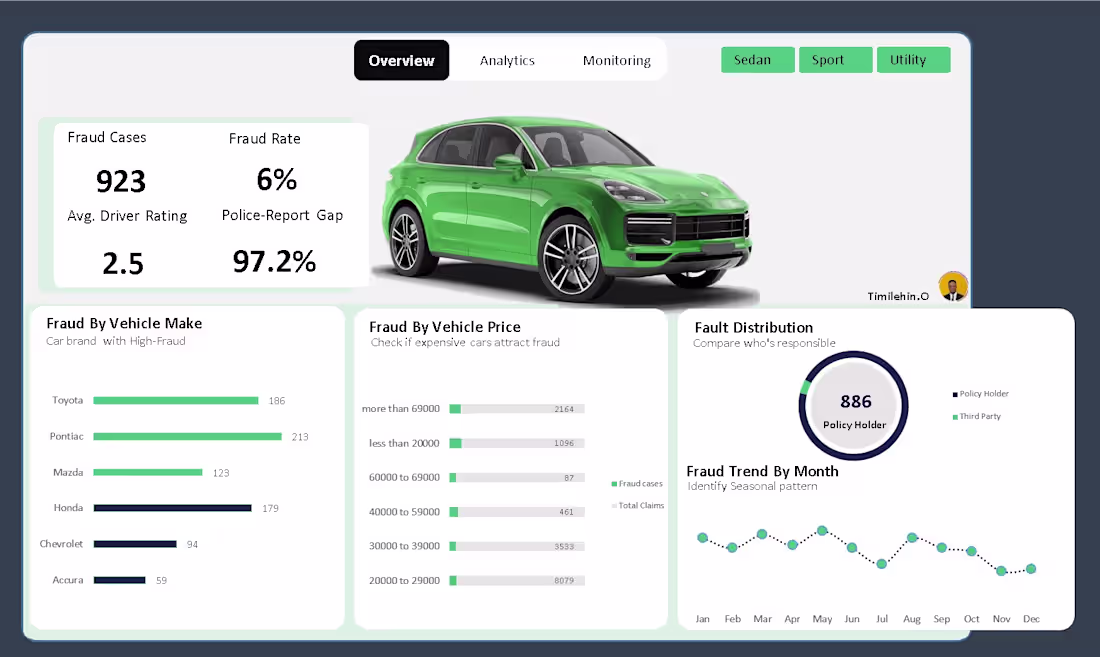
I recently worked on a Vehicle Insurance Claim Fraud Analysis case study where the goal was simple:
👉 identify hidden risk signals and process gaps that allow fraudulent claims to slip through.
🔍 The problem
Insurance teams deal with thousands of claims, but:
• Fraud is often buried inside normal-looking transactions
• Manual checks miss systemic weaknesses, not just bad actors
• High-risk signals are rarely quantified clearly
So I approached this as a real-world fraud analyst, not just a dashboard exercise.
🛠️ What I did (end-to-end)
Using Excel analysis, I:
• Cleaned and structured claim-level data
• Defined fraud-focused KPIs, not vanity metrics
• Built an interactive dashboard with slicers to simulate decision-making
📊 Core KPIs tracked
• Fraud Rate (%)
• Total Fraud Cases
• Average Driver Risk Rating (Fraud)
• Police Report Gap (%) - fraud claims filed without police reports
🚨 Key insights discovered
• Fraud concentration varied strongly by vehicle price band, not just volume
• Certain vehicle categories consistently showed higher fraud exposure
• An alarming 97%+ of fraudulent claims lacked police reports, highlighting a major verification gap
• Driver risk ratings provided early signals that could support preventive controls
These insights aren’t theoretical, they point directly to where insurers are leaking money.
💡 Business impact (how this helps)
This type of analysis helps organisations:
• Flag high-risk claims earlier
• Strengthen fraud prevention rules
• Improve compliance and documentation checks
• Reduce payout losses without increasing manual workload
🧠 Tools & skills applied
Excel (Advanced Pivot Analysis)
Fraud & Risk Analytics
Dashboard Storytelling
Business Intelligence Thinking
I’m building and sharing real fraud analytics case studies as I continue to grow in this space, focusing on credit card, insurance, and transaction fraud.
If you’re a:
• Fraud / Risk Manager
• Insurance or FinTech team
• Founder needing data-driven fraud insights
I’m open to conversations and collaboration.
#FraudAnalytics (https://www.linkedin.com/search/results/all/?keywords=%23fraudanalytics&origin=HASH_TAG_FROM_FEED) #FraudDetection (https://www.linkedin.com/search/results/all/?keywords=%23frauddetection&origin=HASH_TAG_FROM_FEED) #RiskAnalytics (https://www.linkedin.com/search/results/all/?keywords=%23riskanalytics&origin=HASH_TAG_FROM_FEED) #BusinessIntelligence (https://www.linkedin.com/search/results/all/?keywords=%23businessintelligence&origin=HASH_TAG_FROM_FEED) #ExcelDashboard (https://www.linkedin.com/search/results/all/?keywords=%23exceldashboard&origin=HASH_TAG_FROM_FEED) #DataAnalytics (https://www.linkedin.com/search/results/all/?keywords=%23dataanalytics&origin=HASH_TAG_FROM_FEED) #BuildInPublic (https://www.linkedin.com/search/results/all/?keywords=%23buildinpublic&origin=HASH_TAG_FROM_FEED)
2
3
208
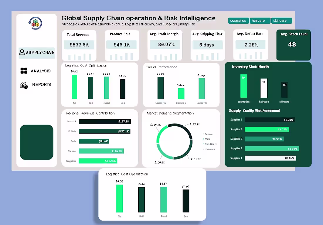
A few weeks ago, my boss Victor Ugwu (https://www.linkedin.com/in/victor-chidera-ugwu-64230431a/) shared a raw supply chain dataset with me.
No instructions.
No predefined questions.
Just one brief: “See what you can uncover.”
Instead of treating it as routine reporting, I approached it as a real business problem:
How can leadership use this data to reduce risk, cut costs, and grow profitably?
That mindset led to the Global Supply Chain Operations & Risk Intelligence Dashboard, built entirely in Excel.
At first glance, the data looked fine. But beneath the tables were silent issues holding performance back: rising logistics costs, inconsistent carrier performance, hidden supplier quality risks, inventory imbalance across product lines, and revenue concentration in just a few regions. None of these were obvious from raw spreadsheets, so I redesigned the analysis around decision-making, not reporting.
Revenue visibility came first. By visualizing regional contributions, leadership can clearly see where growth is coming from. Cities like Mumbai and Kolkata emerge as key drivers, while other regions highlight the need for better distribution or demand stimulation. With $577.6K in total revenue and $46.1K in products sold, investment decisions become sharper and more focused.
Logistics efficiency followed. Comparing transport costs with delivery times showed that air freight is fast but expensive, while sea and rail offer better cost efficiency. This helps answer a critical question: Where can we cut costs without slowing deliveries?
Carrier performance revealed another insight. A one-day delivery difference may seem small, but at scale it affects customer satisfaction, inventory turnover, and holding costs. Making this visible enables smarter contract negotiations and volume rebalancing.
Inventory health also stood out. Stock levels varied across product lines cosmetics (59), haircare (48), skincare (40) highlighting risks of both overstock and stockouts.
One of the most critical findings was supplier quality risk, with some suppliers showing defect rates as high as 52%. Instead of reacting after complaints or returns, teams can now identify and mitigate risks early.
This analysis was done using Excel, Power Query, Pivot Tables, and calculated KPIs.
The result isn’t just a dashboard, it’s a decision engine that delivers clarity, cost savings, early risk detection, and smarter growth decisions.
If you’re a founder or operations leader dealing with rising costs or poor visibility, I help turn your data into clear, practical actions.
📩 DM me if you want to uncover the growth opportunities hidden in your data.
1
95