
Shawaiz Hassan
Website & Funnel Expert | Kajabi • WP • GHL • Framer
- 1x
- Hired
- 5.00
- Rating
- 19
- Followers
Turned a “dead” funnel into $2,700 in just 3 days
without changing the offer.
The funnel looked fine…
But it wasn’t converting.
Here’s what we fixed, and why it worked:
🧠 UX clarity:
We restructured the entire journey to match how real users think.
🎯 CTA focus:
We didn’t just add buttons, we made them impossible to ignore.
🖼️ Visual hierarchy:
Your layout should guide the eyes.
We built a layout that goes: headline → trust → benefit → CTA.
That’s how you earn trust in 5 seconds.
🎨 Modern UI:
→ Clean design
→ Fast load
→ Consistent styling
→ Mobile-first build
→ Zero template vibes
📈 The result?
✅ $2,700 in sales in 3 days
✅ 3 booked calls in 48 hours
✅ Client said: “This is exactly what I was trying to explain, but better.”
No ad spend. No discount.
Just a smarter, smoother funnel that actually works.
2
170
80% of your visitors decide in the first 5 seconds if they’ll stay or leave.
↳Your hero section decides whether you win a client, or lose them.
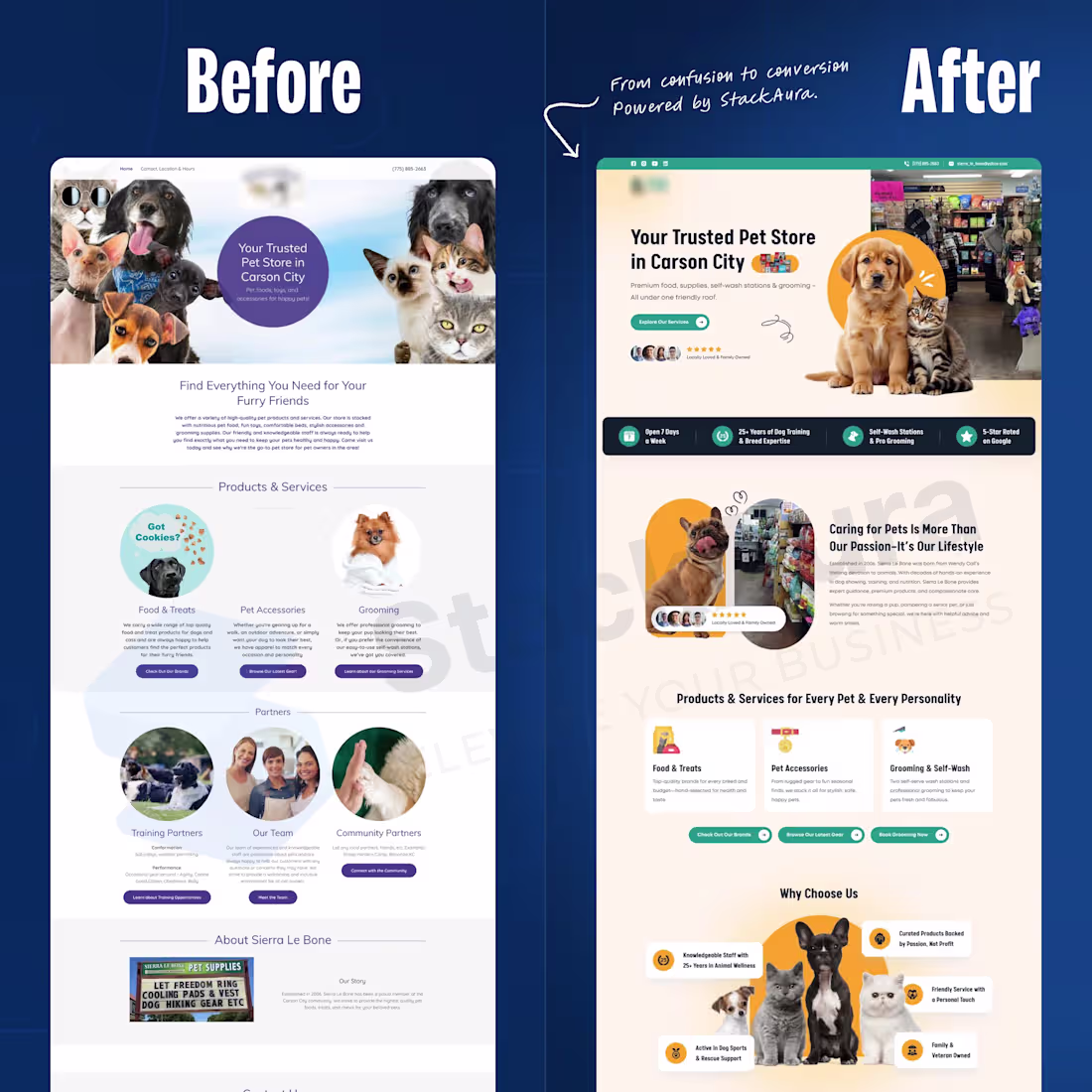
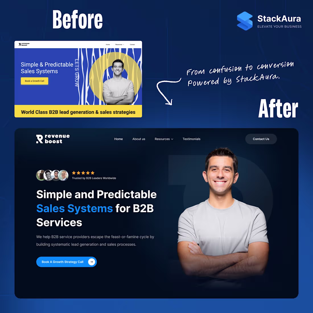
Here’s a real example from a client project 👇
Before:
❌ Vague headline, didn’t say who they help
❌ Background distracted from the message
❌ CTA visible, but no clear reason to click
❌ Looked okay… but didn’t build trust
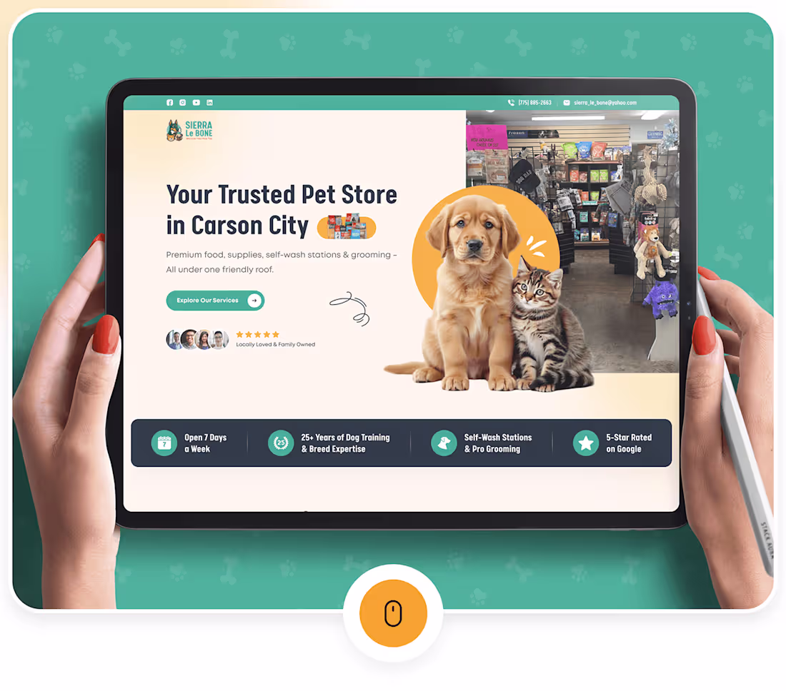
After:
✅ Headline calls out B2B service providers directly
✅ Subheadline hits the “feast or famine” problem
✅ Added instant credibility (photos + 5-star rating)
✅ Dark mode design that makes CTA pop
✅ Structured hierarchy guiding the user naturally
The difference?
Visitors instantly know:
👉 Who you serve
👉 Why they should trust you
👉 What action to take next
That clarity = higher conversions.
And higher conversions = more revenue.
3
228
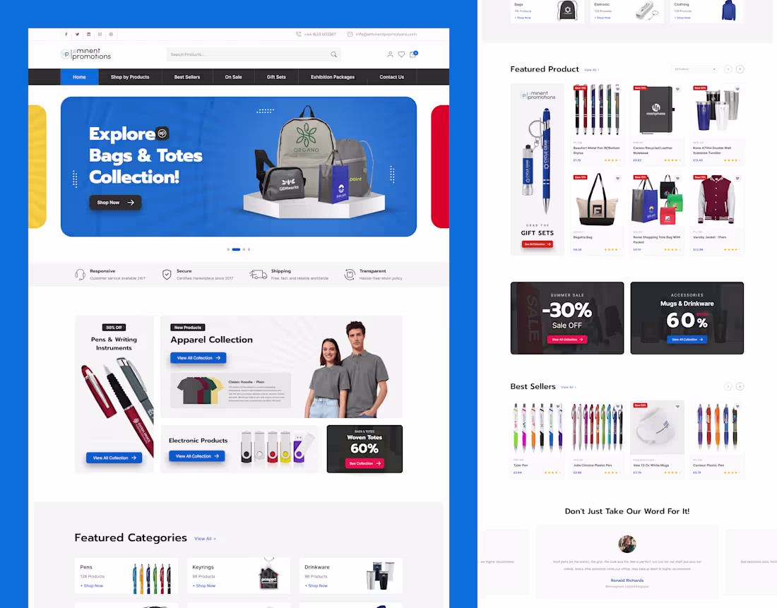
Pet Care & Shop Website Design
2
13
Shopify Multivendor Website
4
14
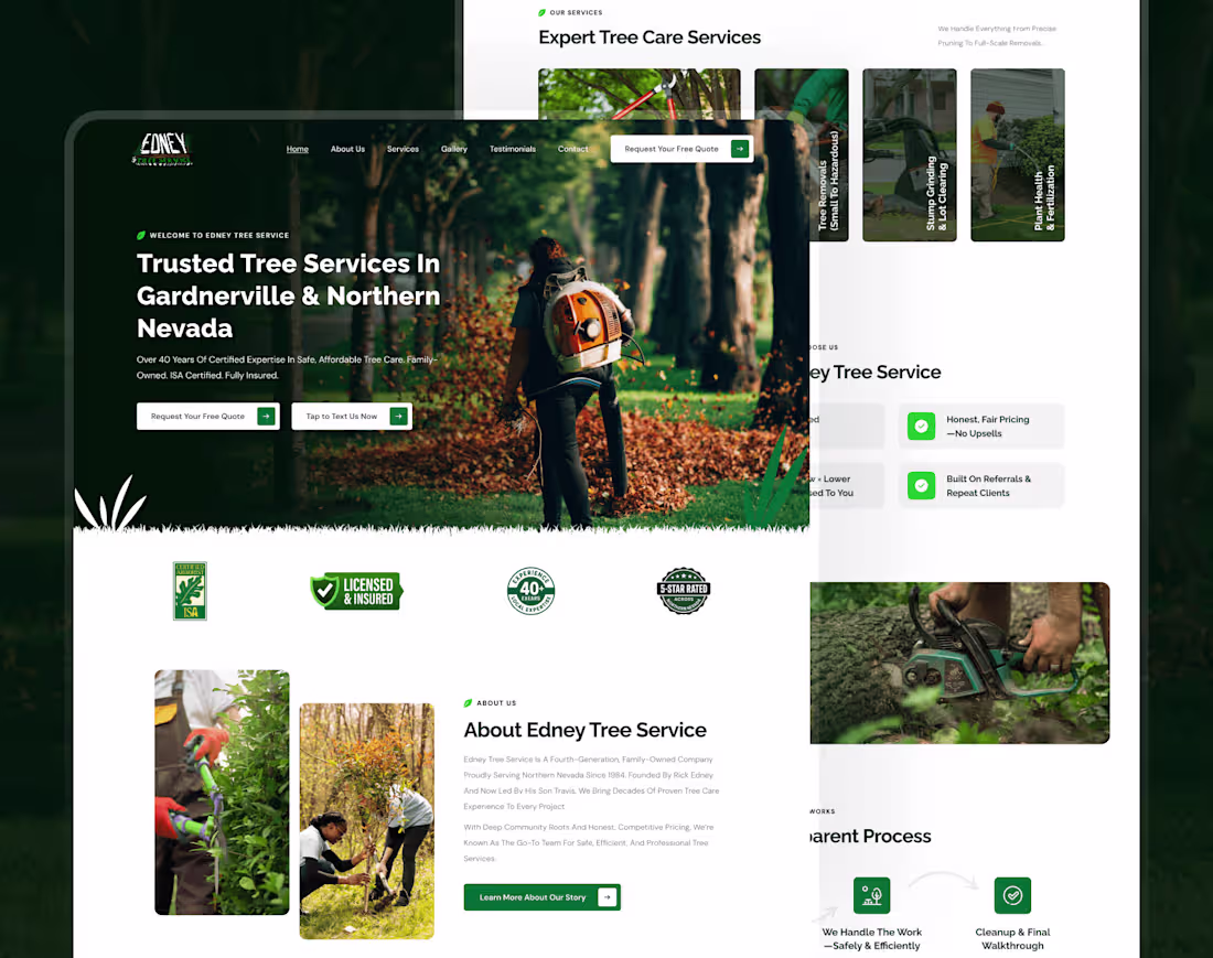
Edney Tree Service
4
20
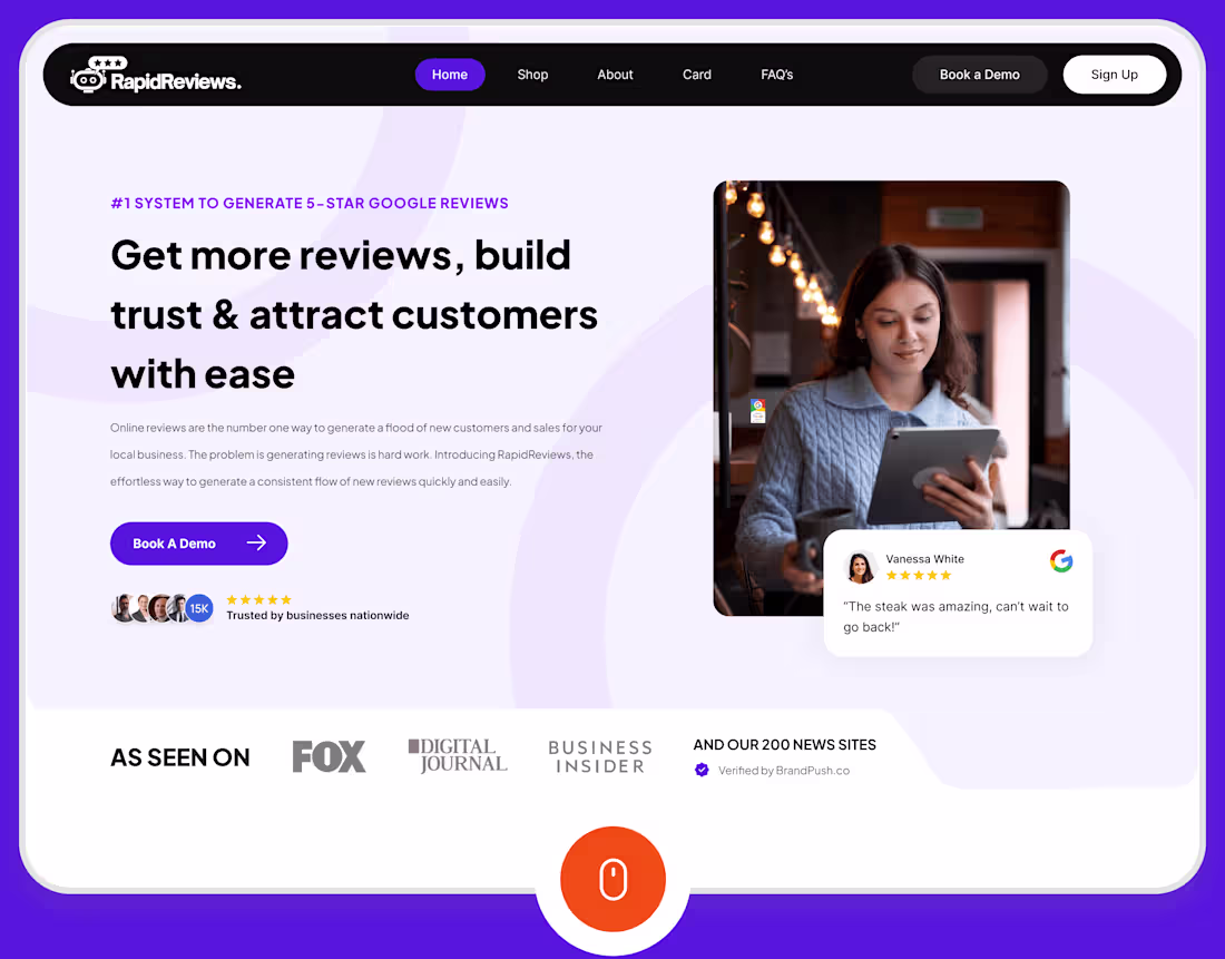
Reputation Management Website
1
5