pro
Through the Lens: Conceptual Photography Brand Mark
A concept-driven logo identity for a photographer, designed by merging the letter “N” with core camera elements to create a mark that feels both minimal and meaningful. Built on a 3:2 aspect ratio grid, the logo draws directly from the visual language of photography, resulting in a refined, editorial identity with a strong conceptual foundation.
This project presents a refined brand identity for a photographer, built around a smart conceptual fusion of the letter “N” and a camera form.
The logo seamlessly integrates the subject’s initial with key photographic elements — the camera frame, lens, and flash/viewfinder — resulting in a mark that feels both minimal and conceptually rich. Its construction is grounded in a 3:2 aspect-ratio grid, a subtle yet intentional reference to the native proportions of photography, giving the identity greater relevance and precision.
The visual presentation highlights the thoughtful build process, revealing how each component contributes to the final symbol. Shown in application against a dark, atmospheric photographic backdrop, the identity takes on a distinctly premium, editorial, and artist-led character.
0
107
LOGO DESIGN FOR PHOTOGRAPHER
0
142
LOGO DESIGN FOR KAVYA
0
138
LOGO DESIGN FOR HUE COAST
1
136
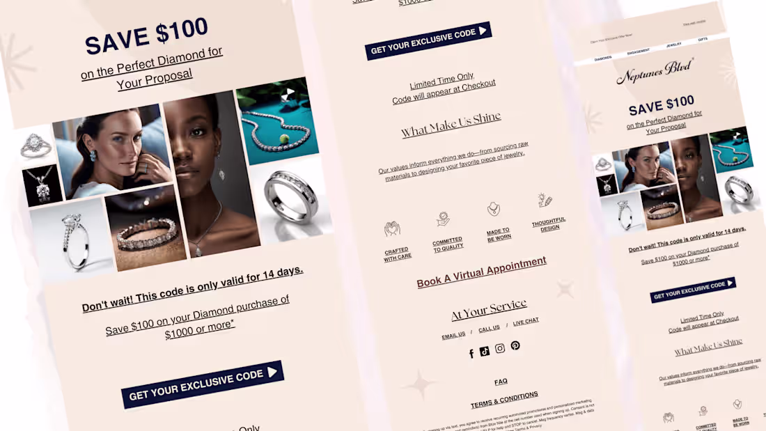
Project Summary
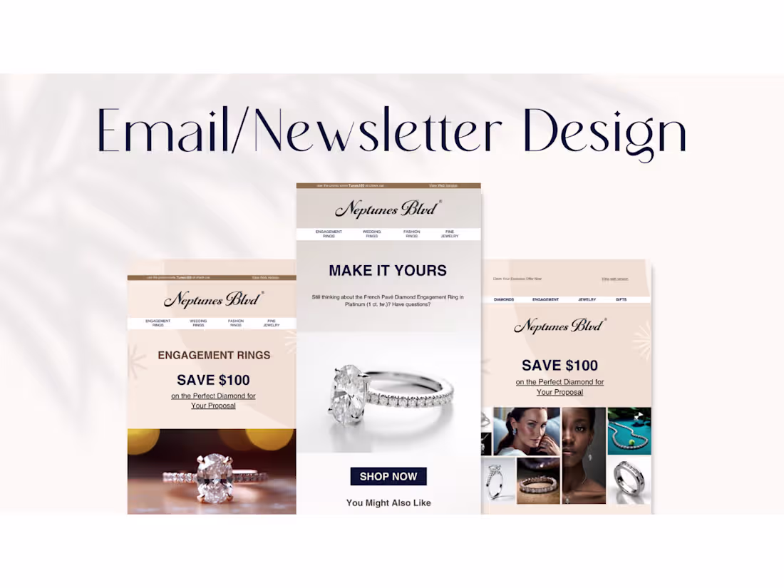
The objective of this project was to design luxury email marketing creatives for a fine jewellery brand, with a focus on engagement rings and diamond purchases. The emails were developed to support both brand positioning and sales performance.
By using a refined visual hierarchy, premium typography, and product-led storytelling, the campaigns communicate value without aggressive promotion. Trust signals, brand values, and service accessibility were integrated to reduce purchase hesitation and reinforce credibility.
These email designs serve as a scalable system that can be reused across promotions, product launches, and seasonal campaigns.
2
173
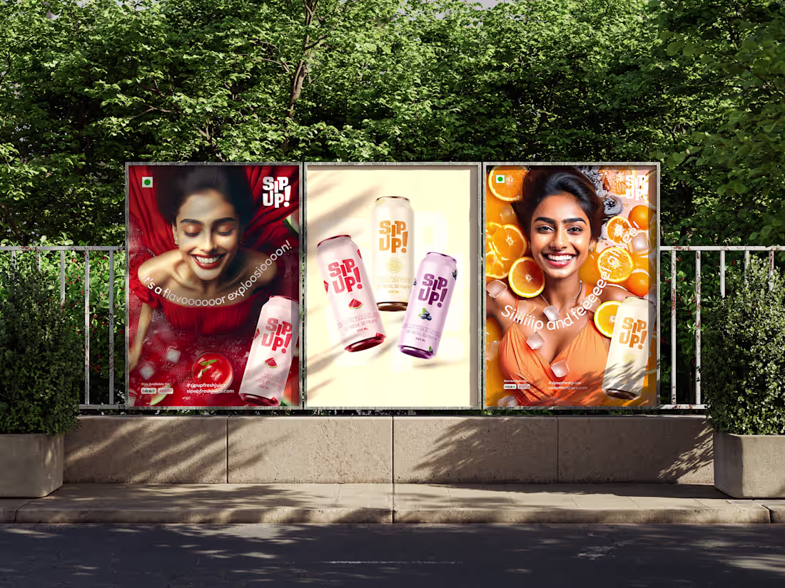
Campaign Design for Beverage Brand
0
9
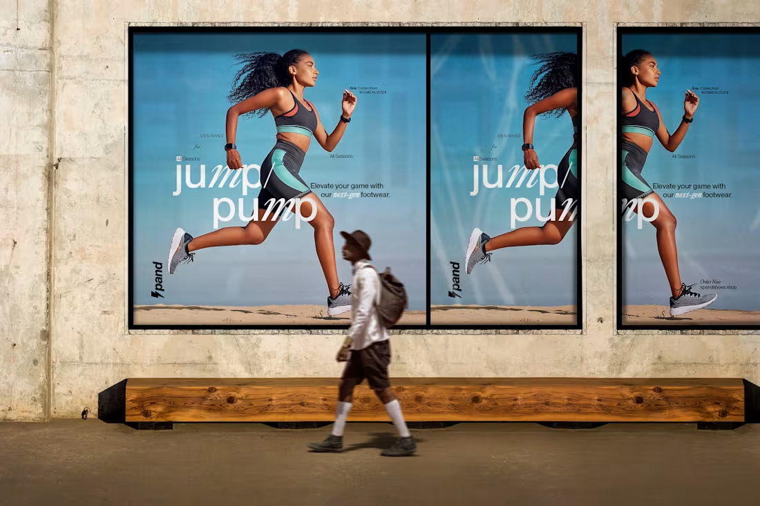
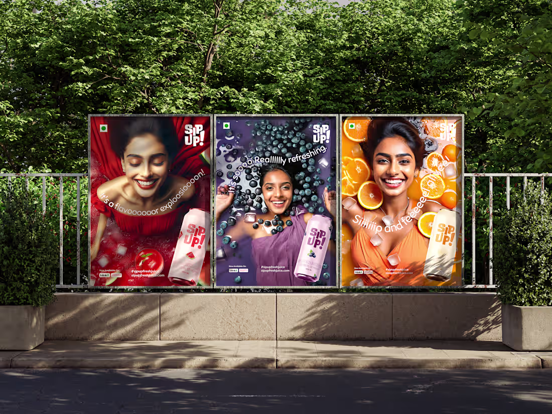
Poster Design
1
5
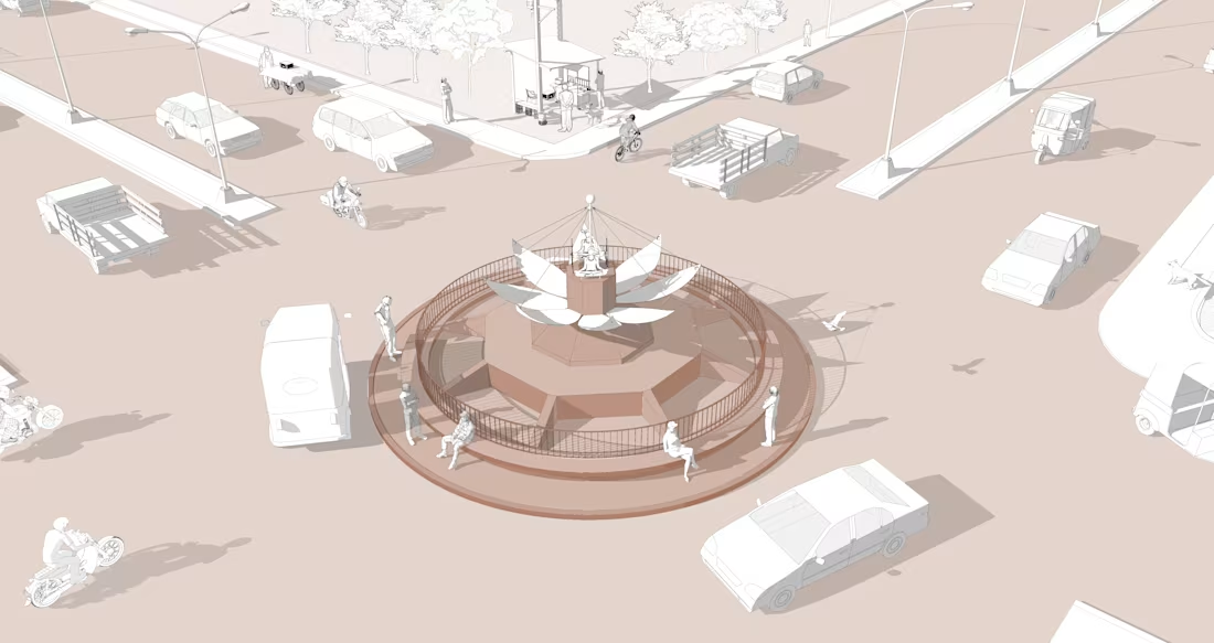
illustration
0
8
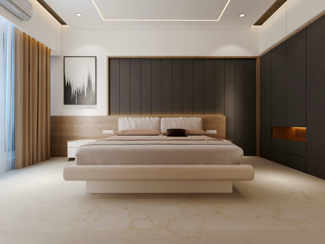
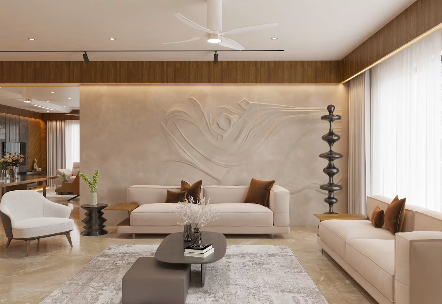
Modern and Minimalist Bedroom Render
0
23
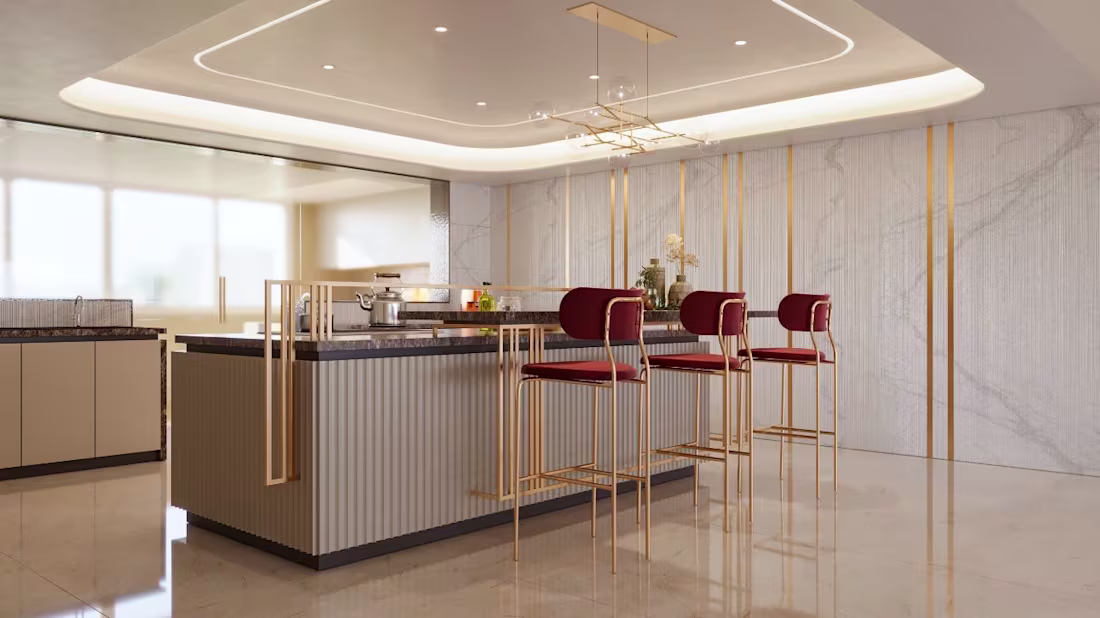
INTERIOR DESIGN
0
11
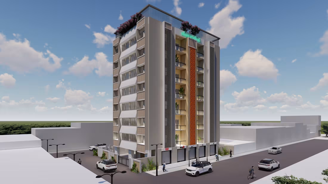
Grandeur on Green: A Modern Residential Tower
0
4
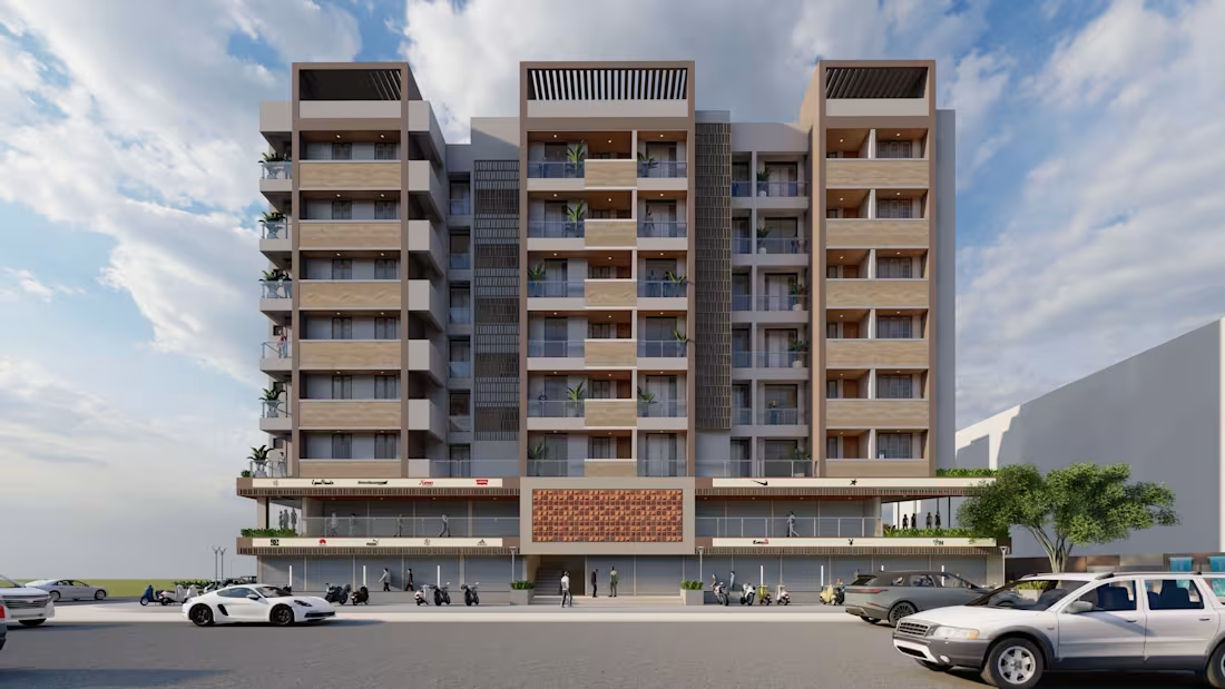
The Urban Facade: A Modern Mixed-Use Building
1
9
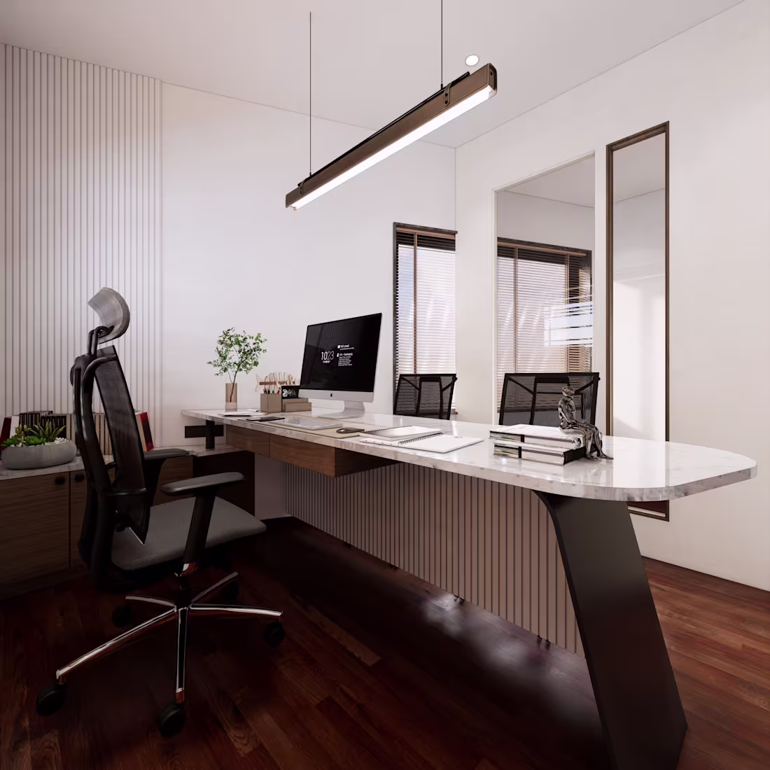
Modern Office Interior
1
10
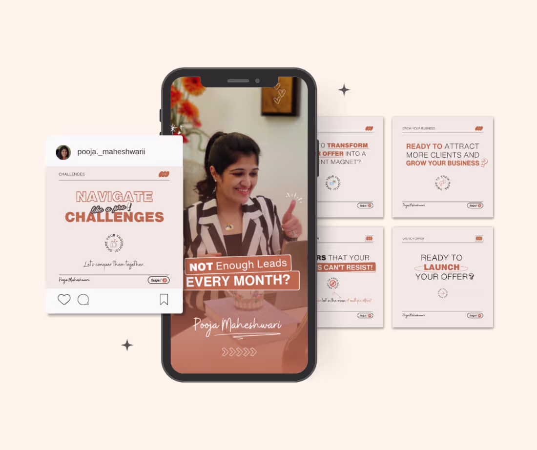
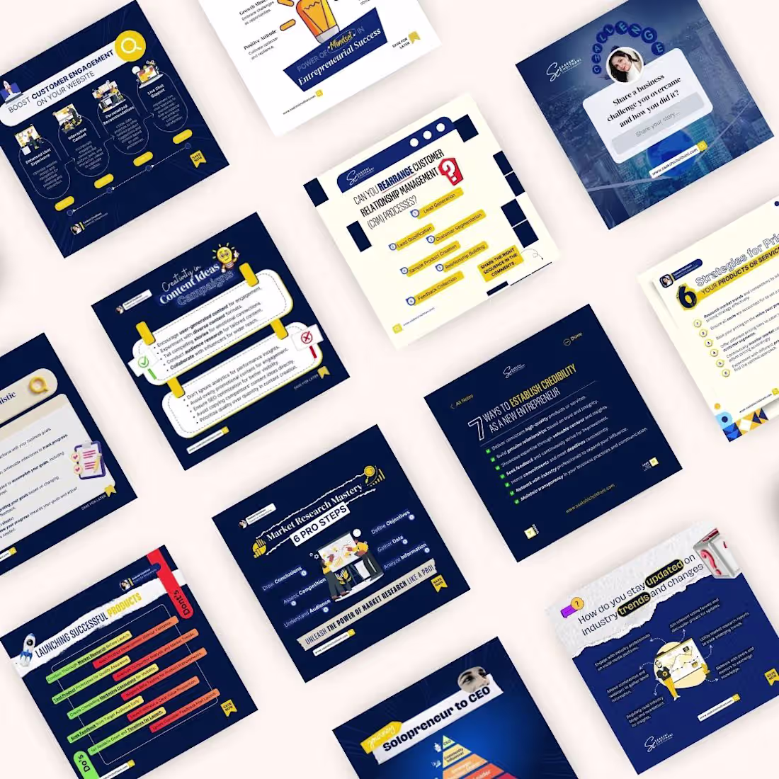
Social Media Posts
1
8
Social Media Content Design
0
3
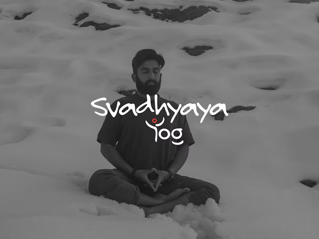
Logo Design - Svadhyaya Yog
0
3
Poster Design
0
2
Social Media Content Design
1
2
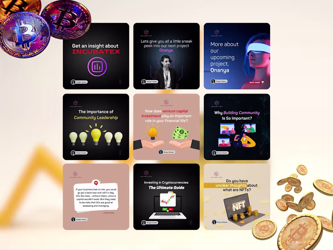
Social Media Designs - Crypto & NFT
0
2
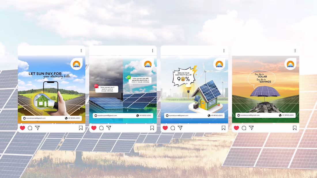
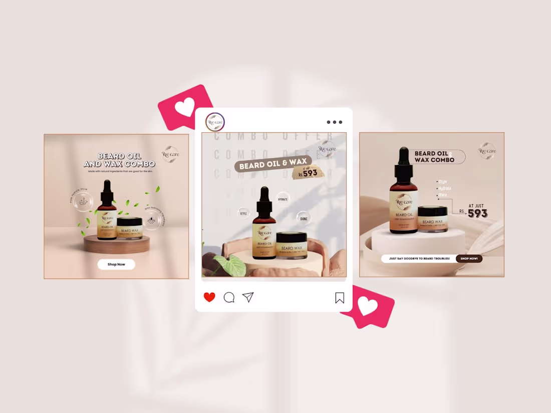
Social Media Design/ Campaign Design
0
2
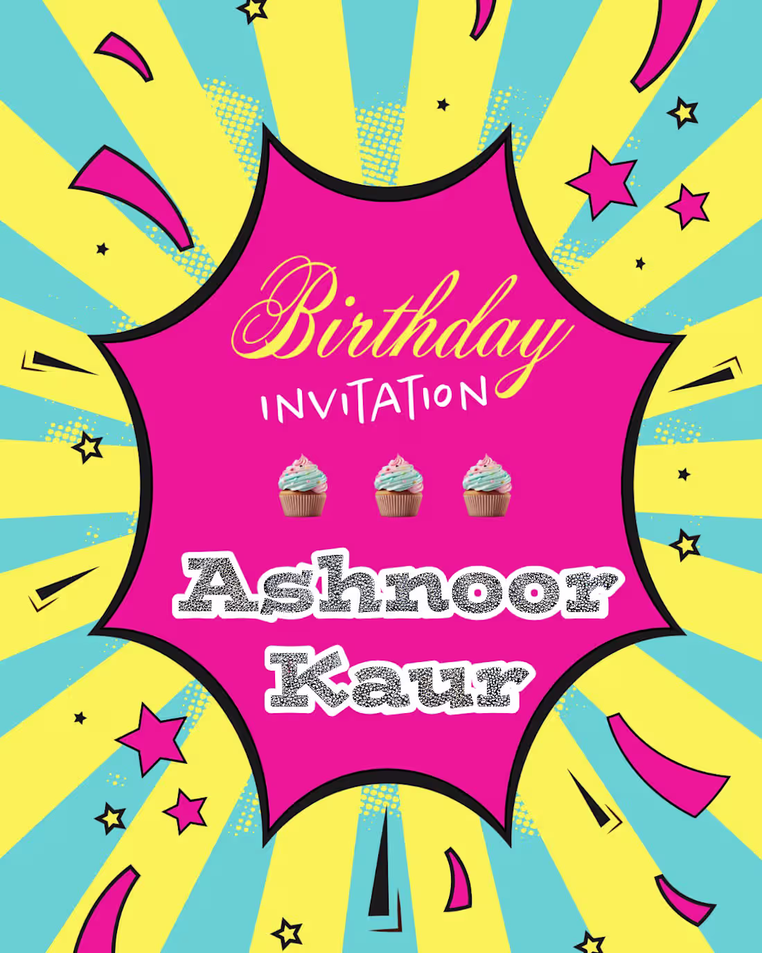
Digital Invitation Card
0
2
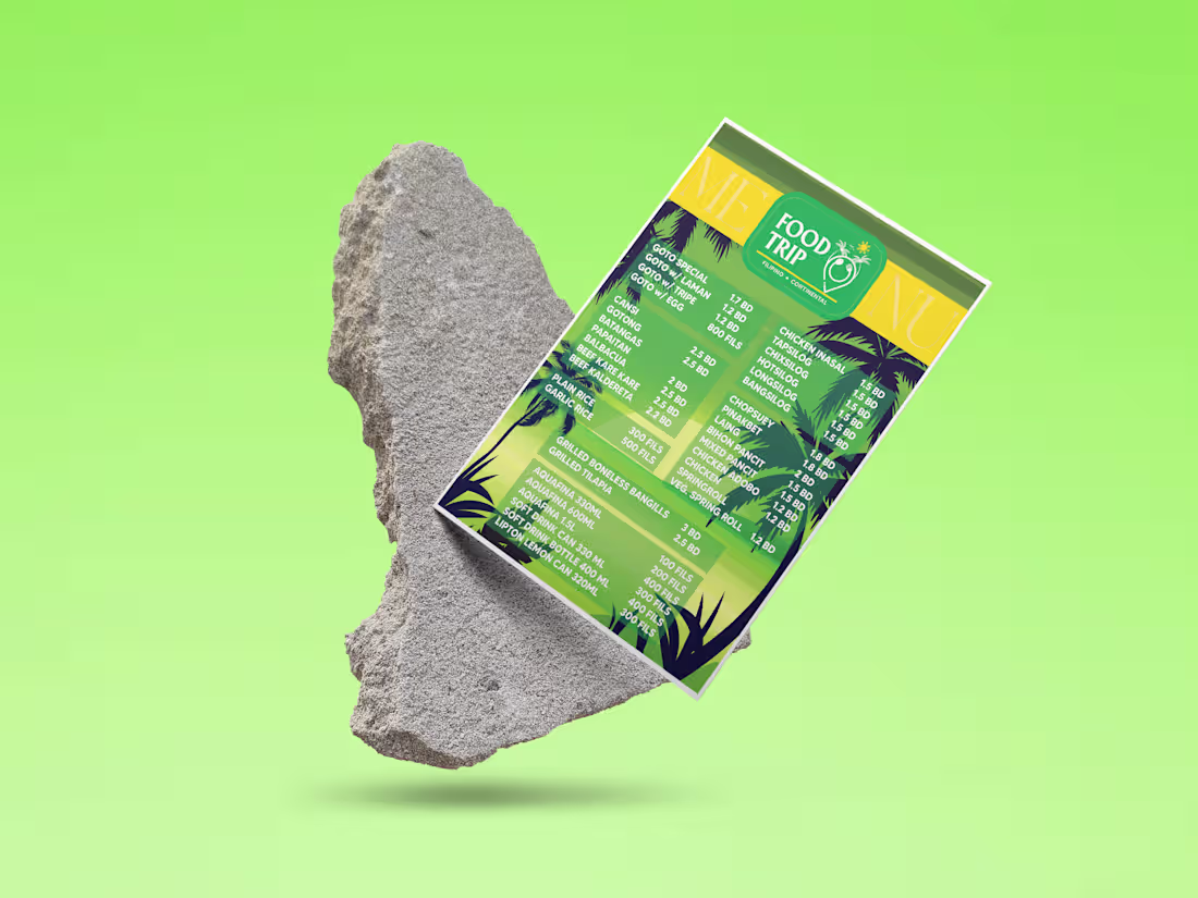
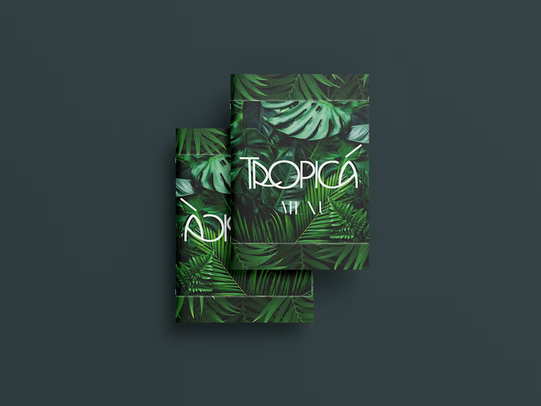
Print Design - Menu Design
0
5
Facebook Ads Video Creation
0
3
Creative Ads Design for social media
0
1
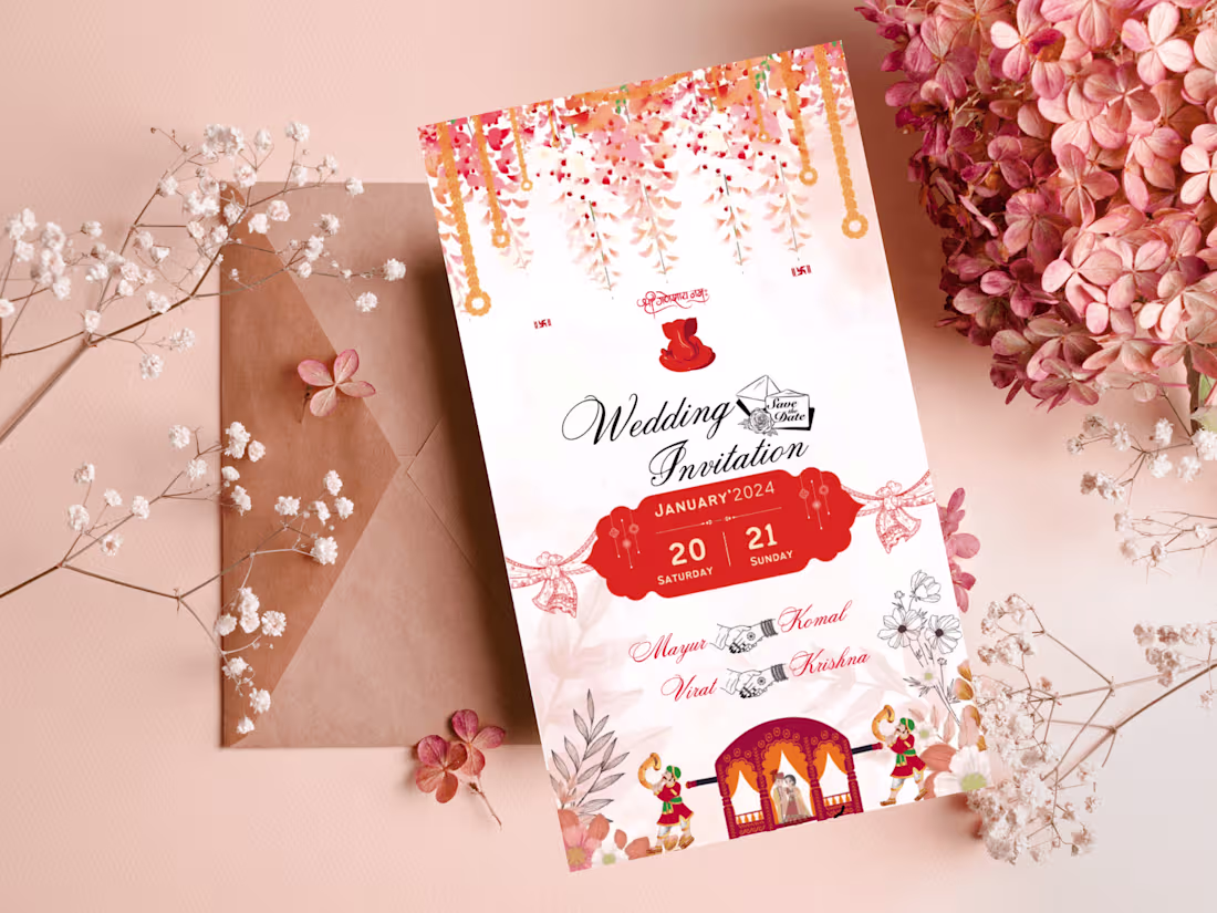
Wedding Invitation Card Design
0
3
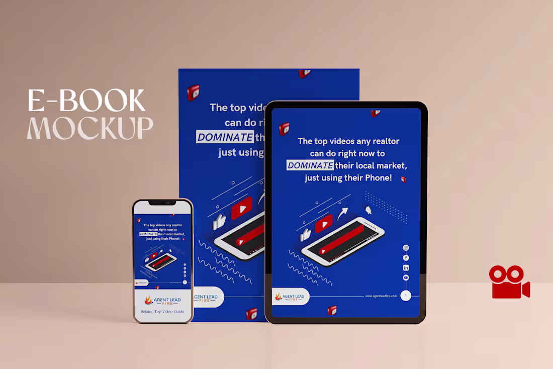
E-book Design
0
3
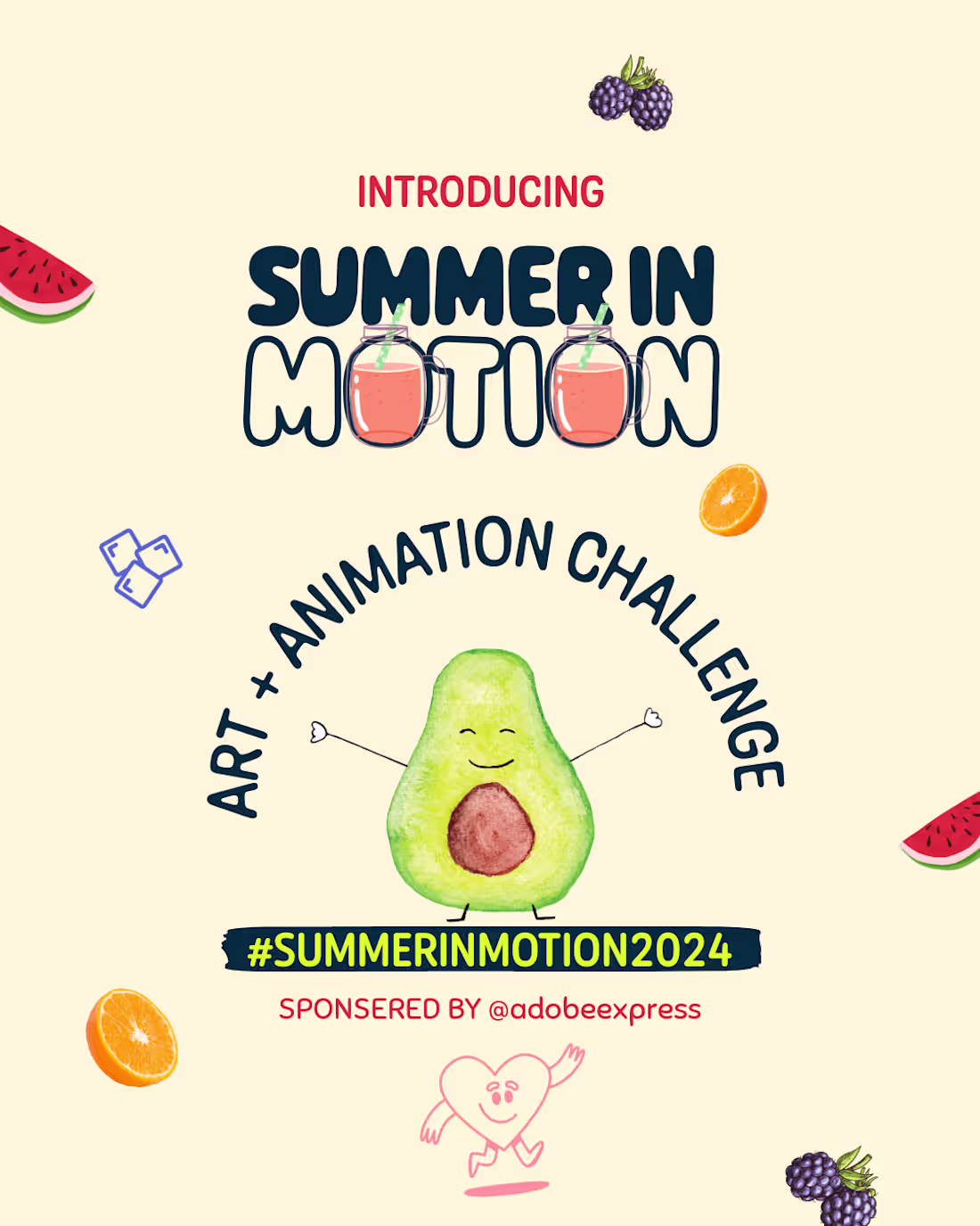
Art + Animation
0
1
Social Media Ads Design
0
2
Brochure Design
0
4
Invitation Page (Event)
0
5
Landing Page Design
0
1
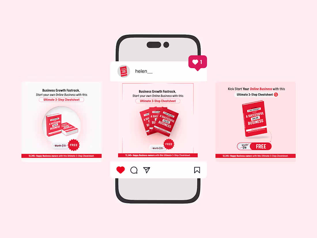
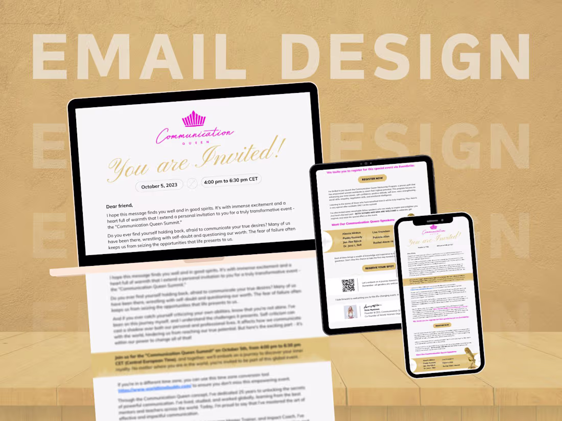
Email Newsletter Design for Jewellery Brand
0
3
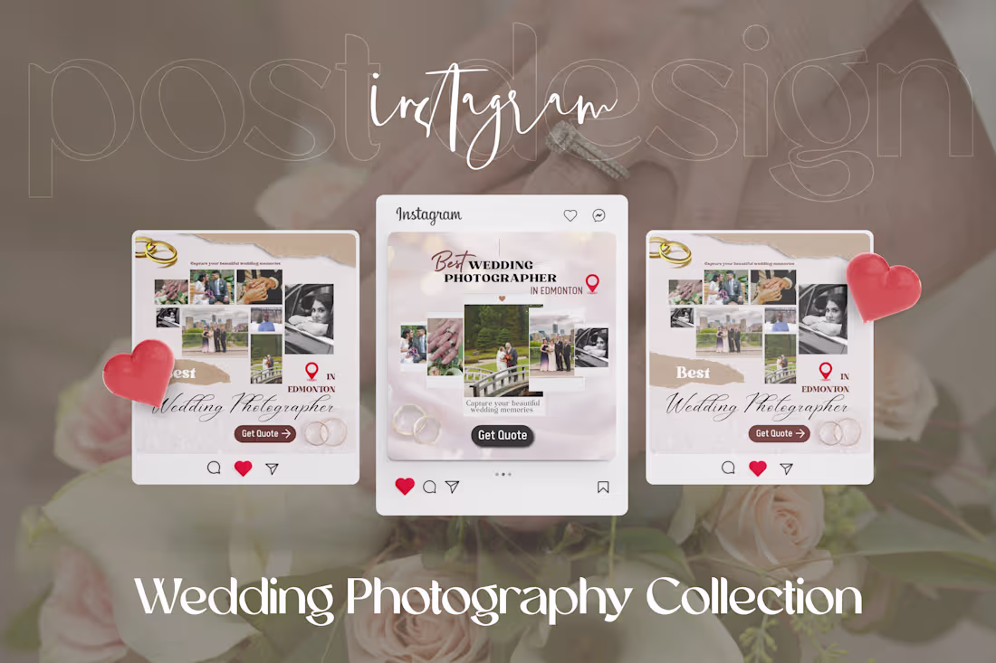
Instagram Ads Design
0
1