
Daniel de Mesquita
Graphic Designer | Social Media & Campaign | English C2
Ready for work
Daniel is ready for their next project!
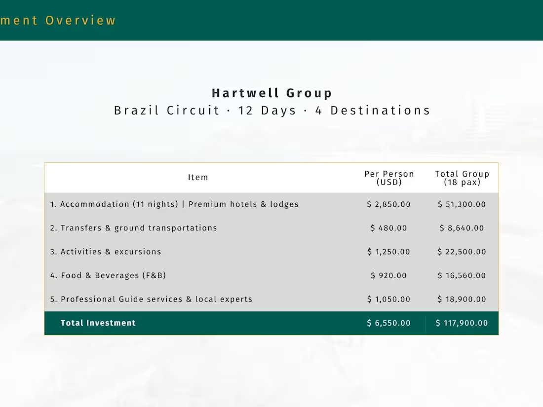
Hartwell Group — 12-Day Brazil Circuit
18 executives · US-based corporate client · FIT + MICE
The Brief:
A US-based events agency needed a fully custom luxury itinerary proposal for 18 C-suite executives across four Brazilian destinations — Rio de Janeiro, Iguaçu Falls, the Pantanal, and São Paulo. Deadline: 48 hours. Budget tier: ultra-premium.
My Approach:
Built a 32-slide branded deck from scratch: custom cover with client's logo, Compass Brazil overview, full itinerary map, day-by-day breakdowns (morning · lunch · afternoon · dinner · evening), curated photography per destination, and a tiered pricing table. Delivered within 36 hours.
0
11
The Brief
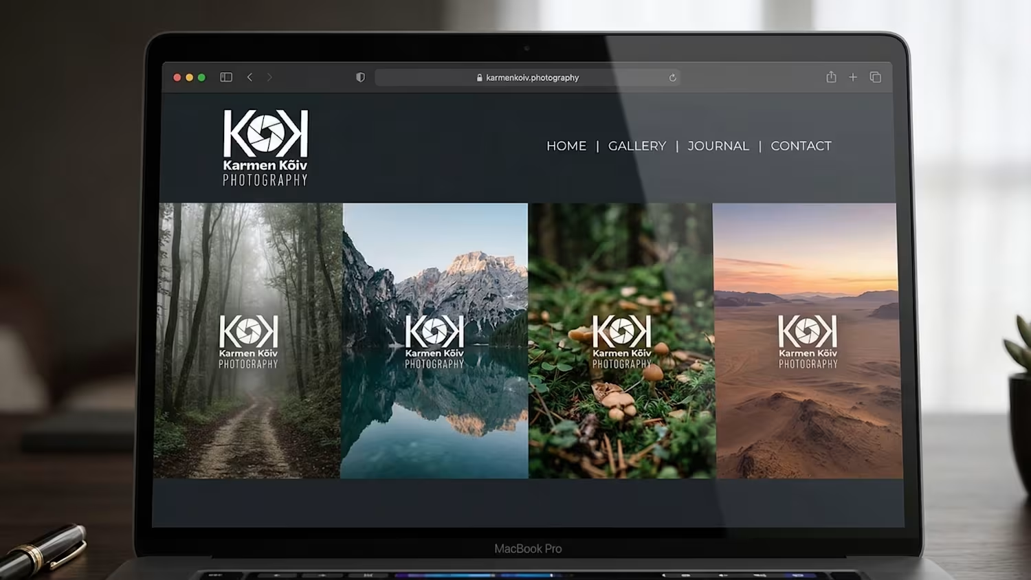
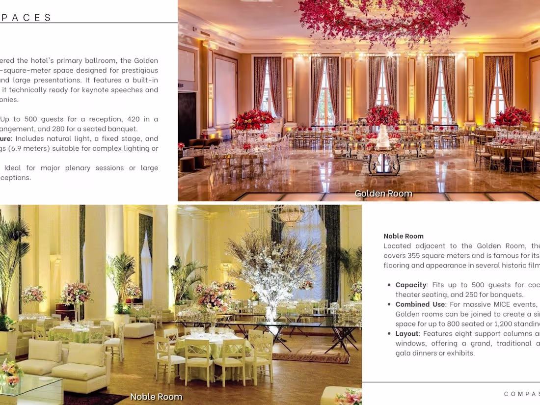
Compass Brazil needed a standalone hotel presentation to pitch the Belmond Copacabana Palace to high-end US and European travel agents unfamiliar with the property. The deck had to convey the hotel's heritage, room categories, F&B offering, event spaces, and why it belongs in every luxury Brazil itinerary — all without relying on the Belmond brand's own materials.
My Approach
Designed a 20-slide property showcase structured around the agent's decision journey: opening with Rio de Janeiro context and the hotel's 100-year legacy, followed by curated room-tier spreads (Superior through Penthouse), pool and beachfront lifestyle imagery, dining at Cipriani and Pérgula, meeting & events capacity, and a final rates-on-request contact slide. Typography and white space were used deliberately to let the photography breathe — no cluttered layouts, no competing colours. The result felt editorial, not promotional.
0
39
The Brief
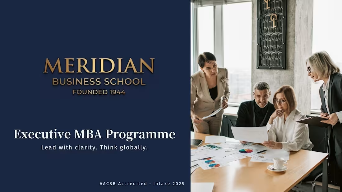
Meridian Business School needed a flagship enrollment presentation to recruit Executive MBA candidates across three international markets. The existing materials were text-heavy, inconsistent in tone, and failing to communicate the programme's competitive edge against established US and European schools. The new deck had to work equally well in a live admissions event, a one-on-one advisor meeting, and as a self-guided PDF sent to prospective students — three formats, one design system.
My Approach
Built a 28-slide deck structured around the candidate's decision journey: programme overview and accreditation credentials, cohort profile data visualised as infographics, curriculum structure with module breakdown, faculty highlights, career outcomes (average salary uplift, hiring partners, alumni network reach), campus and student life, and a clear application timeline. Data was treated as design material — every stat was turned into a graphic element rather than a bullet point, shifting the tone from institutional brochure to confident, evidence-led pitch. Colour system and typographic hierarchy were built from scratch to position Meridian as premium without feeling inaccessible.
0
34
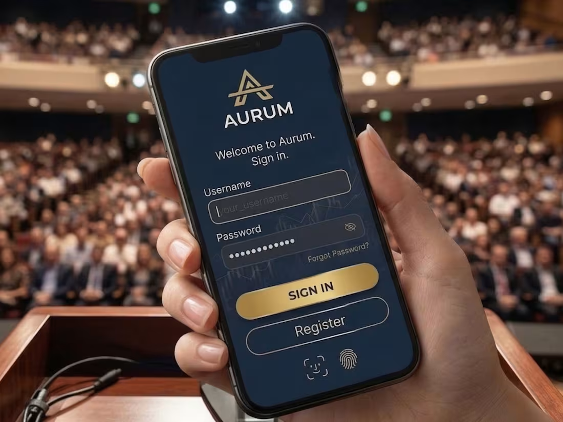
Aurum — Enterprise Fintech Identity
The Brief
Aurum needed a brand identity that could sit comfortably inside a Fortune 500 CFO's dashboard — authoritative without being cold, modern without being trendy. The name (Latin for gold) anchored the direction: timeless value, precision, trust. No visual clichés — no coins, no upward arrows, no generic blue gradients.
The Concept
The mark is a geometric "A" where the crossbar is replaced by a single horizontal rule — evoking a balance sheet line, a horizon, stability. The wordmark uses DM Sans weight 500: technical enough to feel like software, refined enough to feel like finance. The palette pairs deep navy with restrained warm gold — wealth implied, never stated.
0
23

in.vest — Fintech Investment App Identity
Consumer fintech · Personal investment platform · Growth-focused
The Brief:
in.vest needed a wordmark that communicated two things simultaneously: the product name and its core promise. The brand had to feel modern, credible, and self-explanatory — a logo that a first-time investor and a seasoned trader could both trust. The constraint: no illustrations, no charts, no literal financial metaphors. The concept had to live entirely inside the letterforms.
The Concept:
The name itself is the idea: in.vest = invest. The period is the pivot — splitting the word into a command and a destination. The upward arrow hidden in the counter of the "n" rewards closer inspection without demanding it. It reads as a clean wordmark first; the hidden meaning surfaces on second look — the same relationship a good investment has with time. The green dot replaces the period separator, adding the only colour accent in an otherwise monochrome mark.
0
4