
Delibix Studio
Helping businesses craft beautiful and user-friendly design
Ready for work
Delibix is ready for their next project!
A simple hover, but it changes everything.
Funny how something this small can show more empathy than most healthcare dashboards ever do.
should we make something like this for your company?Let’s collab.
6
225
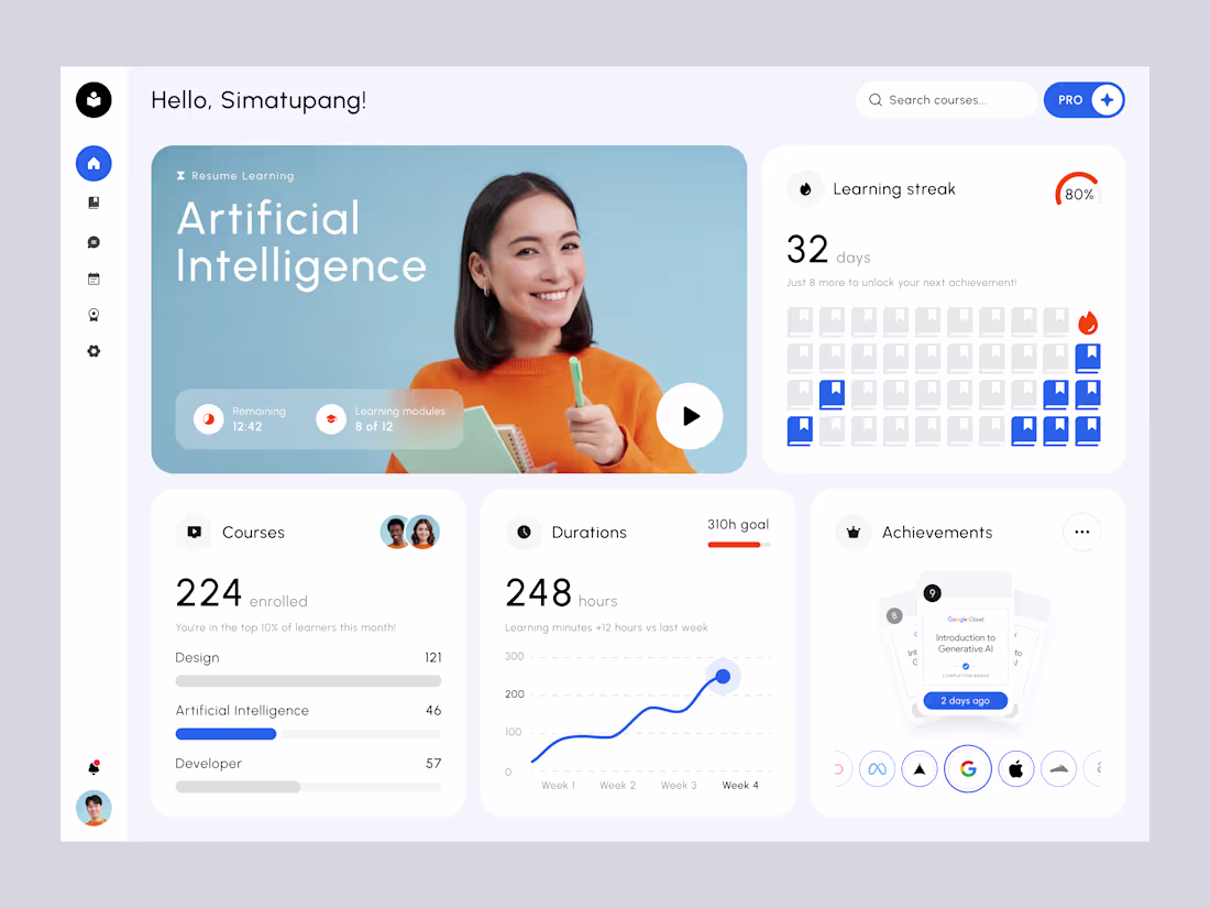
Skillverse Course Learning - Modern Minimal Design for Education Dashboard Delibix
Education today often feels fragmented and overwhelming. Learners struggle to stay consistent, track their growth, and feel truly rewarded for their effort. Skillverse was designed to change that, to make learning not only measurable but meaningful.
Every element of the dashboard has purpose. The hero section welcomes users back to their active course with warmth and clarity. The learning streak builds momentum, turning small daily habits into visible progress. Metrics like duration and achievements transform complex data into motivation, celebrating growth instead of simply recording it.
The result is a platform that not only looks beautiful but inspires consistency, empowers learners, and redefines how we measure progress in digital education.
3
263
1
3
9
261
Behind The Design
Hospitals manage thousands of patients daily, balancing staff, occupancy, and critical cases. Data is often fragmented, overwhelming, and hard to act on quickly. The challenge is
“How can we give hospital staff a clearer, faster, more human way to understand what’s happening right now?”
The answer came in the form of a mobile-first dashboard that makes complex hospital operations feel clear, intuitive, and human. Instead of raw numbers and endless lists, the design brings forward only what matters most, right when it is needed.
Available for new projects
Feel free to reach out and let's get started!
3
226
Sometimes designers hesitate to try something new, afraid of criticism. But do we really need to break the rules to make something better?
7
205
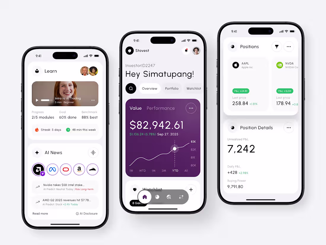
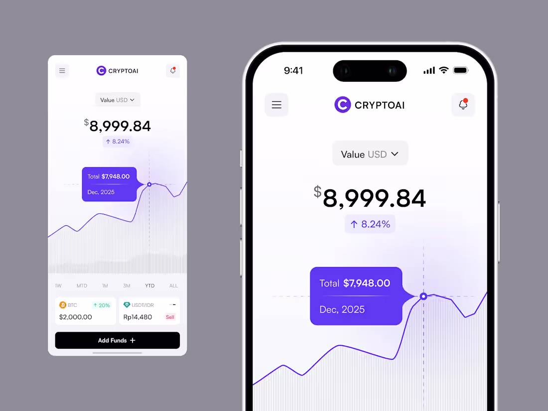
Stovest - Modern Mobile Investment Dashboard
Designing for mobile meant rethinking every detail for the constraints of a smaller screen, where focus and speed matter more than ever. Every interaction was approached with a mobile-first mindset, making sure clarity comes first while still feeling modern and elegant. By combining minimalist structure with professional polish, the design transforms complex financial data into something simple, clear, and instantly usable.
The vision was to design a mobile dashboard that feels like having an intelligent analyst in your pocket, minimal, modern, and always ready to guide decisions. By blending minimalist elegance with professional clarity, the experience goes beyond monitoring. It becomes a tool that empowers smarter, faster, and more informed investing anytime, anywhere.
2
5
238
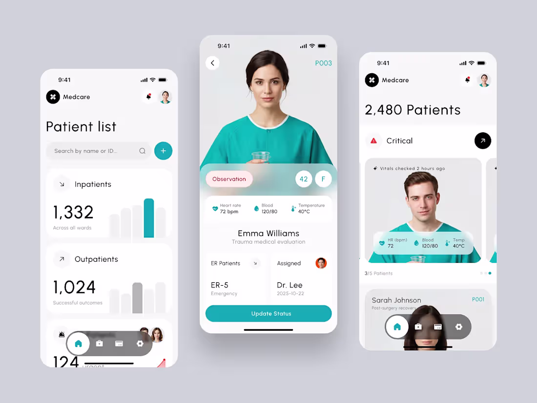
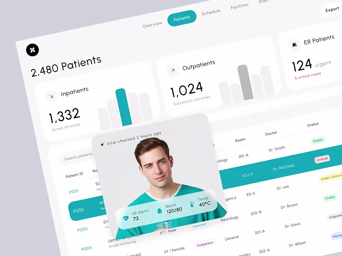
Medcare Health - Patient List on Mobile Hospital Dashboard
Medcare mobile is designed around patients, turning complex medical information into clarity that supports faster, more human decisions. Each card in the patient list provides a clear snapshot of key vitals such as heart rate, temperature, and blood pressure, allowing doctors and nurses to understand every condition at a glance. The interface focuses on helping care teams see people, not just data.
Available for new projects
Feel free to reach out and let's get started!
1
7
223
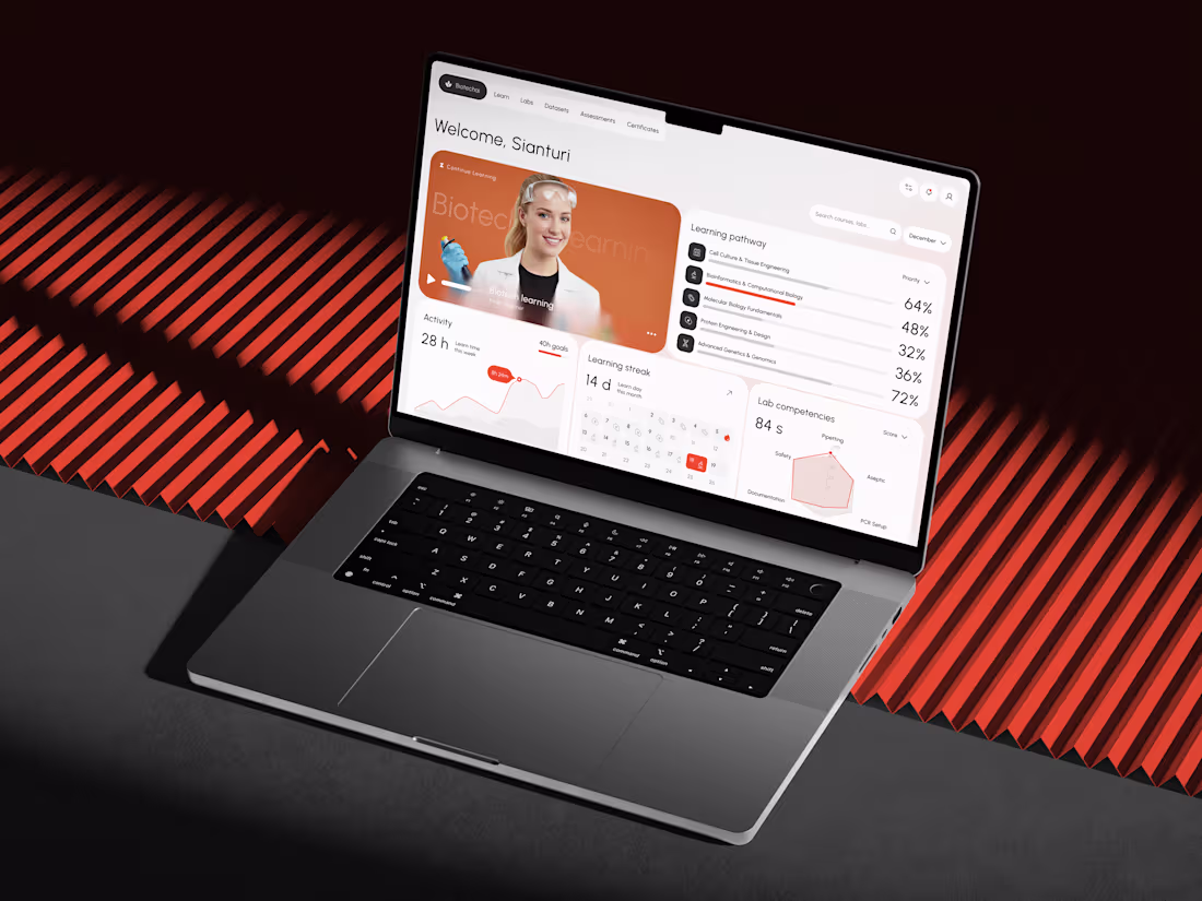
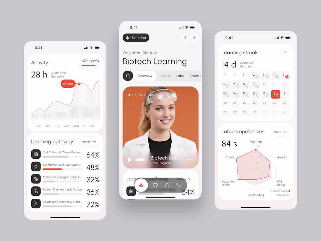
Biotechai - Modern Dashboard for Learning and Lab Competencies Dashboard
Biotechai reimagines how students and researchers explore biotechnology. Designed for clarity, calmness, and motivation, this dashboard transforms complex bio learning into an intuitive experience that feels as natural as lab work itself.
The interface emphasizes clean hierarchy, neutral balance, and soft contrast, supported by coral highlights that symbolize energy and focus. Cards, progress bars, and radar charts work together harmoniously, proving that complex scientific data can still feel elegant and human. This design celebrates precision, progress, and purpose, delivering an experience that feels both intelligent and inspiring.
Available for new projects
Feel free to reach out and let's get started!
4
150
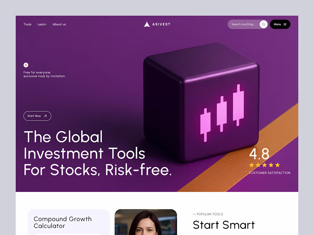
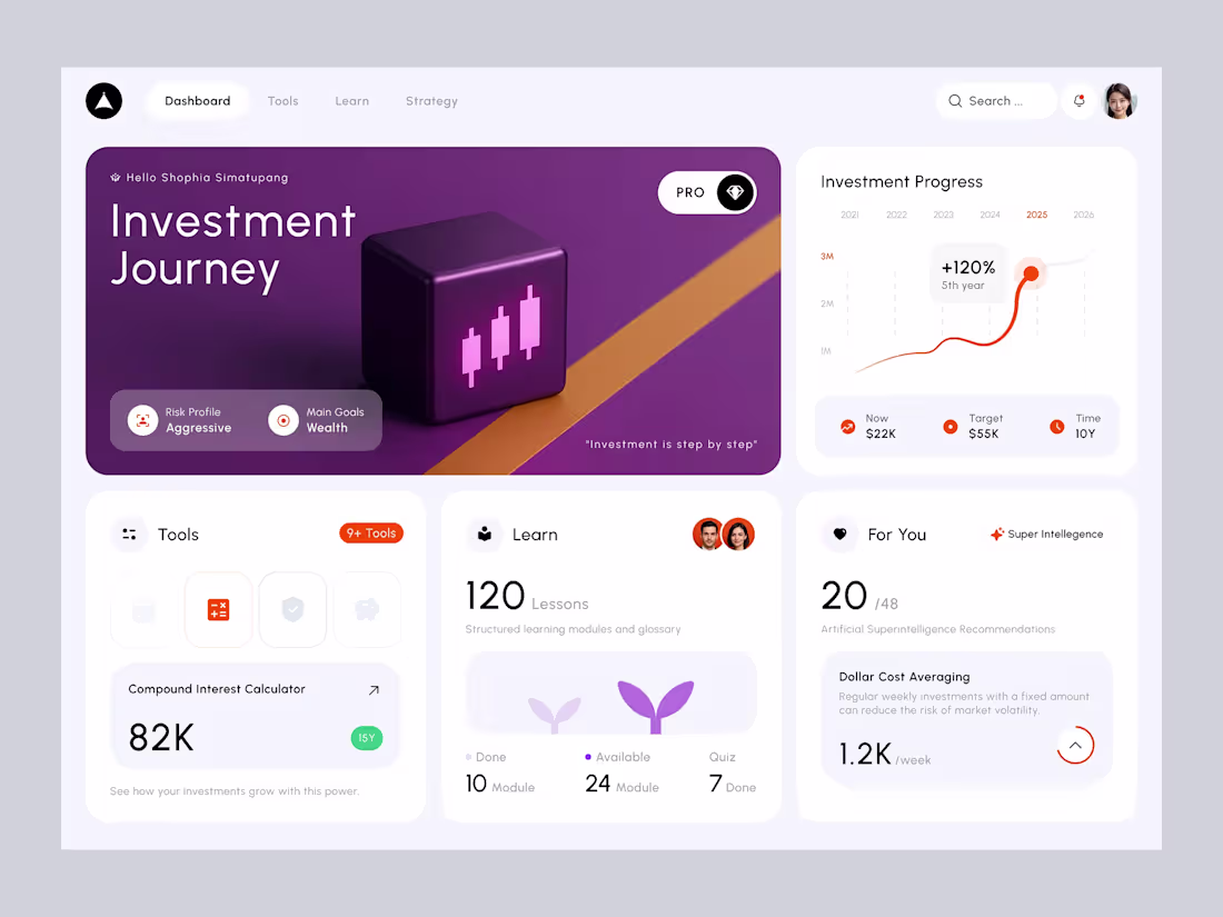
Hero Design - Asivest Investment Tools
We designed this hero section to represent clarity, trust, and exclusivity in investment learning. The goal: make investing tools feel approachable yet premium, with a visual language that balances tech, finance, and lifestyle aesthetics.
This hero is part of Asivest’s mission: Making investment learning simple, visual, and world-class.
Available for new projects
Feel free to reach out and let's get started!
1
5
266
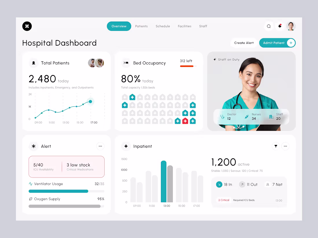
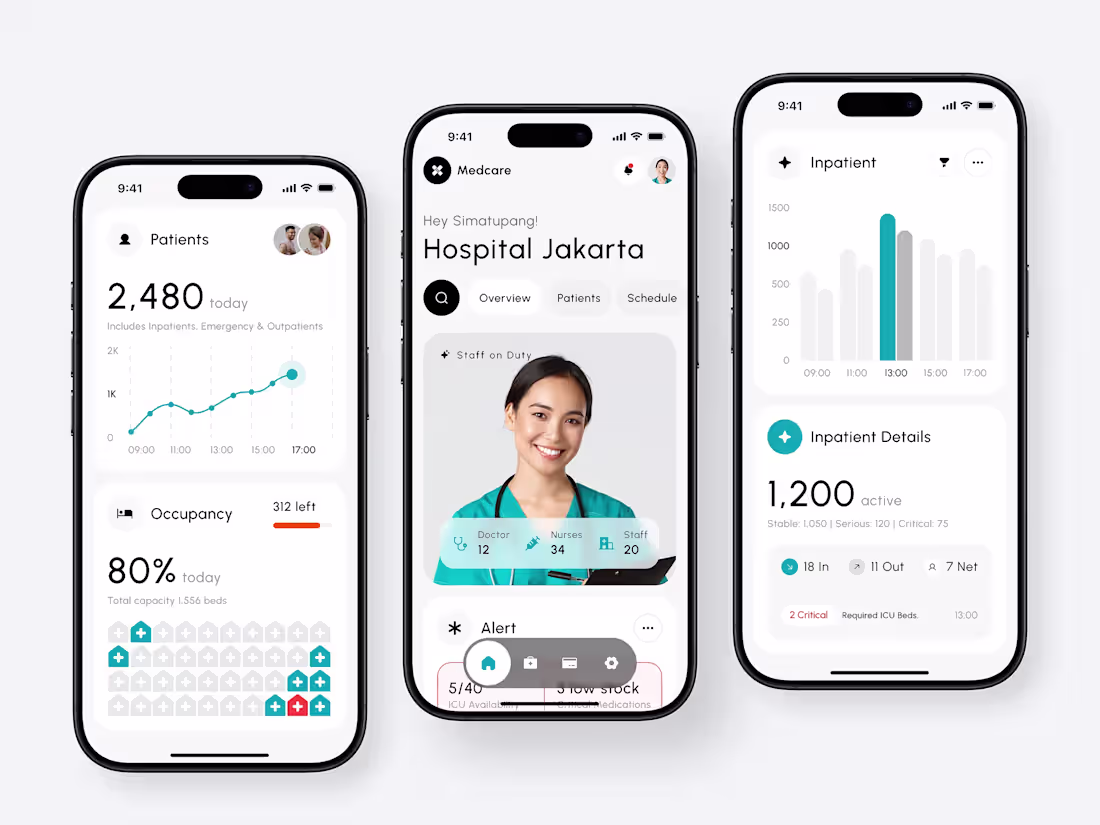
Medcare - Hospital Dashboard Design Dashboard
Managing a hospital means making hundreds of critical decisions every day, and this dashboard is designed to make those decisions faster and clearer. From tracking total patients and bed occupancy to monitoring admissions, discharges, and ICU availability, every detail is presented in one clean view. Alerts highlight what needs urgent attention, while staff availability and resources are always visible, ensuring the entire team can focus on what matters most, delivering the best possible care.
Available for new projects
Feel free to reach out and let's get started!
4
6
250
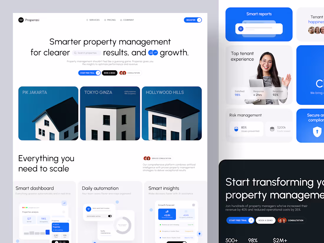
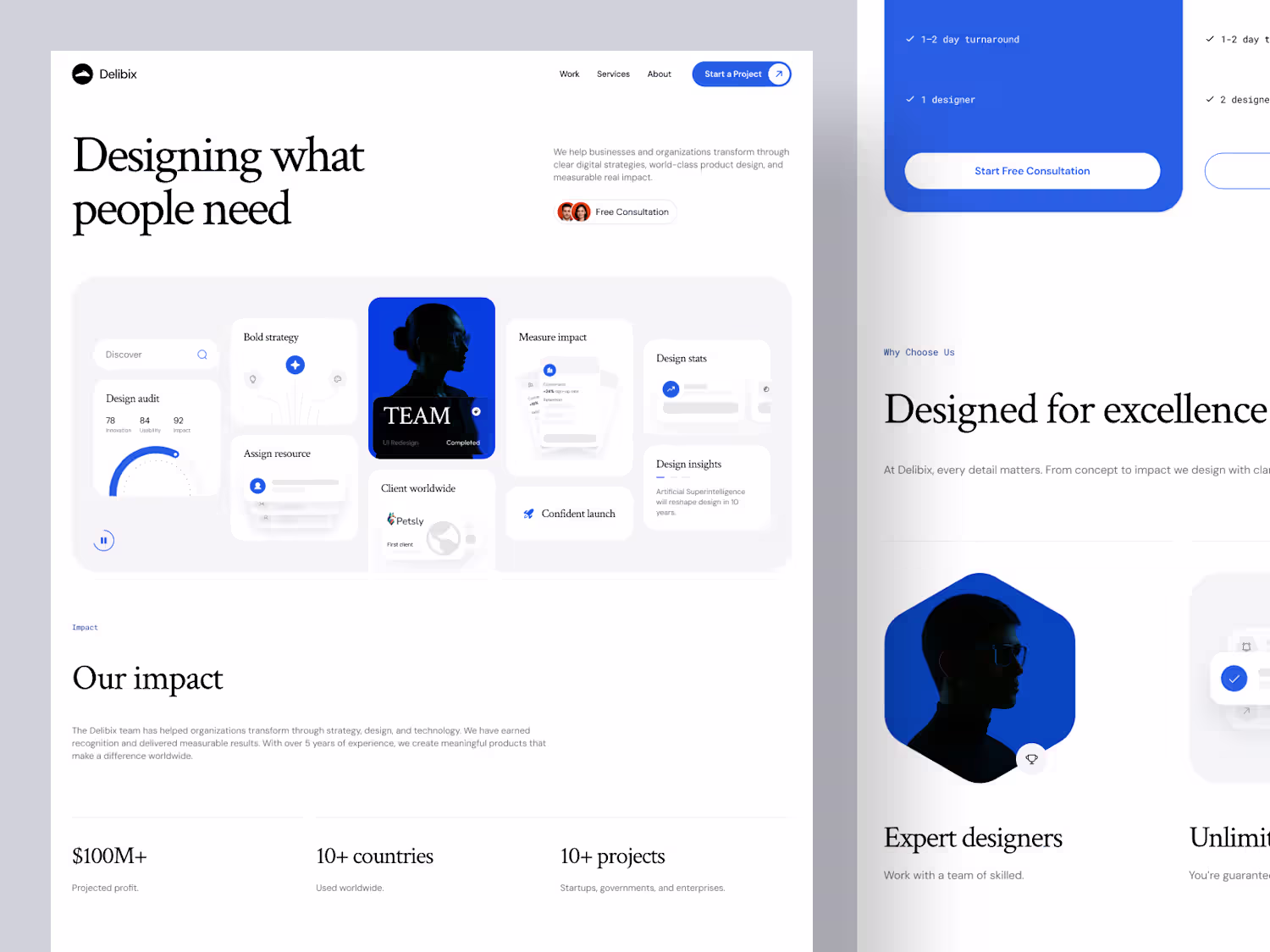
Properasi landing page – smarter property management
Property management platforms often feel crowded and overly technical, filled with dashboards, tables, and numbers that overwhelm more than they help. With Properasi, we wanted to reimagine that first impression and design a landing page that feels clear, intelligent, and trustworthy from the very first scroll.
Every interaction in Properasi is designed to feel natural and effortless. Subtle animations, calm transitions, and balanced composition come together to create an experience that feels intelligent and human. This landing page represents more than design. It is a reflection of clarity, trust, and purpose, turning complexity into calm confidence.
3
154
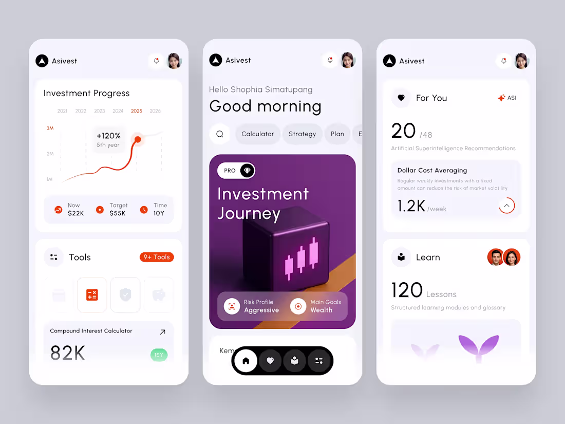
Asivest – Mobile Investment Tools Dashboard App
Meet Asivest, a mobile-first investment learning app that combines powerful financial tools with a clean, intuitive design. This dashboard highlights progress tracking, personalized strategies, and essential calculators such as Compound Interest and Dollar Cost Averaging, while integrating interactive learning modules for a complete investing journey. The layout focuses on clarity, accessibility, and a modern aesthetic to make investing simple and engaging anytime, anywhere.
Available for new projects, Feel free to reach out and let's get started!
✦
Delibix
3
162
1
4
6
336