
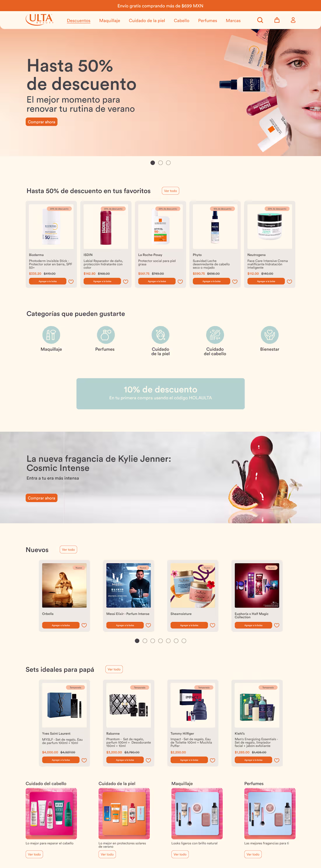
Ulta is a mexican beauty brand. I search for their web page and found out it was kinda heavy in terms of visual information.
With the redesign, I made every section has blank spaces so the images and texts can breathe, also, stablishing a clear color palette and making it more visual kind. The use of blue color makes the accent parts more highlighted (also, its complementary color). I preserve the original webpage images so it stays the same fundamental information.🙌
What you think? How does it look?
0
54
With a video mixed with music, the concept brand GIBOUS debuts on social media. Flashing typographies and hyped music want to get your attention. Keeping the details on the colors that had been used, such as monochromatic and dark green, as a signal of power and confidence.
GIBOUS is a men’s skincare and grooming brand inspired by nocturnal aesthetics, dark minimalism, and contemporary design. The brand seeks to move away from traditional aggressive or sporty masculine branding. The target audience is: Men aged 20–35 and interested in fashion, fragrances, and grooming. Premium lifestyle consumers. Users who appreciate minimal and modern design.
Do you have suggestions?
1
135
Video editing for a marketing agency
1
229
In order to make Pink Bloom relevant in social media, I design an app that functions as coupons and rewards for its products. With a membership or having accounts make more loyal costumers than just casual buyers. This connects with the young audience that is between 16 and 24 years old. This concept brand aims to communicate freshness and fun, with a “bestie-like” voice tone.
Every section is made for making user’s path easier to find whatever she needs. Keep it simple but useful. Along the way while designing this, I realized that many skincare brands don’t have an app where its users can buy products or get rewards by buying.
1
182
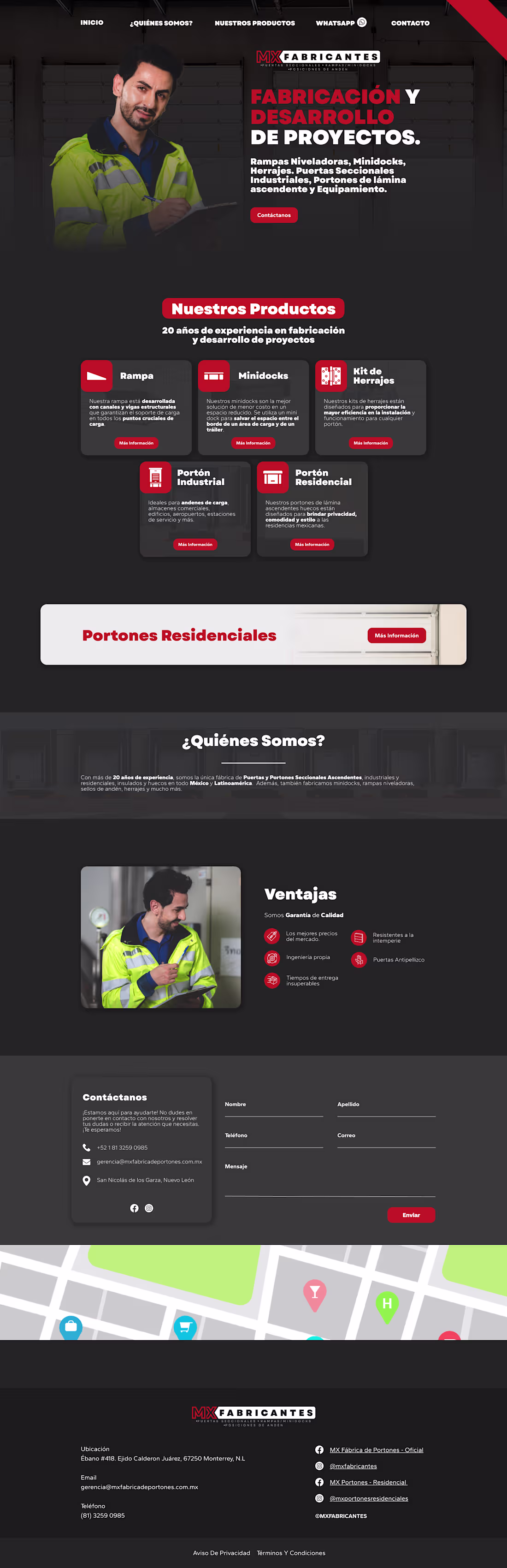
UI design for an industrial company
1
183
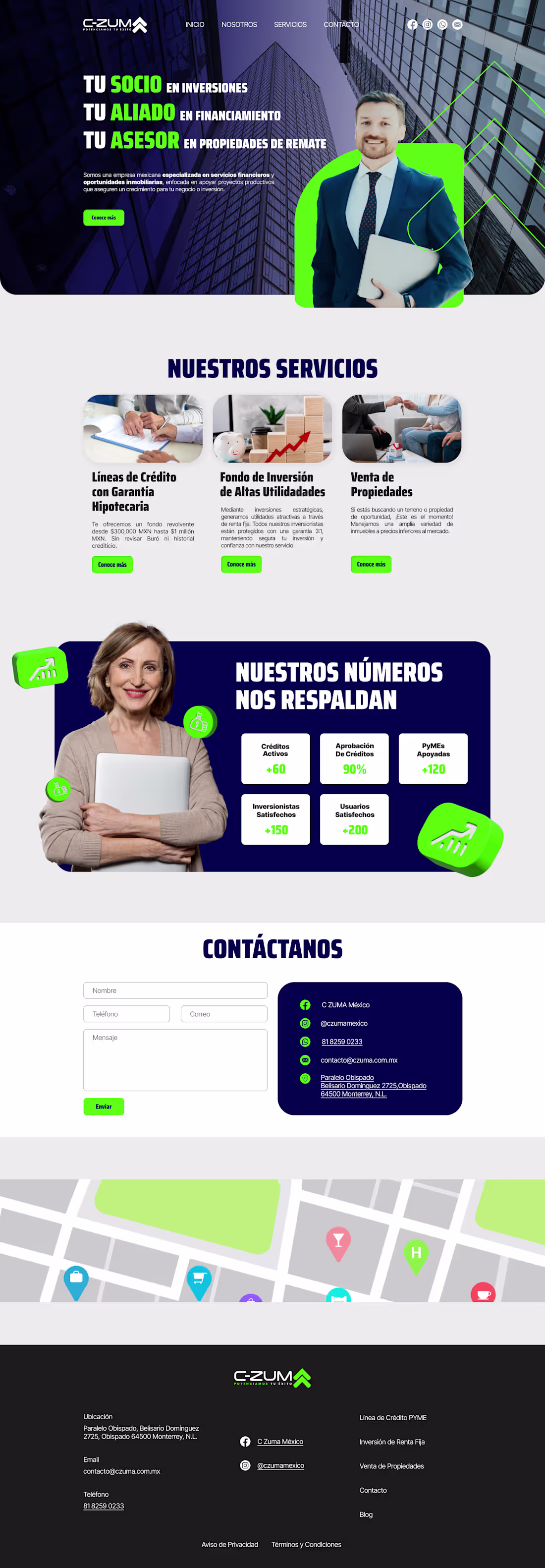
UI Design for web
0
159
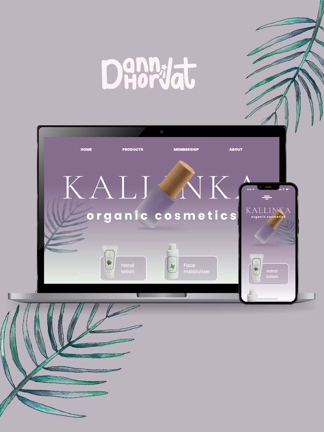
UI design of a concept skincare brand
1
183