
Danielle Cruse
Multidisciplinary Graphic Designer and Art Educator
New to Contra
Danielle is building their profile!
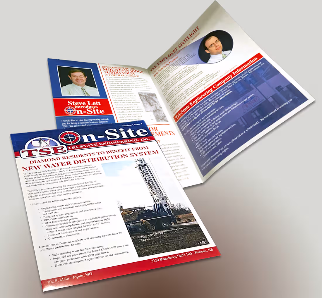
A full‑color newsletter created to keep engineers and project partners informed with clear, organized updates from Tri‑State Engineering. On‑Site features a structured layout, strong technical typography, and project‑driven visuals that highlight ongoing work, field insights, and engineering solutions. The design balances precision and readability, delivering a communication piece that reflects the firm’s expertise and commitment to quality in every phase of a project.
1
8
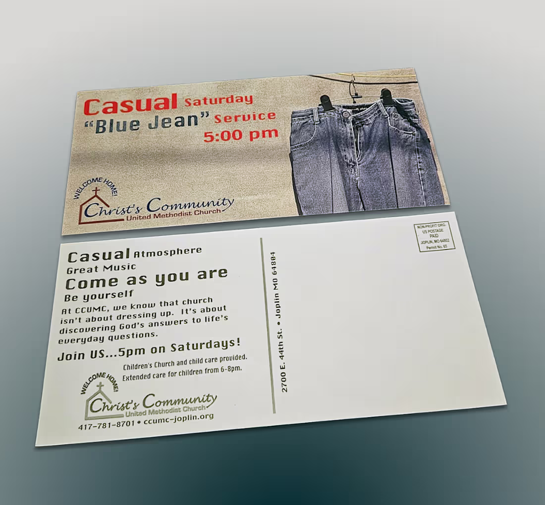
An oversized direct mail piece designed to invite the community to a casual, “come as you are” Sunday service. The layout features welcoming imagery, clear messaging, and a friendly tone that reflects the church’s open‑door approach. Bold, easy‑to‑read typography and a spacious design help the invitation stand out in the mail stack, encouraging recipients to feel comfortable, included, and genuinely welcomed.
1
10
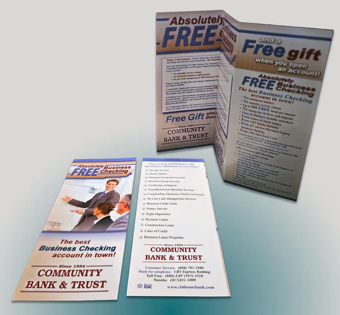
A full‑color tri‑fold brochure created to highlight Community Bank & Trust’s services with clarity and visual appeal. The layout features organized sections, strong typography, and branded imagery to guide readers through key offerings. The design balances approachability and professionalism, reinforcing the bank’s commitment to trusted, community‑focused financial services.
1
15
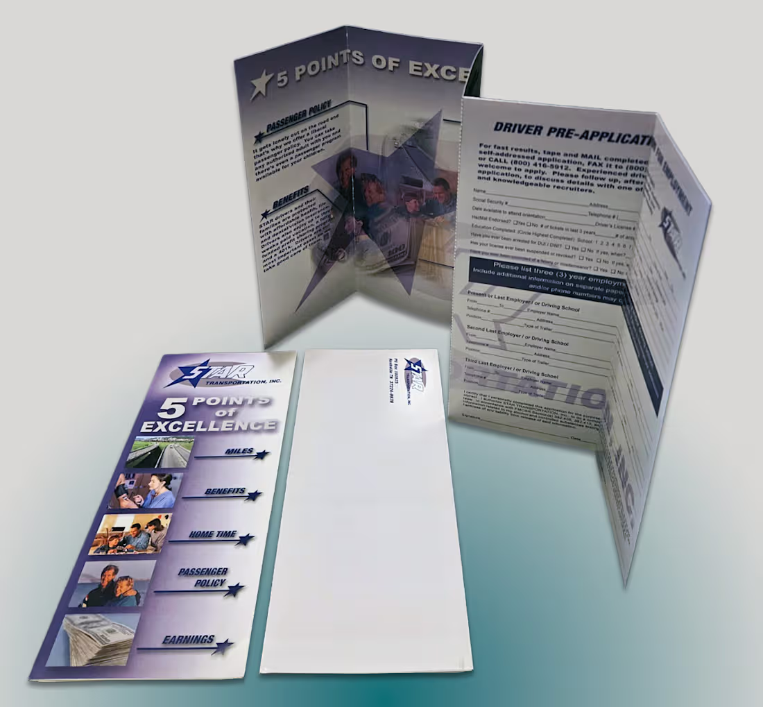
A polished, full‑color brochure designed to reflect the company’s premium, five‑star transportation experience. The piece features a clean layout structure, high‑end visuals, and clear service highlights, along with a perforated mailer that recipients can easily tear off and return.
1
20