OLABISI ABAYOMI's Work | ContraWork by OLABISI ABAYOMI
OLABISI ABAYOMI

OLABISI ABAYOMI

Social Media Content Creator & Short-Form Video Editor

New to Contra

OLABISI is building their profile!

Followed by Kraig M, Scott DS Y, and Matthew D
Cover image for Sometimes, a product doesn’t need
Sometimes, a product doesn’t need a complicated concept to make people stop scrolling — it just needs to look irresistible. For this Frostino campaign, I created a realistic social media visual series focused on capturing the feeling behind the brand: real ice cream, real moments, and the simple joy of enjoying every scoop. I combined lifestyle-driven product scenes with natural lighting, realistic environments, and consistent product presentation to make the campaign feel like a genuine commercial shoot rather than an AI-generated advertisement. From the girl enjoying her cone to the close-up product shots and everyday outdoor moments, each visual was designed to make the audience feel the experience before they even taste the ice cream. The goal was simple: Make Frostino look delicious, memorable, and shareable. 🍦 What I Created Realistic ice cream product visuals Lifestyle advertising scenes Social media campaign composition Product-focused photography Brand-consistent visual direction Natural lighting and commercial styling Engaging visual storytelling
3
64
Cover image for I wanted this snack brand
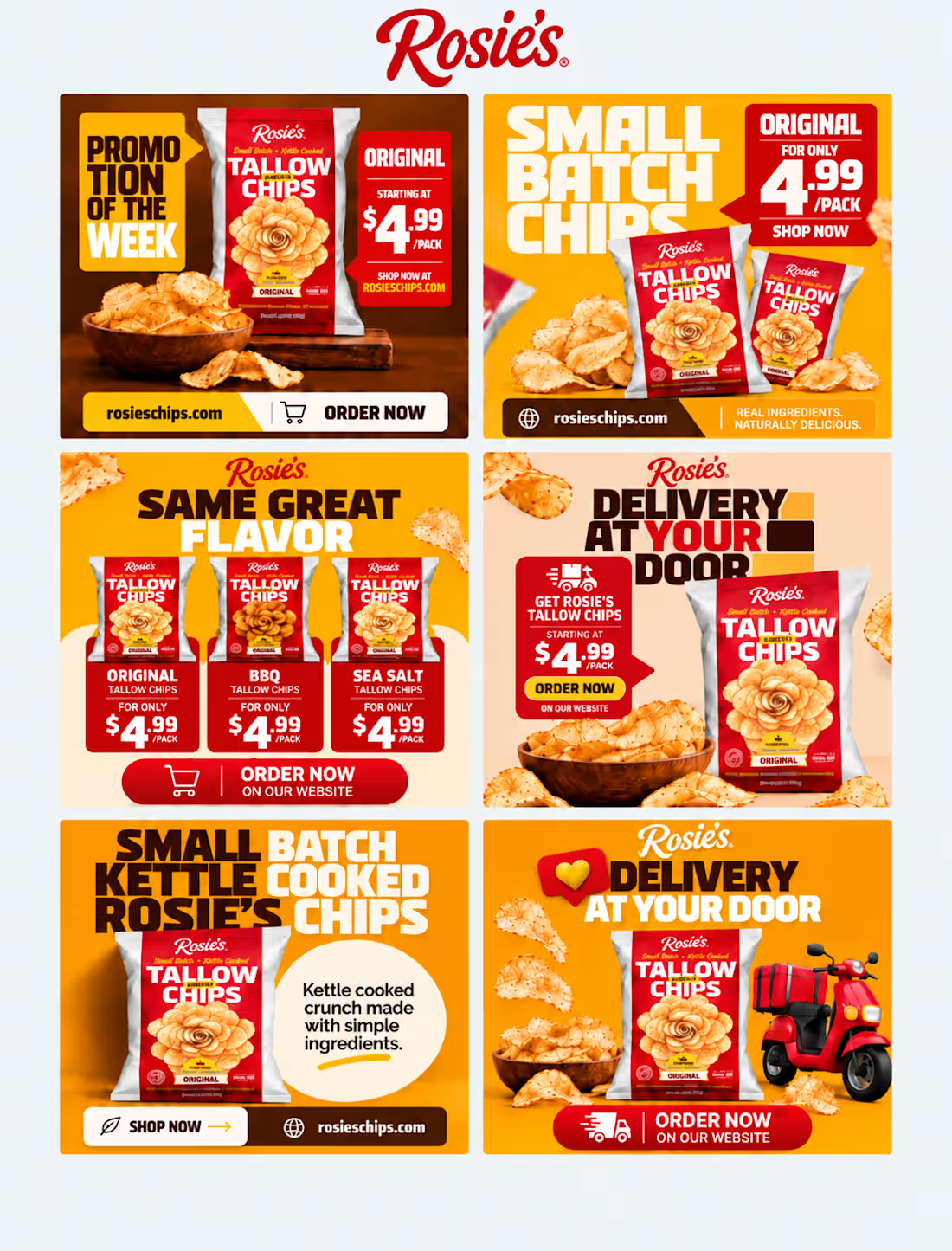
I wanted this snack brand to feel like more than just a collection of social media posts. The idea started with a simple question: what makes someone stop scrolling when they see a snack? Instead of filling the feed with repetitive product shots, I built a 3×3 visual story where every post has a role. One introduces the craving, another brings viewers closer to the product, another builds the brand personality, while the lifestyle and ingredient-focused posts make the snacks feel real, familiar, and worth trying. The final grid moves between realistic food photography, natural lifestyle moments, bold typography, and clean editorial layouts, creating a feed that feels connected without making every post look identical. From “GOOD SNACKS. BETTER MOOD.” to “WHICH ONE ARE YOU HIDING FROM EVERYONE ELSE?”, the content was designed to create curiosity, emotion, and interaction while keeping the snack itself at the center of the story. The result is a warm, natural, and commercially focused social media direction that shows how a snack brand can turn its Instagram feed into a recognizable visual experience—not just a place to post products. Creative Direction: Social Media Design · Food Branding · Art Direction · Visual Storytelling · Content Design Tools: Adobe Photoshop · Adobe Illustrator · AI-assisted creative production
1
1
67
Cover image for It started with a simple
It started with a simple idea: make the sneaker impossible to ignore. I wanted to create a visual direction that felt bold, modern, and premium from the very first glance. Instead of simply placing the product on a poster, I built a complete visual story around the AERON ROV sneaker — from the digital shopping experience to the final advertising campaign. I explored how the same product could live across different touchpoints while still feeling like one strong brand. The result is a futuristic black-and-yellow visual system, combining dramatic product presentation, oversized typography, and clean composition to give the sneaker a strong identity. The goal wasn't just to show a shoe.
1
86
Cover image for What happens when a sneaker
What happens when a sneaker ad stops looking like an advertisement and starts feeling like a statement? For this concept, I wanted to create a visual that communicates movement, power, confidence, and breaking limits—all in a single frame. I combined a bold editorial composition with a dynamic sneaker close-up, a motion-driven athlete, shattered concrete, and dramatic environmental elements to create the feeling that the sneaker is literally breaking through every limitation in its way. The goal was simple: make the product impossible to ignore. From the typography placement to the perspective, impact, lighting, and destruction effects, every element was designed to give the campaign a premium sportswear identity while keeping the sneaker as the hero.
1
153