
Daniel Cariapa
Web Designer | Elementor Expert & Brand Identity
New to Contra
Daniel is ready for their next project!

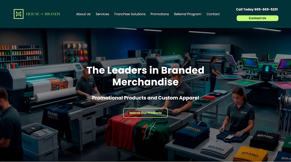
This project for House of Brands was developed as an industrial-modern B2B powerhouse, designed to showcase the scale, precision, and heritage of a large-scale printing and merchandise operation. The development strategy focused on "Operational Transparency," using real-world facility imagery to build immediate credibility with corporate clients.
Here is a breakdown of the design and development strategy for this site:
1. UX Strategy: The "Factory-to-Front-Door" Narrative
The site architecture was developed to take the user on a journey from the production floor to the final branded product:
The "Active" Hero: Instead of a generic stock photo, we used an authentic shot of the production line. This immediately establishes "The Leaders in Branded Merchandise" as a primary manufacturer rather than just a middleman.
Service Grid: We implemented a clean, 4-column card layout to categorize diverse offerings like "Franchise Solutions" and "Sales & Promotions." Each card acts as a quick-entry point into a deeper sales funnel.
The "American Ingenuity" Pillar: We integrated a prominent video section and a "Why Choose Us?" feature list. This pairing of high-quality video with digestible bullet points caters to both visual learners and analytical decision-makers.
2. Visual Identity & UI Design
Color Palette: The design utilizes a high-contrast industrial green and deep charcoal. The "electric lime" green is used sparingly as an action color (buttons/accents), providing a high-energy "go" signal against the professional, dark backgrounds.
Asymmetric Gradients: We developed custom gradient backgrounds in the mid-sections to create depth and visual interest, breaking up the long-scroll format and keeping the user engaged.
Typography: A heavy, bold sans-serif was selected for headlines to mirror the "strength" of industrial machinery, while the body text maintains a high-readability weight for technical service descriptions.
3. Trust & Authority Modules
Physical Presence: By including a high-resolution shot of the physical building signage, we anchored the digital brand in the physical world—a key trust factor for B2B clients looking for long-term partners.
Tabbed Information: We developed a custom "Ingenuity/Experience/Merch" vertical tab system. This allows the user to toggle through dense information without cluttering the screen, keeping the UI clean while providing deep context.
Social Validation: A minimalist "Real Customer Reviews" carousel was integrated at the bottom, using verified star ratings to provide the final push toward the contact form.
4. Technical Goals
The development focused on "High-Resolution Performance." Since the brand’s value is tied to the quality of their prints, we optimized the site to handle large, detailed photos of the facility and products while maintaining fast load times for B2B procurement officers browsing on desktop.
1
26
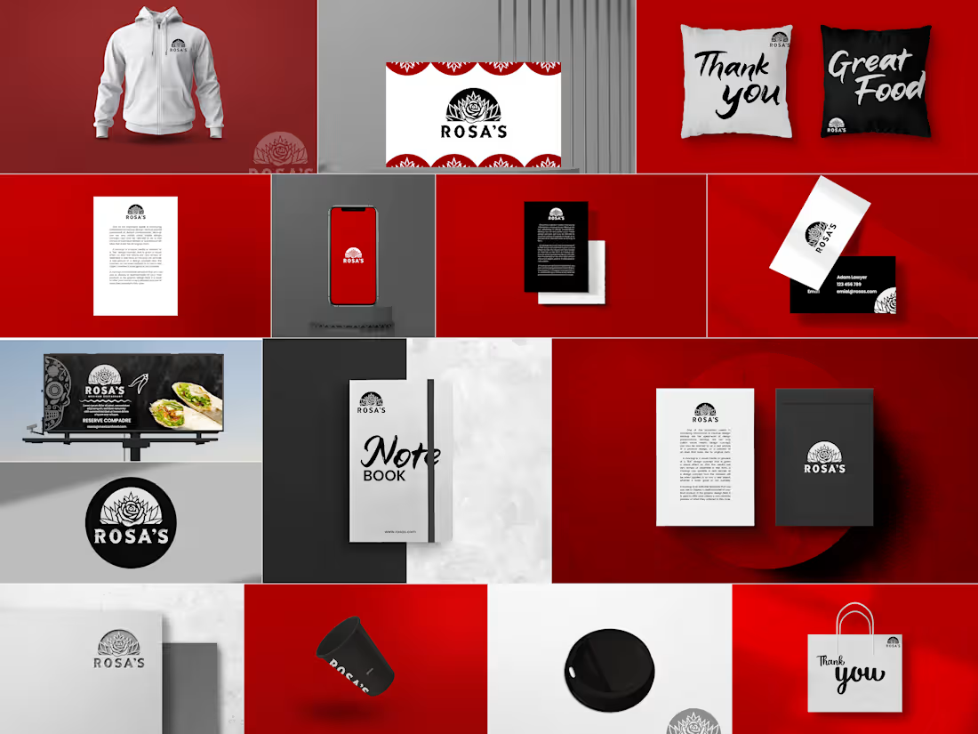
This project for Rosa's was developed as a holistic brand identity and merchandising system designed to transition a traditional culinary brand into a modern, lifestyle-centric competitor. The development strategy focused on "Brand Ubiquity," ensuring that the visual language translates seamlessly from physical storefronts to digital screens and tangible merchandise.
Here is the breakdown of the development and design strategy for this brand:
1. Visual Strategy: The "Bold & Botanical" Language
The core identity was developed to balance the grit of Mexican street culture with a modern, high-contrast aesthetic.
Logo Development: We created a distinctive rose-based emblem that doubles as a badge. The heavy linework was engineered for versatility, ensuring it remains legible whether it is embroidered on a hoodie or embossed on a business card.
Color Psychology: A high-energy Crimson Red was selected as the primary brand driver to stimulate appetite and passion. We paired this with a stark Monochrome (Black & White) secondary palette to ground the brand in sophistication and "cool."
Typography: The project utilizes two distinct styles—a bold, geometric sans-serif for authority and a fluid, "street-style" script for a hand-crafted, approachable feel (seen on the "Thank You" and "Notebook" assets).
2. Multi-Channel Collateral Design
We developed a suite of mockups to test the brand’s scalability across different touchpoints:
The "Lifestyle" Pillar: By developing hoodies, notebooks, and pillows, we moved the brand beyond just "food" and into "culture." This strategy encourages customer loyalty by turning fans into walking brand ambassadors.
The "Service" Pillar: For the physical restaurant experience, we designed high-contrast coffee cups, take-out bags, and billboard layouts. Each piece uses the logo as a centerpiece, reinforced by a "Mexican folk art" pattern for cultural texture.
The "Professional" Pillar: Business cards and stationery were designed with a minimalist "Swiss-meets-Street" layout, utilizing large blocks of color and precise logo placement to convey business maturity.
3. Brand Architecture & Asset Testing
Texture & Finish: We experimented with different manufacturing finishes, including matte black cardstock, white embroidery, and embossed paper stock. This adds a tactile layer to the brand that feels premium and intentional.
Spatial Layout: The billboard and stationery designs were developed to handle large amounts of whitespace. This prevents the brand from feeling "cluttered" and allows the bold red to do the heavy lifting in attracting the eye from a distance.
4. Technical Goals
The final deliverables were provided as a modular toolkit. This allows the client to apply the branding to new items—like staff uniforms or digital menus—using the established grid systems and color ratios without losing visual consistency.
1
28
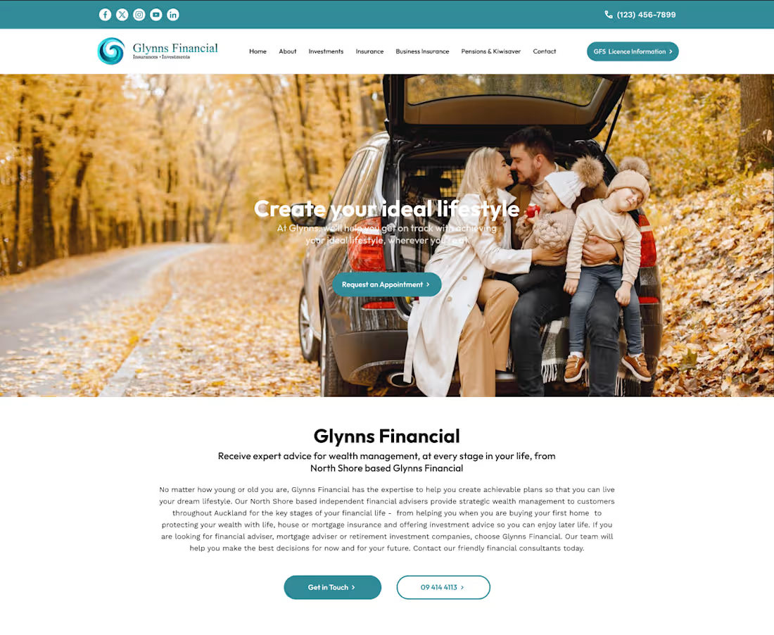
This project for Glynns Financial was developed as a trust-centric digital gateway for personal and business wealth management. The design philosophy centers on "Reliability through Clarity," utilizing a clean, corporate-modern aesthetic to make complex financial services feel accessible and human.
Here is a breakdown of the development and design strategy for this site:
1. UX Strategy: The "Life-Stages" Funnel
The architecture was developed to guide users through a logical trust-building journey:
The Emotional Hook (Hero): We utilized high-quality lifestyle photography (a family in nature) to anchor the technical services in real-world outcomes: freedom, security, and "creating your ideal lifestyle."
Service Categorization: We implemented a "Card-Based" layout for the core pillars—Investments, Insurance, Mortgages, etc. Each card uses custom iconography and concise copy to prevent information overload.
The Education Phase: A custom-built FAQ accordion was developed to address common barriers to entry, helping to move the user from "curious" to "informed" without leaving the page.
2. Visual Identity & UI Design
Color Palette: The primary brand color is a professional teal/deep sea green. This was chosen because it sits between the "stability" of blue and the "growth" of green—perfect for a financial firm.
White Space & Breathing Room: Large margins and generous leading (line spacing) were used to give the content a premium, uncluttered feel. This reflects the "calm" expertise of a financial advisor.
Typography: We utilized a modern, geometric sans-serif font. Bold weights are used for the value propositions, while lighter weights handle the body text to maintain a sophisticated, corporate look.
3. Trust & Conversion Modules
Social Proof Integration: We developed a dynamic testimonial slider featuring verified Google reviews. This provides immediate third-party validation, which is critical in the financial sector.
Lead Generation Form: The "Make an Enquiry" footer was designed with a high-contrast teal background to separate it from the informational content. The form is simplified into four essential fields to maximize conversion rates.
Accessibility & Navigation: A "Sticky" navigation bar was implemented, ensuring the "SECURE MORE INFORMATION" call-to-action is always visible as the user scrolls through the content.
4. Technical Goals
The site was built with a responsive-first approach, ensuring that the complex grid of service cards collapses elegantly into a single column for mobile users. We prioritized high-resolution asset loading for the hero and mid-page imagery to maintain the "luxury" feel across all screen sizes.
1
36
1. Strategic Information Architecture
The layout was engineered using a "Problem-Agitation-Solution" framework.
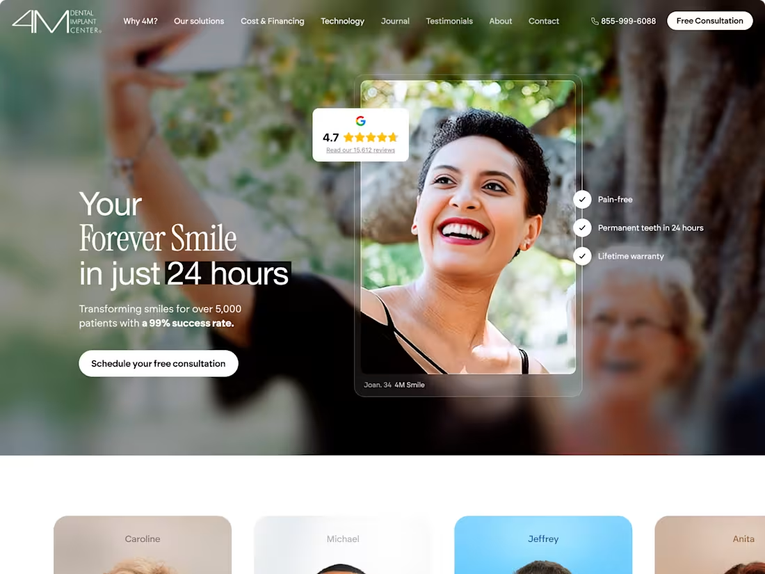
The Hook: We opened with high-impact lifestyle imagery to sell the emotional outcome (a confident smile) rather than the procedure itself.
The Evidence: A massive portion of the development was dedicated to a multi-format "Success Gallery," integrating static "before and after" photography, video testimonials, and a dynamic "Patient Grid" to showcase demographic diversity.
The Comparison: We built a custom comparison module to clearly delineate the brand’s value proposition against traditional dental models, using a clean, tabular UI.
2. Visual Identity & UI Design
Color Theory: We moved away from "clinical white" in favor of a sophisticated warm cream and deep navy palette. This was intentional—it evokes a "boutique hotel" or "wellness spa" feeling, which helps reduce patient anxiety.
Typography: The design utilizes a high-contrast typographic hierarchy. Elegant serifs are used for aspirational headlines, while clean, highly legible sans-serifs handle the technical and pricing data to ensure clarity.
Component Design: Every section was built as a modular block, allowing for a seamless flow between educational content (how the process works) and social proof (who has done it).
3. Media Integration & UX Features
Video-First Approach: Knowing that high-ticket medical decisions require deep trust, we integrated dedicated video containers for "Doctor Introductions" and "Patient Journeys."
Transparency Modules: We developed a structured pricing and "investment" section. By displaying tiers and inclusions clearly, the UX reduces friction in the sales funnel and qualifies leads before they reach the "Book Now" stage.
Environmental Branding: We purposefully included interior photography of the physical space. This bridges the digital-to-physical gap, ensuring the user feels familiar with the office environment before they ever step foot inside.
4. Technical Goal
The final build was optimized to handle heavy image and video assets without sacrificing load speed, ensuring that the high-resolution "After" photos—the project's most important selling point—render perfectly across all device types.
1
39