Damgreat brand 's Work | ContraWork by Damgreat brand Damgreat brand
CMS & Frontend Developer | Fast, Modern Websites
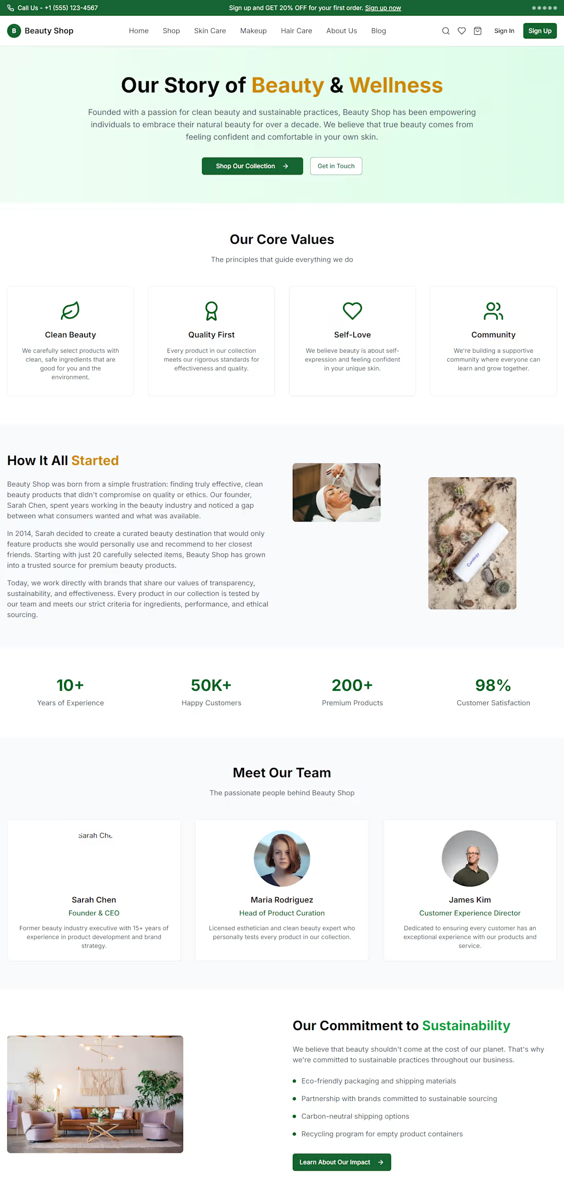
Beauty & Cosmetics E-commerce Website
Overview
I designed and developed a modern e-commerce experience for a beauty and cosmetics brand, focused on creating a clean shopping journey while making products, categories, promotions, and offers easy to discover.
The Goal
The goal was to create a premium-looking online beauty store that feels trustworthy, visually engaging, and easy to navigate — while giving customers a clear path from discovering a product to shopping.
What I Built
Modern beauty-focused homepage
Product discovery and category navigation
Best-selling product section
Product cards with ratings, pricing, discounts, and CTAs
Skincare, makeup, hair care, fragrance, nail care, and body care categories
Promotional and seasonal offer sections
Featured deals and discount sections
Responsive e-commerce layout
Clear shopping CTAs throughout the experience
Newsletter and customer-focused footer sections
My Approach
I focused on combining strong visual hierarchy with a simple shopping experience. Products and promotions are given enough visual space to stand out, while the navigation and category structure make it easy for customers to explore the store.
The design also uses promotional sections strategically to draw attention to discounts and featured collections without making the interface feel cluttered.
Result
The final result is a polished beauty e-commerce interface that brings together product discovery, promotional content, categories, and shopping actions in one cohesive experience.
Live website: https://dam-beta.vercel.app/
Tools & Skills
Web Design · E-commerce · UI/UX Design · Responsive Design · Frontend Development · Vercel Damyestate — Premium Real Estate Website (Framer)
A luxury real estate platform built in Framer to turn listing discovery into advisor inquiries — curated properties, clear process, and premium brand experience.
Overview:
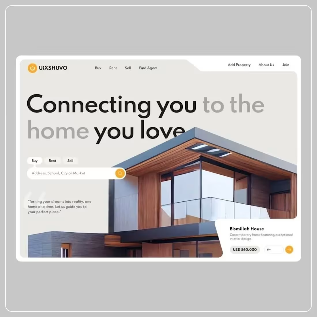
Damyestate is a premium real estate website designed and built in Framer for luxury home buyers, sellers, and investors. The site presents curated listings, property categories, advisory pricing, resources, and a clear path from browsing to contacting an advisor.
Live site: https://realestatew.framer.website/
Brand: Damyestate
Tagline: Find Your Dream Property
Built by: DAMGREAT BRAND
The site covers the full buyer journey — discovery, filtering, trust-building, and inquiry — in a polished, editorial layout suited to high-end property brands.
Purpose:
The goal was to create a credible, conversion-focused real estate presence that:
Positions the brand as premium and trustworthy, not a generic listing portal
Helps users discover luxury properties quickly with strong visuals and clear details
Guides visitors from browse → trust → inquiry with structured CTAs
Supports buyers, sellers, and investors with dedicated content and advisory messaging
Works as a portfolio-ready Framer build demonstrating multi-page systems, CMS-ready structure, and SEO metadata
Primary conversion goal: Move visitors from property browsing to “Talk to an Advisor” / “Inquire” actions.
Problem:
Most real estate templates feel interchangeable — cluttered grids, weak hierarchy, and no clear story from search to closing. For a luxury brand, that creates specific issues:
Low trust — Listings look unverified; photography and copy don’t feel curated
Weak conversion path — Users can browse but don’t know what to do next (tour, inquire, close)
No premium positioning — Layout and typography don’t match high-ticket property expectations
Fragmented experience — Properties, pricing, process, and support live on disconnected pages
Hard to scale content — No clear structure for categories, articles, FAQs, or new listings
The brief: build an original, premium real estate brand in Framer — not a clone of Zillow or Compass — with a site that could pass as a real advisory firm.
Solution
I designed and built Damyestate as a multi-page Framer website with a consistent layout, premium visual language, and a funnel built around advisor-led buying.
Design approach
Clean, editorial layout with strong typography and spacious sections
Luxury property photography as the hero of each listing card
Clear hierarchy: eyebrow → headline → supporting copy → CTA
Trust signals: ratings, verified listings, stats, testimonials, FAQ
Repeated CTAs: Browse Properties, Talk to an Advisor, Inquire
User journey
Discover — Hero + featured properties + categories
Evaluate — Listing cards with price, type, rating, and short description
Trust — Process steps, testimonials, FAQ, stats
Convert — Contact page, pricing packages, email CTA
Technical approach (Framer)
Multi-page site with shared navigation and footer
SEO titles and descriptions per page
Structured sections (hero, grid, process, social proof, CTA)
CMS-ready listing and resource patterns for easy updates
Process
Phase 1 — Strategy & positioning
Defined the brand (Damyestate), audience (luxury buyers/sellers/investors), and primary CTA (advisor inquiry). Mapped the sitemap and core user flows before design.
Phase 2 — Information architecture
Planned 7 pages and home sections:
Home, Properties, Categories, Pricing, About, Resources, Contact
Home: hero, featured listings, categories, process, testimonials, FAQ, newsletter, articles
Phase 3 — Visual design
Applied a premium real estate aesthetic: strong headlines, card-based listings, category grids, and advisory-focused copy. Prioritized readability, whitespace, and high-quality imagery.
Phase 4 — Framer build
Built all pages in Framer with:
Reusable navigation and footer
Listing cards (type, title, description, price, Preview/Inquire)
Category grid with property counts
4-step “How it works” process
Testimonials, FAQ, pricing tiers, and resource articles
Phase 5 — Content & polish
Added sample listings (Skyline Residences, Harbor Villa, Noir Estate, etc.), FAQ copy, pricing packages, and blog-style resources. Set page metadata for SEO.
Phase 6 — Publish
Published to Framer hosting at realestatew.framer.website (http://realestatew.framer.website) for live portfolio and client review.
Deliveries:
Hero — “Find Your Dream Property” + dual CTAs
Trust bar — 500+ Properties, Verified Listings, Expert Agents, etc.
Featured Properties — 6 luxury listings with ratings and prices
Categories — Browse by lifestyle/type
Value blocks — Craft, buying support, workflow benefits
How it works — 4 steps (Choose → Customize → Close → Grow)
Stats — 100+ properties, 5,000+ downloads, 4.9★ rating
Testimonials — 3 client quotes
FAQ — 8 questions (viewings, fees, support, financing, etc.)
Newsletter signup
Pricing teaser — From $79 advisory
Latest articles — 3 resource previews
Footer CTA — “Let’s build something great”
Listing system
6+ featured properties with: type, name, description, price, rating
Category tags (Apartment, Villa, Estate, Penthouse, Loft, etc.)
Preview + Inquire actions per listing
Categories page
12 property types (Apartments, Luxury Villas, Waterfront, Penthouses, Investment, etc.)
Count badges and links to filtered properties
Pricing page
Buyer Advisory (seller-covered)
Seller Concierge
Investor Desk
Resources / blog
3 articles: luxury home buying, coastal investment, staging tips
Contact
“Talk to an advisor” hero
SEO & metadata
Page titles and descriptions on all main routes
Published August 7, 2026
Platform
Designed and built in Framer
Live URL: https://realestatew.framer.website/
Responsive, publish-ready
Outcome:
A live, portfolio-ready premium real estate website that:
Communicates luxury and trust from first scroll
Structures the full buyer journey from discovery to inquiry
Demonstrates multi-page Framer development, IA, and conversion design
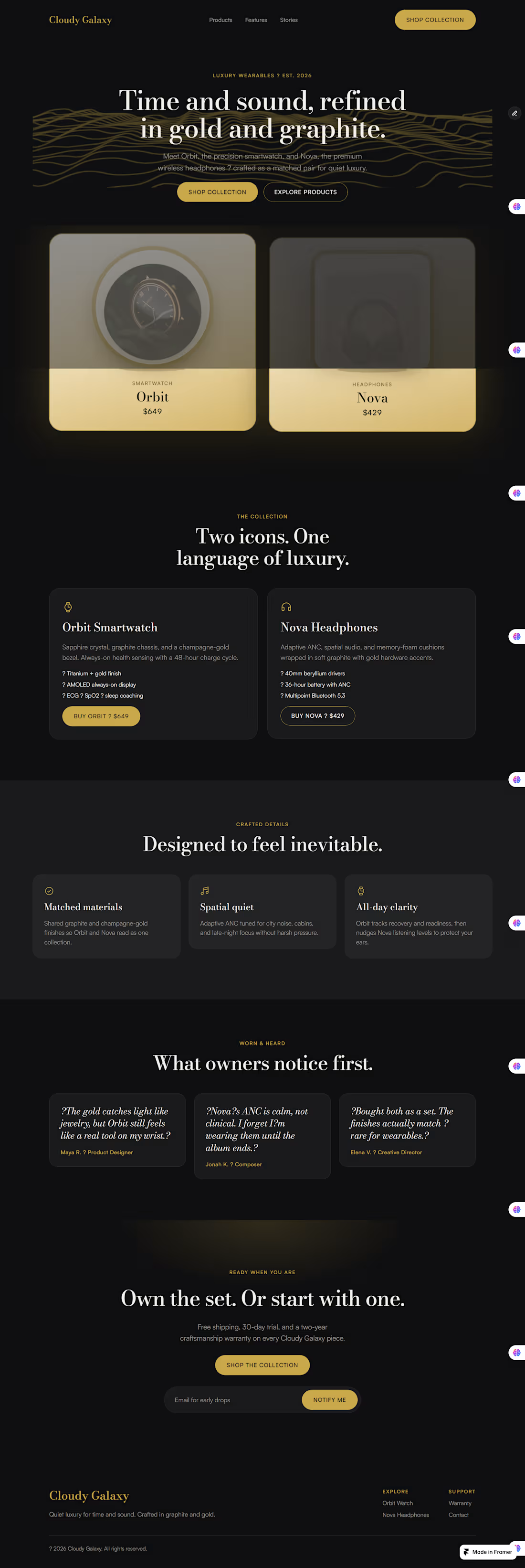
Can be extended with CMS collections, custom domain, and lead forms Cloudy Galaxy — luxury wearables landing page (Framer).
Design process — Cloudy Galaxy (Framer)
1. Brief
Luxury wearables brand. Two products: Orbit (smartwatch) and Nova (headphones). Palette locked early: gold + graphite. Goal was a product landing page that felt premium and still converted.
2. Direction
Dual-product hero (both SKUs visible up front). Standard page depth: hero → products → features → stories → CTA. Built reusable pieces first — buttons, nav/footer layout — so the page stayed consistent.
3. System
Set color tokens and type before layout. Bodoni Moda for headlines, Satoshi for UI/body. Gold for accents and CTAs, charcoal for the page, muted grey for secondary text.
4. Structure
Mapped the page as one scroll story:
Hero with both products
Collection detail cards
Three craft features
Testimonials
Final CTA + email capture
Nav links jump to each section so it feels usable, not just pretty.
5. Hero polish
First pass had black products disappearing into the dark background. Fixed that by putting products on light cream–gold stages, gold borders, and soft glow so the cards actually read on the page. Added float/tilt motion so they feel a bit more 3D without overdoing it.
6. Build in Framer
Designed and built directly in Framer: layout template for nav/footer, button components, desktop + tablet + phone breakpoints, form on the CTA. Kept client-safe editing in mind — layout locked, content editable later if needed.
7. Check
Reviewed contrast, mobile stacking, and scroll targets. Tweaked card elevation and product framing until the hero felt clear at a glance. Real estate Website design