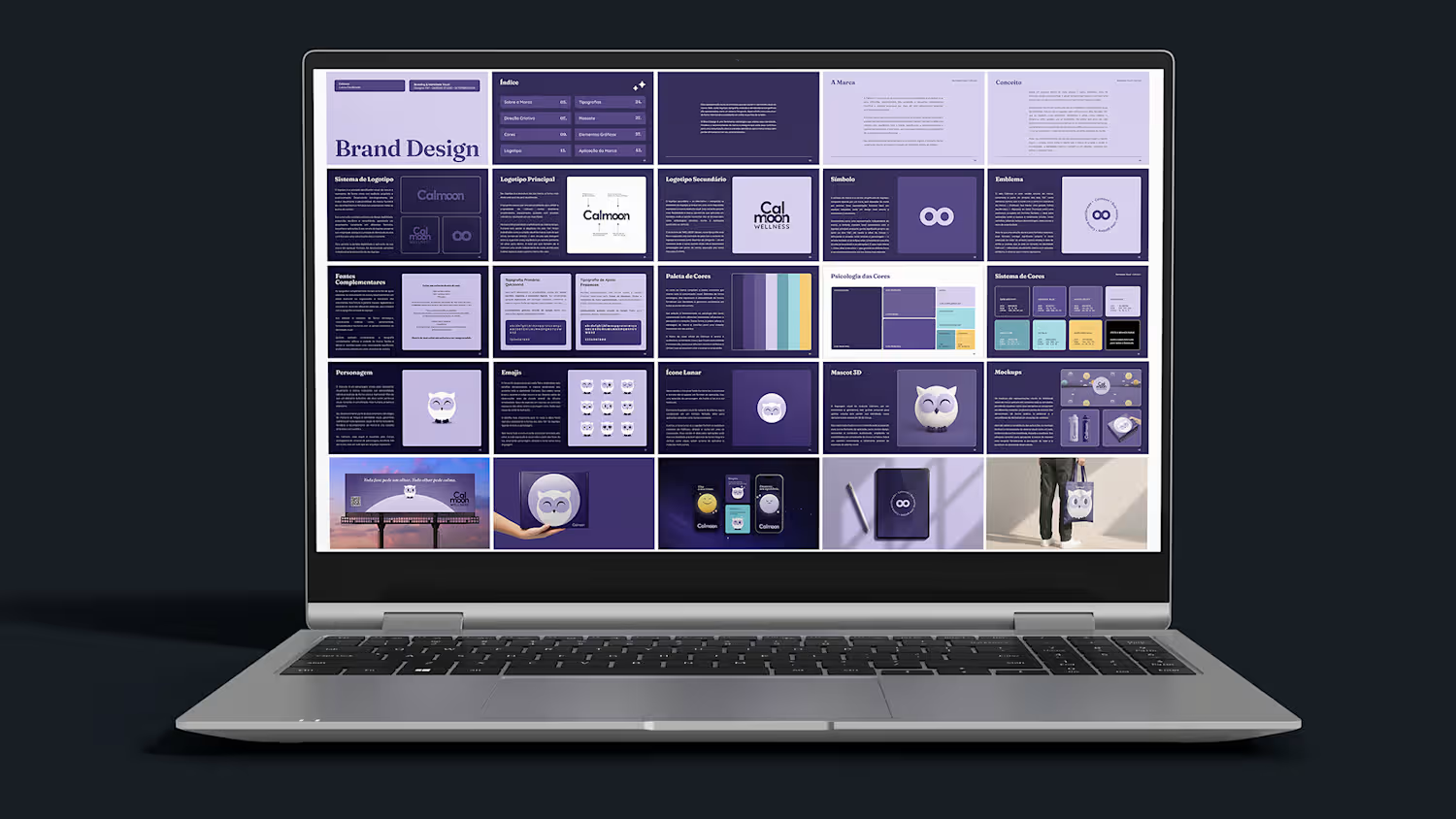
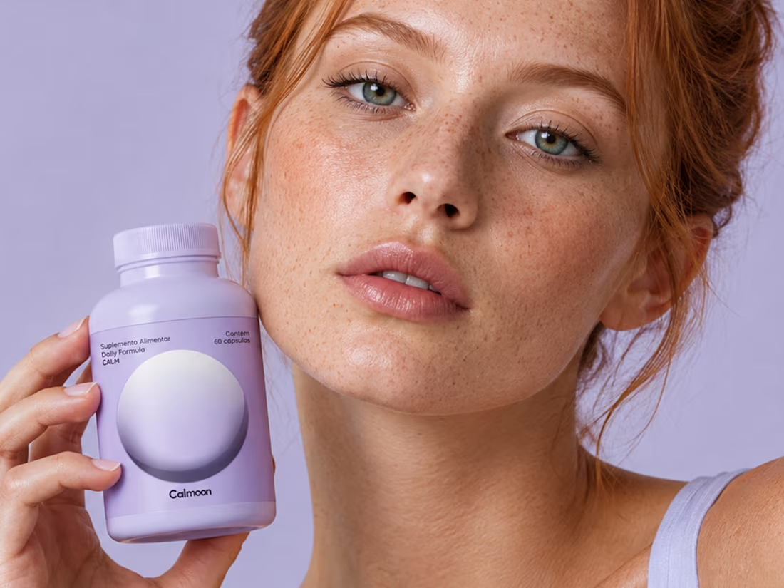
CALMOON is an emotional well-being brand focused on anxiety, created to bring scientific knowledge and emotional care together through accessible and welcoming communication.
The visual identity is built around the concept of an inner universe, with a cosmic color palette and elements that represent different rhythms of the mind. The result is a welcoming visual identity that transforms science and care into a light and accessible visual experience.
1
68
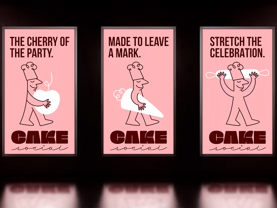
Cake Social is a bakery specializing in custom cakes for birthdays, weddings, and special celebrations. The brand is built around the idea that every great moment deserves an unforgettable detail, turning the cherry into a symbol of the identity and representing the finishing touch that makes every celebration even more special.
The identity combines a modern aesthetic with a playful personality, exploring doodle design elements to create a light, spontaneous, and expressive visual language. The cherry becomes a recurring element throughout the system, reinforcing the brand’s personality and its connection to the world of cakes and celebrations.
The result is a modern, playful, and distinctive visual identity, created to communicate cakes made to be the center of attention.
0
23
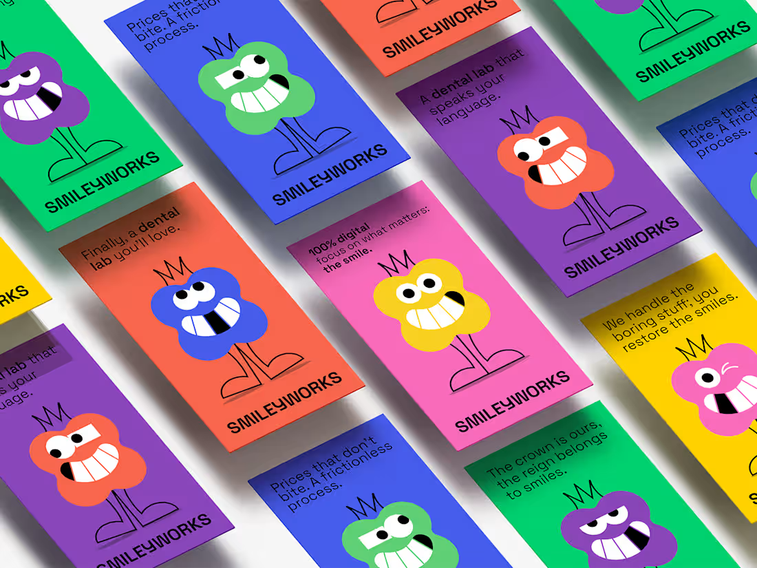
Smiley Works is a dental laboratory based in the UK, combining technical precision, advanced technology, and a contemporary visual approach.
The identity combines minimalist typography, vibrant colors, and a mascot inspired by a dental crown, creating a playful and accessible visual language. The contrast between technical and expressive elements defines the visual system and sets the brand apart from more conventional approaches in the industry. The result is a modern, playful, and bold visual identity.
0
33
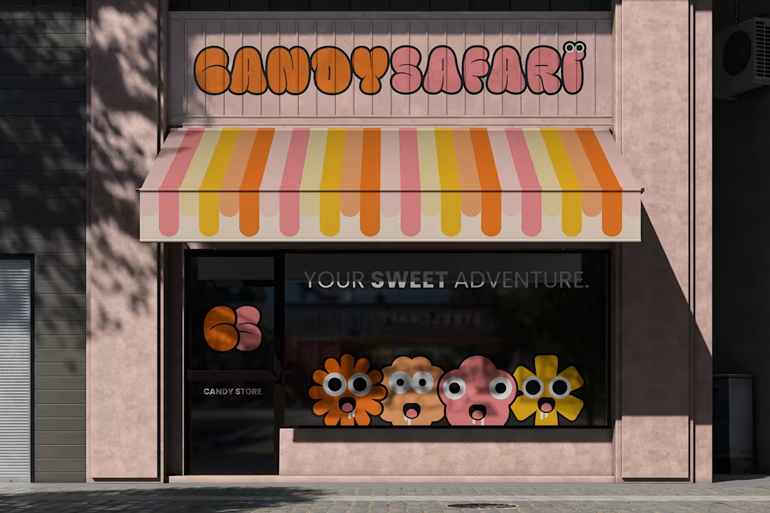
Candy Safari is a candy brand inspired by the energy, colors, and playful spirit of the candy world.
The identity is defined by a bold bubble-style logo and playful geometric shapes that bring expressive mascots to life, serving as the foundation of the visual system. Combined with a vibrant color palette and dynamic compositions, these elements create a recognizable and consistent visual language across different applications.
The result is a bold, playful, fun, and energetic visual identity.
0
12