
Sayeem. A. Hub
Creative Tech Developer And Designer
Ready for work
Sayeem. is ready for their next project!
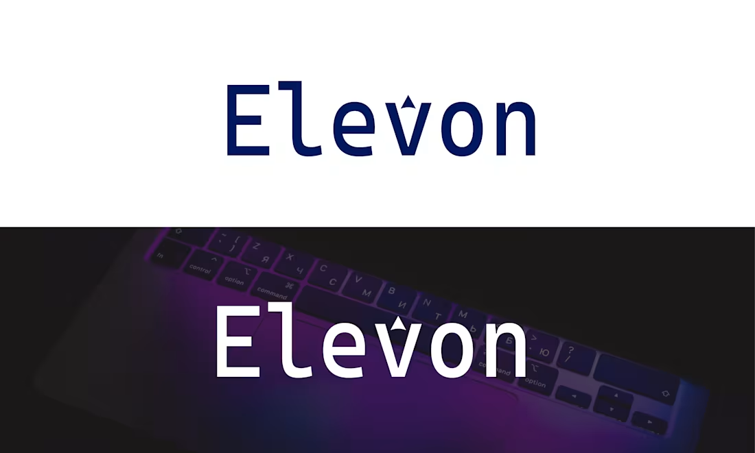
Elevon Tech logo
Elevon represents growth, innovation, and upward momentum.
The name is derived from “elevate” and “on”, symbolizing always moving forward and staying switched on to progress.
The minimalist typography and subtle geometric accent convey a modern, tech-forward identity. Its clean structure ensures clarity, versatility, and strong recognition across digital platforms, startups, SaaS products, and creative brands. Elevon feels premium, confident, and future-ready.
0
63
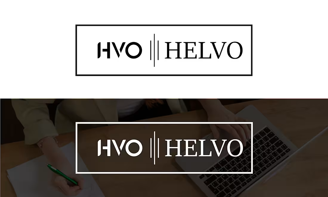
HELVO — Minimal Brand Identity Design
HELVO is a modern and minimal brand identity designed with a focus on clarity, strength, and timeless elegance.
The logo combines clean typography with a refined geometric structure to create a strong yet simple visual presence.
The design approach emphasizes minimalism with purpose, ensuring the brand remains versatile across digital and print platforms. Subtle spacing, balanced proportions, and a monochrome color palette give HELVO a premium and professional look, making it suitable for creative studios, digital brands, and modern businesses.
This project reflects how simplicity, when executed thoughtfully, can deliver maximum visual impact.
1
70
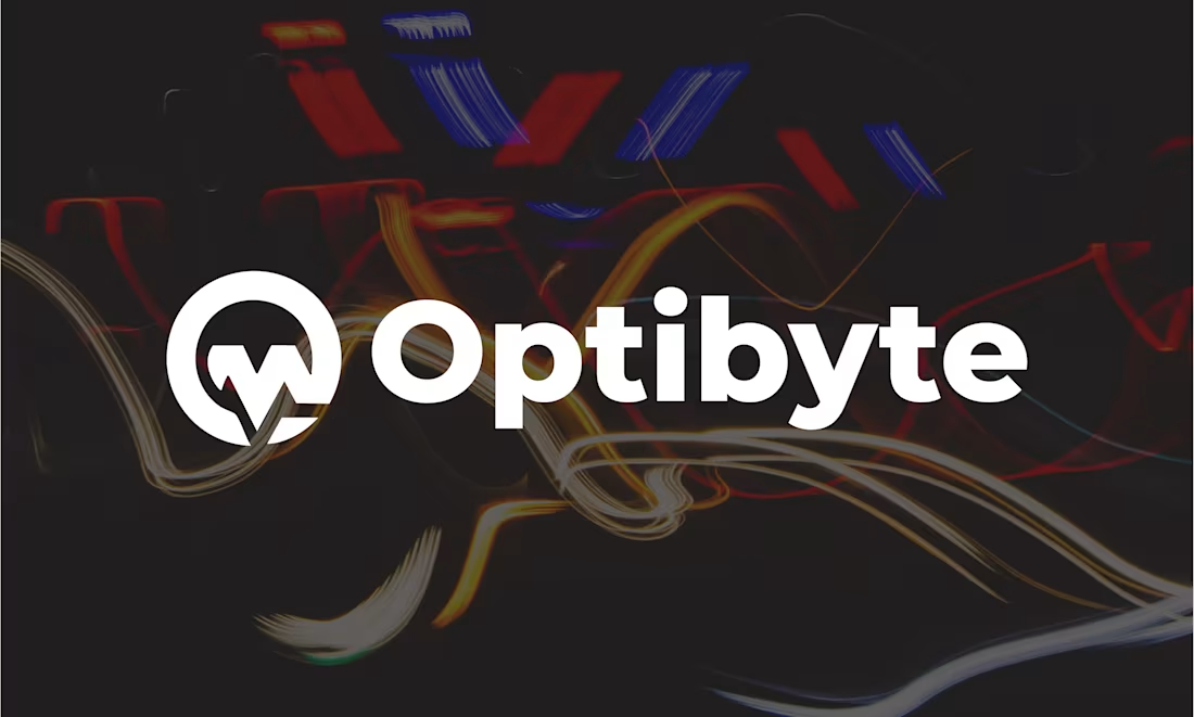
Optibyte — Modern Tech & Digital Solutions Logo Design
Optibyte — A bold, modern tech logo symbolizing digital intelligence, optimization, and data-driven performance. Designed with clean geometry and minimal typography for clarity, scalability, and strong brand recognition across digital platforms.
1
81
CoClick Logo
The CoClick logo is designed to be clean, modern, and impactful. The main icon features a bold letter “C” integrated with a cursor arrow and click spark, symbolizing interactivity, technology, and engagement. The typography combines dark gray for stability and bright blue for energy, innovation, and trust. This balance creates a professional yet approachable identity, making the brand memorable and versatile across digital and print platforms. The overall design reflects connection, action, and forward-thinking, perfectly suited for businesses in tech, digital solutions, startups, or online services.
2
95
7 XPORTS – Brand Logo Design
This logo was designed for 7 XPORTS, a modern and dynamic brand. The concept combines strength, speed, and innovation, reflecting the brand’s active and forward-thinking identity. Logo Concept: The symbol is a creative fusion of “7” and “X”, forming a unique and memorable monogram. The bold geometric style represents power, motion, and confidence. Minimalist and versatile design works perfectly across digital and print platforms. Typography: Clean, bold sans-serif font ensures readability and professionalism. Complementary to the sharp edges of the logo mark. Colors: Neon Yellow-Green: Symbolizes energy, growth, and modernism. Black: Adds contrast, sophistication, and strength. Versatility: Works in full color, black-and-white, and icon-only formats.
1
79
77 Coffee – Brand Identity & Logo Design (http://www.fiverr.com/crezsayeem)
77 Coffee is a modern and energetic coffee brand crafted for people who start their day with passion. The brand needed a clean, stylish, and memorable visual identity that represents its name, personality, and tagline — “Coffee That Gets You.”
Concept
The logo merges the numeric form 77 into a sleek, abstract monogram enclosed within a circular emblem.
The design reflects:
Energy & Movement – The dynamic stroke style gives a sense of forward motion, echoing the brand’s uplifting spirit.
Modern Minimalism – A clean, geometric structure brings contemporary appeal suitable for cafés, packaging, and digital presence.
Brand Authenticity – The warm coffee-inspired color palette reinforces familiarity, richness, and the aroma of freshly brewed coffee.
2
0
92
THINKDEER - Logo Design (http://www.fiverr.com/crezsayeem)
"THINKDEER" is a logo designed to embody the perfect fusion of nature and innovation. The deer, a symbol of agility, wisdom, and grace, is depicted through its minimalistic antlers, created in a smooth gradient blend of blue and pink to represent creativity, modernity, and dynamic thinking.
The typography, bold and contemporary, complements the animal imagery while conveying the brand's strong, forward-thinking identity. The logo is adaptable, featuring both vibrant color variations and a sleek monochrome version, making it versatile for a range of applications—from digital to print.
0
69
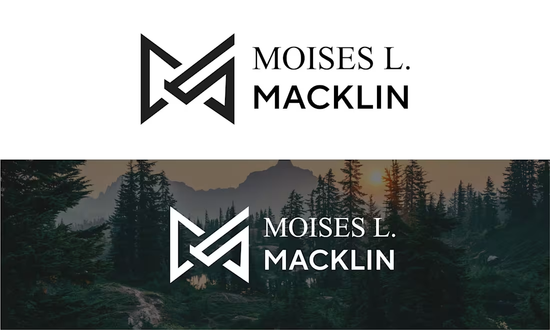
MOISES L MACKLIN Logo
0
73
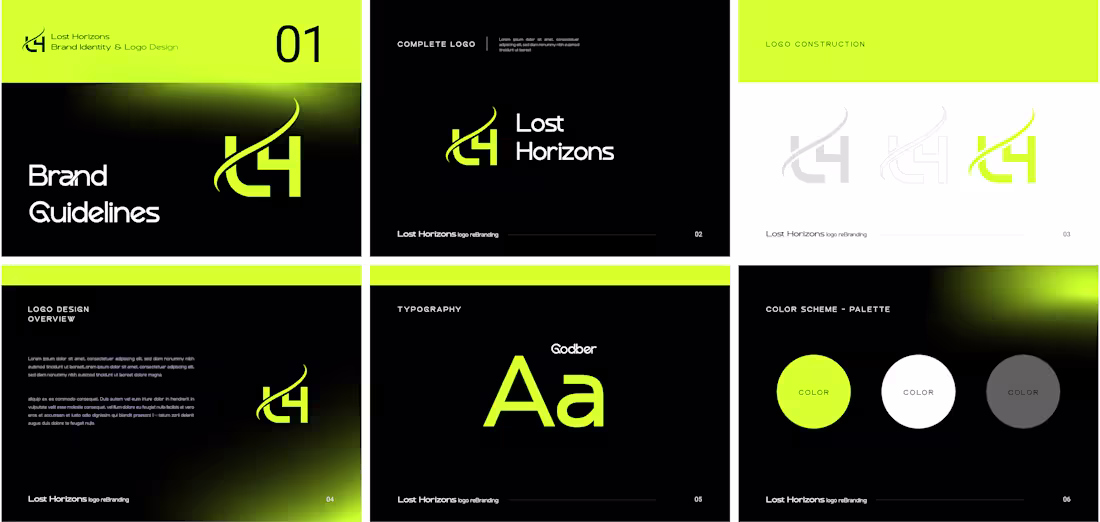
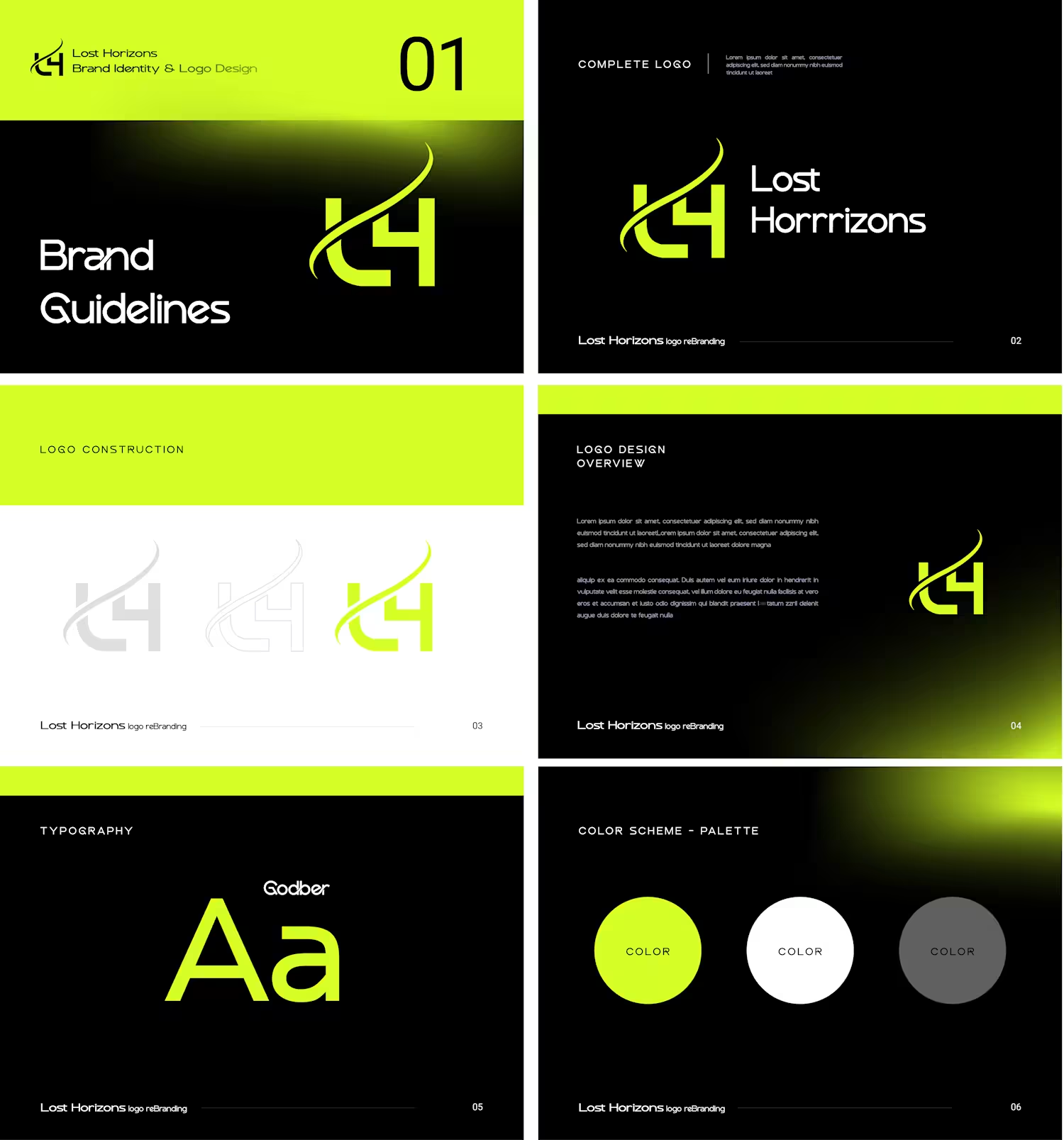
Lost Horizons represents a journey into the unknown — a space of discovery, curiosity, and new possibilities. The brand identity focuses on the idea of going beyond the visible line, symbolized through a fluid horizon stroke that connects the letters L and H into one unified mark. The logo reflects: Exploration — reaching beyond limits Growth & Forward Movement Calm, Balanced, and Modern Aesthetic The typography and line weights are designed to feel grounded yet dynamic, showcasing the brand’s promise: there is always more to discover. Logo Concept Caption : The monogram blends the initials L and H into a continuous form, symbolizing a horizon that invites exploration, curiosity, and new beginnings.
2
2
69
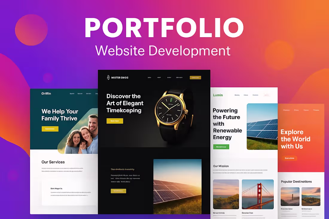
Website Development Portfolio (http://www.fiverr.com/crezsayeem)
I specialize in creating modern, responsive, and professional websites that are tailored to fit your business needs. My focus is on clean design, user-friendly navigation, and SEO-friendly structure that helps your brand grow online.
0
49