
Covenant Zechariah
Website & Mobile App Designer • I Web3 curious • Let’s talk✉


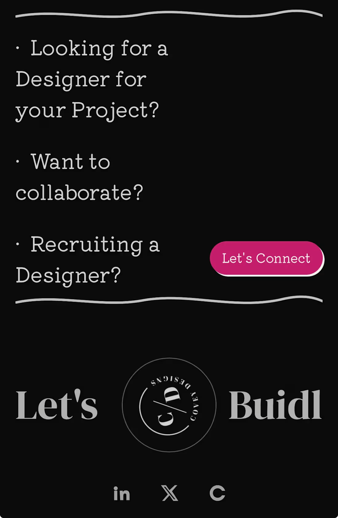
Turns out the most controversial part of my portfolio isn't the design…it's the footer.😄
I've had quite a few people point out that "Let's BUIDL" is a typo and should be "Let's Build."
Plot twist: it's intentional.
"BUIDL" is a term that's deeply rooted in Web3. It's about building, shipping, and creating instead of just talking.
Now I'm curious…
If you saw "Let's BUIDL" on a portfolio, would you:
A. Assume it's a typo
B. Recognize the Web3 reference
C. Be confused enough to ask
Here’s the link to my portfolio: https://coveydesigns.xyz/
0
29
It’s Friday and I’m posting my work.
I’m a Ui/Ux Designer. I design how things work, not just how they look.
Interfaces, flows, and moments that make products feel effortless.
2
70
Practice makes perfect.
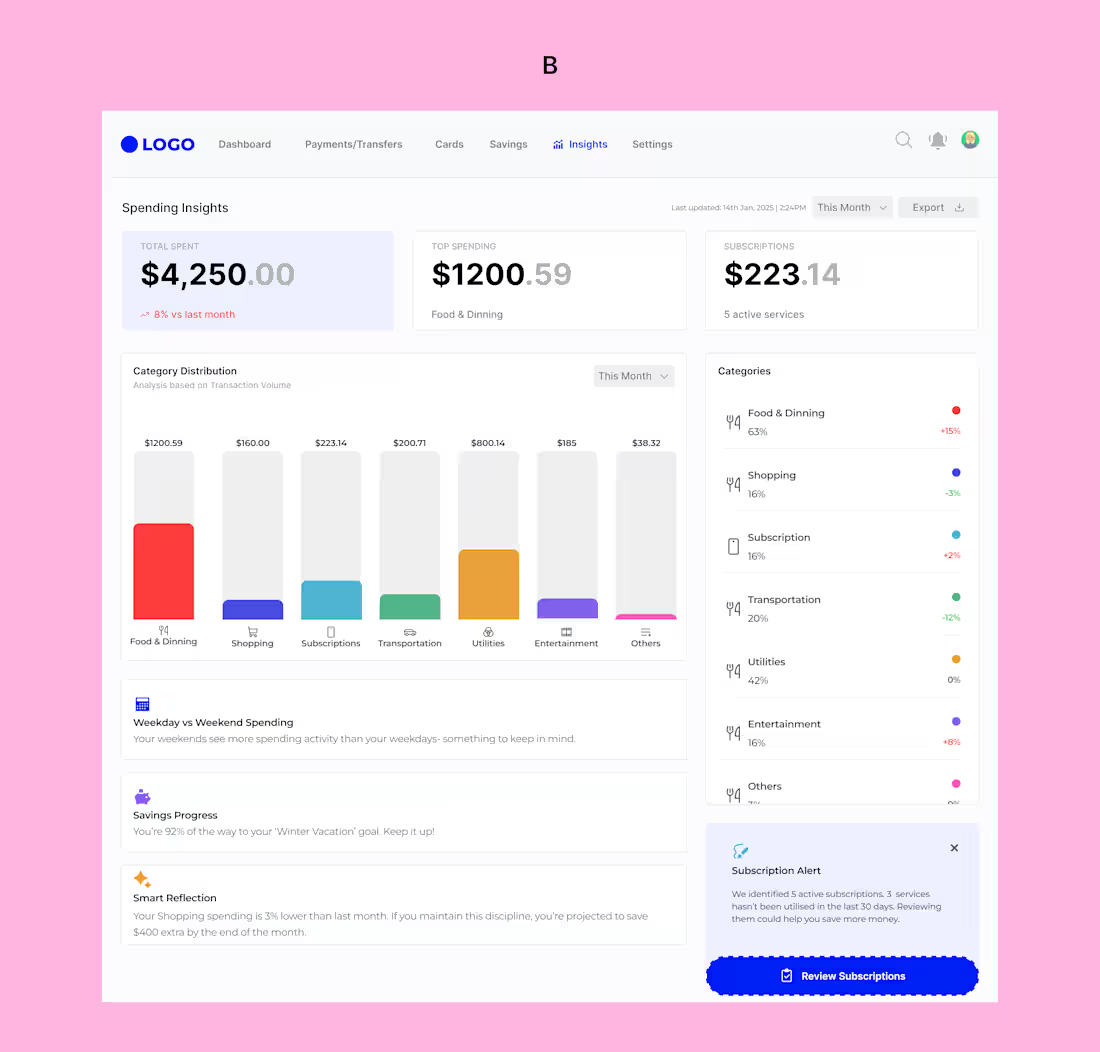
I say that because comparing how I used to design dashboards then and the way I design dashboards now, I see is growth.
I’ve always been one to run away from designing dashboards. They felt intimidating. I’ll say to myself, “too much data”, “too many decisions”, “too many ways to get it wrong”. But I’ve learned that growth doesn’t happen where we’re comfortable. So today, I decided to face that fear.
This wasn’t just about visuals, it was about designing understanding, not just data. I explored two different dashboard approaches, each solving the same problem in a slightly different way, because good UX isn’t always about one “perfect” solution, but about thoughtful trade-offs.
Which of the dashboards do you think has a better UX, A or B?
4
5
134
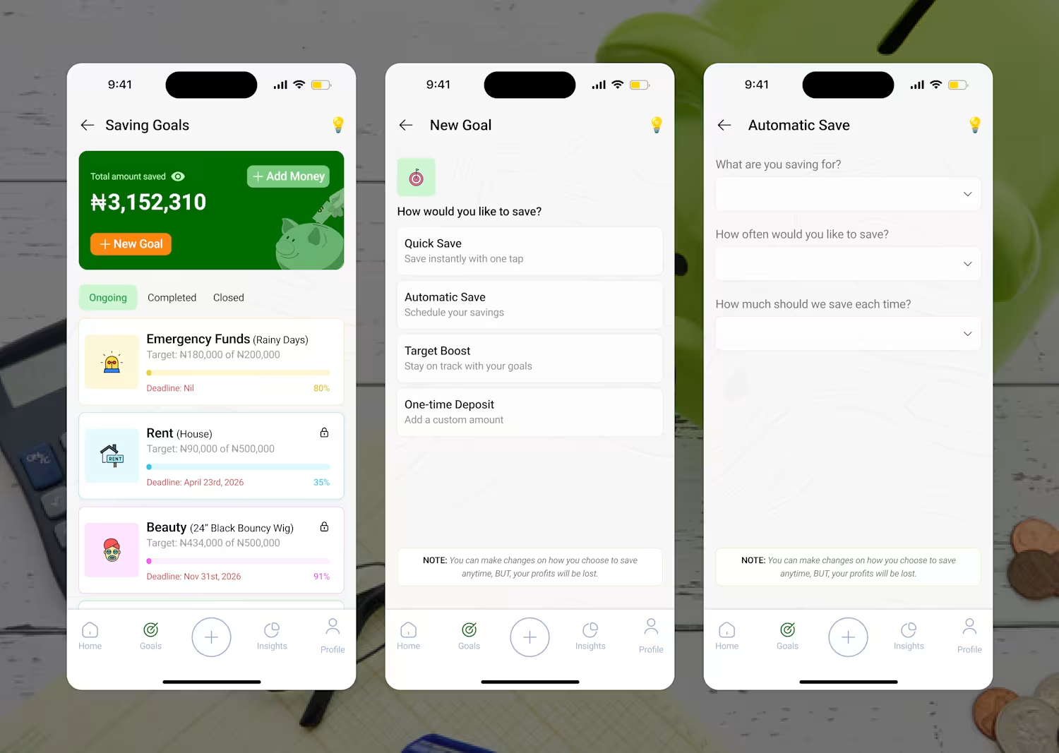
Saving money can be stressful, I know, but the experience shouldn’t be.
I was supposed to design just one screen, but I thought to myself, why not design more screens to enhance a better user experience, so I did.
But instead of starting with visuals, I started with the user’s mindset , made my research and sketched my wireframes. This wasn’t just about designing a screen. I designed the flow, prototyped interactions, and added subtle animations to test how progress and feedback can guide users naturally.
It’s a Good Monday to post, and here are my designs.
2
77