
Cosmin Giurca
UX/UI Designer Turning Complexity Into Clarity
New to Contra
Cosmin is ready for their next project!
Introduction
Running projects, managing invoices, tracking clients, and staying on top of meetings can quickly become overwhelming for small businesses and contractors.
Important information often ends up scattered across spreadsheets, notes, emails, and multiple tools - creating unnecessary friction in everyday operations.
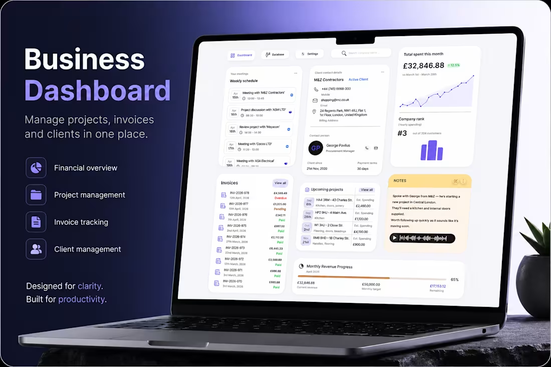
This project explores a centralized dashboard experience designed to simplify business management.
A workspace where users can monitor projects, track payments, manage client relationships, and stay organized from a single interface.
At its core, the product is built around one idea:
bring business operations into one clear, actionable system.
Problem
Many business management platforms focus heavily on functionality but fail to create a truly usable experience.
Users are often faced with:
Too much fragmented information across different sections
Poor visibility of priorities, deadlines, and financial progress
Interfaces that feel dense and difficult to navigate quickly
Administrative workflows that interrupt productivity instead of supporting it
What this creates:
Instead of staying focused on their work, users spend time searching, checking, and manually organizing information.
Simple daily actions become mentally exhausting, especially for contractors and small business owners juggling multiple projects at once.
Over time, the experience feels reactive rather than controlled.
Goal
The goal was to design a business dashboard that feels structured, intuitive, and easy to manage at a glance.
Rather than overwhelming users with complexity, the interface was designed to surface the most important information first while keeping actions accessible and predictable.
The experience was designed to:
Centralize projects, invoices, meetings, and client information
Improve visibility of business performance and financial progress
Reduce friction in day-to-day administrative workflows
Create a cleaner and calmer workspace that supports productivity
Every design decision followed one guiding principle:
“Can users quickly understand what matters and act without interruption?”
My role
I led the product design process from concept to final UI, defining both the user experience and the visual direction of the platform.
The focus was placed on creating a scalable dashboard system with strong information hierarchy, clear spacing, and fast scannability across different types of business data.
I designed workflows for project tracking, invoice management, client communication, scheduling, and revenue monitoring while ensuring the interface remained visually simple and easy to navigate.
The final result is a modern SaaS dashboard experience tailored for contractors and small businesses - balancing functionality, usability, and clarity in a way that supports real everyday workflows.
0
5
Introduction
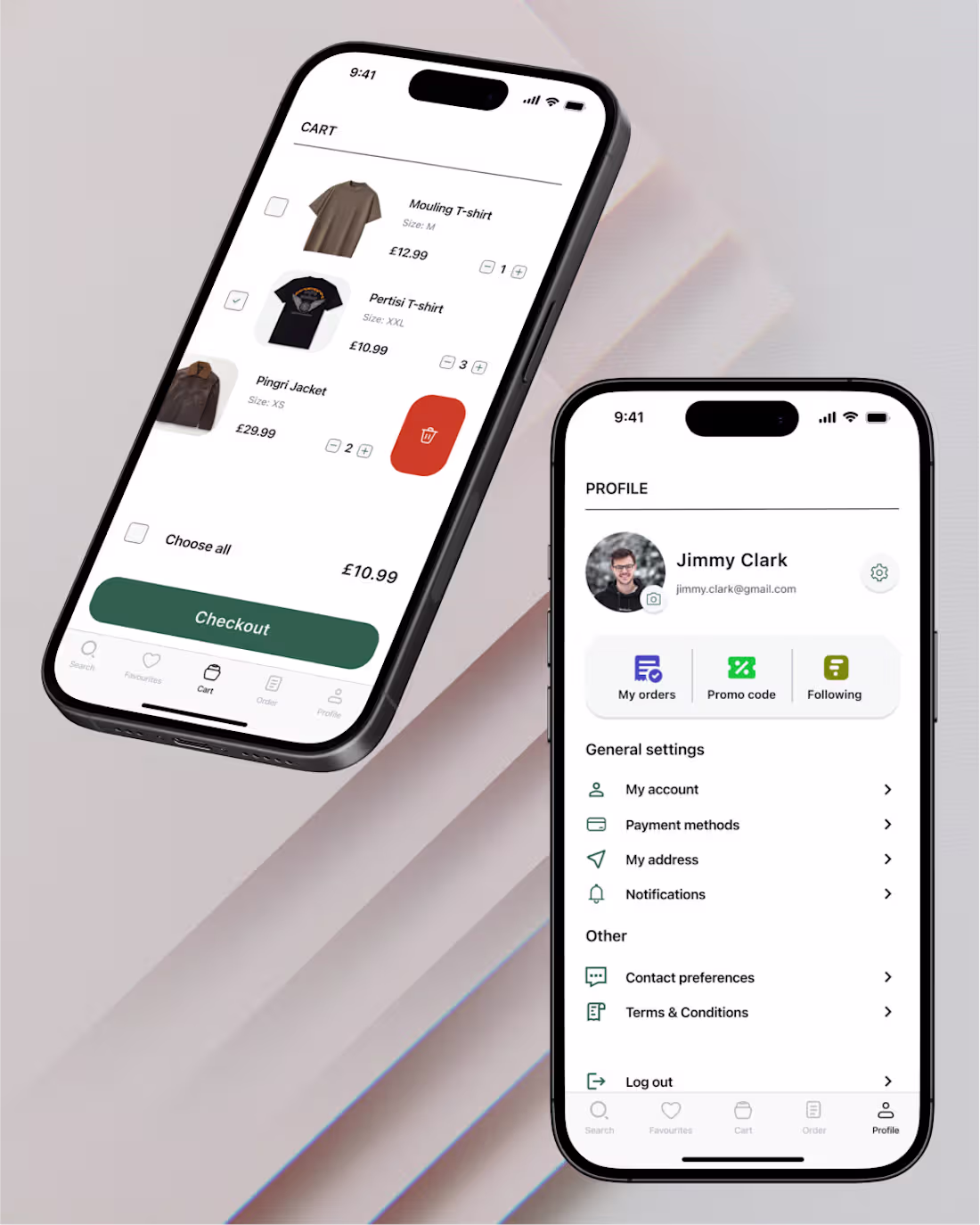
EasyShop is a native iOS app designed to make fashion shopping fast, simple, and stress-free.
Instead of overwhelming users
with endless choices and complex filters,
the product focuses on speed, clarity, and control — helping users find what they need and check out with minimal effort.
Problem
Most fashion apps are built for exploration, not efficiency.
Users:
Spend too much time browsing
Get overwhelmed by options
Drop off before completing a purchase
For students and busy professionals, shopping becomes a chore.
The core issue isn’t lack of features — it’s too much friction.
Goal
Design a focused MVP that:
Reduces decision fatigue
Prioritizes budget-based discovery
Shortens the path to checkout
The goal wasn’t to build more — it was to remove what’s unnecessary.
My role
As the sole UX/UI Designer, I:
Defined the product direction and user flows
Translated business needs into design decisions
Created wireframes and high-fidelity UI
Built a consistent iOS-based design system
Delivered an interactive prototype for validation
0
9
Introduction - Defining the Experience Before the Interface
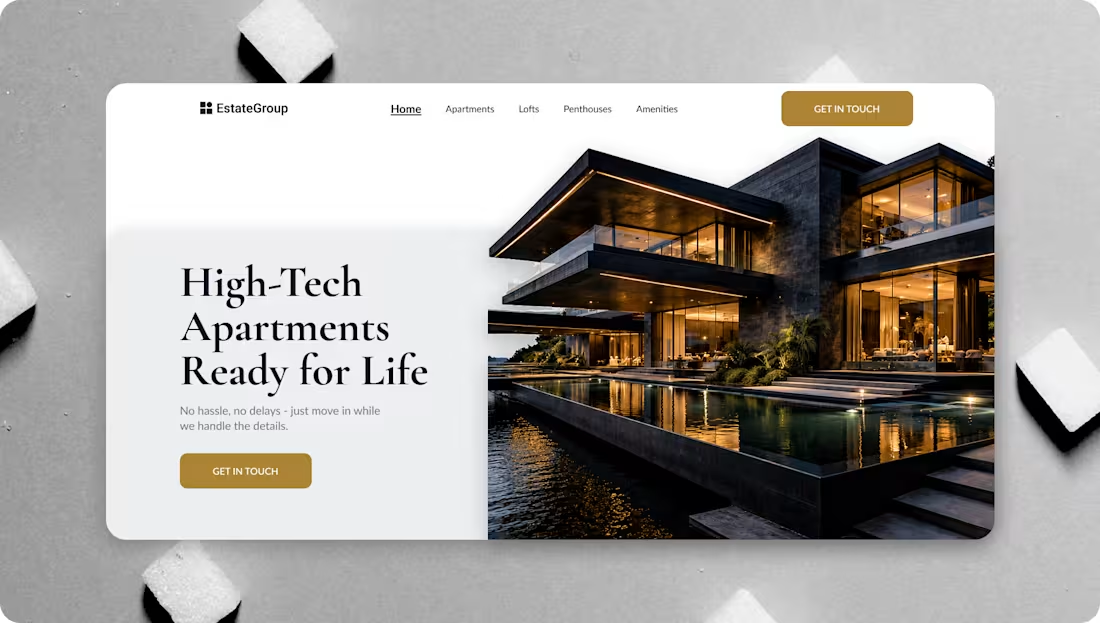
Estate Group offers minimalist, high-tech, fully furnished apartments through an end-to-end service model. Because the physical product is already carefully designed, the digital experience had to match the same level of intentionality, simplicity, and control.
From a UI/UX perspective, this meant one thing:
The website’s content had to behave like the service itself — structured, predictable, and reassuring.
This case study focuses on how content, layout, and visual hierarchy were designed to communicate clarity and reduce user anxiety.
Problem-Too Much Information, Not Enough Structure
Initial analysis showed that the problem was not lack of information, but how information was presented.
Users entering the website typically experienced:
Cognitive overload from feature lists
Unclear service boundaries (what’s included vs. optional)
Marketing language without process explanation
Difficulty understanding where they are in the journey
From a UX standpoint, the problem was clear:
The content lacked hierarchy and narrative flow.
This insight led directly to defining UX-driven goals.
Goal-Turning Content Into Guidance
Instead of adding more content, the goal was to design content behavior.
Primary UX objectives:
Guide users step-by-step through the service
Reduce decision fatigue through progressive disclosure
Use layout and spacing to imply confidence and control
Make the final outcome visible before technical details
These goals informed all subsequent UX decisions.
My role-Owning the Experience End to End
I worked as the UI/UX Designer, responsible for shaping the experience from strategy to handoff.
Responsibilities:
UX strategy and content structuring
User research and mental model analysis
Information architecture and wireframing
UI design and visual hierarchy
Style guide and design system creation
Developer handoff and UX documentation
My role was to ensure that every design decision served clarity, and that the final experience communicated Estate Group’s promise without unnecessary explanation.
0
13
Introduction
Wedding photography is more than documenting an event.
It’s about capturing emotion, atmosphere, and moments people want to remember for the rest of their lives.
Yet many photography websites focus heavily on showcasing images while overlooking the overall experience behind them.
The result often feels visually impressive, but emotionally disconnected and difficult to navigate.
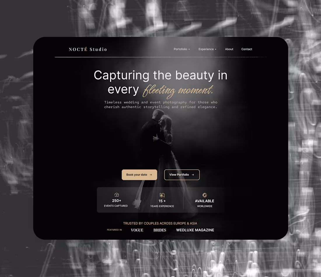
This project explores a more refined digital experience for a luxury photography studio.
A website designed to combine elegance, storytelling, and clarity - allowing visitors to connect with the brand while exploring the work in a calm and immersive way.
At its core, the experience is built around one idea:
make every interaction feel as timeless and intentional as the moments being captured.
Problem
Many portfolio websites in the photography space prioritize aesthetics without considering usability and emotional flow.
Users are often faced with:
Overdesigned layouts that distract from the photography itself
Weak visual hierarchy and unclear navigation
Generic presentation that lacks emotional connection
Interfaces that feel static instead of immersive
What this creates:
Instead of feeling emotionally drawn into the work, visitors browse passively and leave quickly.
The experience fails to communicate trust, personality, and the premium nature of the service - all critical factors in an industry built on emotion and connection.
For luxury photography brands, the website should feel like an extension of the experience itself, not just a gallery.
Goal
The goal was to design a photography portfolio experience that feels elegant, cinematic, and emotionally engaging while remaining simple to navigate.
Rather than relying on excessive visual effects, the focus was placed on atmosphere, typography, spacing, and storytelling.
The experience was designed to:
Create a strong emotional first impression
Let photography remain the primary focus of the interface
Build a premium and trustworthy brand presence
Guide users naturally toward exploration and booking actions
Every design decision followed one guiding principle:
“Does the experience feel emotional, effortless, and memorable?”
My role
I led the creative direction and UI/UX design process from concept to final interface.
The project focused heavily on visual storytelling, composition, typography, and interaction balance - creating an experience that feels immersive without becoming overwhelming.
I structured the layout to support natural content flow while maintaining a refined and minimalist visual language throughout the website.
The final result is a luxury portfolio experience that blends emotion, elegance, and usability -designed to help the studio communicate both artistic identity and professional credibility.
0
17