The network for creativity
Join 1.25M professional creatives like you
Connect with clients, get discovered, and run your business 100% commission-free
Creatives on Contra have earned over $150M and we are just getting started
Back to feedPost
Made a paid ad video for Orchid, the AI executive assistant that lives in iMessage (YC-backed). It texts you your day, drafts replies, books meetings, you approve and it handles the rest.


Amazing work!


ty so much


an assistant that lives in imessage is smart positioning
100%

Did you make it with after effects? Great job Lounes!
yess

Making an ad for a product that basically lives inside a messaging app is a tricky brief, there's nothing physical to point the camera at. What was your approach to giving Orchid a visual identity people could actually picture using?
exactly but the fun is in using it from your messages directly. Animating the message ap was actually really fun
That's such a fun insight, most people treat the messaging interface as a constraint to design around, not the actual hook. What was the messiest part of animating inside that UI, timing the typing indicators or something else entirely?

Nice!

Putting the assistant inside iMessage is a smart distribution choice because it meets users where their daily coordination already happens. The approval step also makes the automation feel safer.
100%

The grainy, VHS-style look is such an unexpected choice for an AI product, most of these ads go clean and futuristic. What made you push for nostalgic over slick, was that your call or the client's brief?
it was from their branding but it's realyl clean really gives that authentic touch

thank you!!


Great work🔥👏👏
thank you!!
The network for creativity
Join 1.25M professional creatives like you
Connect with clients, get discovered, and run your business 100% commission-free
Creatives on Contra have earned over $150M and we are just getting started

Challenges
View all


Related posts

Looking closer.
What begins as a moth on a piece of bark becomes rivers, stars, mountains, and then ordinary things we usually ignore.
A reminder that wonder is often a matter of perspective.
Created with GPT 2.5 Sunburst and H3


Incredible sense of scale and visual narrative! Using AI tools like GPT 2.5 and H3 to bridge macro textures with cosmic perspectives creates a genuinely hypnotic experience. Beautiful work!

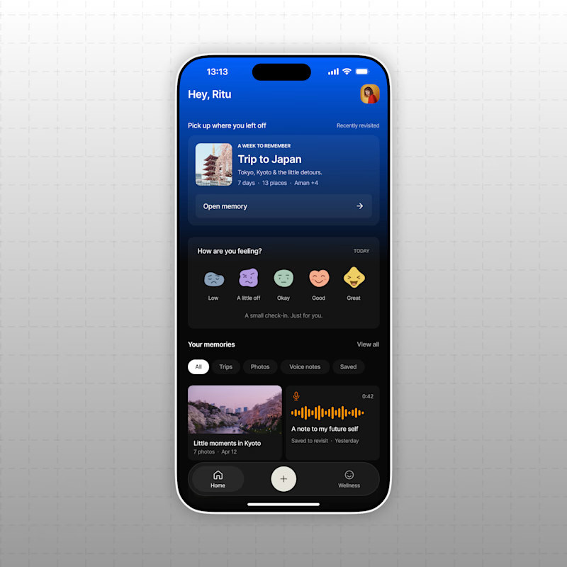
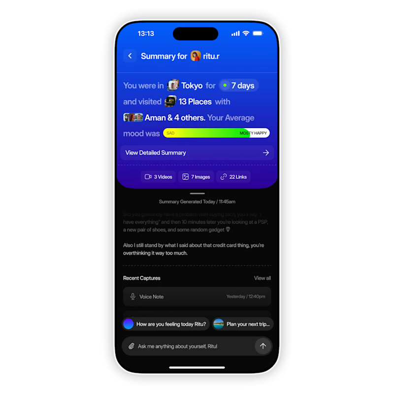
AI based memory rewinder app. Which design is better as Homescreen?
7 voted
88%
1 voted
12%
8 votes
Closed

The mood-capture direction feels more distinctive to me—the layered cards give the memory context real personality. I’d keep the summary drawer as a quick-glance fallback for returning users.

Creative Direction for Innerceuticals


The pivot from the real product bottle into that geometric particle animation is a smooth way to move from proof to brand world. Was Innerceuticals specifically asking for that split, ground it in the actual product first then get conceptual after, or did that pairing come together in the edit?