The network for creativity
Join 1.25M professional creatives like you
Connect with clients, get discovered, and run your business 100% commission-free
Creatives on Contra have earned over $150M and we are just getting started
Back to feedPost


Alex Rivera - Executive Business Coach Personal Brand Website
A premium, sophisticated and high-converting personal brand website designed for Alex Rivera, a professional executive business coach.
The website is crafted to establish Alex as a trusted authority who helps ambitious entrepreneurs and business leaders scale their companies with confidence, strategy, and clarity.
Key Features & Sections:
• Strong hero section with powerful personal branding and clear call-to-action
• Detailed About section showcasing experience, expertise and coaching philosophy
• Premium coaching programs including 1:1 Executive Coaching, Group Mastermind and VIP Transformation Program
• Impressive client success stories with real results
• Speaking engagements and video testimonials
• Free resources and lead magnet section
• Professional FAQ to address common questions
Design Highlights:
Elegant dark navy blue and gold color scheme
Clean, authoritative and luxurious feel
Mobile-first responsive design
Smooth user journey focused on client conversion
This demo project showcases my expertise in creating premium personal brand websites for coaches and consultants that build trust and attract high-quality clients.
Tools Used: Webflow, Figma
Perfect for executive coaches, business consultants, and personal brands.


The network for creativity
Join 1.25M professional creatives like you
Connect with clients, get discovered, and run your business 100% commission-free
Creatives on Contra have earned over $150M and we are just getting started



Related posts

Design Agency Website
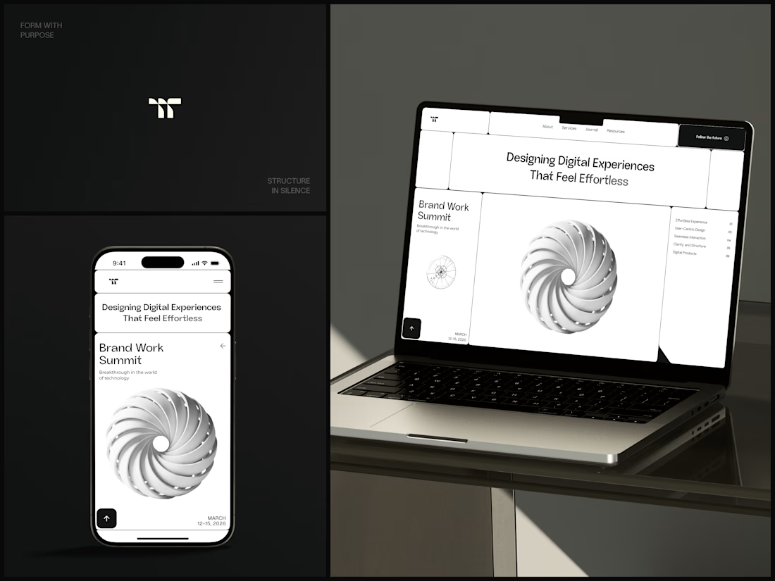
Only one cell on this homepage is black.
The rest of the page is a grid of rounded white cells: the headline, an event card, a white 3D spiral and a list of services. The black one, top right, holds the "Follow the future" button and stands out against all that white.
On the phone, the cells stack into a single column. The navigation folds into a menu icon, and the event card and spiral merge into one cell.
The headline reads "Designing Digital Experiences That Feel Effortless", so the grid has to look organized before anyone reads a word.
Designed by the Hue & Machine team.
#DesignAgency #WebDesign #AgencyWebsite #LandingPage #BentoGrid #MinimalDesign #UIDesign #ResponsiveDesign #MobileDesign #FigmaDesign



Looks cool

Card Banking Web Design Exploration
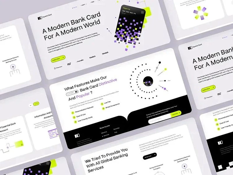
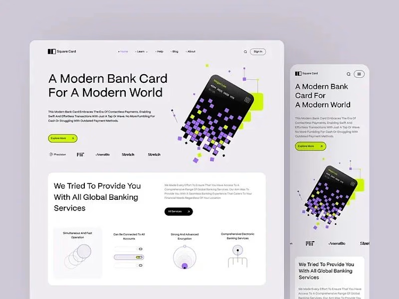
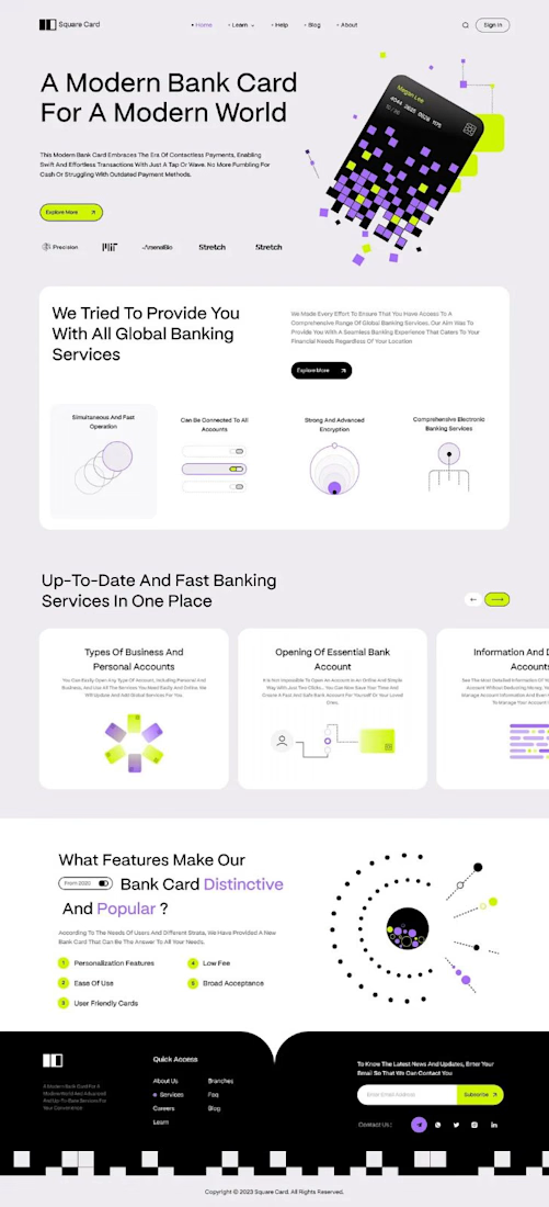
“A modern bank card for the modern world.” That line set the tone, and the layout follows it.
The hero is one pixelated card, built from small squares in lilac, lime and black. It breaks apart into the page, and the product still reads first.
The headline runs large across the left in clean type, so big the message lands before anything else. The card keeps its playful shape, and the words still lead.
Thin line icons and numbered points split the features into small, clear blocks. The busy information gets a strict structure to lean on.
A single lime button sits under the headline and marks where to go next.
Designed by Pixel & Form.
#WebDesign #BankingDesign #FintechDesign #UIDesign #LandingPage #ProductDesign #ResponsiveDesign #CardDesign #Typography #FigmaDesign

Nice work!


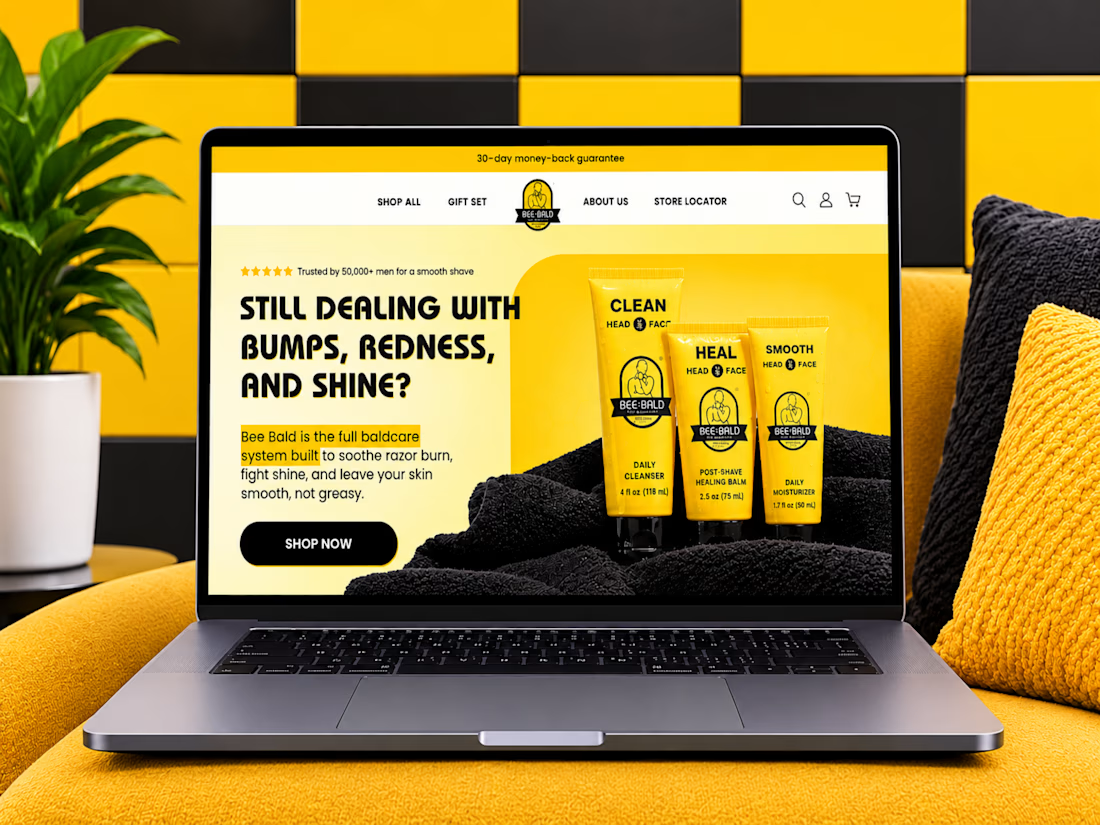
Bald heads deserve skincare designed specifically for them.
Excited to share my website design project for Bee Bald, a grooming and skincare brand dedicated to bald and shaved heads.
The focus was on creating a clean, engaging e-commerce experience that showcases the products, communicates their benefits, and makes shopping simple.
From product presentation to brand storytelling, every section was designed to make the customer experience clearer and more enjoyable.
I'd love to hear your opinion!
When shopping for skincare online, what catches your attention first: the website design, product packaging, ingredients, or customer reviews?
Let's talk in the comments!
#WebDesign #EcommerceDesign #UIDesign #UXDesign #WebsiteDesign #WebDevelopment #ProductDesign #MensGrooming #SkincareBrand #Behance #Contra #CreativeDesign


Love the creativity behind this project. Everything feels well thought out and beautifully presented.