The network for creativity
Join 1.25M professional creatives like you
Connect with clients, get discovered, and run your business 100% commission-free
Creatives on Contra have earned over $150M and we are just getting started


The network for creativity
Join 1.25M professional creatives like you
Connect with clients, get discovered, and run your business 100% commission-free
Creatives on Contra have earned over $150M and we are just getting started





Related posts


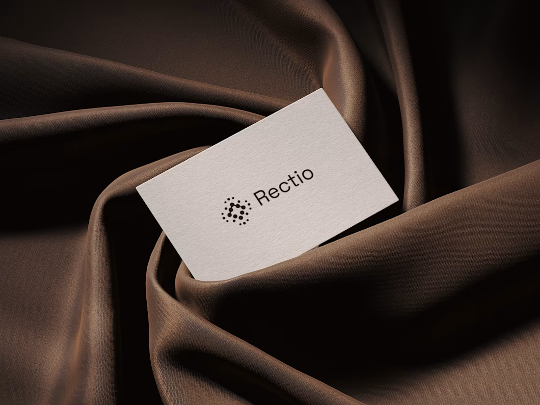
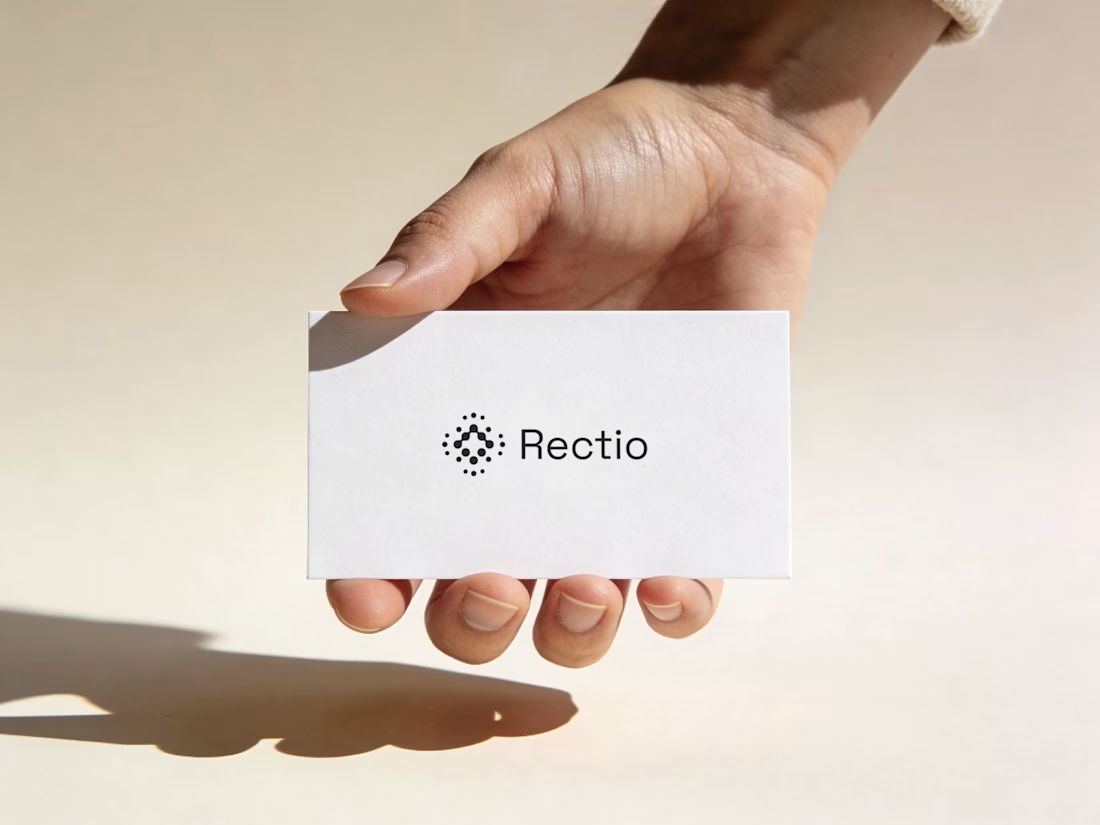
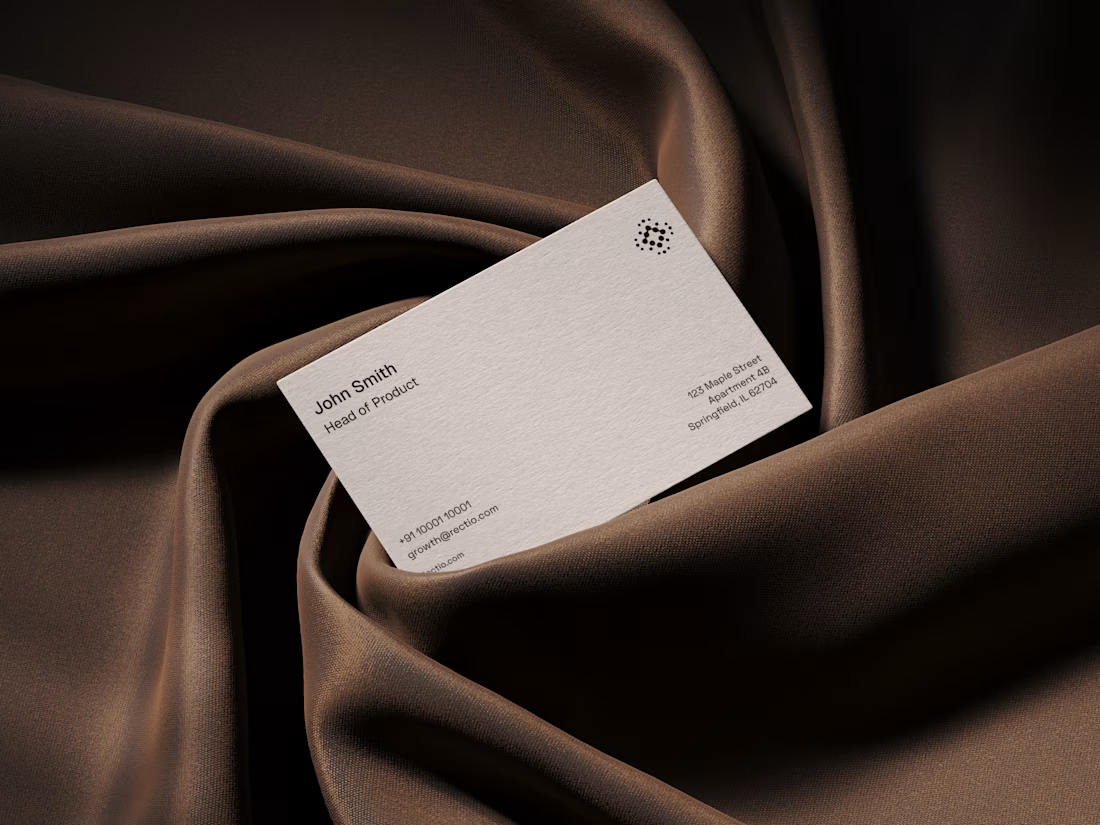
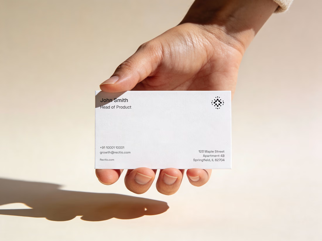
Rectio — Brand Identity
Brand Identity • Visual Direction • Business Cards • Mockups
A modern and minimal branding direction for Rectio, from visual identity to business card applications.
Created by Artonest Design Studio — artonest.design




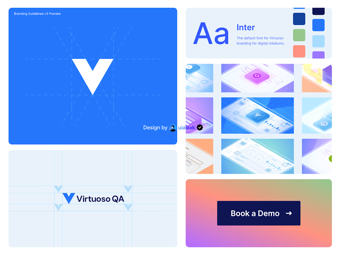
Branding v3 for Virtuoso
This design evolution, made an impact to the brand growth's by:
- Increasing website conversions
- Having consistent brand presence across digital mediums
- Increase brand awareness
See full case study here

One of the best designs I’ve seen today. Really solid work

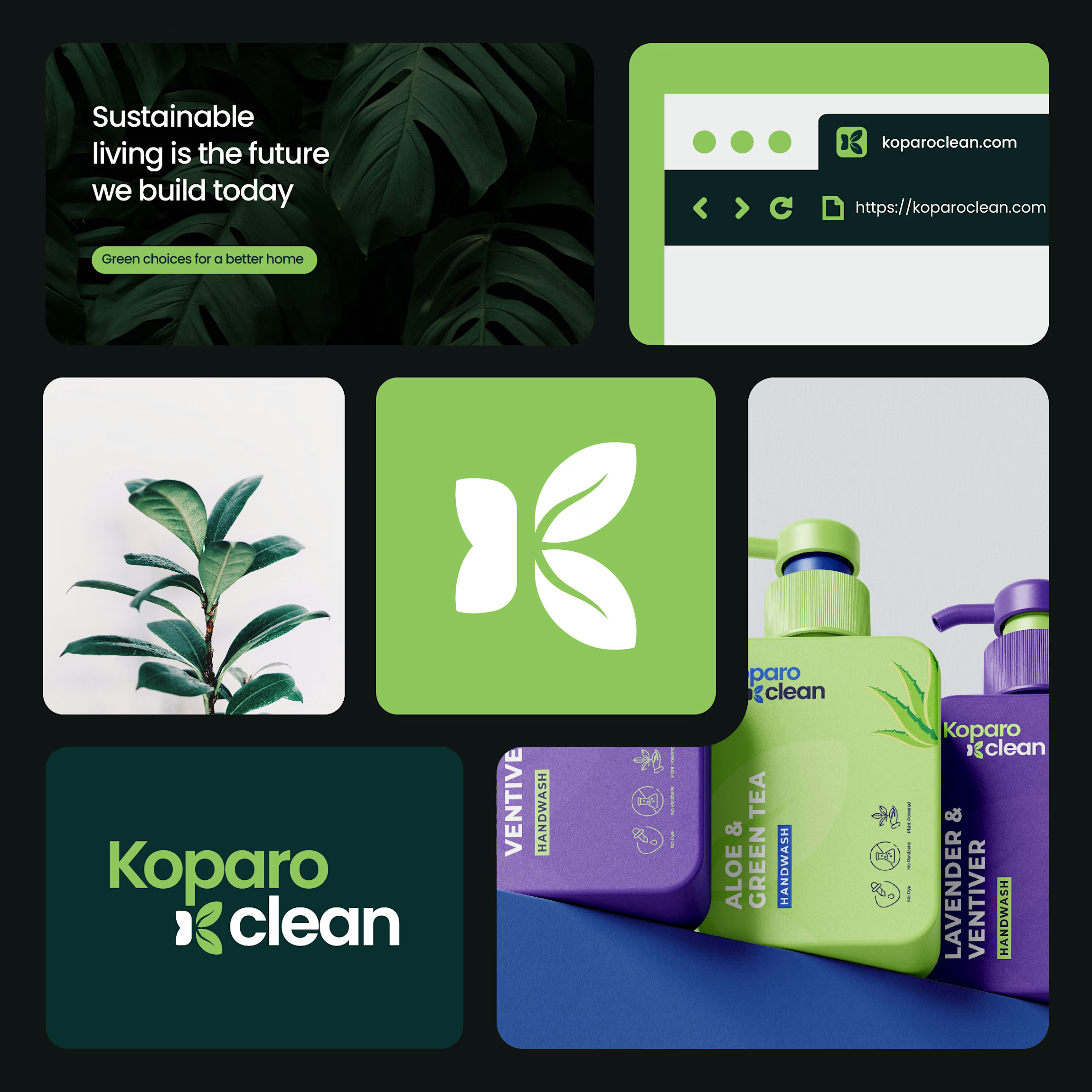
Koparo Clean — Brand Identity Refresh & Packaging Redesign
Koparo Clean is an eco-friendly brand delivering non-toxic, plant-based home cleaning and hygiene products. To support their growth and appeal to environmentally conscious, modern consumers, we designed a fresh identity and custom packaging strategy that blends minimal aesthetics with functional utility.
The Goal Craft a unified visual language and packaging system that communicates purity, eco-friendliness, and trust, setting Koparo apart on crowded retail and e-commerce shelves.
What Was Delivered
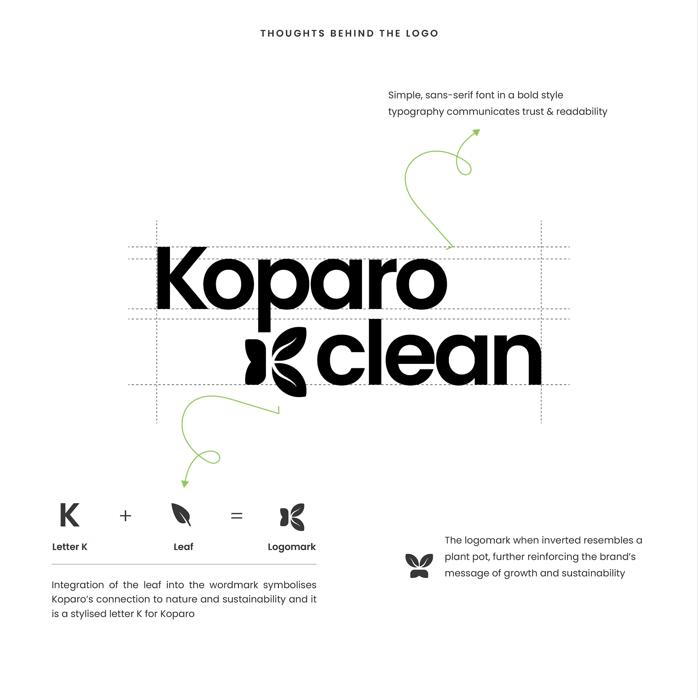
Identity & Logo System: Designed a custom wordmark featuring an integrated stylized 'K' and leaf logomark that doubles as an emblem for growth and sustainability.
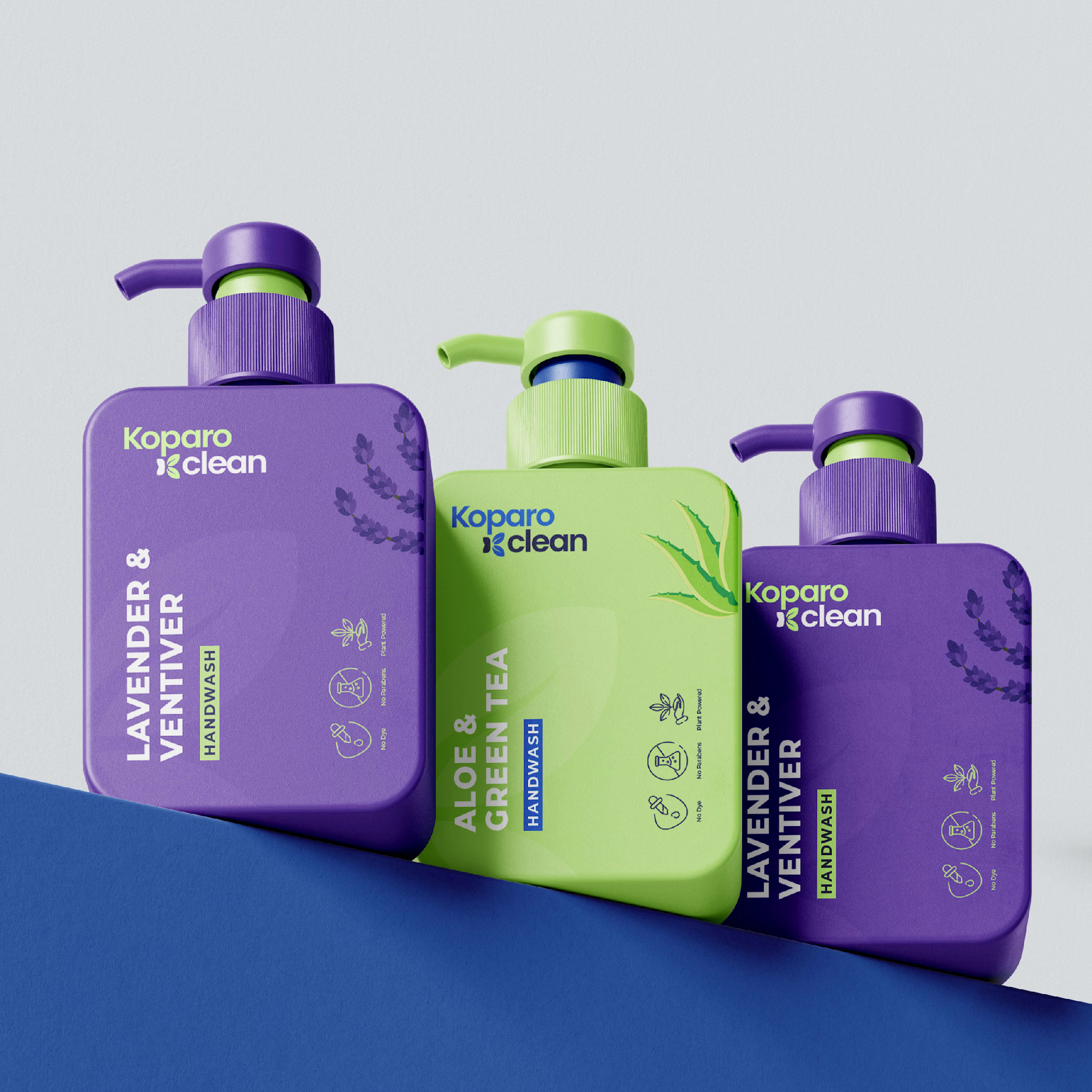
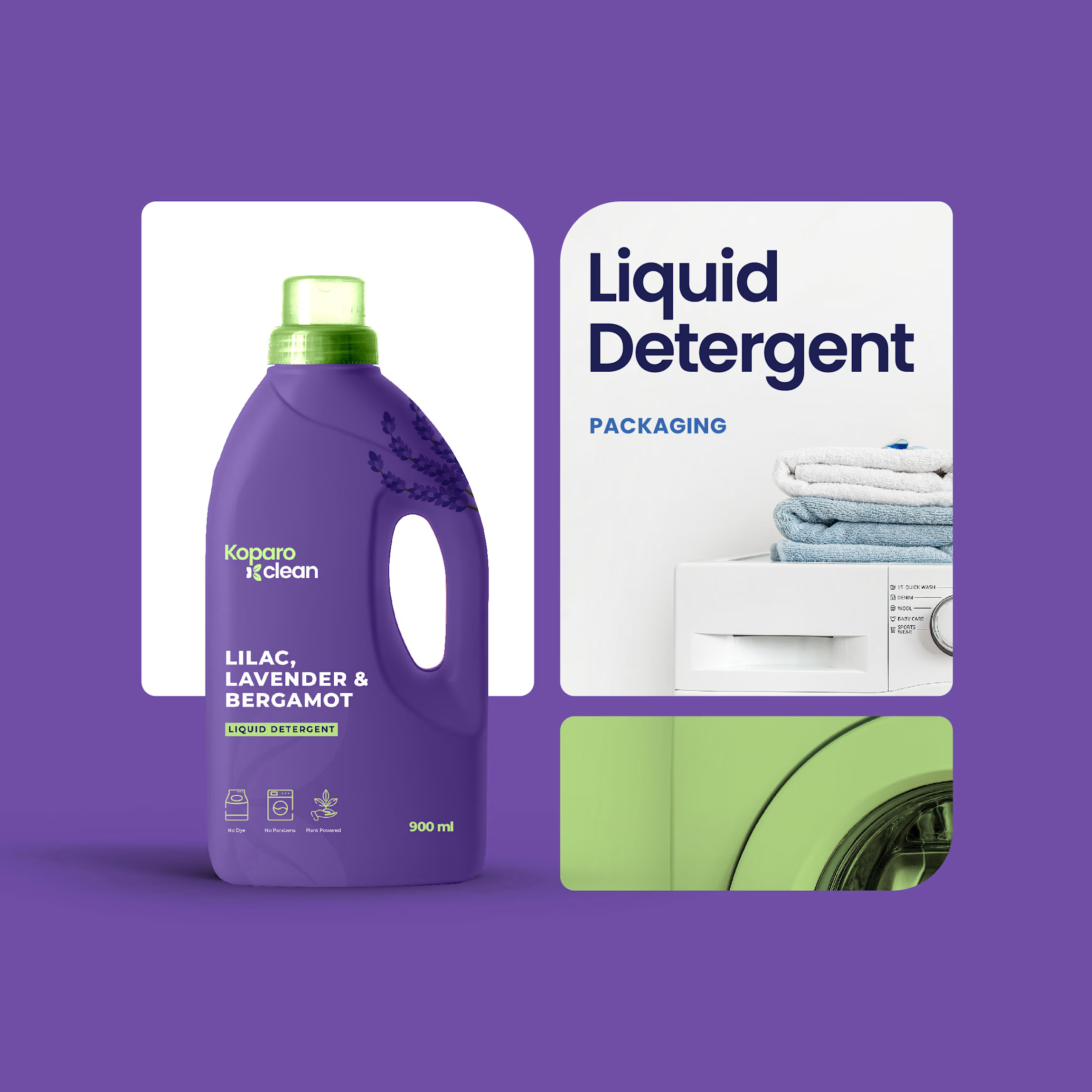
Packaging Design & Architecture: Engineered custom bottle shapes tailored for product utility, sleek rectangular bottles for handwashes to maximize shelf space, ergonomic handle jugs for liquid detergents, and clean cylindrical bottles for all-purpose sprays.
Visual Hierarchy & Labeling: Established a clean sans-serif typography system, product-benefit iconography (non-toxic, eco-friendly, pet-safe), and category-specific color coding for immediate product identification.
The Result
A modern, vibrant, and sustainable brand system that balances consumer usability with a premium, eco-friendly shelf presence.