The network for creativity
Join 1.25M professional creatives like you
Connect with clients, get discovered, and run your business 100% commission-free
Creatives on Contra have earned over $150M and we are just getting started
Back to feedPost

🚫 Most wellness websites are designed for aesthetics, not revenue.
And that’s exactly why they don’t convert.
Soft colors, calming fonts, beautiful layouts…
none of that matters if users don’t know what to do next.
Here’s the problem:
👉Most wellness sites feel like a moodboard — not a product.
👉No clear flow.
👉No real structure.
👉No frictionless way to book or pay.
So users scroll… hesitate… and leave.
Because calm design without clarity doesn’t build trust.
It creates confusion.
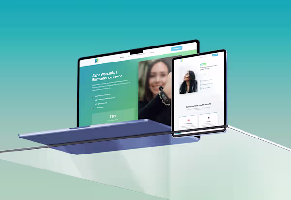
In this wellness platform, I focused on what actually drives results:
♻️A clear path from landing → service → payment
Seamless booking and integrated payments
Structure that guides users without overwhelming them
Design that supports action, not just aesthetics
Because in wellness, people aren’t just browsing, they’re deciding who to trust.
And if your UX doesn’t make that decision easy,
you’re losing clients.
👉 If your website looks beautiful but isn’t bringing clients,
it’s not your brand — it’s your UX.
Check it out anywere healing, a website where I apply correctly all of these UX strategies.


The network for creativity
Join 1.25M professional creatives like you
Connect with clients, get discovered, and run your business 100% commission-free
Creatives on Contra have earned over $150M and we are just getting started

Related posts

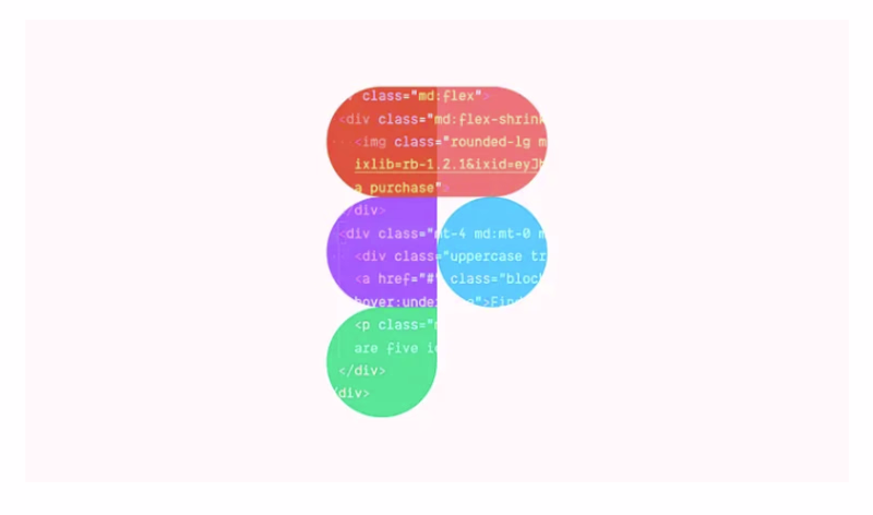
Forget Figma, AI is the new Design tool
When I joined Booking.com back in 2019, coding wasn’t a nice-to-have for UX designers, it was required. You simply couldn’t get hired at Booking.com without it. At the time, that felt like an outlier, almost extreme.
Six years later, it’s becoming the norm. Companies like Linear, Vercel, Cursor, and XAi have been quietly rewriting the designer job description and hiring “design engineers”. They want designers who can build and ship, not just push pixels.


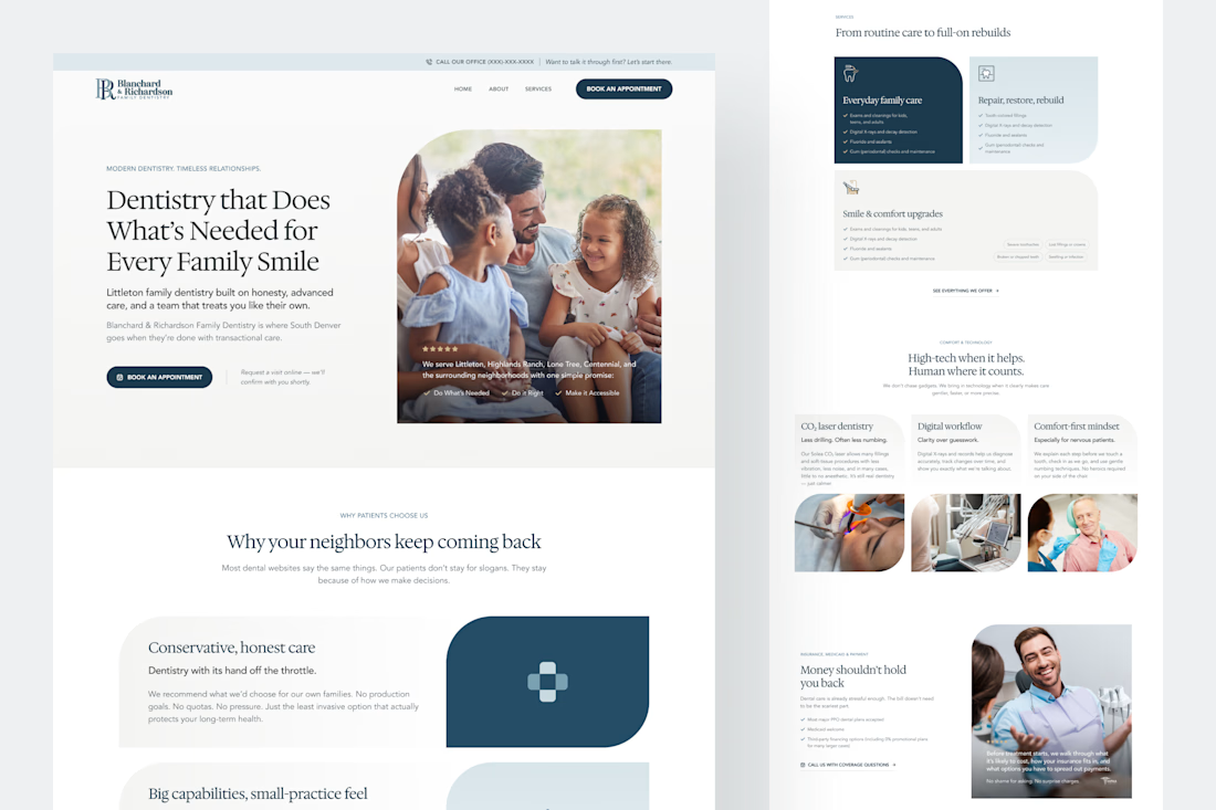
This dentistry website design we created gives clarity in under 3 seconds.
When you land on it, you immediately know who they are, what's offered, and what to do next.
Not every website needs the bells and whistles, but if you want more engagement and bookings, it needs design taste without distractions.
In short, if your website isn't clear, it's not converting.

Good job


Trending


Figma Make
Go from idea to prototype in minutes. What are you designing?
aivideo
AI video tools are moving at warp speed. Which ones are you experimenting with?
illustration
Handcrafted illustration is bubbling up across the web. What are you drawing lately?
aidesignflow
AI tools are redefining design work. What's your current workflow?
freelancerlife
Freelancer life is wins, pivots, and everything in between. What’s yours right now?