The network for creativity
Join 1.25M professional creatives like you
Connect with clients, get discovered, and run your business 100% commission-free
Creatives on Contra have earned over $150M and we are just getting started
Back to feedPost

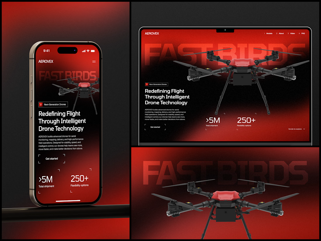
AEROVEX - Drone Technology Product Website
Hardware companies either go full corporate spec-sheet or full sci-fi movie trailer. There's rarely anything in between. This one finds the gap.
The typography is massive enough to set the tone but transparent enough to stay behind the hero. It's attitude parked underneath the product so the drone gets to be serious while the brand gets to be memorable.
The red gradient isn't random either. Look at the drone itself - there's a red accent plate on the body. The entire background palette is pulled from one physical detail on the hardware. That's how you make a color scheme feel inevitable instead of arbitrary. The site looks like it was born from the product.
#WebDesign #DarkUI #HardwareTech #ProductDesign #IndustrialDesign

The network for creativity
Join 1.25M professional creatives like you
Connect with clients, get discovered, and run your business 100% commission-free
Creatives on Contra have earned over $150M and we are just getting started








Related posts

Built something that isn’t client work for a change.
Flowkidz. Short games that teach kids design, websites, AI, code and internet safety.


From the cover to what’s inside 👀
Thank you to everyone who voted in my cover test. This time, I’m trying two short previews of DCS 654: my library of 654 dessert-inspired colors and matching textures, with ready-made palettes for your own design work.
Which video makes you more curious to explore the library: A or B?
And what made you choose that one?
You can take a closer look here: https://dcs.mariya.design/
36 voted
61%
23 voted
39%
59 votes
Closed


I’d pick B. It makes the colors and textures feel more engaging and makes me want to explore the full library.

Visual Direction for Zoah(an a16z
speedrun
company) — 10-Day Motion Sprint
Sound on
Core Focus:
✦ Agent Builder: Direct canvas manipulation flow.
✦ Design is Code: Seamless transition between frame & code.
✦ Vector & Canvas Collabration Branching: Fluid spatial micro-interactions and with dynamic, multi-threaded branch animation.
✦ Custom Spatial Audio: Tactile sound design built from scratch to complement every pixel movement.
From zero to a polished demo experience in 10 days.
*For reference only, all final product details , official announcements and brand details remain subject to Zoah's official release.
Designed & Animated by
@acream_1


A polished demo experience in just 10 days is seriously impressive, acream. The custom spatial audio built from scratch is a thoughtful touch. Zero to polished that fast is wild.