The network for creativity
Join 1.25M professional creatives like you
Connect with clients, get discovered, and run your business 100% commission-free
Creatives on Contra have earned over $150M and we are just getting started
Back to feedPost

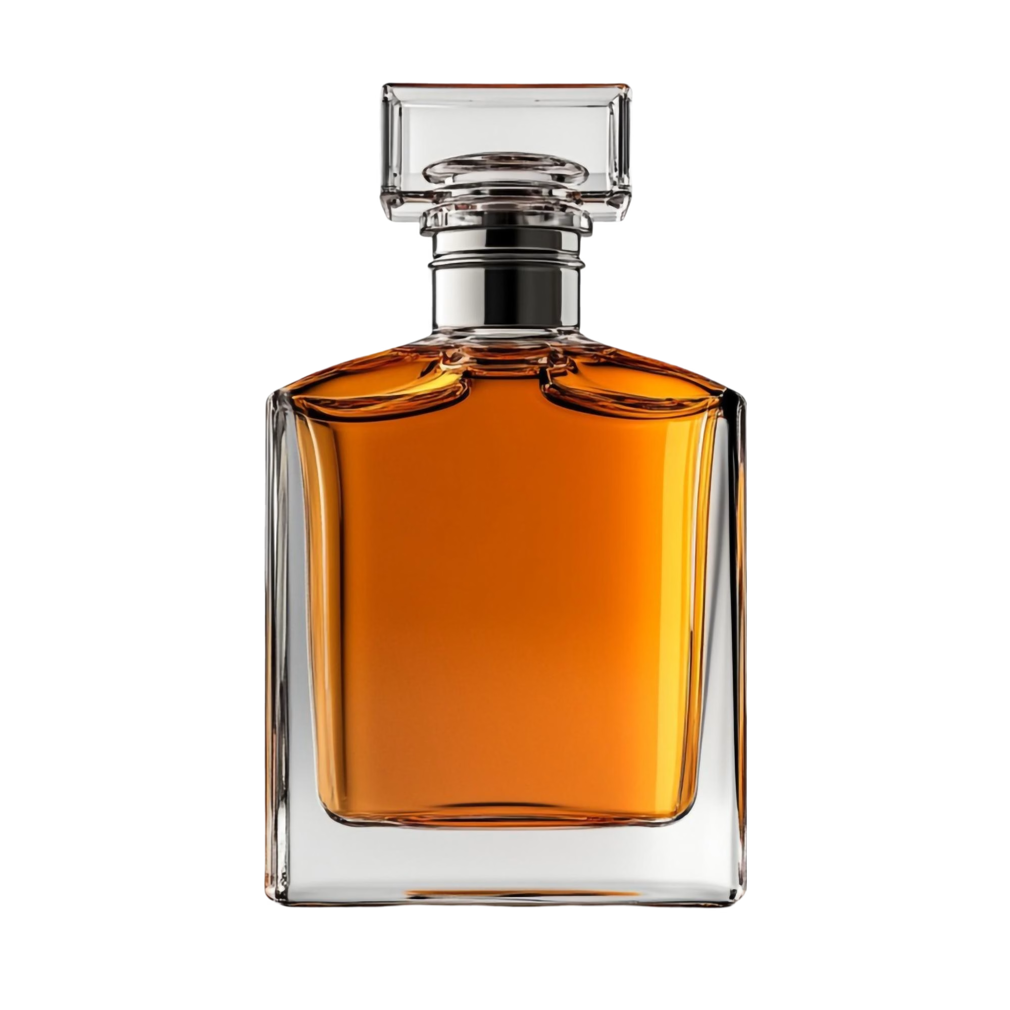
1. The Starting Asset
Started with just a raw transparent cutout of the glass bottle.
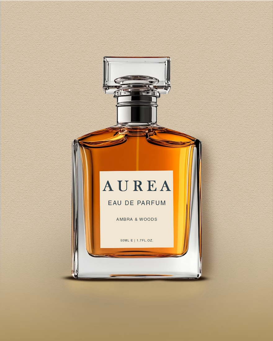
2. The Problem (Beige Background)
I initially placed it on a warm beige background, but the bottle looked like it was awkwardly floating in mid-air. It lacked depth and grounded realism.
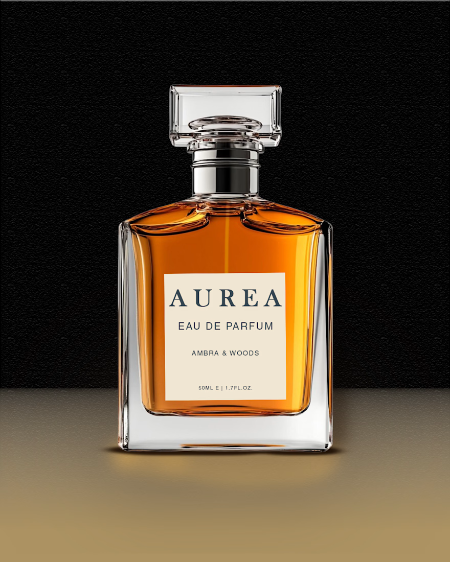
3. Grounding & Reflection
To fix the floating effect, I switched to a jet-black background and added a warm gradient across the bottom to establish a clear surface floor. I also researched and built a crisp glass reflection on the surface to make the bottle feel heavy and physically planted.
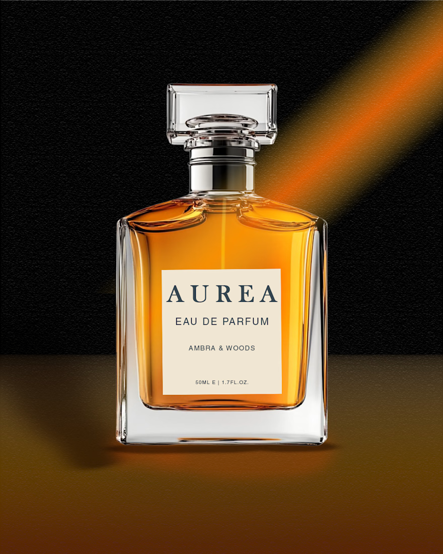
4. Lighting & Final Polish
To bring atmosphere into the frame, I added a dramatic orange light beam coming from the top-right corner. Then I adjusted the highlights and cast shadows across the glass to match the new directional light source, along with setting up the custom label layout.
Sometimes making a product look "expensive" comes down to how well you control the lighting and environment around it.
productvisualPhoto RetouchingadvertisingdesignGraphic DesignPhoto EditingVisual DesignAdobe PhotoshopGoogle Gemini


The network for creativity
Join 1.25M professional creatives like you
Connect with clients, get discovered, and run your business 100% commission-free
Creatives on Contra have earned over $150M and we are just getting started





Related posts

Light or dark, which one wins? ☀️🌙
Same site, two moods. Warm stone and lacquer red, or the same build after dark.
Both are hand-built with a 3D paper crumple, real physics, a stick-figure film drawn in code, and a receipt that gets a bicycle kick. 🔊 Sound on.
Tell me which you'd ship: light or dark? 👇
26 voted
59%
18 voted
41%
44 votes
Closed

I really like how the light version looks, but it has some legibility issues. Since readability is more important for users than visual appeal, I think the dark version is the better option.
BTW, I initially voted for the light version, but after analyzing both options more closely, I changed my mind 😄

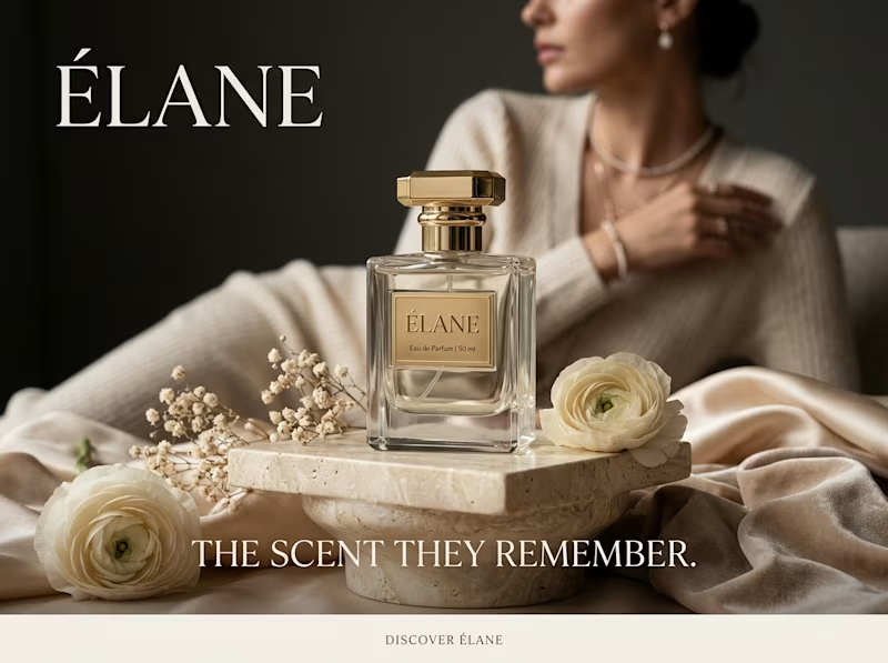
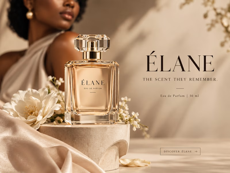
Same prompt. Same concept. Two AI tools. 👀
I gave ChatGPT and Gemini the exact same prompt to create a luxury perfume ad creative.
No changes. No extra instructions.
Now I want to know what YOU think:
Which creative did it better?
🔵 A— Gemini
🟣 B— ChatGPT
Look at the overall concept, visual quality, composition, typography, and how “ad-ready” it feels.
Who wins this round? 👀
Vote below and tell me what made you choose your answer.
#AIContent #AIAdvertising #AdCreative #CreativeStrategy #ChatGPT #Gemini #SocialMediaManager #SocialMediaStrategy #SocialMediaMarketing #MarketingStrategy #DigitalMarketing #ContentCreation
11 voted
39%
17 voted
61%
28 votes
Closed


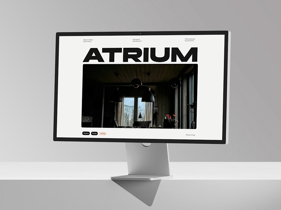
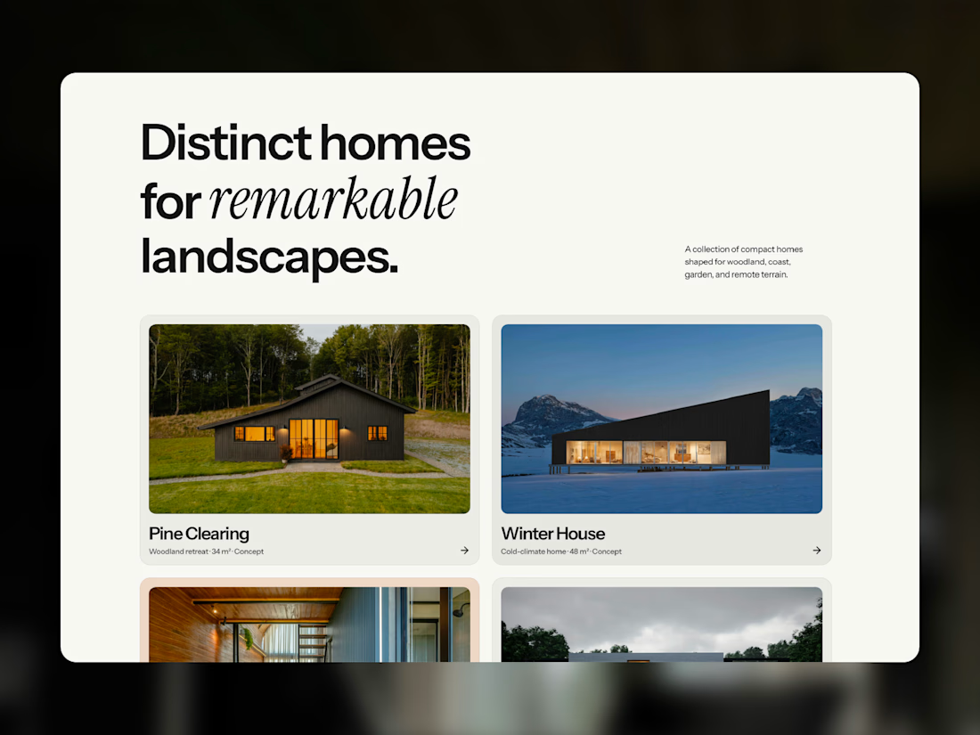
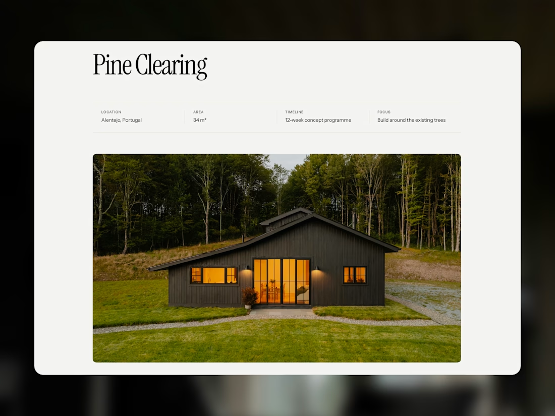
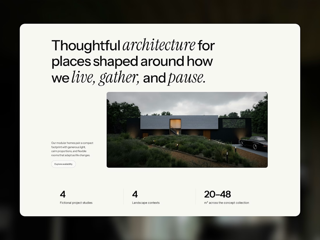
Meet Atrium Studio, my latest Framer template for architects, interior designers, and modular home studios.
Bold typography, generous whitespace, and immersive photography create an editorial feel that gives each project room to stand out. Dedicated garden room pages and a CMS project portfolio let you share the spaces you create and the thinking behind them.
Designed for desktop, tablet, and mobile, with reusable components and customizable colors and typography.
Take a closer look at Atrium, or make it your own.



But this feels too premium 🙄