The network for creativity
Join 1.25M professional creatives like you
Connect with clients, get discovered, and run your business 100% commission-free
Creatives on Contra have earned over $150M and we are just getting started
Back to feedPost

TNL Connects Logo Design
Project Overview
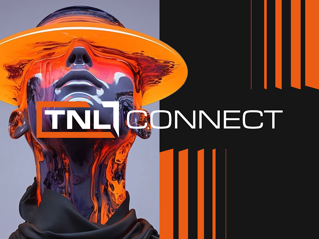
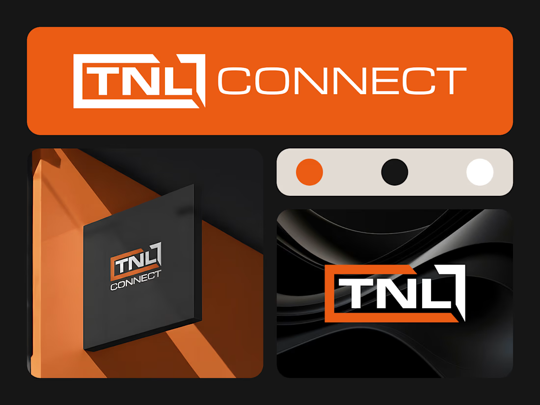
TNL Connects is a modern brand identity concept built around connection, technology, speed, and strong visual impact. The goal of this logo design was to create a bold and memorable identity that feels professional, digital, and future-focused.
The design uses a sharp custom wordmark, strong contrast, and a vibrant orange accent to create a confident brand presence.
The Challenge
The main challenge was to design a logo that feels modern and connected without becoming too generic. Instead of using common network icons, globe symbols, or simple connection dots, the logo needed a stronger and more ownable visual style.
The identity had to feel bold, clean, and recognizable across digital platforms, brand presentations, social media, and marketing materials.
Design Direction
The visual direction focused on a strong technology-inspired identity with a clean and structured layout.
Key design attributes:
Modern
Bold
Tech-focused
Professional
Energetic
Clean
Sharp
Confident
Memorable
Logo Concept
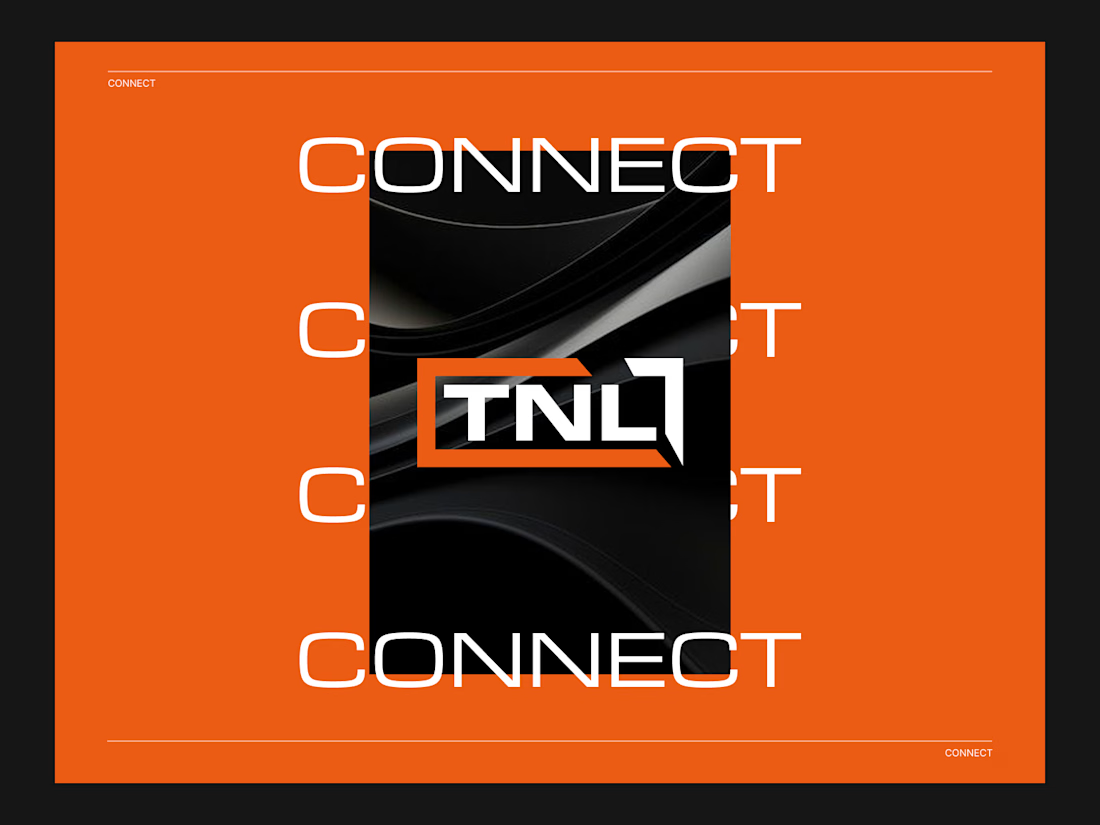
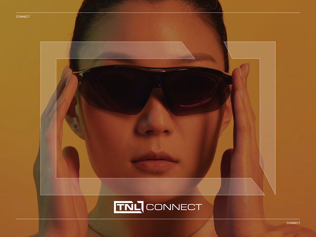
The final logo concept is based on a custom TNL wordmark enclosed within a sharp geometric frame. The frame creates a sense of structure, movement, and connection, while the bold typography gives the identity a strong and professional look.
The orange angular element adds energy and direction, making the logo feel active and forward-moving. Combined with the black and white contrast, the logo creates a premium and technology-driven appearance.
Color Palette
The color palette uses a bold combination of orange, black, and white.
Orange represents energy, innovation, and action.
Black gives the brand a premium, powerful, and professional feel.
White creates clarity, contrast, and modern simplicity.
This color combination helps the logo stand out strongly across both digital and print applications.
Typography
The typography style is sharp, modern, and geometric. The letterforms were designed to feel strong and futuristic without becoming too complex or hard to read.
The custom “TNL” mark gives the brand a unique visual identity and helps it remain recognizable even when used without supporting text.
Visual Presentation
The logo presentation uses a bold orange background, repeated “CONNECT” typography, and a dark central composition to highlight the identity. This creates a strong brand atmosphere and gives the logo a modern, high-impact look.
The overall presentation feels suitable for a tech brand, communication platform, networking business, or digital connection-based company.
Final Outcome
The final TNL Connects logo delivers a bold, sharp, and modern identity. It creates a strong visual impression through custom typography, high contrast, and a confident orange accent.
The result is a clean and scalable logo system that feels professional, energetic, and ready for digital-first brand applications.


Nice visuals!
The network for creativity
Join 1.25M professional creatives like you
Connect with clients, get discovered, and run your business 100% commission-free
Creatives on Contra have earned over $150M and we are just getting started





Related posts

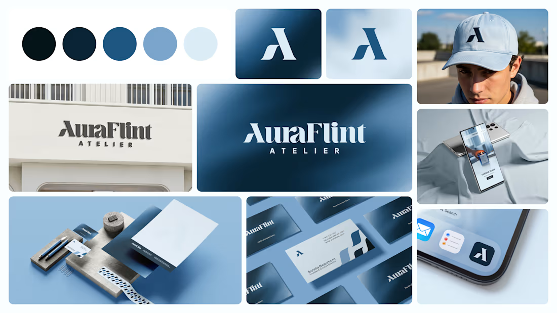
Logo Design & Brand Identity created for Auraflint Atelier — a scent & fragrance brand.
©2025

I liked colour palette.


Hero exploration for an AI Startup - Orbio.
- Editorial serif caps
- Marble statue as the hero
- A live 01 grid reacting to mouse
- Different highlight color for each division


a different highlight colour per division is such a clean system move. the live 01 grid reacting to the mouse is a nice touch too

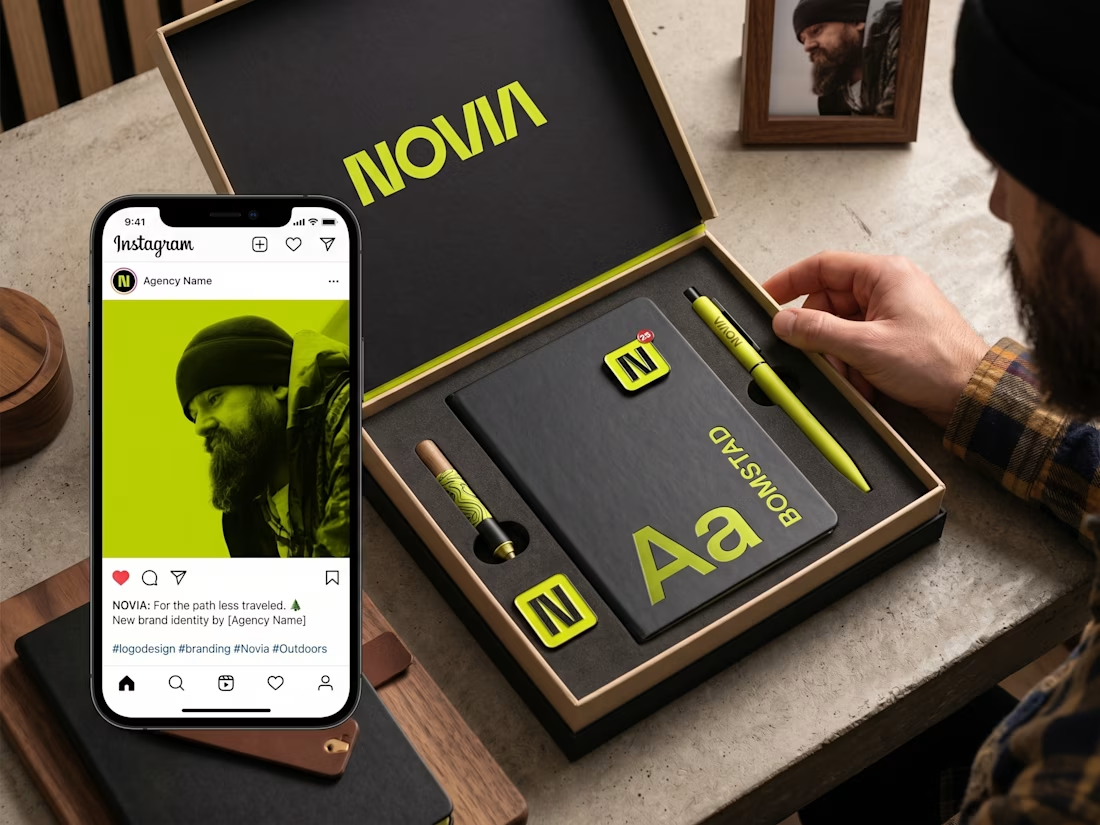
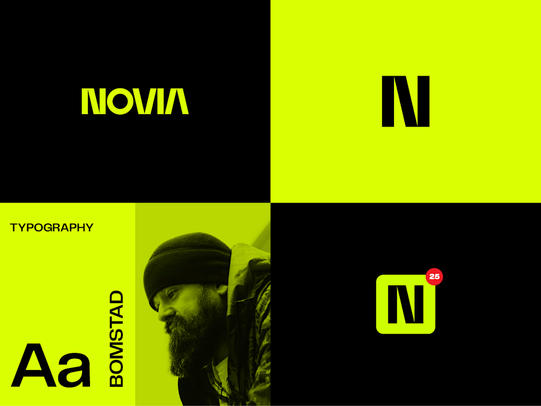
✨ Recent Work | Logo Design for Novia
Recently completed a logo design project for Novia, creating a distinctive and modern mark that gives the brand a clear visual identity.
The goal was to develop a logo that feels clean, memorable, and versatile — one that can work confidently across digital platforms, print materials, marketing assets, and future brand applications.
I focused on creating a strong balance between simplicity and personality, with careful attention to typography, proportions, visual balance, and scalability.
Project: Logo Design
Client: Novia
Services: Logo Design • Visual Identity • Typography • Brand Direction
Another identity project where a simple mark is designed to give a brand a strong and recognizable starting point.
#LogoDesign #BrandIdentity #Branding #VisualIdentity #GraphicDesign #LogoDesigner #CreativeDesign #BrandDesign #Novia