The network for creativity
Join 1.25M professional creatives like you
Connect with clients, get discovered, and run your business 100% commission-free
Creatives on Contra have earned over $150M and we are just getting started
Back to feedPost

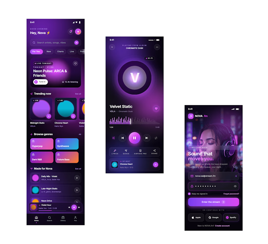
The first screen pulls you into a futuristic world with glowing purple neon cards, smooth glass effects, and immersive music categories that instantly set the vibe.
Then the player screen becomes the emotional center of the experience — bold artist visuals, animated waveforms, soft gradients, and cinematic lighting that make listening feel personal and premium.
And finally, the login screen delivers that strong first impression with a sleek cyberpunk aesthetic, glowing buttons, dark futuristic backgrounds, and clean modern layouts that make the app feel next-level before users even sign in.
Overall, the design combines Spotify style usability with a futuristic Gen-Z visual identity modern, immersive, and built to feel like the future of music streaming.”

Stunning!
The network for creativity
Join 1.25M professional creatives like you
Connect with clients, get discovered, and run your business 100% commission-free
Creatives on Contra have earned over $150M and we are just getting started











Related posts

From Xerox-inspired print to an interactive digital experience.
What happens when you take a printed music report full of personality and bring it to life on the web?
That was the challenge behind SoundCloud’s Music Intelligence Report 2026: turning a bold, print-inspired editorial piece into a digital experience that feels just as distinctive, tactile, and engaging as the original.
From the Xerox-inspired textures and expressive layouts to the animations, transitions, navigation, and interactive timeline, every detail was designed to make the experience feel alive — inviting people to explore, discover, and enjoy the content at their own pace.
I designed the experience in Figma and led the development process, working to bring the original vision to life with as much fidelity as possible, down to the smallest details in spacing, motion, and interaction.
The result is an immersive, responsive editorial experience that brings music insights to life through design, movement, and storytelling.
Take a look around and explore the full experience.
Role: Digital Product Design, UI/UX, Interaction Design & Development Direction


Some onboarding screens from Slab, an app I’m designing for card collectors.


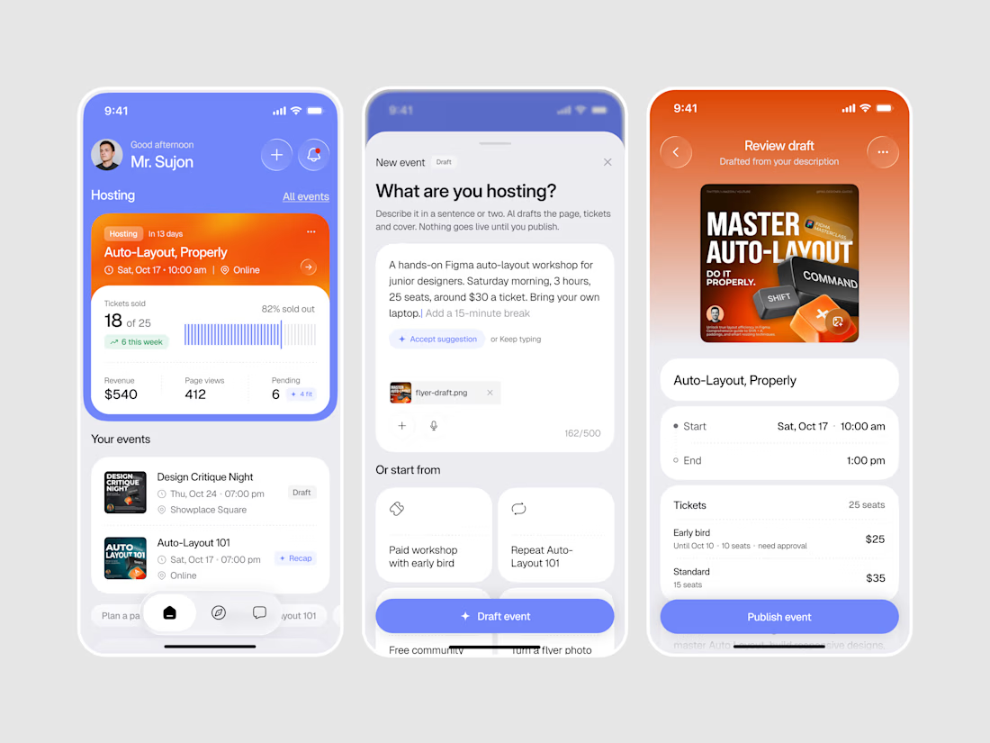
Designed a modern AI Event Hosting Mobile App.
A bright periwinkle blue interface with bold orange event cards and clean, friendly typography for a fresh and energetic first impression.
A clear hosting dashboard with tickets sold, revenue, and page views, plus an AI flow that turns a short description into a full event page, tickets, and cover, make hosting feel quick and effortless. Soft rounded cards, smart suggestions, and a floating tab bar keep the whole app simple and easy to use.