The network for creativity
Join 1.25M professional creatives like you
Connect with clients, get discovered, and run your business 100% commission-free
Creatives on Contra have earned over $150M and we are just getting started
Back to feedPost

Excited to be working again, this time on VÉLYX! 🙌
After AELYA, it's great to be building another brand together. Looking forward to bringing VÉLYX's visual identity to life! ❤️


NEW PAID PROJECT
Raghav GoyalTaoufik Houmadi
The network for creativity
Join 1.25M professional creatives like you
Connect with clients, get discovered, and run your business 100% commission-free
Creatives on Contra have earned over $150M and we are just getting started



Related posts

Proper Form — Social Media Branding System
A flexible social media system created for Proper Form as part of the wider brand identity.
The template system was designed to adapt across different post formats, banners and platforms while maintaining a consistent visual language.
Rather than repeating one rigid layout, the system gives the brand room to vary composition, imagery and content while remaining clearly recognizable.
Created by Lepisov Branding in collaboration with Creative Mints.
Logo design: Ilya Gorchanyuk
Creative direction: Dmitry Lepisov
Brand identity + social system: Lepisov Branding × Creative Mints


This is how a social system should work: strong enough rules that the brand reads at thumbnail size, loose enough that the feed never looks copy-pasted. Do you hand clients a Figma kit for this, or build it in something their team edits themselves?

🍔 BITE BOX — Where Every Bite Brings a Smile! 🧡
A fun, fresh, and memorable logo concept designed for a modern fast-food brand. The smile icon represents happiness, while the bold typography creates a friendly and recognizable identity. 🍟✨
#LogoDesign #FoodBranding #GraphicDesign #BrandIdentity #LogoDesigner


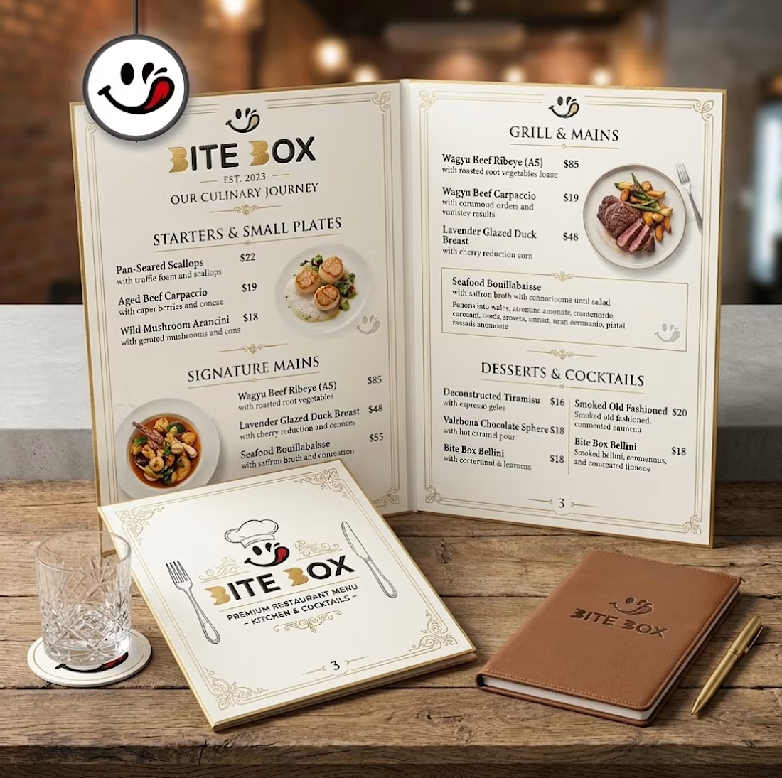
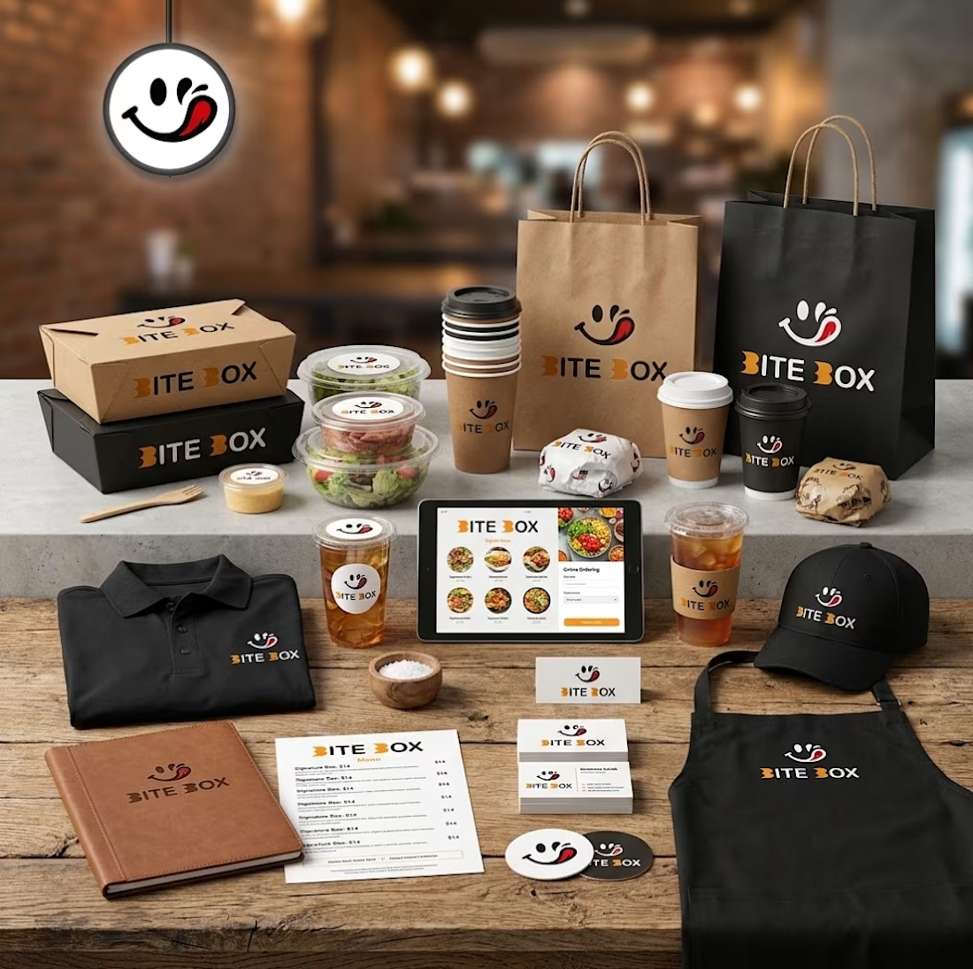
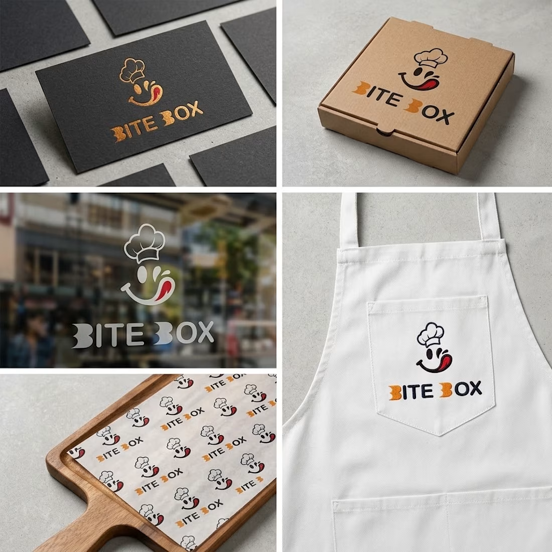
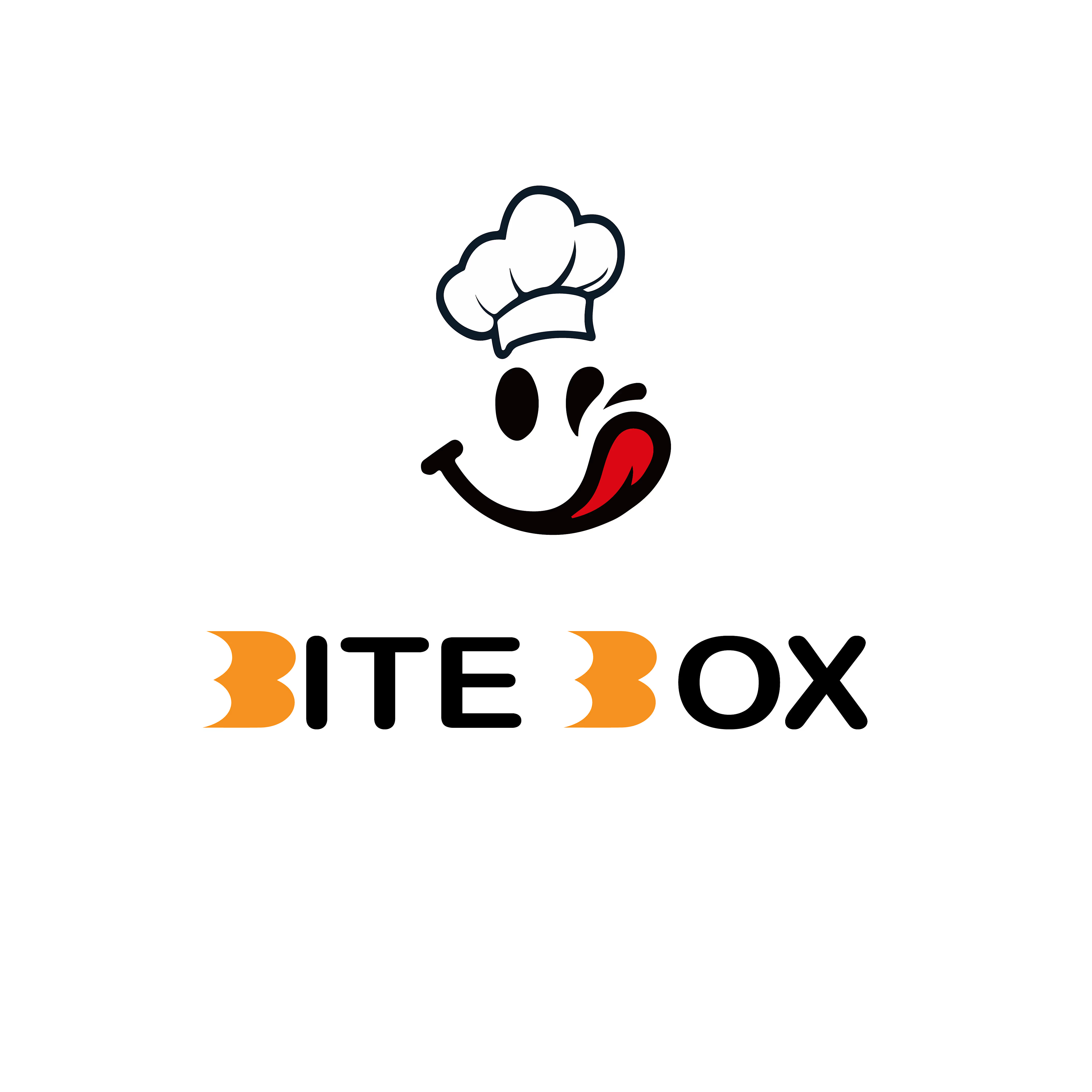

Creative concept with a fun and memorable brand identity!


A little throwback to one of our favorite collaborations with Lion Pose! 🧡
We worked with the founders to bring their vision to life through core brand identity, logo, and packaging design, creating a bold, playful visual language that feels fresh in the skincare space.
So lovely to see Lion Pose grow from its early days to the shelves of Sephora, with our packaging work recognized at the 2024 Dieline Awards!


Nice work


