The network for creativity
Join 1.25M professional creatives like you
Connect with clients, get discovered, and run your business 100% commission-free
Creatives on Contra have earned over $150M and we are just getting started
Back to feedPost


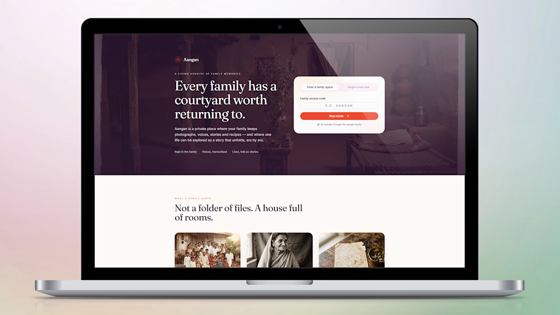
Aangan — A Living Archive of Family Memories
A home for the stories, photographs, voices, and traditions that make a family unique.
Aangan is a digital experience designed to bring families closer by preserving their memories in one meaningful, private space.
Inspired by the warmth of traditional Indian homes and the nostalgia of family courtyards, the platform reimagines how families can collect, explore, and pass down their stories across generations.
Rather than feeling like another cloud storage platform, Aangan creates the experience of walking through a house filled with memories — where every photograph, voice recording, recipe, and story has a place.
Design Highlights
Emotional Storytelling: A warm, nostalgic visual identity inspired by Indian family heritage.
Elegant UI Design: A refined combination of editorial typography, earthy tones, and immersive imagery.
Intuitive User Experience: A simple entry experience for creating or accessing private family spaces.
Memory-Centric Interface: Organizing family photographs, recorded voices, stories, and recipes into meaningful collections.
Cultural Inspiration: Bringing the feeling of an Indian courtyard into a modern digital experience.
The Vision
To transform the way families preserve their history — making memories more than just stored files, but stories that can be experienced, revisited, and shared across generations.
Aangan — Every family has a courtyard worth returning to.


Love this idea.
The network for creativity
Join 1.25M professional creatives like you
Connect with clients, get discovered, and run your business 100% commission-free
Creatives on Contra have earned over $150M and we are just getting started
Related posts

New on Contra, not new to design.
I draw logos by hand, then build everything around them: the brand, the website, the store. Lately I also make product films and ads with AI.
Recent work: an RY monogram and site for a Koreatown law firm, a winged W for a defense firm, and my family's golf eyewear brand, from the mascot to Shopify.
Starting a brand, or have one that doesn't feel like you yet? Show me what you're building.

The logo-led system reads tight because the wordmark sits clean in the negative space instead of fighting the emblem — when a brand has that kind of restraint, the Shopify store usually carries the same hierarchy into the product grid and checkout without inventing new rules....


I felt something was off with my own website.
Too plain. Not how I envisioned the brand.
So I added more creative touches and built a real story into it. Now everything makes sense.
It finally feels like Outredge 🚀
https://outredge.com/


That big bold wordmark with the corner brackets gives it so much more character. "A marketing site as good as your product" is a strong line too, says exactly what you do.

The contact page is usually the last page anyone designs.
We made it one of the best
Recent client work: a contact section UI design for a company with offices across cities. Globe in the back, every location up front, and small interactions that make the whole web design feel alive.


Impressive work