The network for creativity
Join 1.25M professional creatives like you
Connect with clients, get discovered, and run your business 100% commission-free
Creatives on Contra have earned over $150M and we are just getting started
Back to feedPost

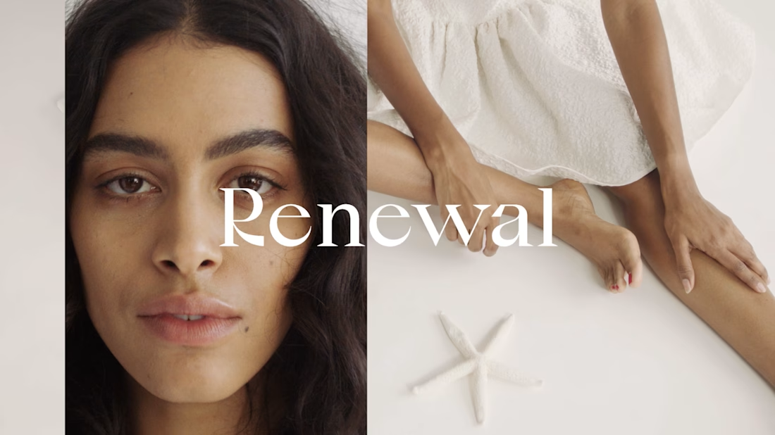
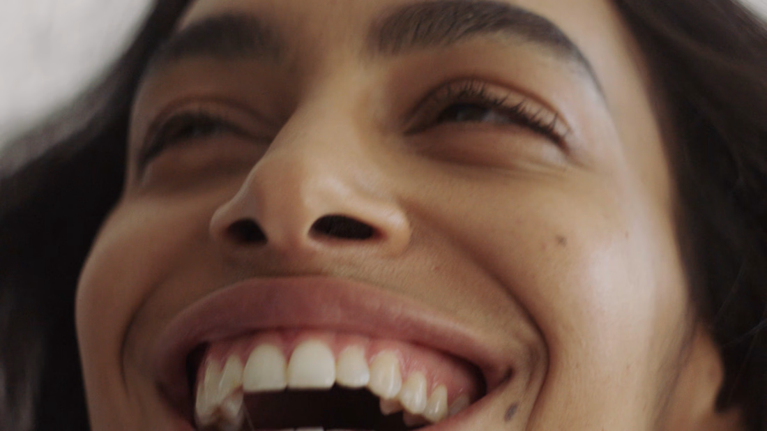
Ad for fashion brand Renewal directed by Brigitte Sire 🔥


The network for creativity
Join 1.25M professional creatives like you
Connect with clients, get discovered, and run your business 100% commission-free
Creatives on Contra have earned over $150M and we are just getting started




Related posts

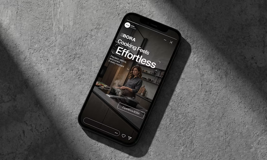
BORA – Ad Creative Concept
Most kitchen appliance ads sell you the warm family dinner. I wanted to try the opposite.
Built this BORA concept as a portfolio piece, treating the product like architecture instead of tech – dark marble, concrete, no hands, no food styling. Just a pot, steam, and silence.
The steam does all the movement in the motion piece. Typography stays out of the way – one line, low CTA, nothing fighting the composition. Turns out when you strip out the lifestyle, the price point sells itself.




meet my first draft of a video edit for A TIGER CUB, founded by eric, who's a young man with a monumental & meaningful goal: he's committed to showcasing the beauty of culture in community through 100 experiences in atlanta. this is all footage from the dragon boat festival, not captured by myself (shoutout to kadin), but retold through glimpses of the variety the event offered to attendees & eric's participation through storytelling & crafting at his vendor booth!
come rain or come shine, when people show up to support one another, magic happens.


The community-focused story feels authentic.

First video ad for thegoatdebate.io (my Messi vs Ronaldo paid poll — $1 = 1 vote, you get a card), made entirely in Higgsfield.
It's hard. Way harder than I expected. Also the most fun I've had on this project.
Yes, it looks AI. I know. Ignore that for a second — what I actually want to know is whether the idea lands: someone says "you're not even a real fan", the other guy doesn't argue, just shows his card.
Does that make you want to click, or is it too subtle?


That conflict to proof hook is solid. Showing a live card graphic right after the flex will instantly convert that viewer emotion into paid votes.