The network for creativity
Join 1.25M professional creatives like you
Connect with clients, get discovered, and run your business 100% commission-free
Creatives on Contra have earned over $150M and we are just getting started
Back to feedPost
Taste Test

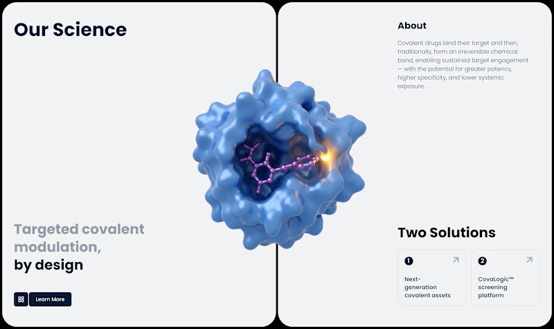
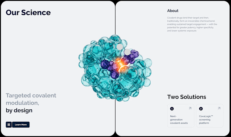
Which of these block variations in the Biotech Website do you prefer?
18 votes
Ends in 23h

Wonderful design !

The teal molecule reads a bit more clinical and trustworthy to me for a biotech brand, the blue leans slightly more generic tech. Is this block going right under the hero, and if so does the molecule color need to match anything earlier on the page?
Hi, thanks a lot for the comment!
Personally, I prefer the version with the blue molecule. It actually looks much more like a protein structure.
Regarding the color matching, the first variation actually works better since it uses the brand colors. However, I don't think it's...
Good call on positioning, if it's the third or fourth block down the brand color match matters less since you're further from the hero's first impression. Makes sense that blue reads more like an actual protein structure too, that's probably worth more than strict brand consistency at that point in the page.

One of the best designs I’ve seen today. Really solid work 👏 Variant 2 has a beautiful structure that would feel amazing on canvas.

Yurii it's hard to decide both are great 😊

Super polished!

Varian 1
The network for creativity
Join 1.25M professional creatives like you
Connect with clients, get discovered, and run your business 100% commission-free
Creatives on Contra have earned over $150M and we are just getting started
Related posts

37 votes
Ends in 20h

Butterfly mood looks incredibly immersive and lively!🔥

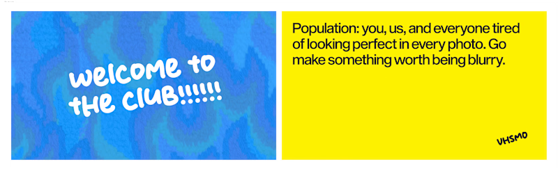
We're working with a digicam brand right now. We're following a retro modern approach to branding. I need HELP with picking Thank You cards.

3 votes
Ends in 17h
Actually both are great 😃

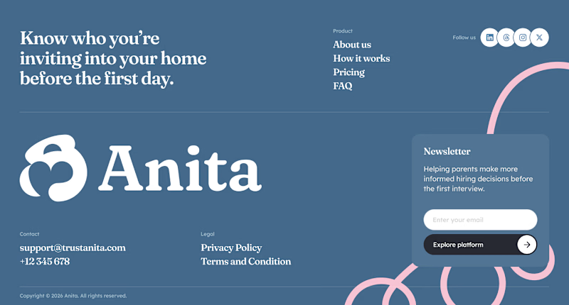
Which footer should I present to the client? 🤔
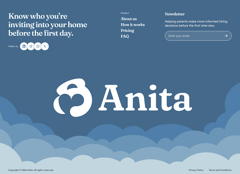
23 votes
Ends in 1d

Footer 2






Trending

Claude
Claude has entered the design space. How are you using Claude Design?

Contra University
Learn from expert creatives how to earn more using next-gen AI tools.
fifaworldcup2026
The World Cup is here and the whole world's watching. How are you designing for the world stage?
creativeaiflow
Creative AI workflows are evolving. What tools do you use, and what are their strengths and weaknesses?
freelancerlife
Freelancer life is wins, pivots, and everything in between. What’s yours right now?