The network for creativity
Join 1.25M professional creatives like you
Connect with clients, get discovered, and run your business 100% commission-free
Creatives on Contra have earned over $150M and we are just getting started
Back to feedPost
Book Design | Cover Design | KDP Formatting
I recently worked on the book design for Navigating the Waves: Embracing Homebirth With Confidence, creating a visual identity that reflects the book’s themes of birth, confidence, ancestral wisdom, and empowerment.
The design combines a soft, calming color palette with a pregnancy-inspired visual element to create a warm and welcoming feel while keeping the overall presentation professional and readable.
For the full cover, I focused on maintaining consistency across the front cover, spine, and back cover, while making sure the author information, book description, and biography were clearly structured.
What I focused on:
📖 Full-wrap book cover design
🎨 Cohesive color and typography selection
✍️ Professional text hierarchy and layout
📐 Print-ready KDP formatting
👩🏾🍼 Visual direction aligned with the book's subject
📚 Front cover, spine, and back cover consistency
The goal was to create a cover that feels personal, empowering, and connected to the subject matter, while still looking polished and professional for publication.
Have a manuscript that needs professional book design, formatting, or a publication-ready cover? I can help bring it together from manuscript to final KDP-ready files.


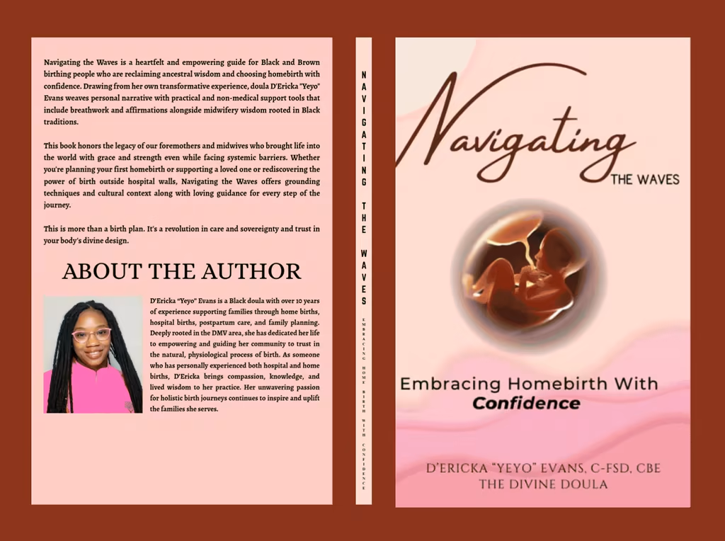

Book cover deesign
The network for creativity
Join 1.25M professional creatives like you
Connect with clients, get discovered, and run your business 100% commission-free
Creatives on Contra have earned over $150M and we are just getting started

Challenges
View all


Related posts


👍

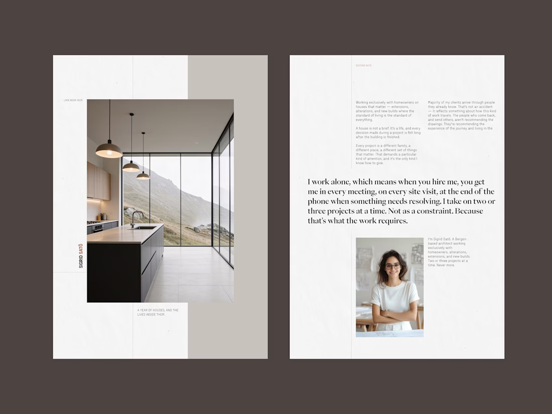
Sigrid Satō - Look book (01)
A self initiated project. The look book is project specific, it goes beyond the website case studies, detailing the steps taken, her decisions, challenges and important information for the client to consider in moving forward. The prospective client receives the look book after the first call, thus allowing Sigird to match the provided look book to the clients project.

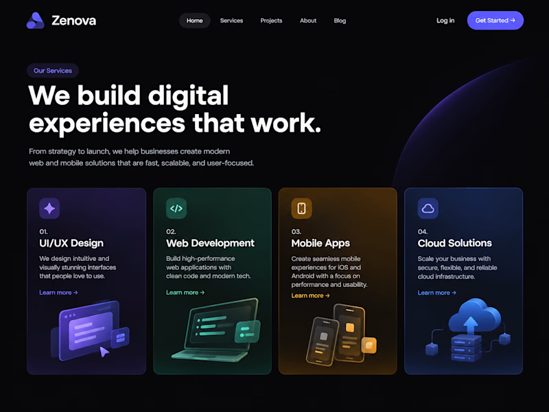
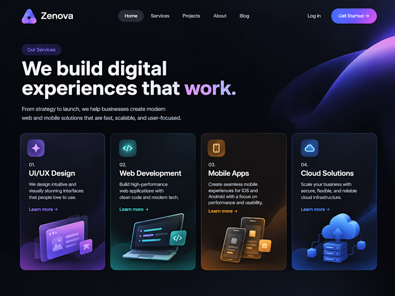
Same copy, two designs - does layout really change how it reads?
What's your first reaction - left or right?

1 voted
33%
2 voted
67%
3 votes
Closed

The copy stays constant, but the type scale and card rhythm make the two directions feel genuinely different. I’m leaning left—the tighter headline width gives the first screen a calmer reading path.