The network for creativity
Join 1.25M professional creatives like you
Connect with clients, get discovered, and run your business 100% commission-free
Creatives on Contra have earned over $150M and we are just getting started
Back to feedPost

Creative Advertising & Outdoor Branding Design
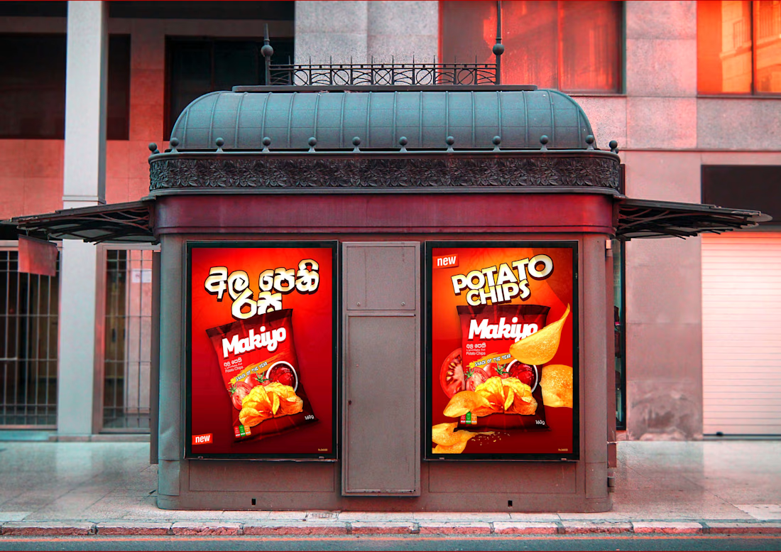
A creative outdoor advertising design for Makiyup Potato Chips, featuring bold colours, attractive product images, and eye-catching layouts. Designed to grab attention and promote the product in public spaces.😍


The network for creativity
Join 1.25M professional creatives like you
Connect with clients, get discovered, and run your business 100% commission-free
Creatives on Contra have earned over $150M and we are just getting started



Related posts

LUMINA - Premium Skincare Cream Packaging & Label Design
Minimalist and elegant cosmetic jar label design created for a luxury skincare brand. Focused on clean typography, premium branding, and aesthetic product presentation.


The gold rule under the wordmark does a lot of work on a label this restrained. Did you try the claim line in a lighter weight, so the product name and descriptor separate a bit more?

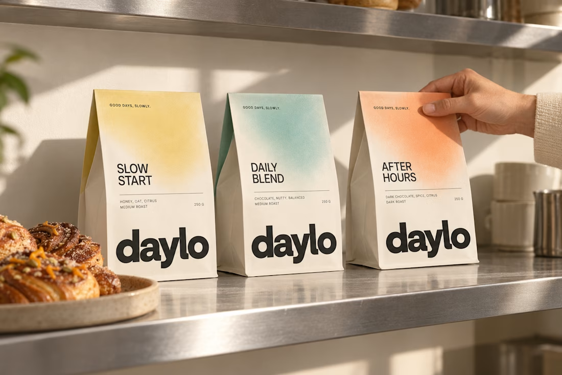
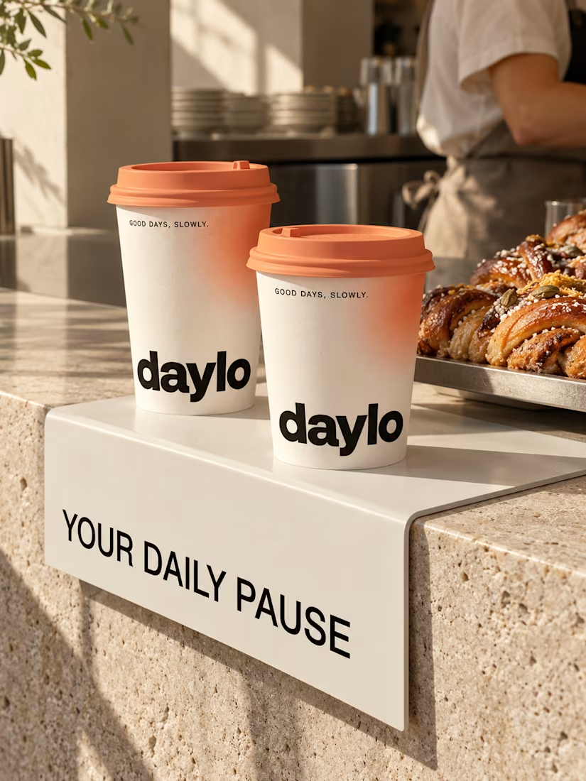
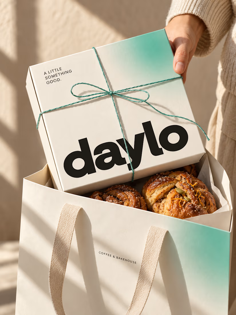
☕ Meet DAYLO - A minimalist coffee branding concept featuring bold typography, warm neutrals, and soft colors designed to make every cup feel a little more special. 🤎
Explore the full project on my Contra profile and let me know your thoughts!




Good branding isn’t just about how a logo looks. It’s about what it represents.
Sharing one of our recent projects: NEXU, a fintech brand identity built around connection, trust, and opportunity.
The idea was to create a visual identity that makes finance feel more human and approachable. The symbol brings together the gesture of reaching out and the strength of a bridge, representing the connection between people, capital, and opportunity.
From the logo concept to the broader visual identity, every detail was designed to communicate confidence, clarity, and progress.
It’s always rewarding to see how a simple visual idea can tell a much bigger story.
Would love to hear what you think!
Check it out
#BrandIdentity #LogoDesign #Fintech #BrandDesign #ContraCommunity

Such a thoughtful concept! Making finance feel more human and approachable through design is a great way to build connection and trust.


