The network for creativity
Join 1.25M professional creatives like you
Connect with clients, get discovered, and run your business 100% commission-free
Creatives on Contra have earned over $150M and we are just getting started
Back to feedPost

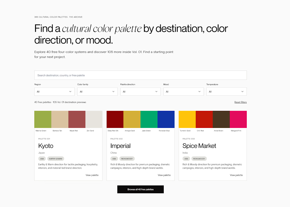
I've been sharing parts of my 365 Cultural Color Palettes, but the bigger project is actually the archive behind them.
I wanted it to be more useful than a gallery of pretty swatches, so each public palette is built as a practical reference for designers.
You can:
• copy the colour values
• see HEX, RGB, CMYK and Pantone references
• save/print the palette as a PDF
• see the four colours as a connected system rather than isolated swatches
I’m still refining the archive, and this is exactly the kind of thing I’d love other designers to test.
If you landed on one of these pages during a real branding project, what would you want to do next?
What’s useful? What’s missing? What feels unnecessary?



this is brilliant, i love!
Love that you love it! Feel free to test it out and share what you liked or didn't, as I am genially interested in getting more feedback if this is a useful resource or not.
The network for creativity
Join 1.25M professional creatives like you
Connect with clients, get discovered, and run your business 100% commission-free
Creatives on Contra have earned over $150M and we are just getting started

Challenges
View all


Related posts

I am gathering cool references for my own work as a Motion Designer, and this one caught my eye this week.
Day 3 of 60-days-collecting-awesome-motion-design-references
I love the way this is designed, based on abstract shapes and concepts with a coding visual language that we are all already familiar with. This is a great reference in this modern era where we deal more and more with products and services that live on the internet, not on a physical product.
This animation was created by Odd Fellows in collaboration with Figma.


60 days of references is a serious commitment. Curious, are you mostly drawn to the same visual language each time, or does it shift a lot depending on the day?

Someone said FOOTER?
If you need a website that reflects your brand, I got one spot available for September 🙌


Boooom Mattia this is one crazy footer!! 🙌

Ledger — AI CFO Platform
Ledger is an AI platform that acts as an always-on Chief Financial Officer for founders — connecting to accounts, learning cash rhythm, and surfacing risks before they become real problems. I designed the full landing page.
My role: UI/UX Design
Scope: Landing page
Financial tools for founders usually feel either cold (dashboards) or intimidating (accounting software).
For Ledger, we borrowed from old-world institutional finance instead — serif type, oil-painting textures, classical architecture — so an AI CFO feels like real authority, not another app.


This color pallet works so well with data and makes everything look premium. love it!