The network for creativity
Join 1.25M professional creatives like you
Connect with clients, get discovered, and run your business 100% commission-free
Creatives on Contra have earned over $150M and we are just getting started
Back to feedPost

Spotify Data Analysis
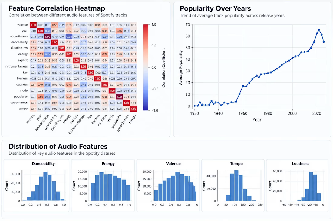
Analyzed a Spotify tracks dataset using Python to understand patterns in music features and popularity.
I cleaned and explored the data, looked at relationships between different audio features, and created visualizations to make the findings easier to understand.
What I explored:
Correlation between audio features
Popularity trends over the years
Distribution of danceability, energy, valence, tempo, and loudness
Relationships between different characteristics of tracks


The network for creativity
Join 1.25M professional creatives like you
Connect with clients, get discovered, and run your business 100% commission-free
Creatives on Contra have earned over $150M and we are just getting started

Challenges
View all


Related posts

Sometimes it’s hard to visualise data clearly without overwhelming users, but that’s what we aim for.
A snippet from daily design explorations using Magicpath and Figma.


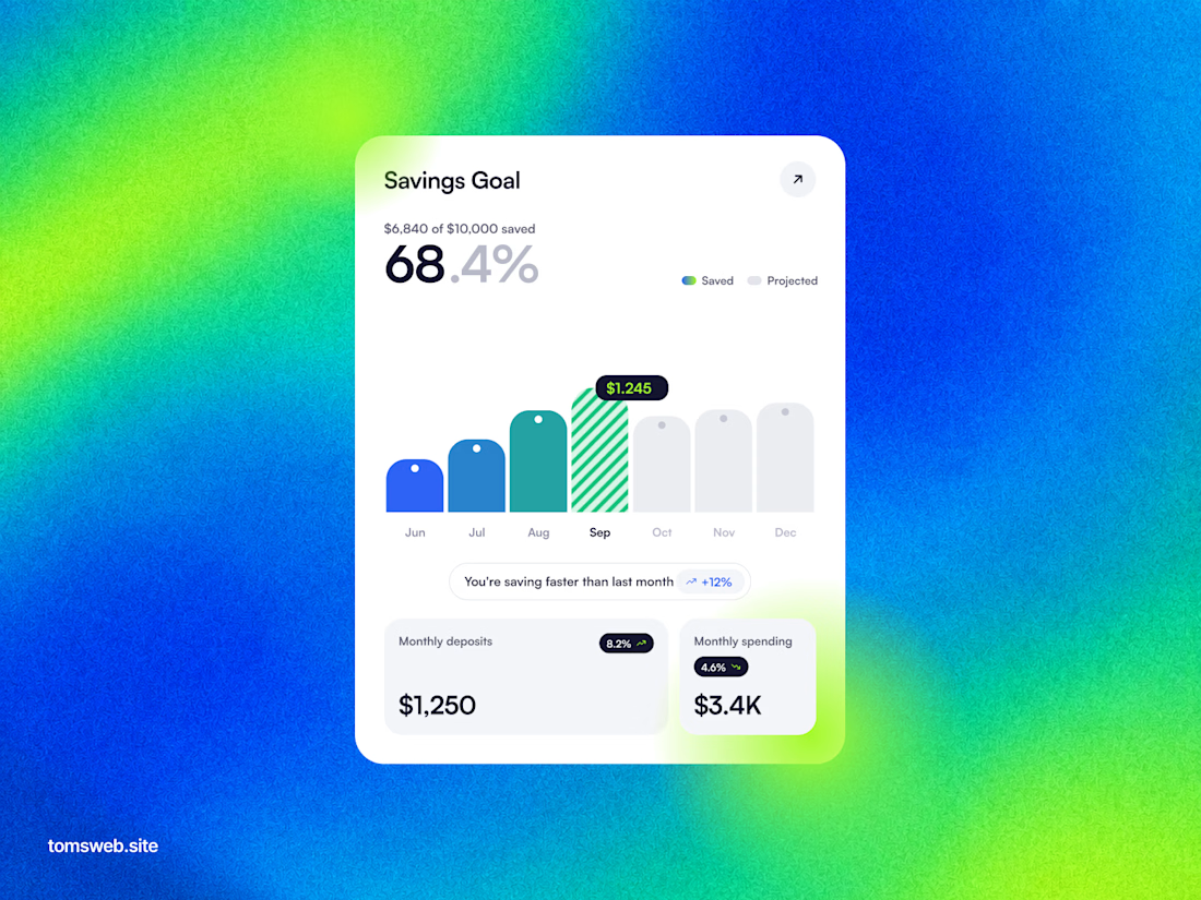

The chart keeps the progress story legible without turning the dashboard into a wall of metrics. The bright gradient is a bold backdrop, while the centered white card gives the key numbers a clear focal point.


Check this out what stood out to you

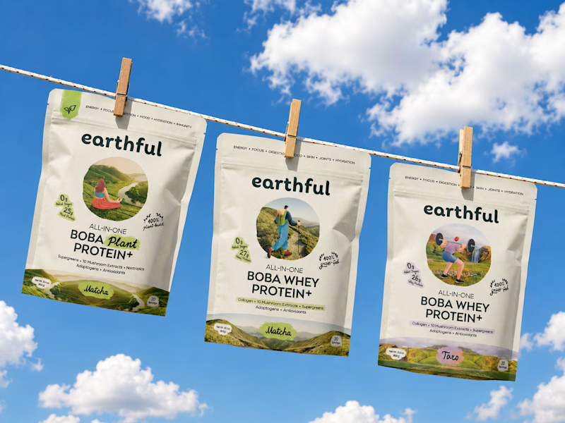
Decided to change the cover of Earthful's project with a nicer mockup of the pouches. Which one would you click if you saw it in the discovery feed - a static nice mockup or a motion piece?
33 voted
72%
13 voted
28%
46 votes
Closed

CUTE. LOV IT!

Took a little time to challenge my motion design skills.
I recreated a Spotify app concept to explore how UI elements, motion, timing, and transitions can come together to create a more engaging product experience.
This was a self initiated practice project, but I treated it like a real product animation project.
Always looking for ways to make interfaces feel more alive through motion.
#MotionDesign #MotionGraphics #UIAnimation #AppAnimation #AfterEffects #ProductDesign #VideoEditing #Animation


NICE WORK REALLY LOVE IT