The network for creativity
Join 1.25M professional creatives like you
Connect with clients, get discovered, and run your business 100% commission-free
Creatives on Contra have earned over $150M and we are just getting started
Back to feedPost

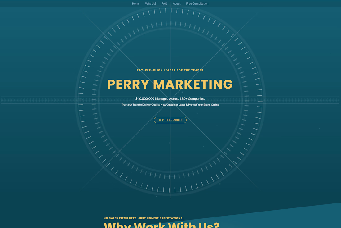
Perry Marketing — High-Converting Landing Page Funnel - Website design & build
Designed and developed a sleek, single-page website for Perry Marketing focused on clearly communicating their Pay-Per-Click expertise and converting high-intent visitors into qualified leads.
The Goal
Unlike traditional SEO builds, this project was designed as a conversion-first funnel—educating potential clients, building trust, and guiding them toward taking action. The audience: home service business owners looking for a smarter, more transparent approach to Google Ads.
What I Did
Structured a long-form, single-page funnel to walk users through services, differentiators, and value in a logical, persuasive flow
Designed content-rich sections with varied layouts to keep dense information engaging and easy to digest
Highlighted core differentiators—their PPC philosophy, transparency, and focus on real business growth
Built a clean, modern UI that feels polished without overwhelming the user
Optimized for conversion, with clear CTAs, strategic section breaks, and intuitive navigation throughout
Ensured the site is fast, responsive, and easy to update
The Result
A strong, trust-building digital presence that clearly communicates Perry Marketing’s value
Improved user engagement through structured storytelling and visual hierarchy
A streamlined path from visitor → understanding → inquiry
A site that supports paid traffic and sales conversations, not just brand awareness
This project highlights my ability to build websites that guide users, communicate clearly, and convert interest into real opportunities.


The network for creativity
Join 1.25M professional creatives like you
Connect with clients, get discovered, and run your business 100% commission-free
Creatives on Contra have earned over $150M and we are just getting started





Related posts


Your homepage should answer one question: what do you do? If a visitor can't answer that in five seconds, everything below the fold doesn't matter.


I just saw Bright Studios’ new website. You guys nailed it! Really like it.

I think this could be my favorite Framer code component I’ve created. Meet Page Transition Studio, you can add animated transitions between pages across 10 styles. My favorites are vertical strips and centre split. What’s yours? Check the live preview here


Good work, like the interaction

A few parts of the Kodilion website we worked on recently. Have a look at the whole shebang at https://kodilion.hr/

