The network for creativity
Join 1.25M professional creatives like you
Connect with clients, get discovered, and run your business 100% commission-free
Creatives on Contra have earned over $150M and we are just getting started
Back to feedPost
Custom Photography & Media Brand Logo
A custom brand logo and icon design for a visual media business. Combines line art camera illustration, custom typography, and sleek branding accents.
What I can create for you:
Custom client logos & business brand identity
Line art camera, photography, & media graphics
Typography & brand marks for small businesses


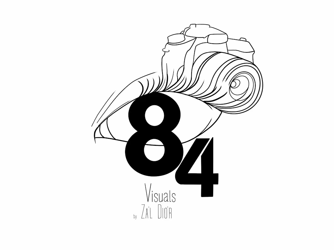

A camera growing out of an eye with a heavy 84 under it is a memorable idea, and the thin line art against the bold numerals gives it good tension. Contrarian note: the line work is delicate and the 84 is heavy, so at small sizes the camera will disappear and the logo will read...

Thank you so much for the feedback and the contrarian note, Aditya! You make a great point about how the camera lines scale down at favicon size—I'll definitely test a bolder line variation for smaller branding applications. Appreciate you taking the time to share that design tip!
The network for creativity
Join 1.25M professional creatives like you
Connect with clients, get discovered, and run your business 100% commission-free
Creatives on Contra have earned over $150M and we are just getting started











Related posts




Clean and confident work! The green gradient with the mark feels very modern for fintech - trustworthy but not boring. The app screens look really polished. Curious how you landed on this mark, does it represent growth / movement?

A flower that inflates arrives in the mail.
Next month, a phone made of shell.
STILL LIFE SERVICE. Case study dropping soon.
Which object earns your shelf? Reply below.
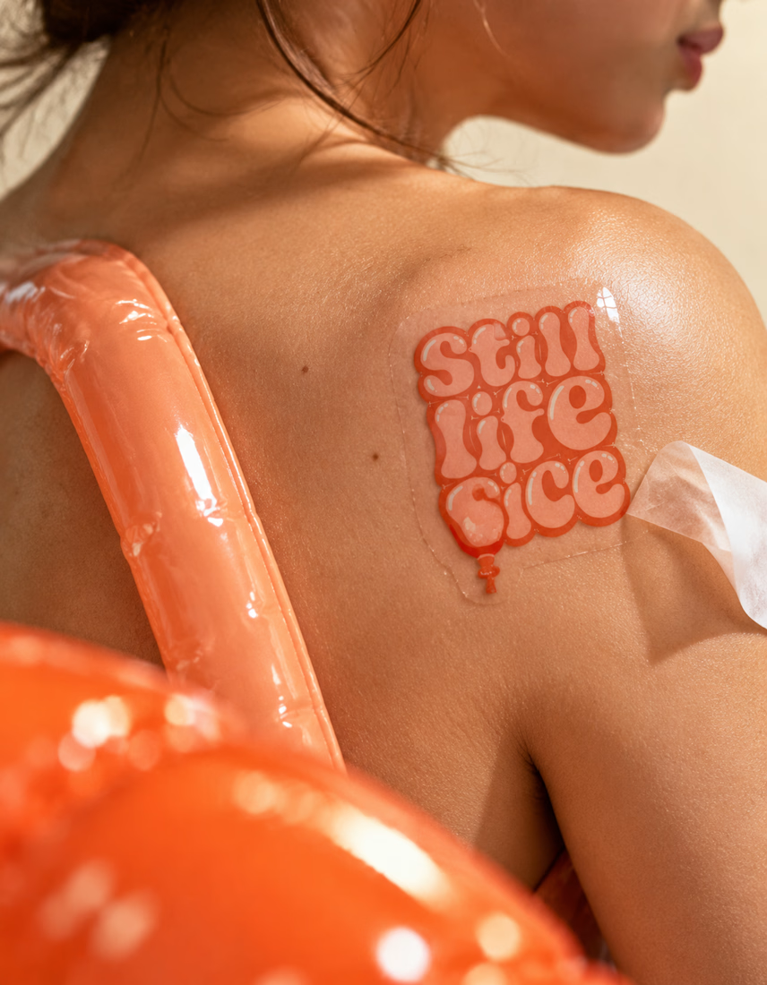
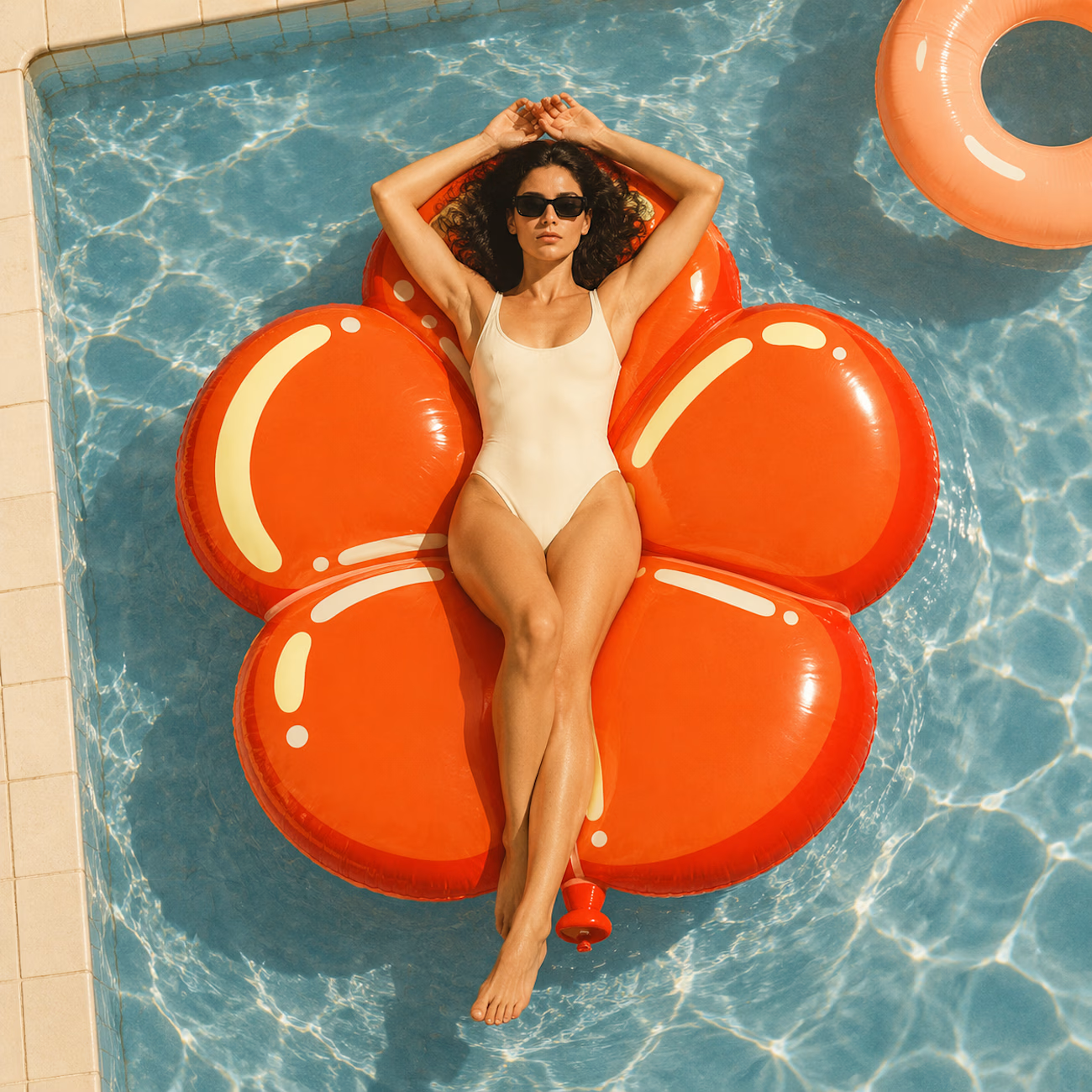
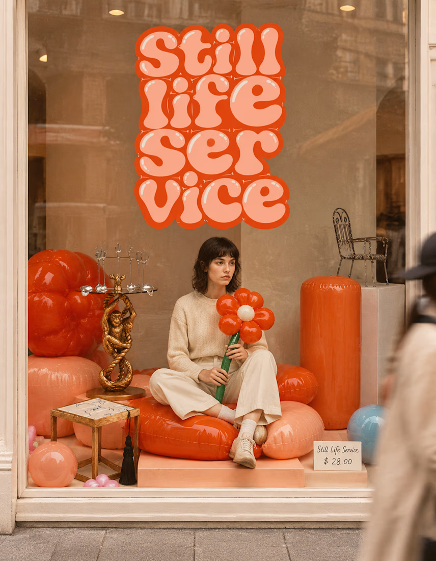

The inflatable flower. Only houseplant I'm guaranteed not to kill. Also, a new object every month is a sneaky good retention hook, people will stay subscribed just to see what's next.

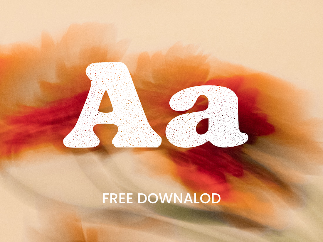
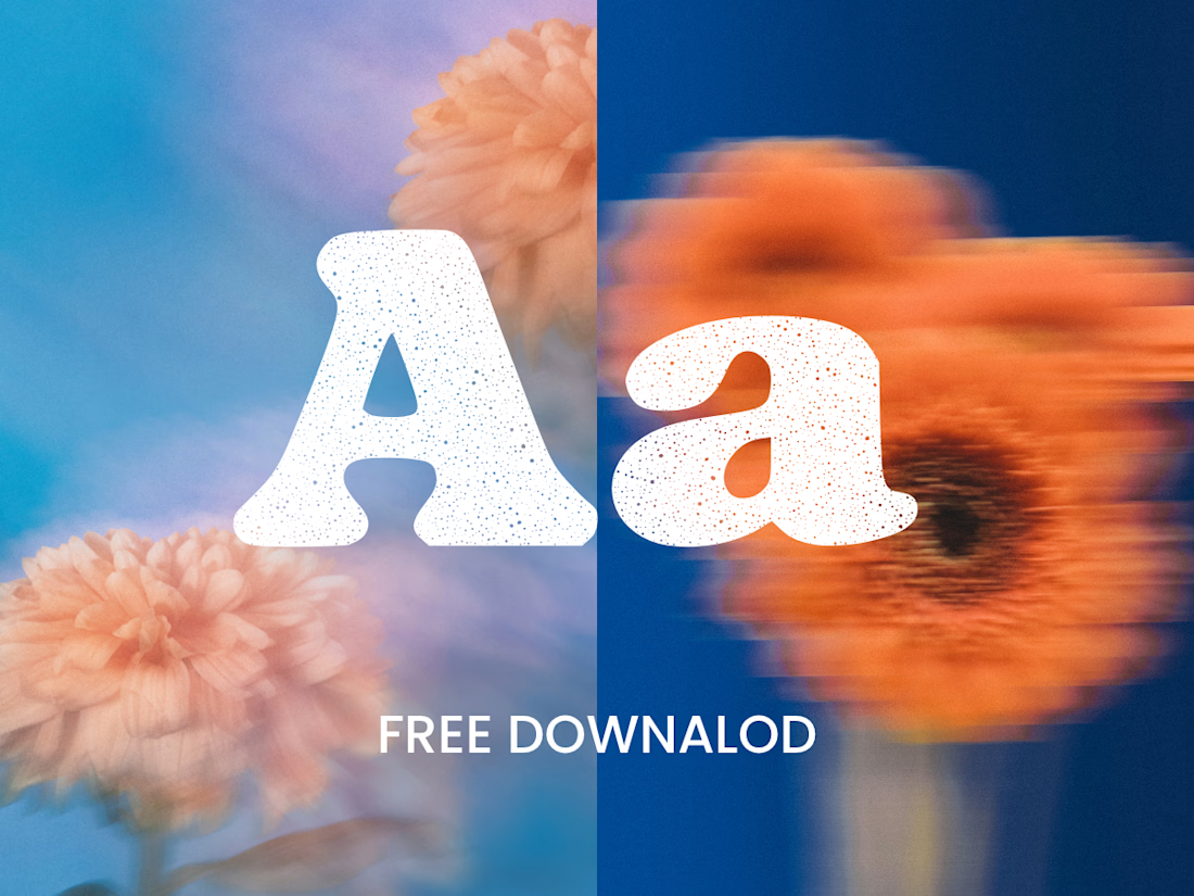
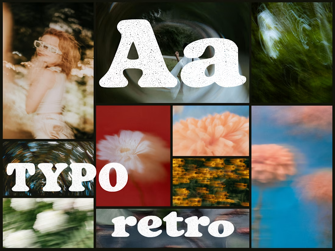
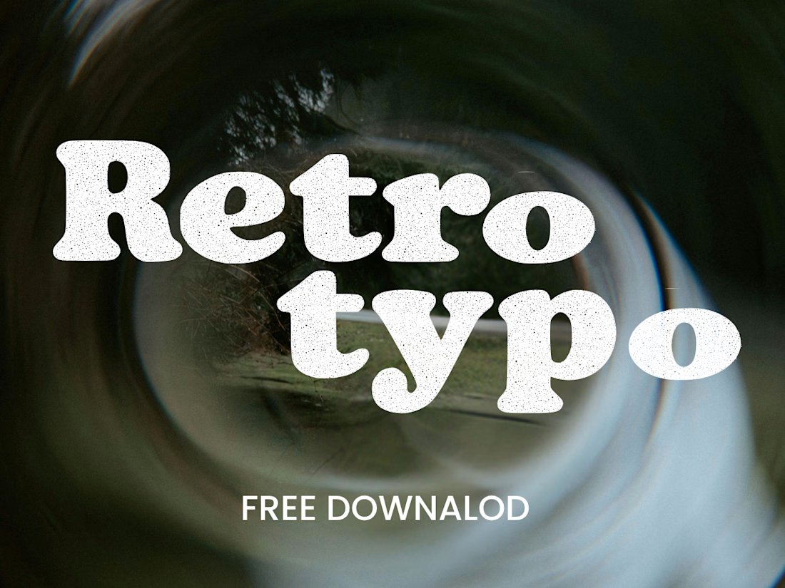
Anima is a self-initiated type design project inspired by vintage print, worn ink and analog photography.
The collection includes two experimental serif typefaces: Anima Editorial, with elegant proportions and contrasting strokes, and Anima Retro, with softer, bolder shapes. Both feature grain built into the letterforms.
I developed the creative direction, custom fonts and promotional artwork, combining AI-assisted exploration with font development. The campaign pairs textured typography with motion-blurred photography to capture a warm, nostalgic mood. FREE DOWNLOAD AT https://twaperdigital.com/anima-retro



Great job Denisa the font style background and it's effects are great 🎉🎉🎉🎉
keep going Denisa🔥🔥🔥🔥