The network for creativity
Join 1.25M professional creatives like you
Connect with clients, get discovered, and run your business 100% commission-free
Creatives on Contra have earned over $150M and we are just getting started
Back to feedPost
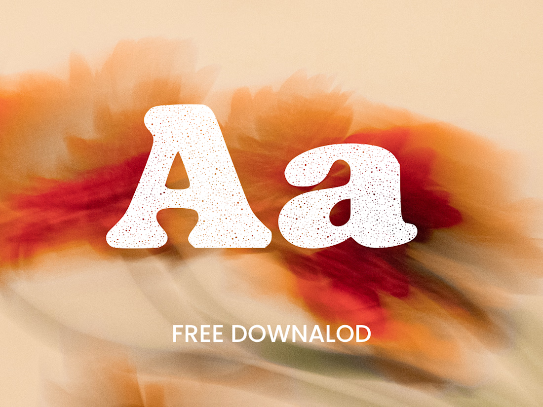
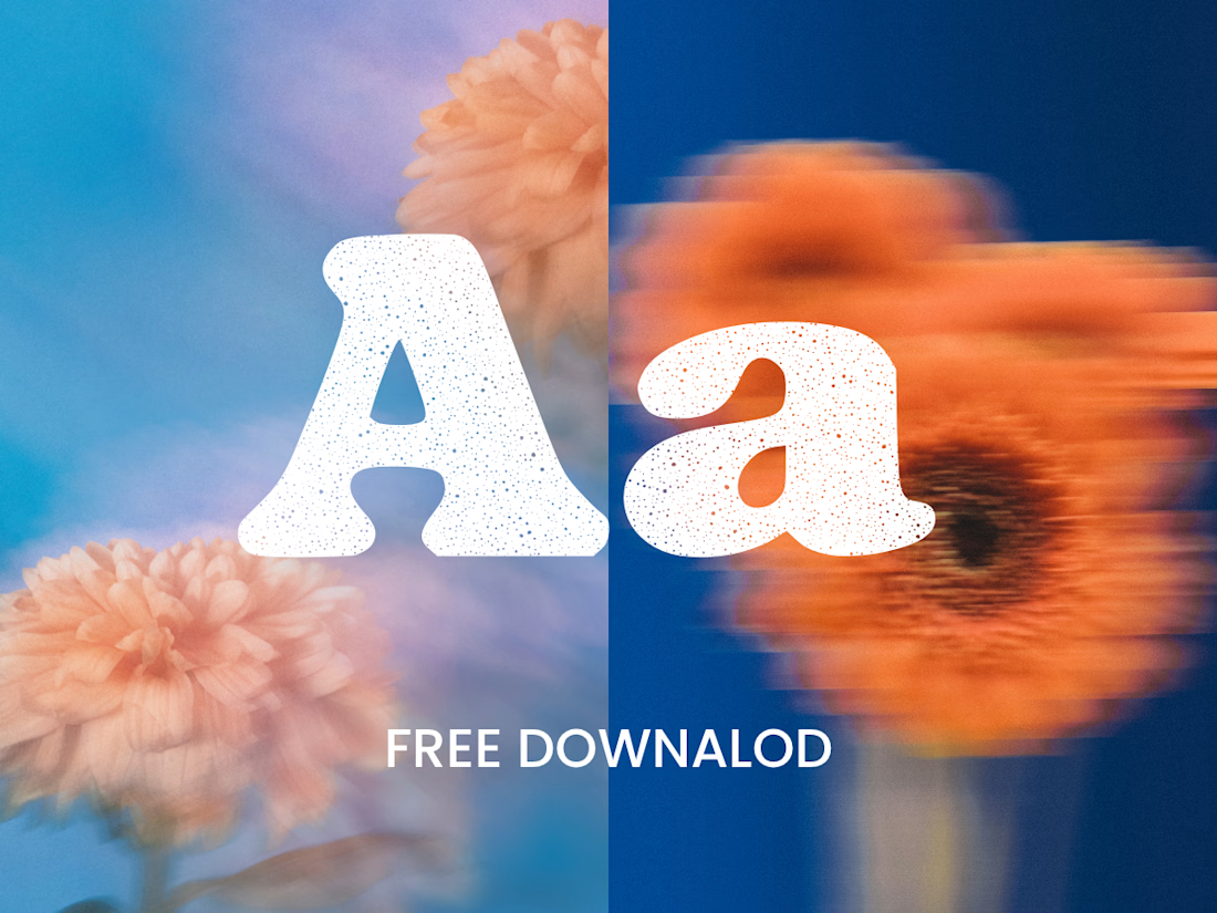
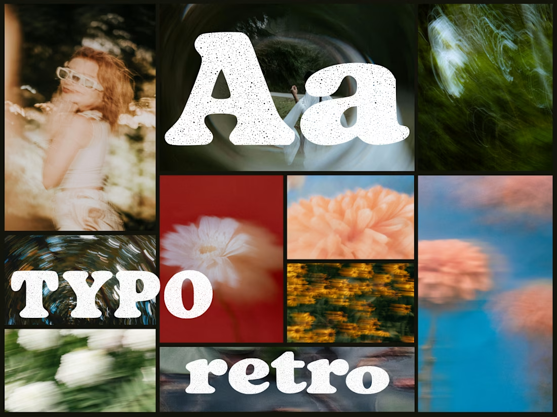
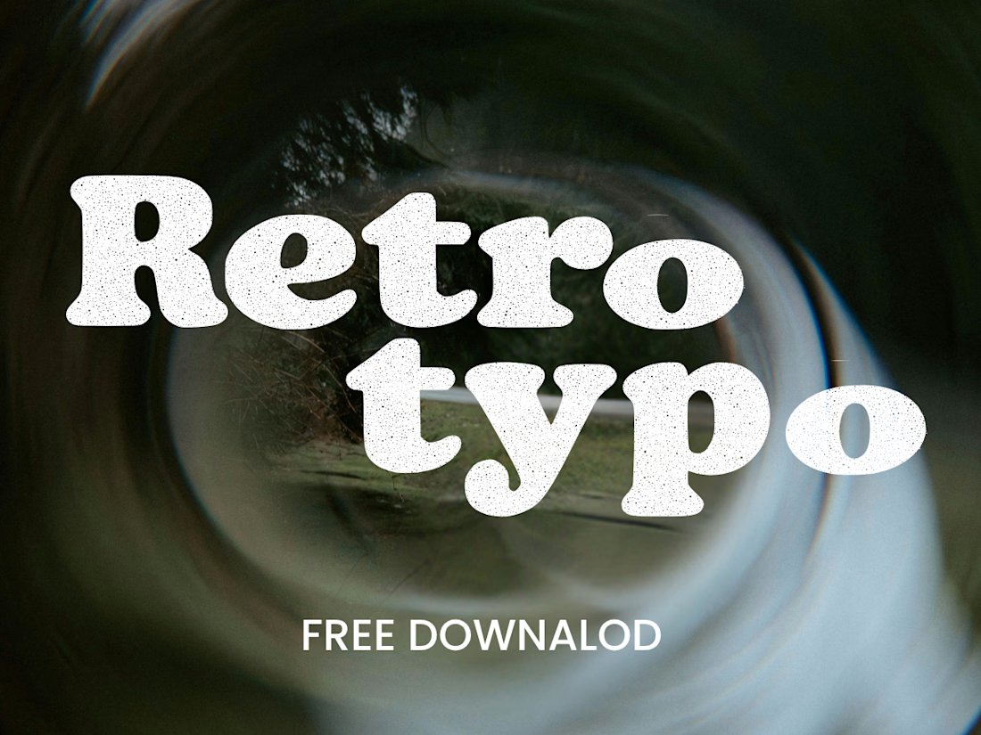
Anima is a self-initiated type design project inspired by vintage print, worn ink and analog photography.
The collection includes two experimental serif typefaces: Anima Editorial, with elegant proportions and contrasting strokes, and Anima Retro, with softer, bolder shapes. Both feature grain built into the letterforms.
I developed the creative direction, custom fonts and promotional artwork, combining AI-assisted exploration with font development. The campaign pairs textured typography with motion-blurred photography to capture a warm, nostalgic mood. FREE DOWNLOAD AT https://twaperdigital.com/anima-retro



Great job Denisa the font style background and it's effects are great 🎉🎉🎉🎉
keep going Denisa🔥🔥🔥🔥

Thank you a lot 🤗
Pardon Denisa❤️

adore this style!
Glad you do, thanks a lot 😊


two serifs with grain baked into the letterforms is a smart call, saves people faking it with overlays later. anima retro is the one id grab first
Feel free do to do so. Thanks for the feedback 🙌

Hello there and thank you a lot 😊

Building the grain into the letterforms, rather than laying it on as a texture, is what keeps Anima Retro reading as worn ink. How does it hold up at very small sizes, where grain can start to look like noise?
Great question, Artur! I mainly use it for posters and large, expressive headlines. It’s intended as a display font, so very small text wasn’t the focus. For body copy, I’d pair it with a cleaner typeface and let Anima Retro bring the character to the larger elements.
The network for creativity
Join 1.25M professional creatives like you
Connect with clients, get discovered, and run your business 100% commission-free
Creatives on Contra have earned over $150M and we are just getting started






Related posts

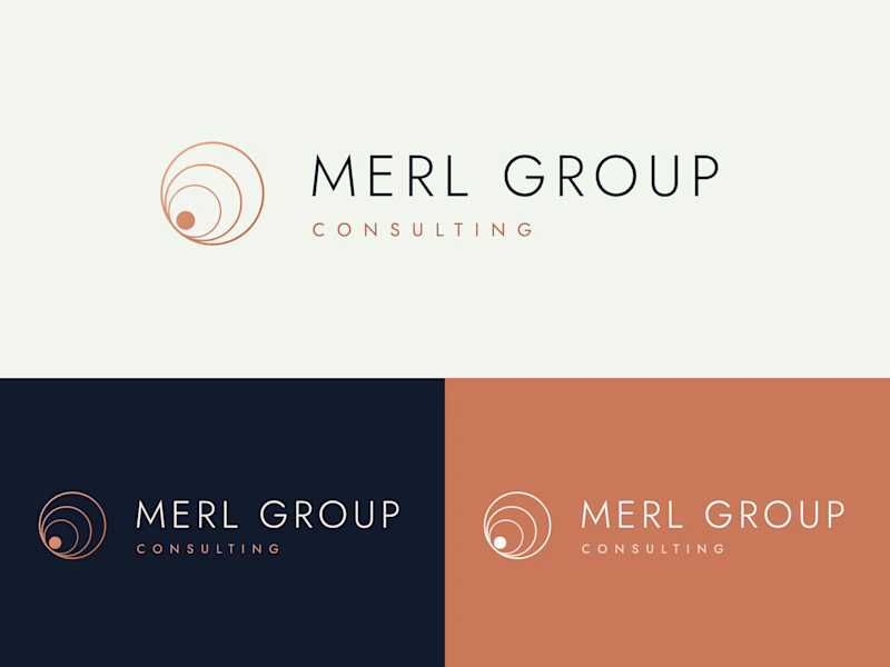
Two logo directions for Merl Group Consulting. Which one would you trust with your business? 👇

22 voted
69%
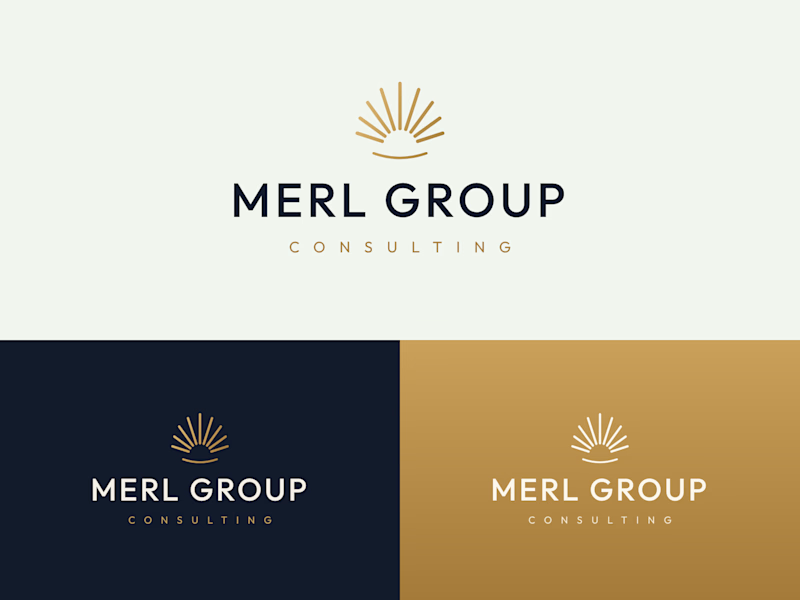
10 voted
31%
32 votes
Closed

I would go with Rising Sun Mark!
Two color directions for the Elite Virtual Care logo. Same mark, very different feel.
Option A: muted sage and forest green palette, softer and more clinical
Option B: deep forest and bright green, higher contrast, more energetic
Which one feels right for a virtual healthcare brand? 👇
2 voted
12%
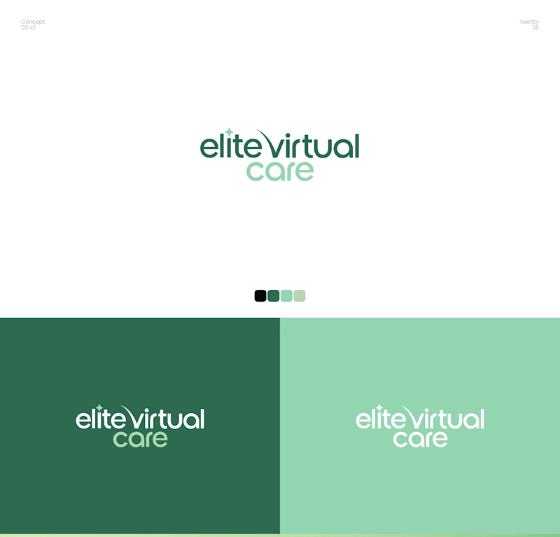
15 voted
88%
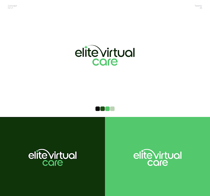
17 votes
Closed

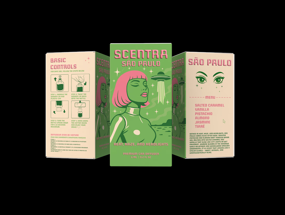
Sharing my my retro futuristic packaging design for @scentramotors car perfumes and diffusers :) Created using: @Figma @Adobe @Pacdora PTE. LTD. @ChatGpt @claude (help with text).


Cool! Love the illustration and typography. Did you use a custom font for “Scentra”?