The network for creativity
Join 1.25M professional creatives like you
Connect with clients, get discovered, and run your business 100% commission-free
Creatives on Contra have earned over $150M and we are just getting started
Back to feedPost

Nice work

🚀 3D Animated Product Website — Built for a Client
Recently designed and developed this interactive 3D website for a client’s product, combining modern UI/UX with smooth animations and an engaging user experience.
✨ 3D Product Animation
✨ Smooth Interactive Experience
✨ Premium...
The network for creativity
Join 1.25M professional creatives like you
Connect with clients, get discovered, and run your business 100% commission-free
Creatives on Contra have earned over $150M and we are just getting started











Related posts

Figma Football
An unofficial football concept inspired by Figma and its visual language.
The ball was created using a custom 3D generator I built in ChatGPT, with animated interface icons and graphics developed with Claude.
Part design experiment, part exploration of how custom AI-powered tools can become part of the creative process.


The interface icons translate surprisingly well into a football identity.

Design Exploration: Hero Section of Architecture Website. Which one do you think much better?


12 voted
43%
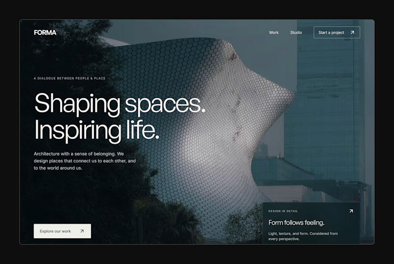
16 voted
57%
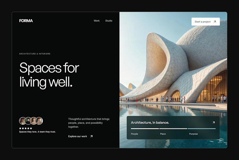
28 votes
Closed


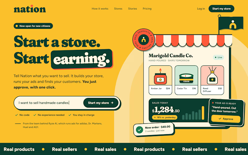
Two visual directions for the same brief. Which do you prefer?
2 voted
29%
5 voted
71%
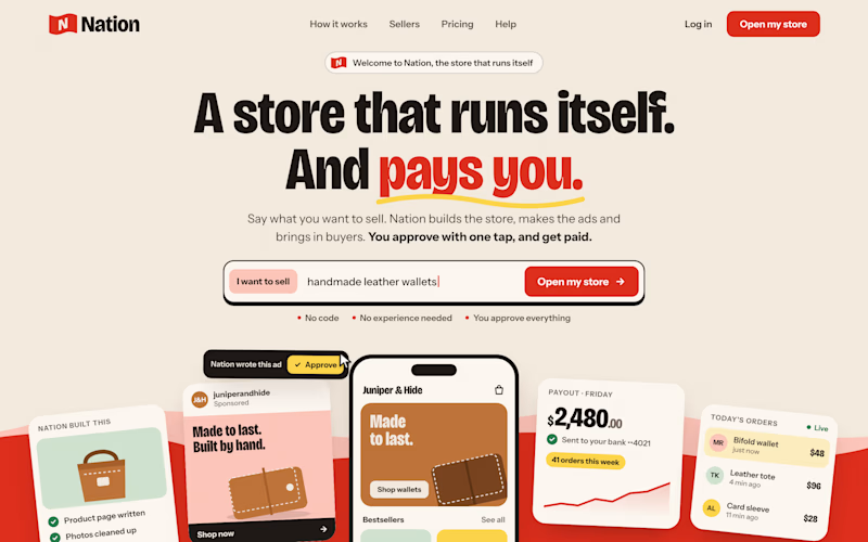
7 votes
Closed

Direction A is more better to me it feels modern professional cartoony style that's impressive ❤️❤️
Great job Ayoub🔥🔥