The network for creativity
Join 1.25M professional creatives like you
Connect with clients, get discovered, and run your business 100% commission-free
Creatives on Contra have earned over $150M and we are just getting started
Back to feedPost
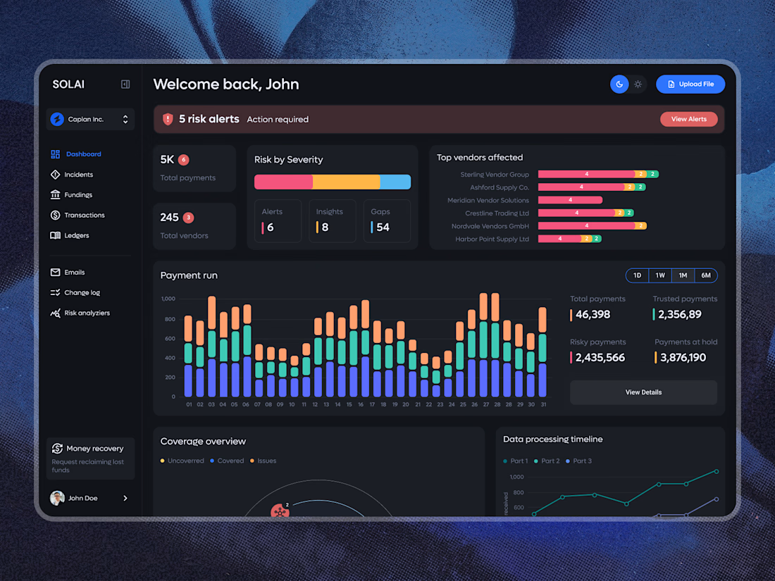
A dashboard with a lot of data doesn’t have to feel overwhelming.
The focus here was on clear hierarchy, easy-to-scan risk alerts, and making complex payment data feel simple and intuitive. Dark UI, structured analytics, and just enough color to guide attention where it matters.
What do you think of this direction?

Looks so clean! Love it 👏

Thank you!
The network for creativity
Join 1.25M professional creatives like you
Connect with clients, get discovered, and run your business 100% commission-free
Creatives on Contra have earned over $150M and we are just getting started
Related posts

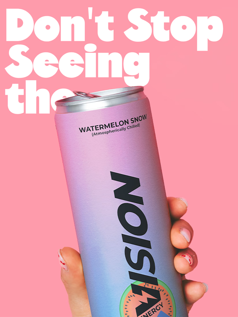
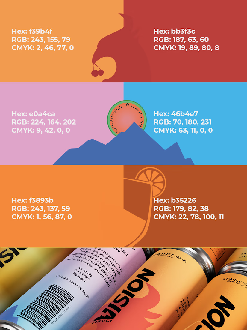
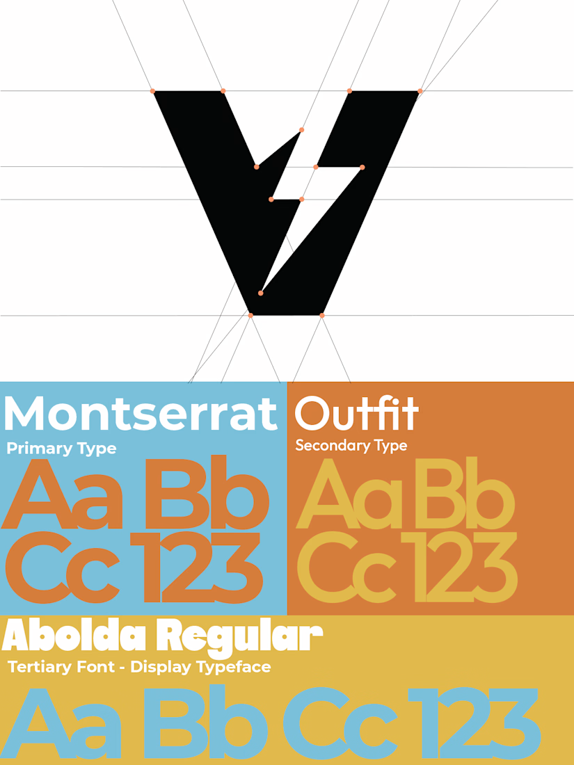
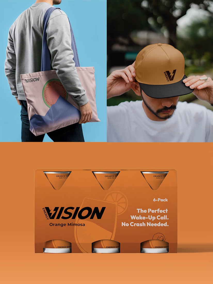
Two timeless types (with an energetic, younger sister font), gradients with bold colors, and playful minimalist designs were the focal point for my brand VISION. I really wanted to push and see what the balance of fun, colorful, and playful along with quiet, focused, and stabilizing felt like for an energy drink company. So everything from the type to the packaging on a six pack had to be fine tuned as much as the 3D spec did.
See the VISION.

Good work


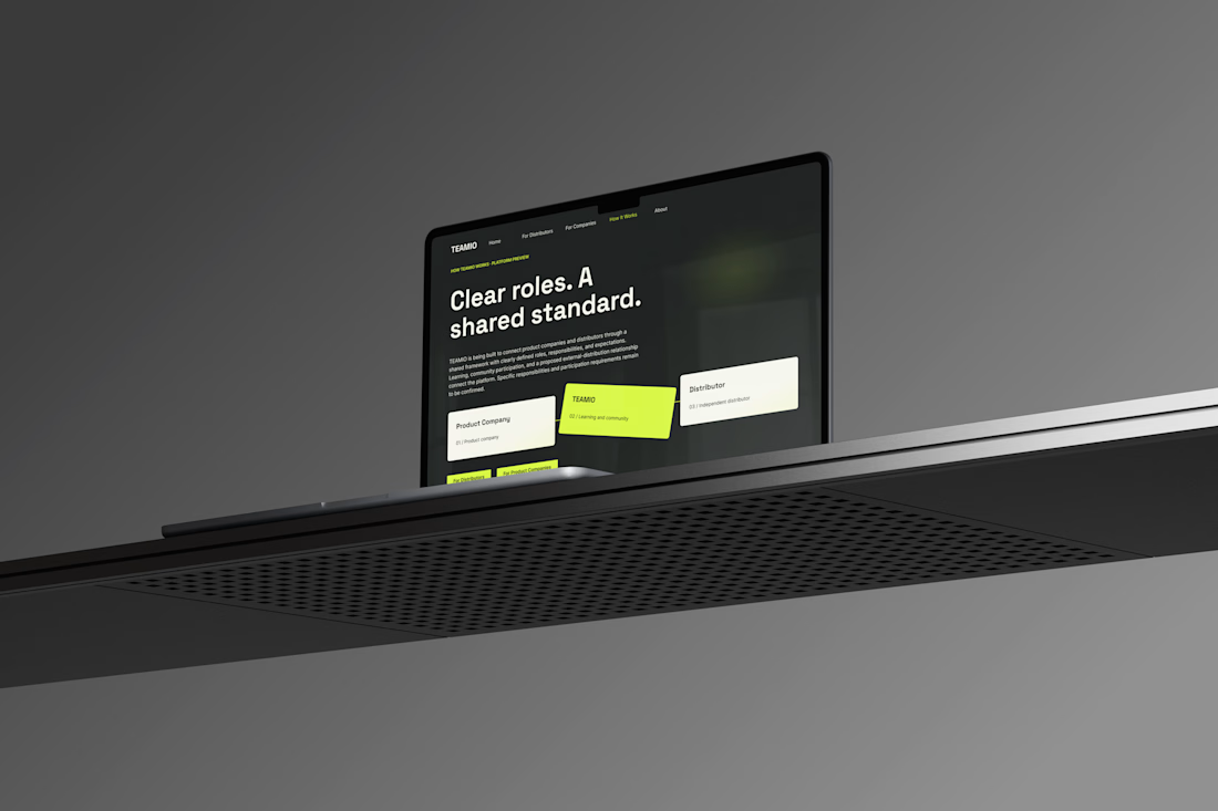
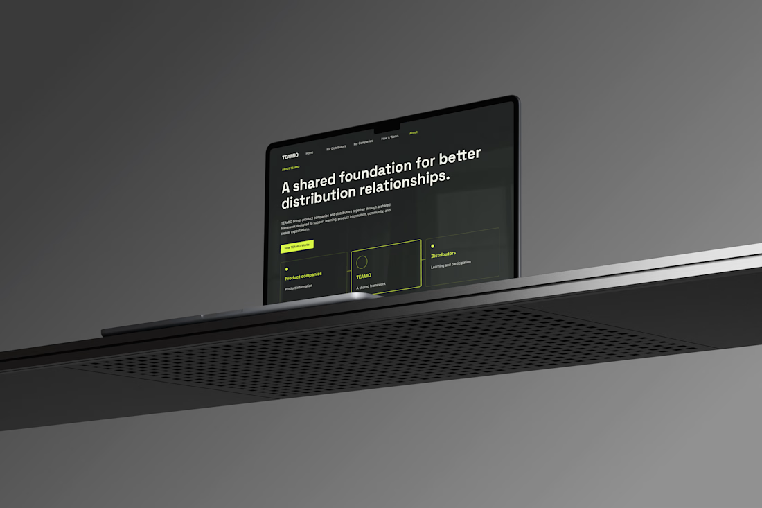
One produc Multiple experiences One cohesive design system
Meet TEAMIO a product I designed from the marketing website to the partner dashboard, bringing the entire experience together through thoughtful UX and consistent UI
Which screen is your favorite?



I like the colour combinations and the website vibes it's super elegant but still very creative 👏✅