The network for creativity
Join 1.25M professional creatives like you
Connect with clients, get discovered, and run your business 100% commission-free
Creatives on Contra have earned over $150M and we are just getting started
Back to feedPost
Two timeless types (with an energetic, younger sister font), gradients with bold colors, and playful minimalist designs were the focal point for my brand VISION. I really wanted to push and see what the balance of fun, colorful, and playful along with quiet, focused, and stabilizing felt like for an energy drink company. So everything from the type to the packaging on a six pack had to be fine tuned as much as the 3D spec did.
See the VISION.
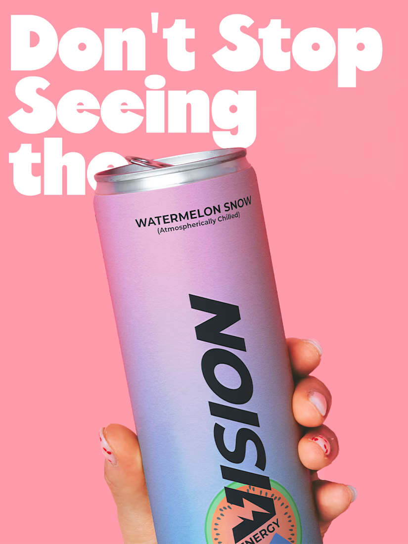
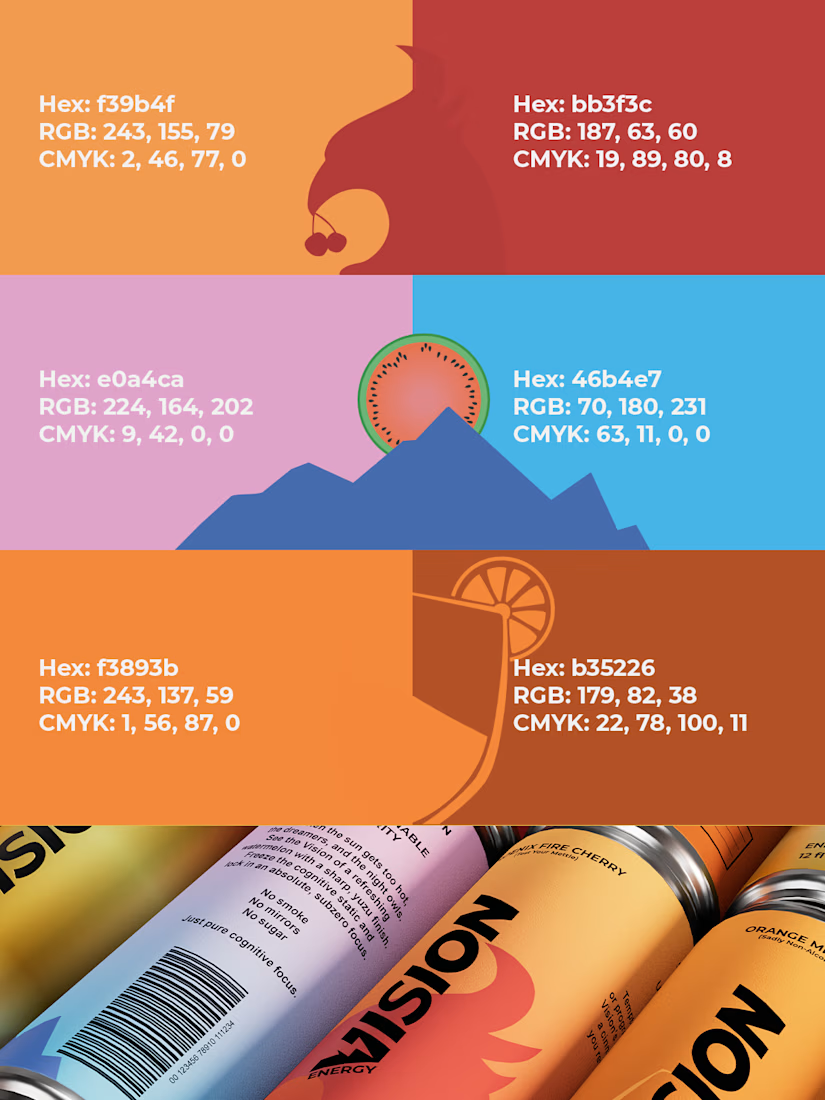
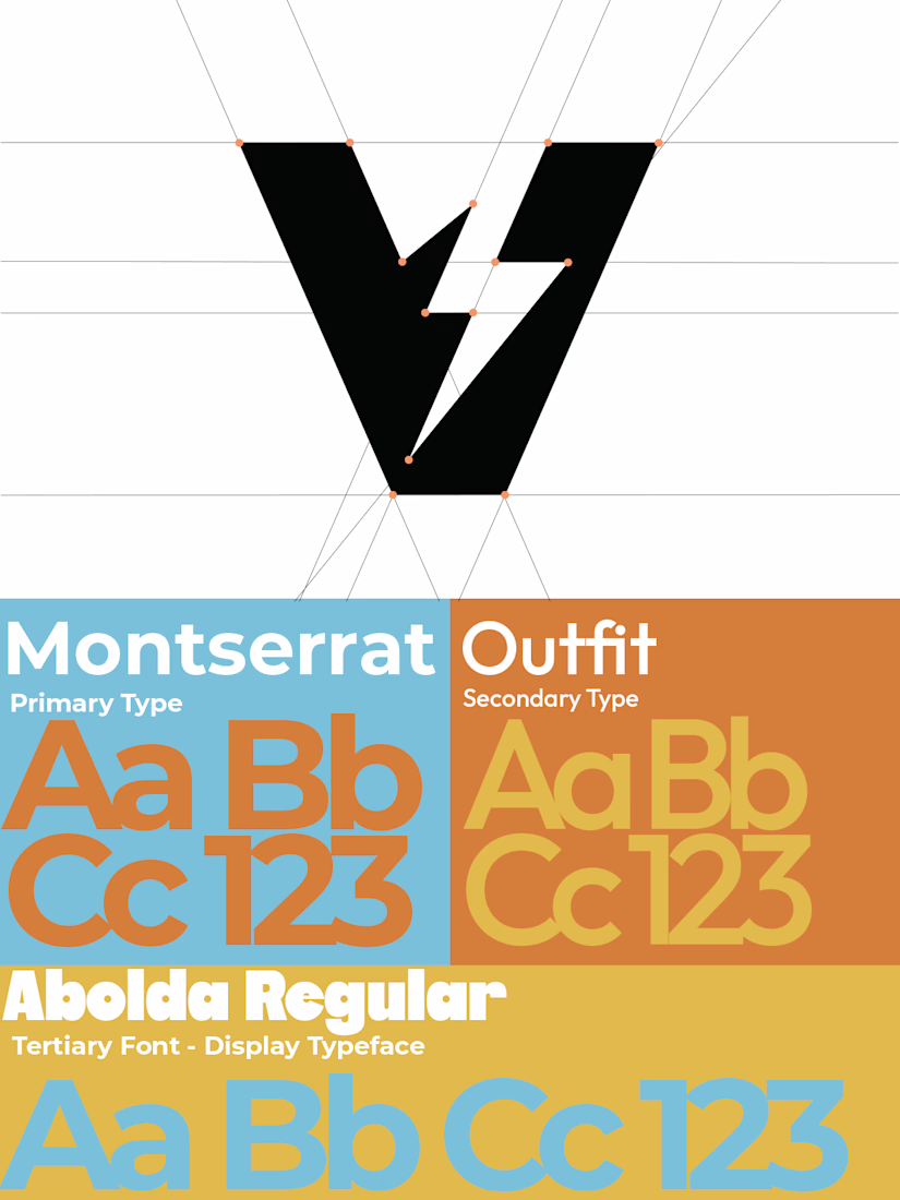
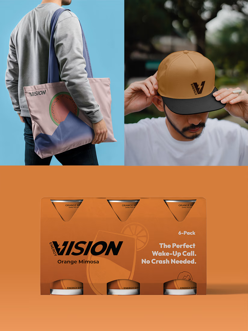

The pink can with the black mark and the orange, blue and pink swatches with hex and CMYK values give this a real system, not just a pretty can. One pushback: Montserrat as the primary typeface is the safest pick on the board, and the loud palette is carrying all the...

If the palette and mark are carrying the personality, then Montserrat is definitely doing its job!
I tested several fonts as the primary typeface early on, but a lot of energy drinks are bold, loud, or have a lot of visual chaos. I wanted VISION to subvert expectations, be...

this is amazing visual color brand .
The network for creativity
Join 1.25M professional creatives like you
Connect with clients, get discovered, and run your business 100% commission-free
Creatives on Contra have earned over $150M and we are just getting started



Related posts

Friday app: Understudy
What if an app’s menu was a hole in a face?
UNDERSTUDY turns one circle into the interface: eyes open shows, voids open seat plans, and a typewriter clock counts down to curtain.
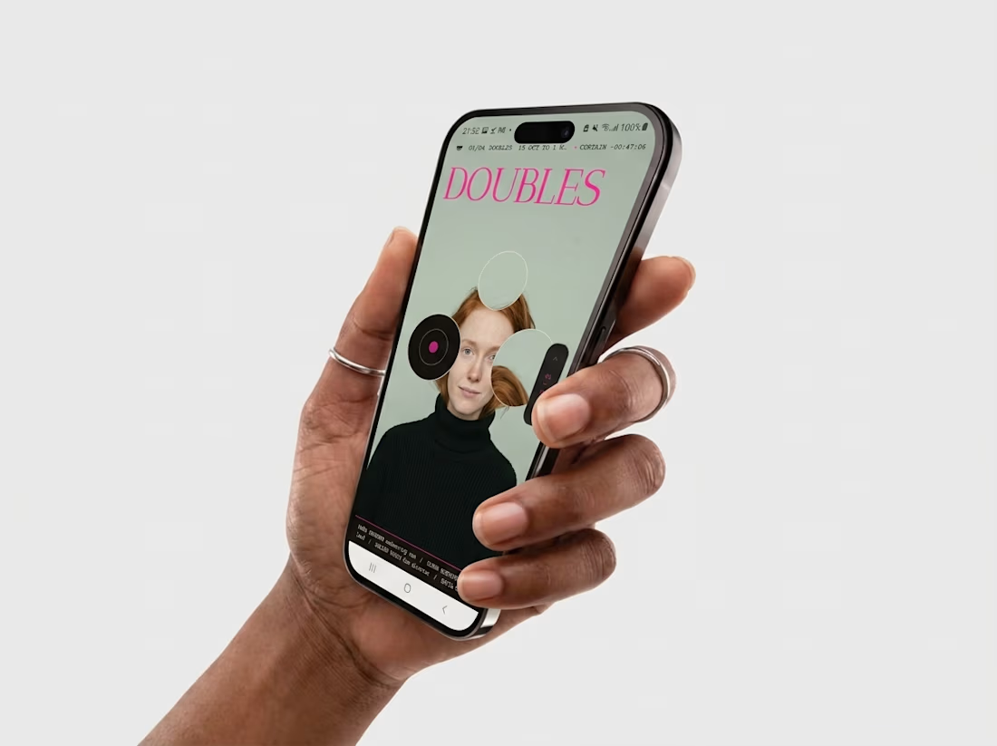
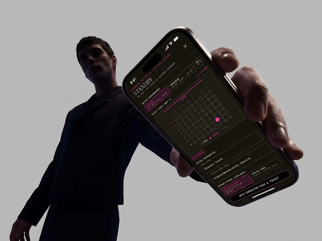
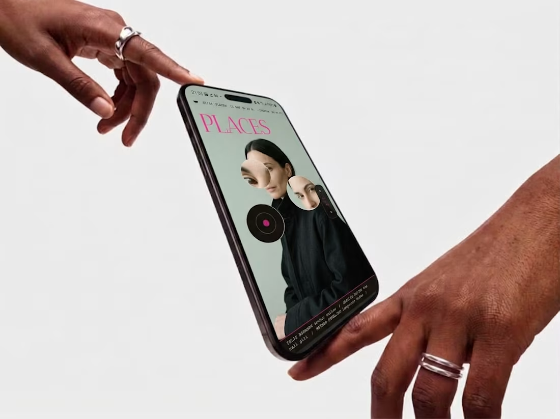
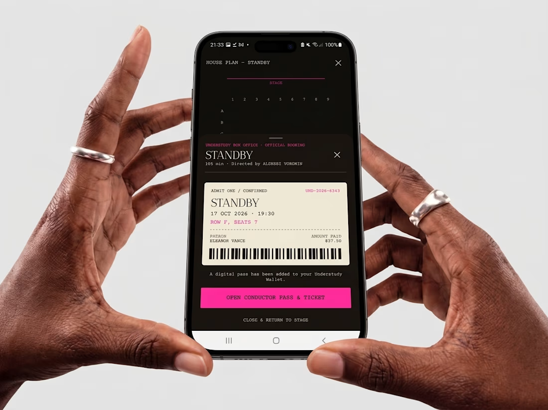


Check it out
New case study: Industrial IoT platform redesign with AI integration ⚡
Spent 5 weeks redesigning Lumicent’s industrial IoT platform. The headline change: cut alarm resolution from 4 taps to 1.
Started with a design audit that uncovered three UX failures burying the information operators actually needed to act. Mapped 3 personas (Technician, Risk Manager, Site Executive) and rebuilt the alarm, investigation, and home flows around how they actually make decisions under pressure.
AI assistant woven in at the right moments: contextual chat during investigation, daily brief on the home page, remedy suggestions at the point of alarm.

Putting the AI assistant at specific decision points, like remedy suggestions right at the alarm and a daily brief on the home page, feels much more useful than a generic chat box. Cutting alarm resolution from 4 taps to 1 is a strong result for operators working under pressure.

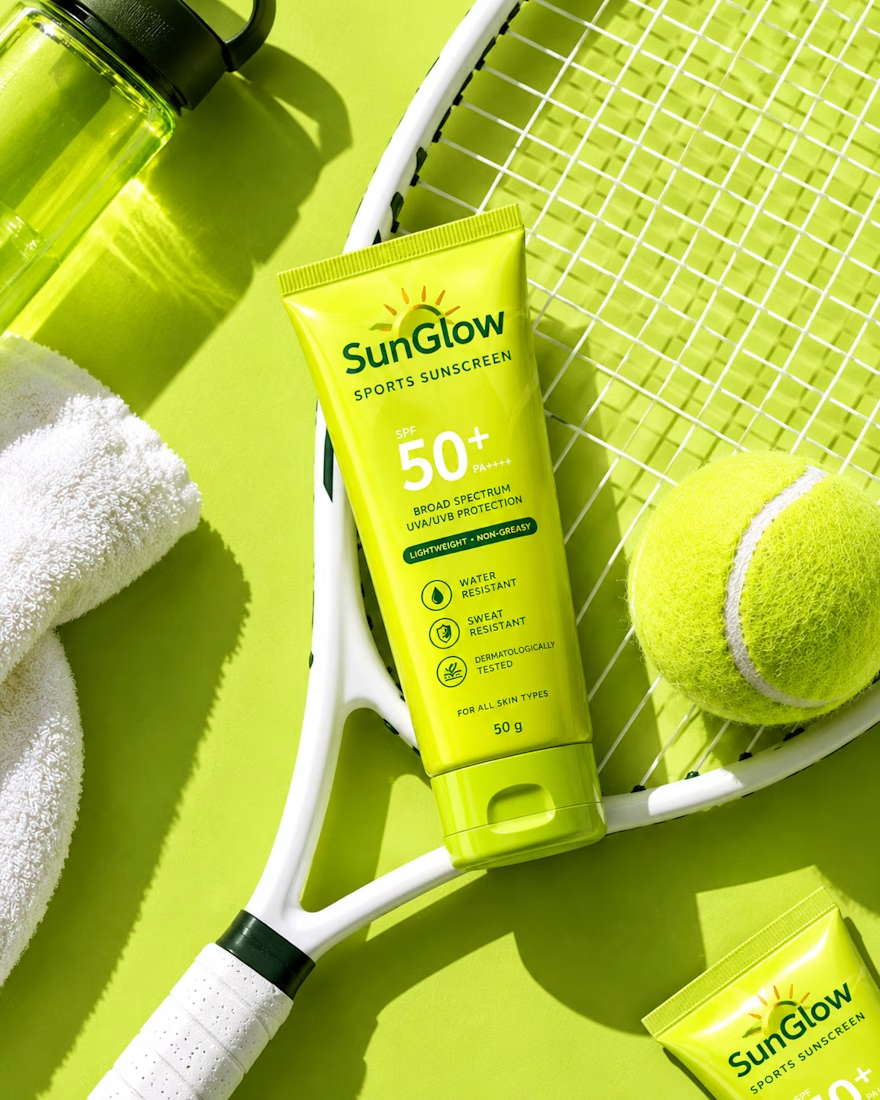
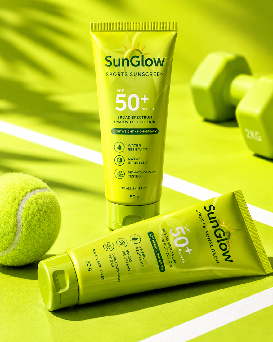
Built for sport. Designed to stand out.
SunGlow sports sunscreen packaging — clean, energetic, and easy to trust at first glance.
Would you take this to the court?



good work


