The network for creativity
Join 1.25M professional creatives like you
Connect with clients, get discovered, and run your business 100% commission-free
Creatives on Contra have earned over $150M and we are just getting started
Back to feedPost

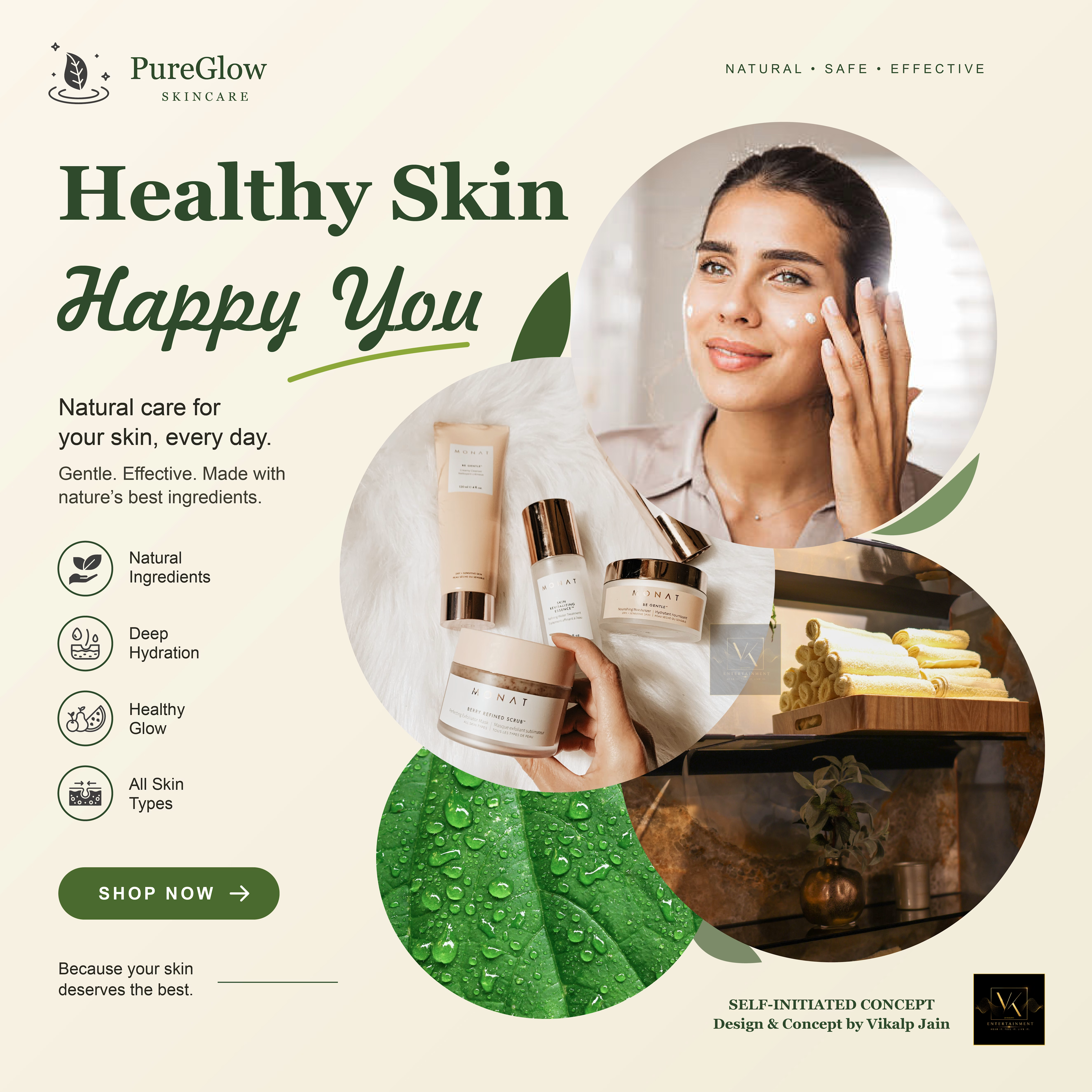
PureGlow Skincare .. Advertising Poster Design
Project Type: Self-Initiated Graphic Design Concept
Role: Graphic Designer
Tool: Adobe Illustrator
Project Overview
PureGlow Skincare is a self-initiated advertising poster concept focused on creating a fresh, natural, and premium visual identity for a skincare brand.
The design explores organic shapes, earthy green and warm beige tones, and carefully arranged typography to create a visually engaging composition. The layout is designed to highlight skincare products and benefits while maintaining a clear visual hierarchy and a natural brand aesthetic.
My Contribution
Designed the poster layout and overall visual composition.
Explored a nature-inspired colour palette.
Used typography and visual hierarchy to guide attention.
Integrated imagery within organic shapes to create a distinctive layout.
Structured the design around product presentation and a clear call-to-action.
Design Objective
To explore how colour, typography, imagery, and composition can communicate a skincare brand's natural and premium positioning through advertising design.
Design & Concept: Vikalp Jain
Disclaimer: Self-initiated concept created for creative exploration; not an official brand campaign.

The network for creativity
Join 1.25M professional creatives like you
Connect with clients, get discovered, and run your business 100% commission-free
Creatives on Contra have earned over $150M and we are just getting started
Related posts

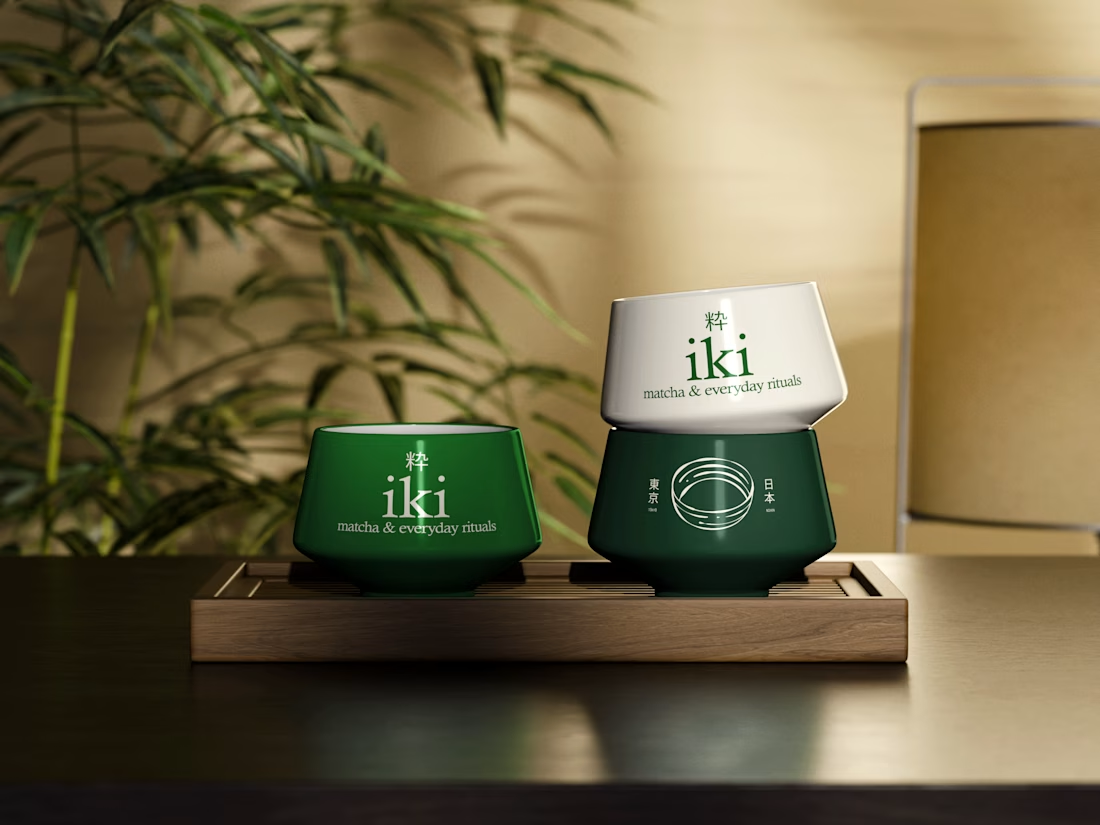
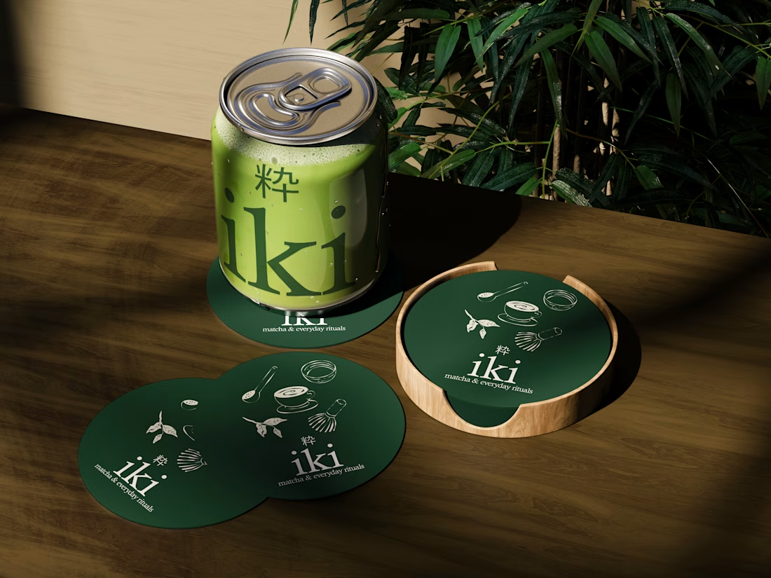
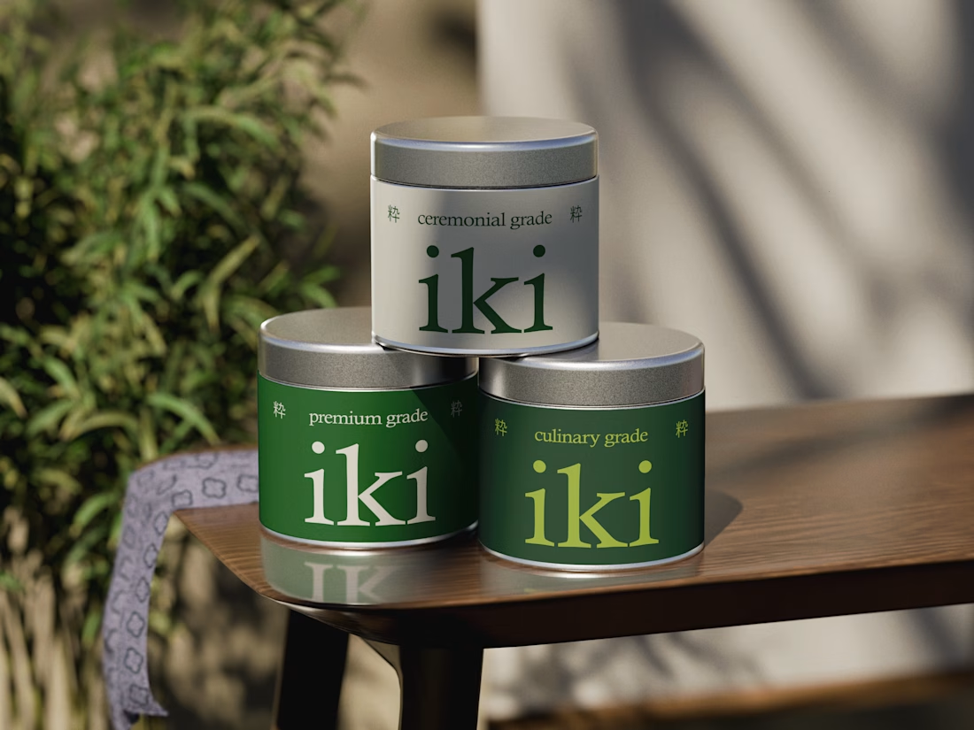
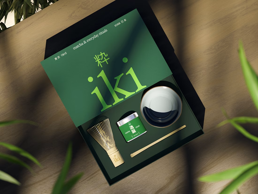
more glimpses of iki 🍵
the project is almost finished, and i should be wrapping everything up next week.
it’s been a fun one to work on, especially seeing how the initial concept has evolved into a complete visual identity.
excited to share the final result soon :)

Two warm ups today, both might become full case studies:
Parlata: an audio-postcard service that records and archives local dialects. Every recording becomes a small printed card with a QR link.
MODULO: an Industrial IoT brand. Olive, navy, one wobbly blob.
One is warm and human. One is technical and playful. Which would you want to see go all the way?
31 voted
63%
18 voted
37%
49 votes
Closed

Love it

A little more about the inspiration behind Tindara.
I wanted the identity to have a connection to Tindari, Sicily. The Madonna di Tindari statue was the starting point for the symbol, while Sicilian decorative patterns inspired the graphics around it.
For the colors, I chose mustard yellow, deep green, and burgundy, balanced with cream. I wanted to bring some of that warmth and richness into the packaging, while keeping the different elements comfortable together.
For me, these references are what give the project its character and sense of place.

