The network for creativity
Join 1.25M professional creatives like you
Connect with clients, get discovered, and run your business 100% commission-free
Creatives on Contra have earned over $150M and we are just getting started
Back to feedPost
Taste Test
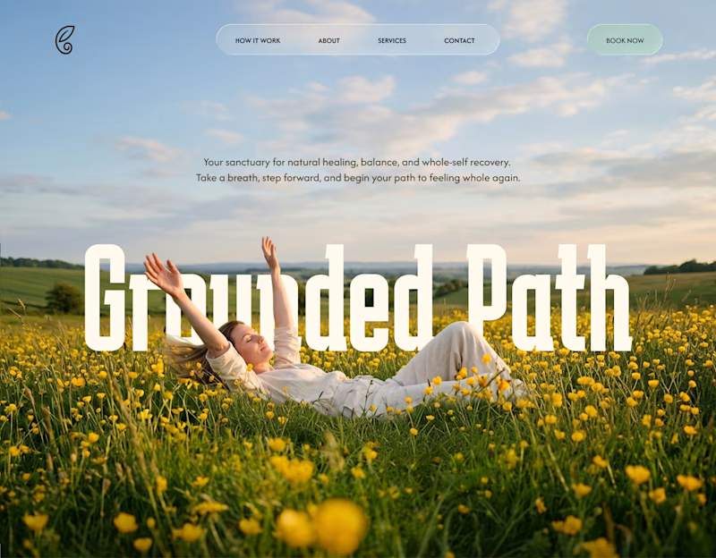
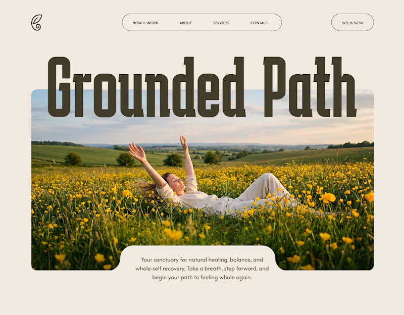
Recently I worked a wellness coaching project called "grounded path"
Let's compare two of my hero section design of wellness coach design project.
Which one would you vote for?
#figma #ui #ux #hero section #website ui
11 votes
Ends in 1d

love the option one!

Thanks for the comment. Option 1 works for me as well👍


First one is too simole and too peaceful. Secind one is a bit more different and looks more artistic.
Thanks for the comment, yes, I usually create a minimal version for the hero section. For the second version, i used a liquid glass effect!

that is a valid point, thanks for the comment mate 😃
The network for creativity
Join 1.25M professional creatives like you
Connect with clients, get discovered, and run your business 100% commission-free
Creatives on Contra have earned over $150M and we are just getting started
Related posts



Both are great 🫠

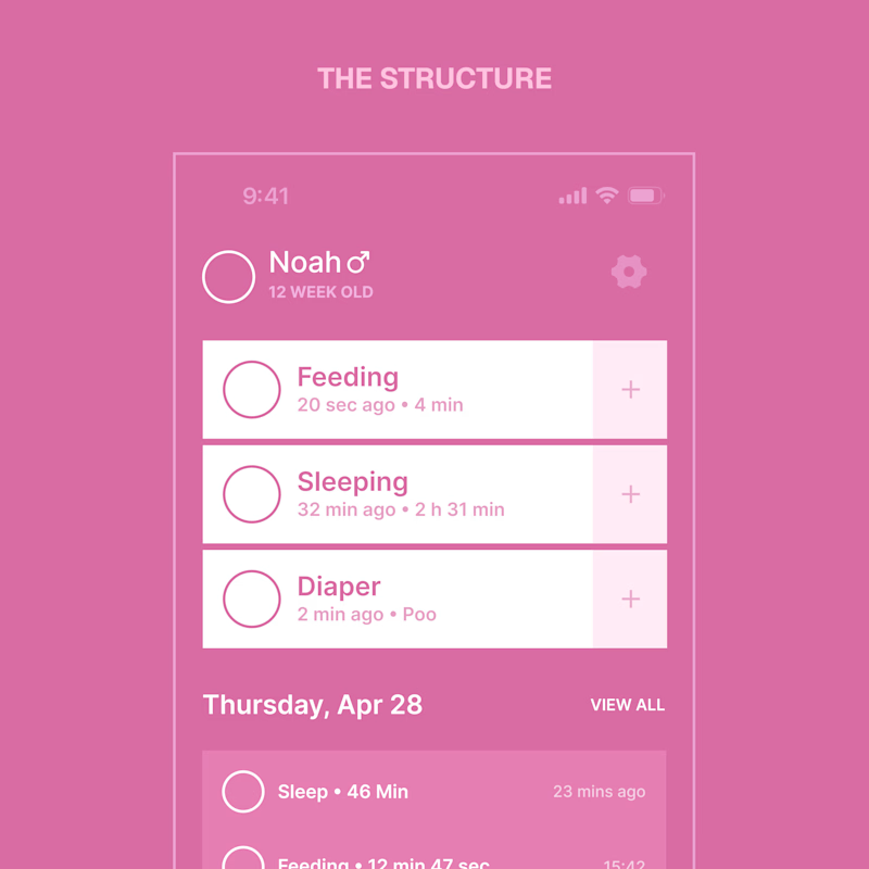
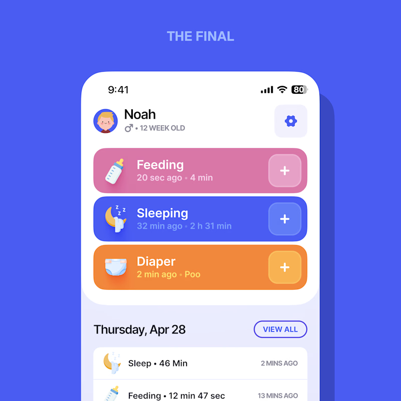
Every screen I design starts flat – structure first, style second.
When a designer shows a case, which do you actually want to see?
Same screen, two stages.

3 voted
21%
11 voted
79%
14 votes
Closed

Love it. The final

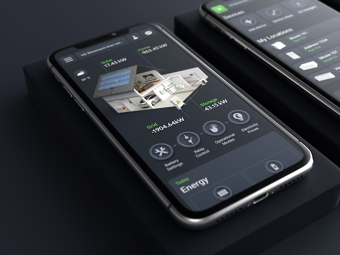
A short case study for SG Connect, a smart energy app I designed.



Impressive !












Trending

Claude
Claude has entered the design space. How are you using Claude Design?

Contra University
Learn from expert creatives how to earn more using next-gen AI tools.
creativeaiflow
Creative AI workflows are evolving. What tools do you use, and what are their strengths and weaknesses?
freelancerlife
Freelancer life is wins, pivots, and everything in between. What’s yours right now?