The network for creativity
Join 1.25M professional creatives like you
Connect with clients, get discovered, and run your business 100% commission-free
Creatives on Contra have earned over $150M and we are just getting started
Back to feedPost

People often see the finished campaign. What they don’t see is the system behind it.
The decisions that shape it:
- What gets shown first.
- What gets removed.
- How information is layered.
- How consistency is maintained across every touchpoint.
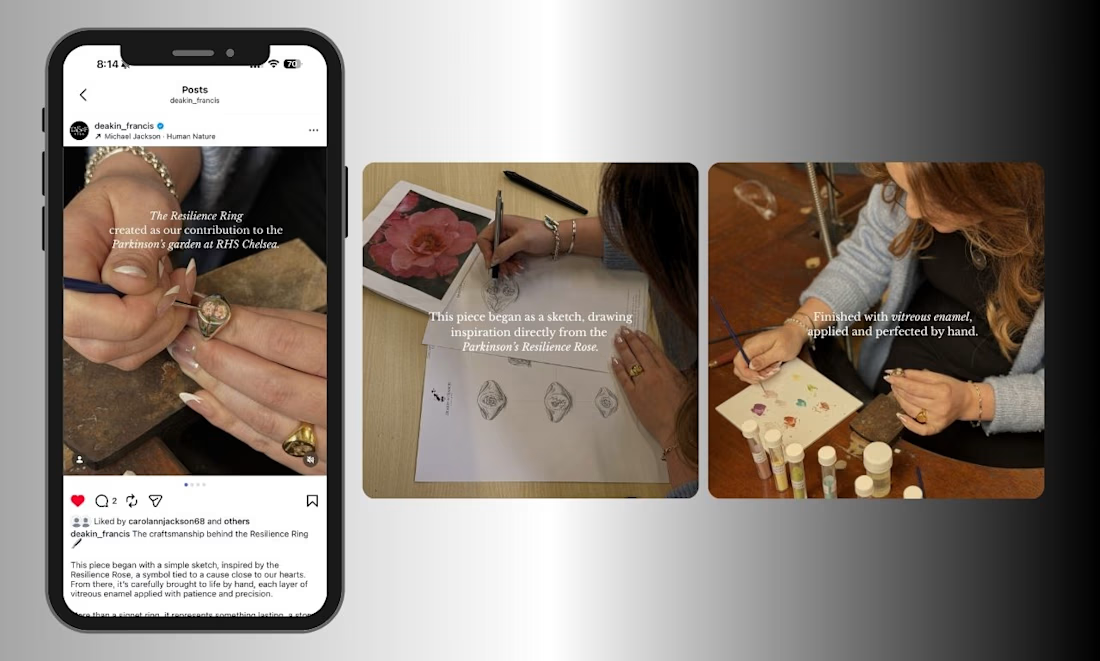
It’s making sure the same level of clarity and intention exists throughout. This carousel was designed to guide the viewer from initial concept to the design process, in a way that feels clear, considered, and easy to follow.


The network for creativity
Join 1.25M professional creatives like you
Connect with clients, get discovered, and run your business 100% commission-free
Creatives on Contra have earned over $150M and we are just getting started




Related posts


Hot take: aesthetics and clinical results should walk hand in hand.
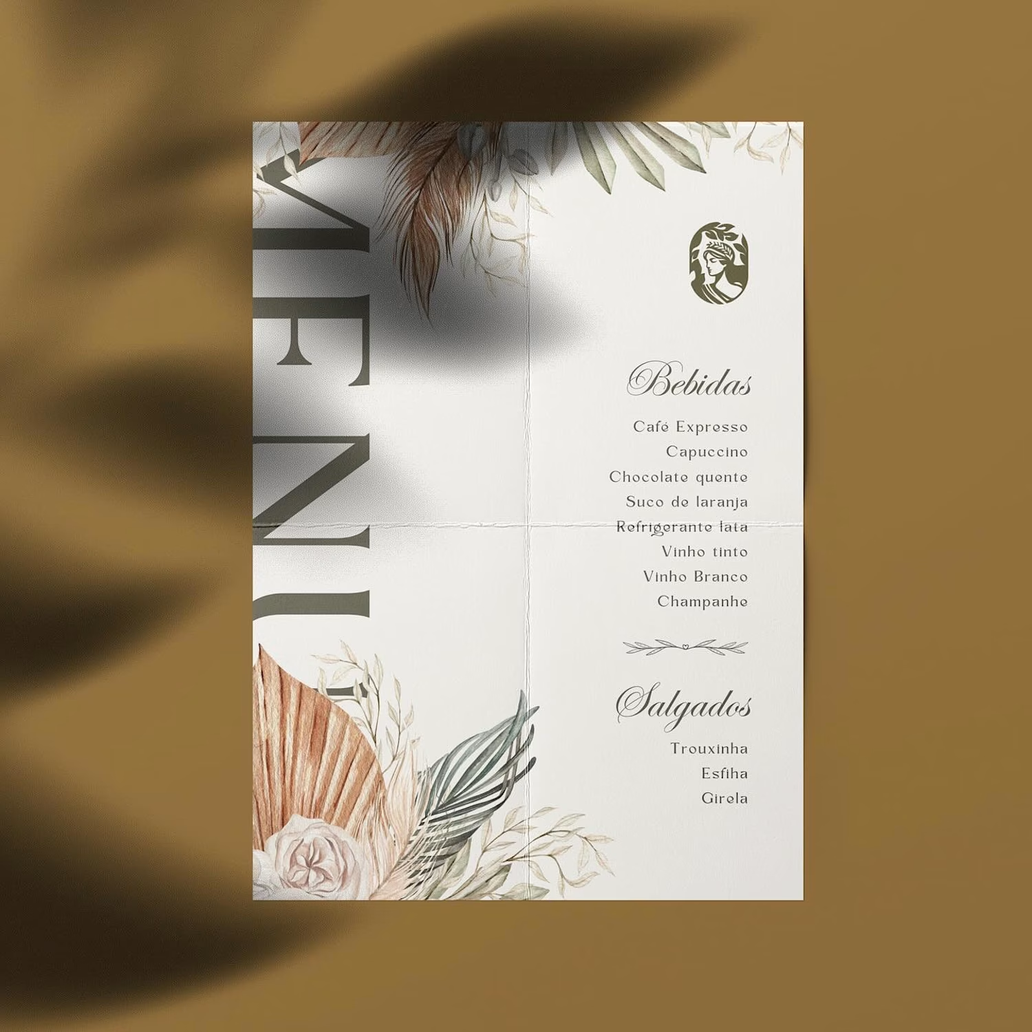
Most brands in this space lean into cold, sterile whites or aggressive dark tones. It reads functional, but it also feels like something you'd hide in a medicine cabinet, not display on your vanity.
For this rebrand, we anchored the identity in classical beauty and organic sophistication. By combining warm earthy tones, botanical cues, and timeless iconography, we moved away from the "pharmacy product" feel into true high-end personal care.
It was a deliberate shift: positioning the brand not for someone who feels like they are treating a flaw, but for someone investing in a premium daily ritual.
Would a piece like this deserve a spot on your display shelf?






This is brilliant!


Tash rendered in a custom holographic alphabet, built from patterned letterforms in Figma.


The holographic effect makes it really stand out.

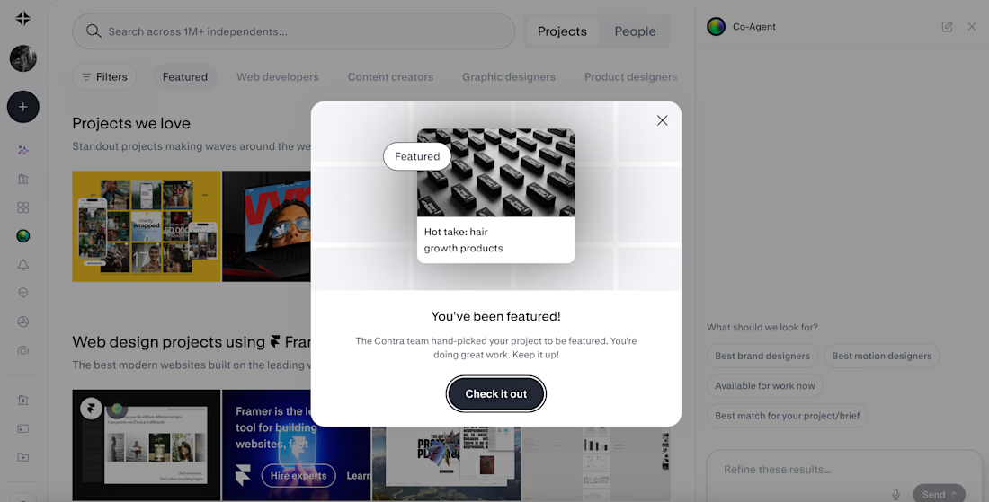
Woke up excited! 🎉 Contra just featured two of my projects, one in Standout Projects, one in Brand Design.
Wasn't expecting to open the app to that. Grateful, and it's a good reminder to keep showing up for your own work even when you don't know who's watching it.


Wooohooo congrats!!