The network for creativity
Join 1.25M professional creatives like you
Connect with clients, get discovered, and run your business 100% commission-free
Creatives on Contra have earned over $150M and we are just getting started
Back to feedPost


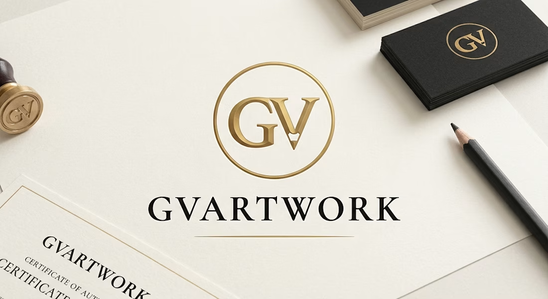
Analysis: What Makes This Design Work
Professional Polish: The context is perfect. By showing the logo applied to tangible objects—a wax seal stamp, a clean certificate of authenticity, and high-quality business cards—the design demonstrates that this is a established, serious business, not just a casual portfolio.
Branding the Craft: The primary "GV" monogram inside the gold circle is very strong. The subtle vertical line through the 'V' mimicking a pencil tip is brilliant. It immediately communicates the core subject (drawing) without needing extra text, which is crucial for a brand built on traditional skills.
The Luxury Palette: The combination of obsidian charcoal (#121212) and burnished gold (#C5A059) on an off-white texture creates an expensive, gallery-standard aesthetic. It separates your work from digital artists and suggests your drawings are valuable collectibles.
Clarity: The full 'GVARTWORK' wordmark uses a sophisticated serif font (Cormorant Garamond/Playfair Display) that reads cleanly and pairs well with the minimalist monogram.
The network for creativity
Join 1.25M professional creatives like you
Connect with clients, get discovered, and run your business 100% commission-free
Creatives on Contra have earned over $150M and we are just getting started






Related posts


It looks so good

New Day - New Case Study
Developed a visual identity for SuperMatics, a Berkeley-based technology company combining physics and AI to discover new superconducting materials.

Amazing work!!


Some of my recent works. As you can see I have pretty wide range of styles and topics 😅


the range is real


