The network for creativity
Join 1.25M professional creatives like you
Connect with clients, get discovered, and run your business 100% commission-free
Creatives on Contra have earned over $150M and we are just getting started
Back to feedPost
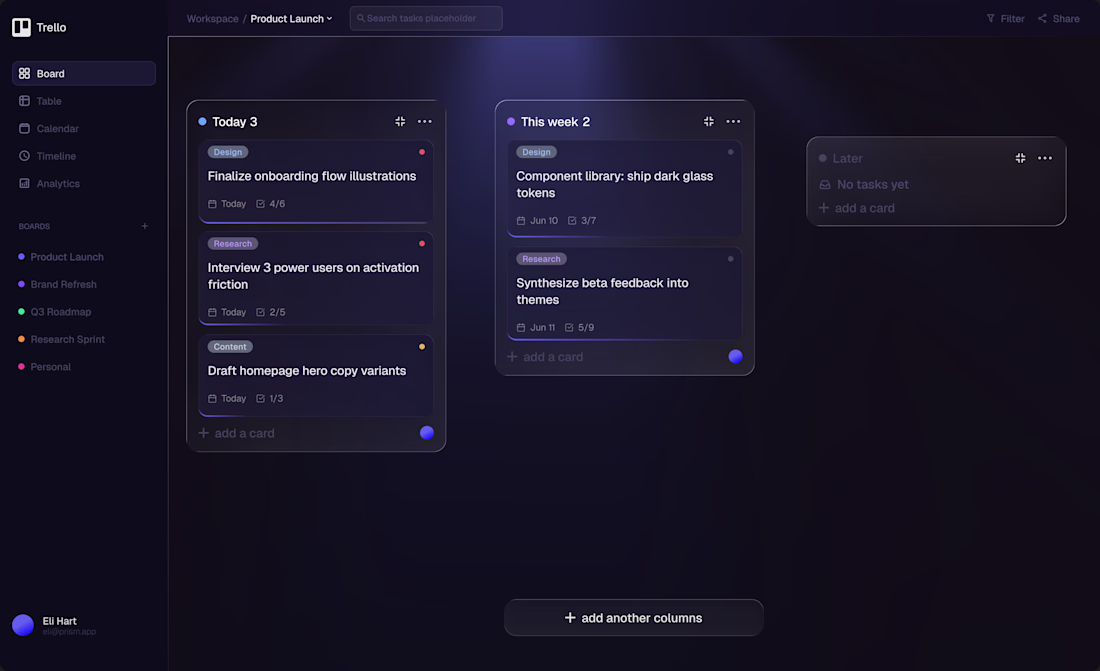
I redesigned Trello's board UI — here's what I changed and why
The original Trello is functional, but visually it hasn't evolved much. I took it as a challenge to reimagine it with a modern dark glassmorphism aesthetic.
What I improved:
→ Added visual hierarchy to columns — Today feels urgent, Later feels passive. Color communicates priority without words.
→ Replaced the cluttered sidebar with clean navigation — Inbox is now separate from the board, not competing with it.
→ Added priority dots on cards — one glance tells you what needs attention now.
→ Empty state for the Later column — instead of dead space, it guides the user.
→ Dissolving white borders — subtle glassmorphism that feels premium without being distracting.
The goal wasn't to make it "pretty" — it was to make it clearer and faster to use.
What would you change? 👇
The network for creativity
Join 1.25M professional creatives like you
Connect with clients, get discovered, and run your business 100% commission-free
Creatives on Contra have earned over $150M and we are just getting started
Related posts
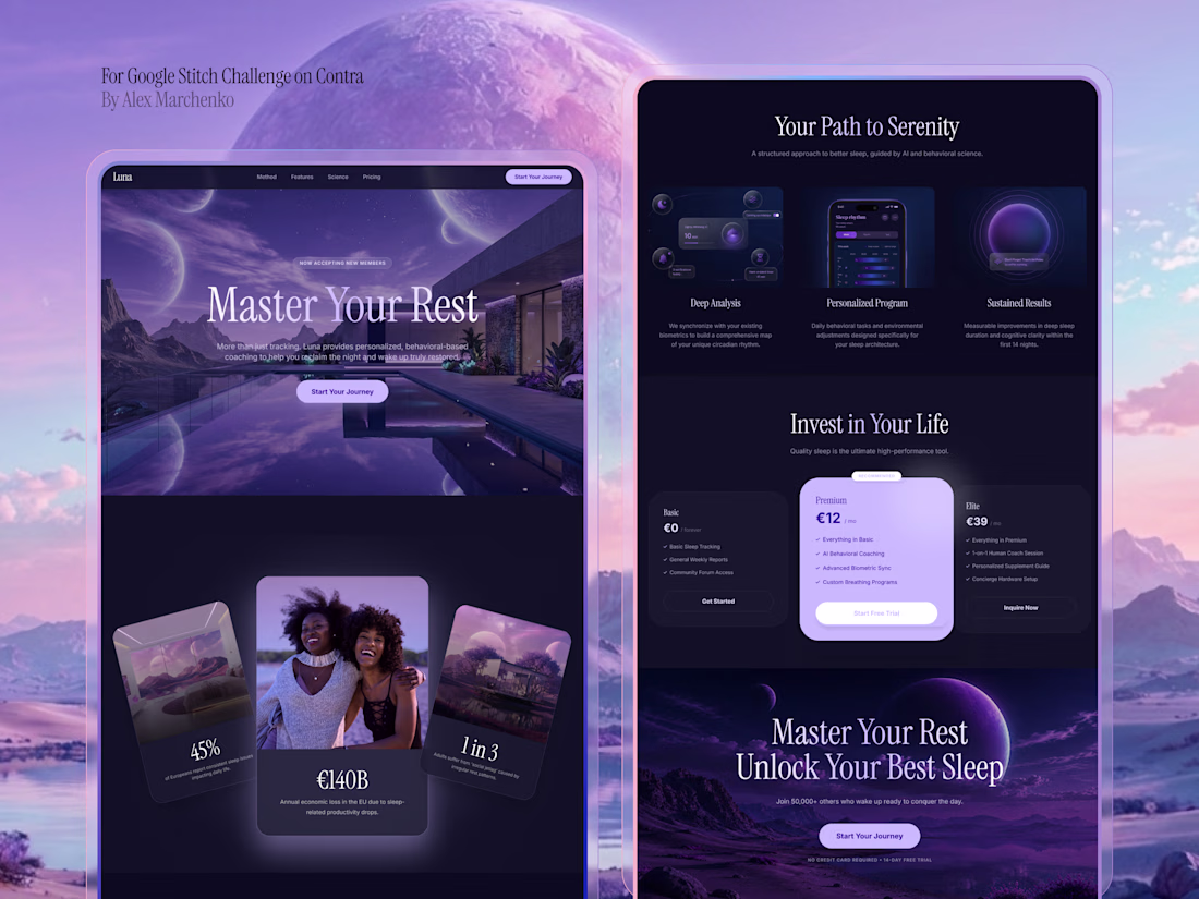
I’m happy to take part in this challenge and share my project created with Google Stitch ❤️🔥
For this challenge, I designed a marketing landing page for a sleep improvement app that helps users build better sleep habits 😴
[𝗪𝗼𝗿𝗸𝗳𝗹𝗼𝘄]I used Google Stitch throughout the whole design process:
- Imported my design system from Figma
- Added visual references
- Generated the first version of the interface with prompts
- Improved the content and layouts using AI edits
- Added animations and interactions to complete the experience
[𝗞𝗲𝘆 𝗦𝘁𝗶𝘁𝗰𝗵 𝗙𝗲𝗮𝘁𝘂𝗿𝗲𝘀 𝗨𝘀𝗲𝗱] In this project, I explored several Stitch features:
- Design imports
- AI editing
- Prompt-based UI generation
- Animations and motion
𝗘𝘅𝗽𝗲𝗿𝗶𝗲𝗻𝗰𝗲 🤩
I really enjoyed working with Stitch. The workflow felt intuitive and easy to understand, making it simple to move from ideas to polished screens. Creating and updating layouts was fast, and the AI-powered editing significantly accelerated the design process. I also appreciated how seamlessly Stitch worked with my existing design assets, allowing me to combine my design system with AI-generated concepts and iterate efficiently
Workflow Video (the same video as the one attached) : https://drive.google.com/file/d/1y1NIdNjLn1JM2S_s2wYpn0jR1nB-nyoj/view?usp=sharing
😇 𝗦𝘂𝗽𝗽𝗼𝗿𝘁 𝗠𝘆 𝗦𝘂𝗯𝗺𝗶𝘀𝘀𝗶𝗼𝗻 😇
If you enjoyed this project and found the workflow demonstration valuable, I would greatly appreciate your support. Thank you for taking the time to review my submission ❤️
This is a great example of how AI can actually speed up the design process without replacing the designer’s vision.
Really like how you combined your own design system with Stitch’s AI capabilities instead of relying purely on generated outputs. The workflow feels practical, the...
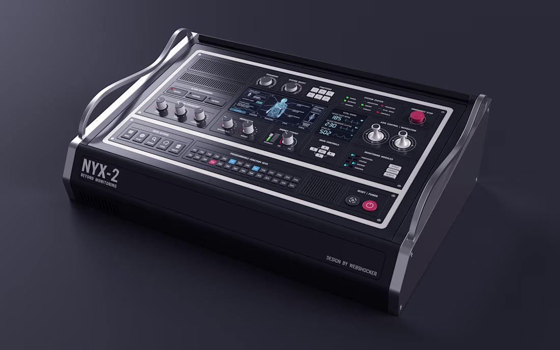
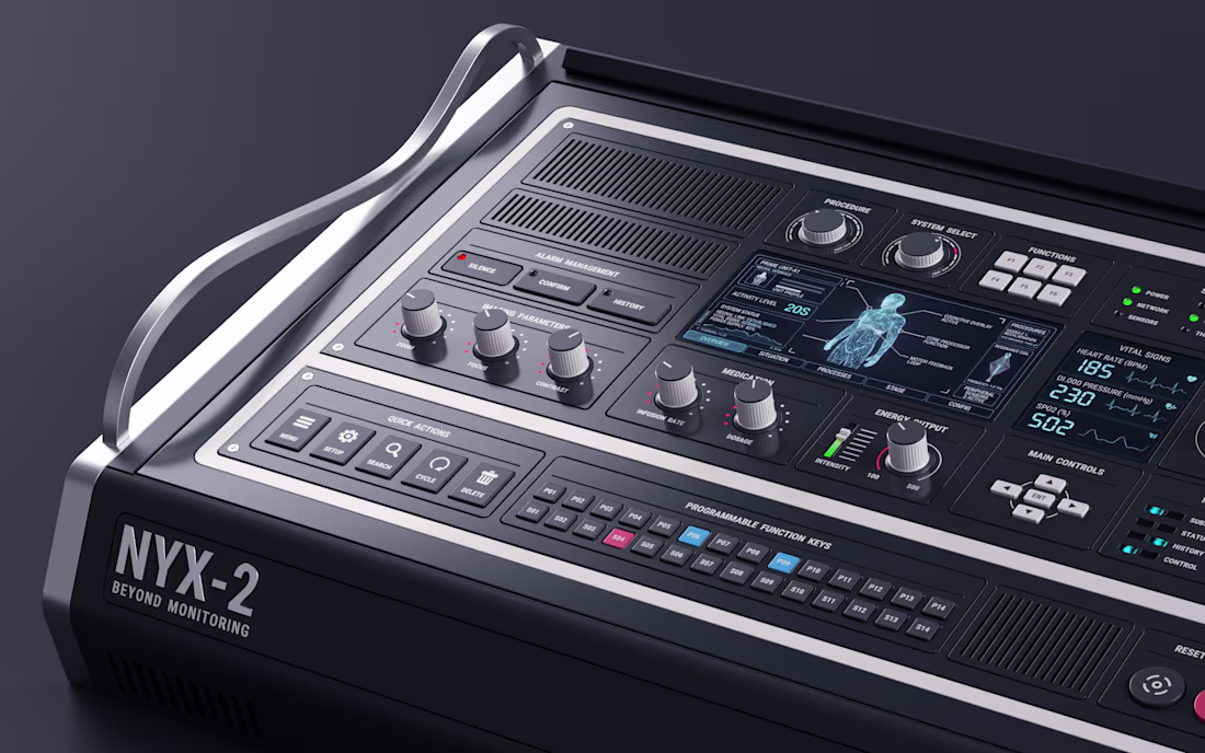
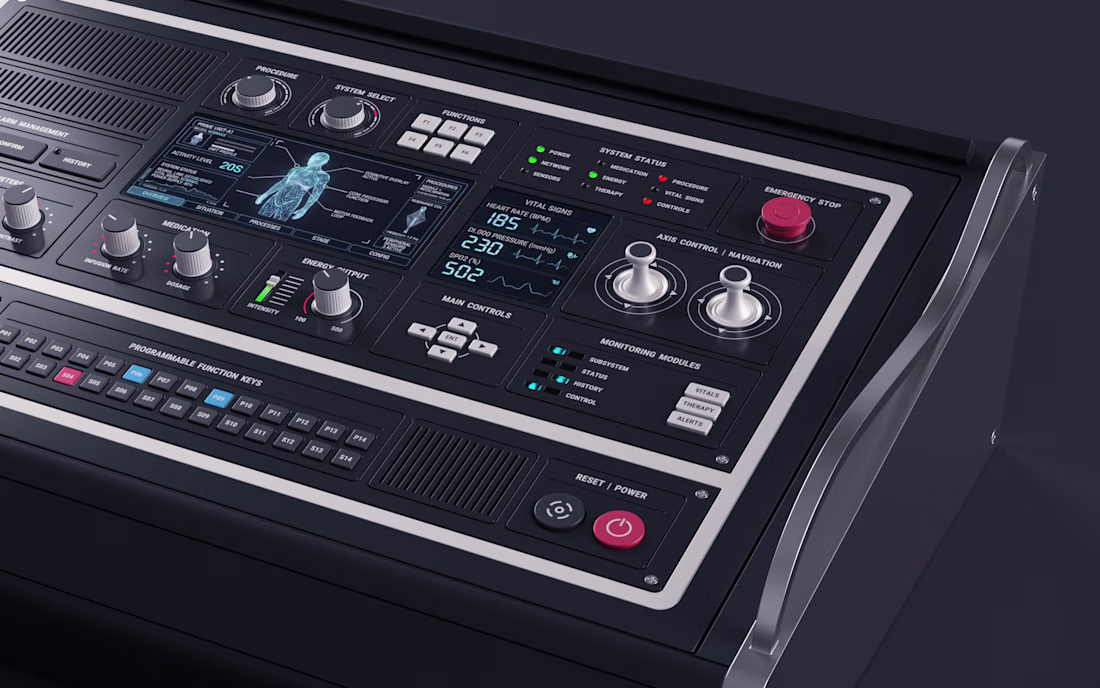
NYX-2
Second 3d UI I created. Pretty pleased with this one.
This is perfectly structured
Project title
STALL — Your farmers market, alive.
A swipe-to-shop farmers market companion that connects local vendors with regulars before Saturday ever arrives.
The problem
Every Saturday, the same thing happens.
You show up to the farmers market at 10am. The ramp vendor you wanted is sold out by 9. You forgot cash. You walk past a honey stall three times because you can't remember if you already bought some. And that new mushroom farm you heard about? Gone before you spotted them.
On the vendor side, it's just as frustrating. Small farmers wake up at 4am, load the truck, drive an hour, and have no lightweight way to tell their regulars — the people who actually want what they grow — "I have asparagus this Saturday. Come find me."
STALL fixes both sides of that problem.
What STALL does
STALL is a two-sided farmers market app built around one weekly ritual: Saturday morning.
For shoppers:
Follow vendors at your local market
Swipe through a weekly produce deck — right to add to your list, left to skip — exactly like Bumble, but for ramps and sourdough
Get a Friday evening digest: what your vendors have this week, your auto-built shopping list, and where each stall is on the map
Pre-reserve high-demand seasonal items before you leave the house
Discover first-of-season arrivals with a "what's new this week" spotlight
For vendors:
Post a weekly inventory update in 3 taps — what you're bringing, quantities, price
Reach your regulars directly before market day
Manage pre-reservations without a complicated system
The app celebrates the seasonal nature of farmers markets — ramps in April, strawberries in June, squash in October. Every week feels like something worth showing up for.
How I built this with Google Stitch
STALL was designed and prototyped entirely using Google Stitch as the primary build tool, with Figma used only for initial wireframing.
The workflow:
Day 1 — Brand and wireframes
I started by defining the brand: the name, palette (Pumpkin Spice Forest — a warm amber, fern green, mauve, and cream system), and illustration direction. I wireframed the three core flows — swipe deck, Friday digest, and vendor post — before touching Stitch.
Day 2 — Into Stitch
I imported my Figma file directly into Stitch using the .fig import feature. From there I used streaming generation to build each screen live on the canvas — watching the splash screen, onboarding flow, and homepage assemble in real time was genuinely remarkable. The HTML-native canvas meant every animation I added — card tilt on swipe, drawer slide-up, bento tile stagger — rendered exactly as it would in production.
Key Stitch prompts used:
"Add a swipe gesture to the produce card stack — right swipe shows a green Added overlay with 5° card tilt, left swipe shows a mauve Skipped overlay with -5° tilt"
"Make the shopping list items stream in one by one with 120ms stagger on page load"
"Add a bottom drawer that slides up from the vendor card with spring easing — show the farm bio, full inventory list, and two action buttons"
"Build the Friday digest screen — vendor items animate in sequentially, the seasonal spotlight card pulses gently"
"Export web assets and deploy to Netlify"
In-place edits I used:
Swapped the swipe overlay color from red to mauve to match brand
Adjusted the bento grid gap from 8px to 6px after seeing it render on canvas
Changed the CTA button from outlined to filled after in-place visual comparison
Rewrote the seasonal spotlight copy directly on the canvas without regenerating
What Stitch made possible that nothing else could:
The swipe gesture interaction, the drawer spring animation, and the staggered list streaming — all three of these would have taken days to hand-code. In Stitch, they were prompt-driven and live on the canvas within minutes. The gap between "designed" and "interactive prototype" collapsed entirely.
Screens delivered
Splash screen — farmer illustration, full-bleed cream background
Onboarding screen 1 — market basket illustration, "Your market, every Saturday"
Onboarding screen 2 — swipe mechanic explainer with card UI
Onboarding screen 3 — Friday digest bento preview
Homepage — bento grid with market header, seasonal spotlight, list, map preview, swipe deck, streak tracker
Swipe deck — card front, vendor expand drawer, swipe right (added), swipe left (skipped)
Friday digest — streaming vendor list, seasonal spotlight, auto-built shopping list
Market day map — vendor stall grid, spot numbers, live confirmation states
Vendor post flow — 3-tap inventory update screen
Design decisions worth noting
The swipe mechanic — Borrowing the Bumble swipe pattern for produce discovery was the conceptual breakthrough. It transforms a passive browse into an active, satisfying decision. Every right swipe builds your list. Every left swipe still shows you where the vendor is on the market map — skipping is never permanent.
The Friday digest as the hero feature — Most apps make you come to them. The Friday evening push notification with a personalised market brief is the one moment where STALL comes to you. It changes Saturday morning from reactive to intentional.
Bento homepage — Instead of a scrolling feed, the homepage gives you everything at a glance: your market, your list, the seasonal moment, your vendors. Seven tiles, seven pieces of information, zero scrolling.
The color system — Pumpkin (#E8872A), Fern (#728040), Mauve (#B07090), Cream (#FDFAF6), and Moss (#4A5228). Every color has one job. Pumpkin is interactive. Fern is seasonal and confirmed. Mauve is reserved and streaks. Cream is every surface. Nothing competes.
What I learned
Stitch genuinely changes the prototyping workflow. The moment I stopped thinking of it as a design tool and started thinking of it as a build tool — one where the canvas is the product, not a picture of the product — everything accelerated. The in-place edit feature is the one I'll keep coming back to: being able to change a color, rewrite copy, or swap a component without regenerating the whole screen is the difference between iteration and rework.
STALL started as a hackathon idea. After building it in Stitch, it feels like something real.
Live Prototype: https://stitch.withgoogle.com/preview/8229547464152593644?node-id=e53124995cda49808685283be978dc8c
Brilliant soothing vibe the choice of theme is so much appeal loved it
Challenges
View allTrending
Claude
Claude has entered the design space. How are you using Claude Design?
Contra University
Learn from expert creatives how to earn more using next-gen AI tools.
MagicPath
The canvas is infinite, and exploration is becoming the workflow. How are you using MagicPath?
creativeaiflow
Creative AI workflows are evolving. What tools do you use, and what are their strengths and weaknesses?
freelancerlife
Freelancer life is wins, pivots, and everything in between. What’s yours right now?