The network for creativity
Join 1.25M professional creatives like you
Connect with clients, get discovered, and run your business 100% commission-free
Creatives on Contra have earned over $150M and we are just getting started
Back to feedPost
Taste Test
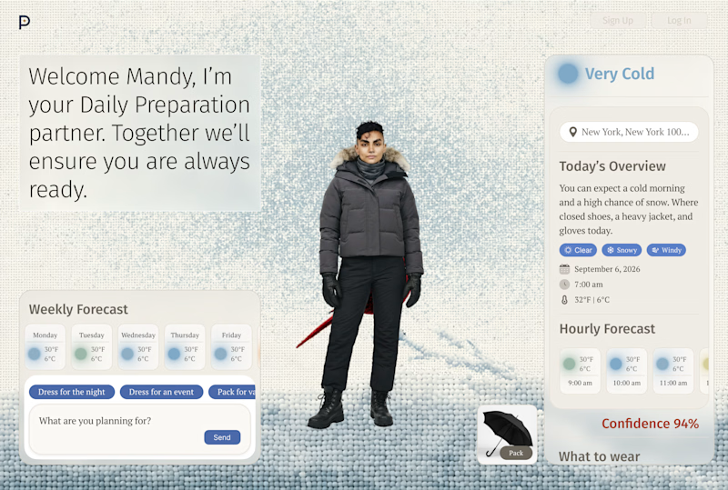
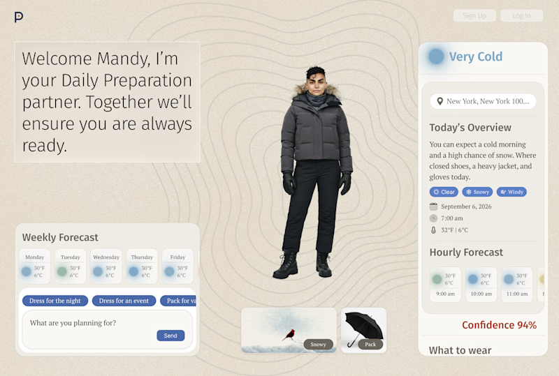
I am a bit unsure if I should use card to showcase the weather outside (7 different themes) or make that theme the background.
I am personally leaning towards the card that showcases the theme "eg. snowy" rather than the large colorful and sometimes contrasting background.
Which do you prefer?
A. background visual
B. card visual
9 voted
82%
2 voted
18%
11 votes
Closed


You‘re right. I am not surpised! I went forward with it thanks 🙏

A background look clearly nice

Background Visual for sure.

clear one is background visuals
dang thanks everyone! I was leaning away from it tbh 😂
The network for creativity
Join 1.25M professional creatives like you
Connect with clients, get discovered, and run your business 100% commission-free
Creatives on Contra have earned over $150M and we are just getting started







Related posts

Covers are my weakest muscle. I can build a whole visual world, and then freeze at one thumbnail 😅
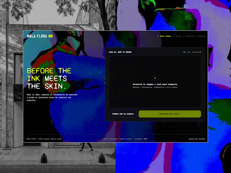
MALA FLORA: a tattoo studio + gallery built from my painting Jardín Turbio. A shows the site on the street, B shows the flow in motion.
Which one makes you want to click?
3 voted
20%
12 voted
80%
15 votes
Closed


B, the tattoo frames moving made me stop scrolling where A reads more like a site screenshot

Did this for fun. Which one’s better?
2 voted
40%
3 voted
60%
5 votes
Closed

The previous poll on this preloader had exactly 50-50 results between Horizontal gallery and Circle intro. Now I'm continuing with 2 other options. Which one is better? Check the live preview here
19 voted
53%
17 voted
47%
36 votes
Closed

Team mosaic!!