The network for creativity
Join 1.25M professional creatives like you
Connect with clients, get discovered, and run your business 100% commission-free
Creatives on Contra have earned over $150M and we are just getting started
Back to feedPost

Radha Krishna Synthetic - Logo & Brand Identity
Bold. Industrial. Engineered. The RKS monogram hides a double-arrow in the S, representing input ↔ output - built for a manufacturing brand that moves product both ways.
Building a brand? Let's design something that stands out.
Available for logo & brand identity projects; DM is open.


🔥 Amazing work! The attention to detail is outstanding.
The network for creativity
Join 1.25M professional creatives like you
Connect with clients, get discovered, and run your business 100% commission-free
Creatives on Contra have earned over $150M and we are just getting started





Related posts

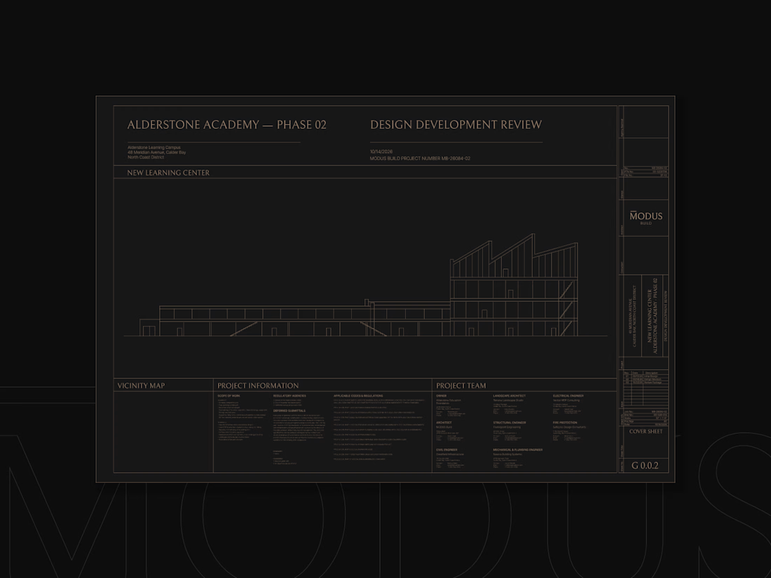
MODUS Build - Brand Identity & Web Design
Coming from an architectural background, I approached MODUS Build with a particular appreciation for precision, proportion, and thoughtful design.
The challenge was to create a distinctive identity that communicates these values without relying on conventional construction imagery.
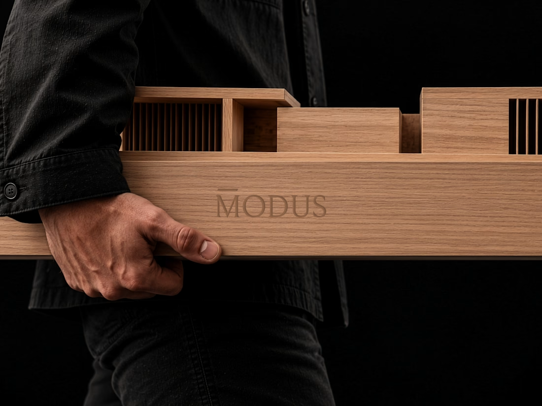
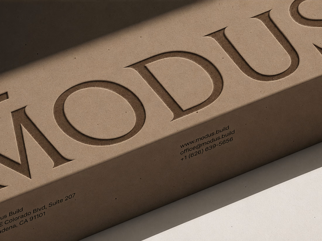
The concept was built around a simple typography idea: “The Measure of Good Building.” A small detail above the letter M represents a reference measure - a fixed length against which other dimensions can be measured. This subtle intervention gives the logo its meaning and connects it directly to the brand's philosophy.
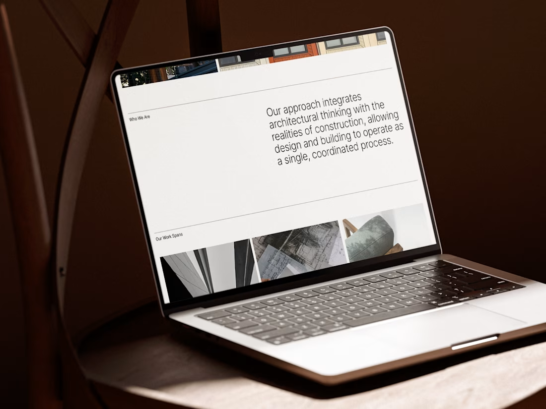
I carried this idea into a cohesive visual system, bringing together typography, graphic patterns, brand applications, and website design.
For me, the most rewarding part was creating something visually refined yet purposeful, where even the smallest detail has a reason to exist, keeping the same principle as in architecture.
#branding #logodesign #webdesign



Great brand design Alexandar wooden style is so premium🔥🔥

Branding work for WithNation
Love the motion, visual style and aesthetics on this one
The concept is to mix the power of creative prompting and allowing everyone to orchestrate their business from start to finish.
Build • Run • Market
The logo represents a shopping bag with the prompting input inside


MARLOW is a modern fashion and clothing brand identity built around individuality, everyday style, and self-expression.
The branding combines a custom rounded wordmark, bold M monogram, warm red tones, and minimalist typography to create a confident and recognizable fashion identity.
From logo design and brand guidelines to apparel graphics, clothing labels, hang tags, packaging, shopping bags, stationery, and advertising campaigns, MARLOW creates a cohesive visual experience across fashion and lifestyle applications.
Services: Brand Identity, Logo Design, Fashion Branding, Clothing Brand Design, Apparel Branding, Packaging Design, Visual Identity.

That rounded M monogram in warm red sounds like it carries the whole system. Fashion identities live or die on the small touchpoints, so going all the way down to hang tags and labels is exactly right. Which piece of the rollout was the trickiest to keep consistent, the packaging or the apparel graphics?