The network for creativity
Join 1.25M professional creatives like you
Connect with clients, get discovered, and run your business 100% commission-free
Creatives on Contra have earned over $150M and we are just getting started
Back to feedPost


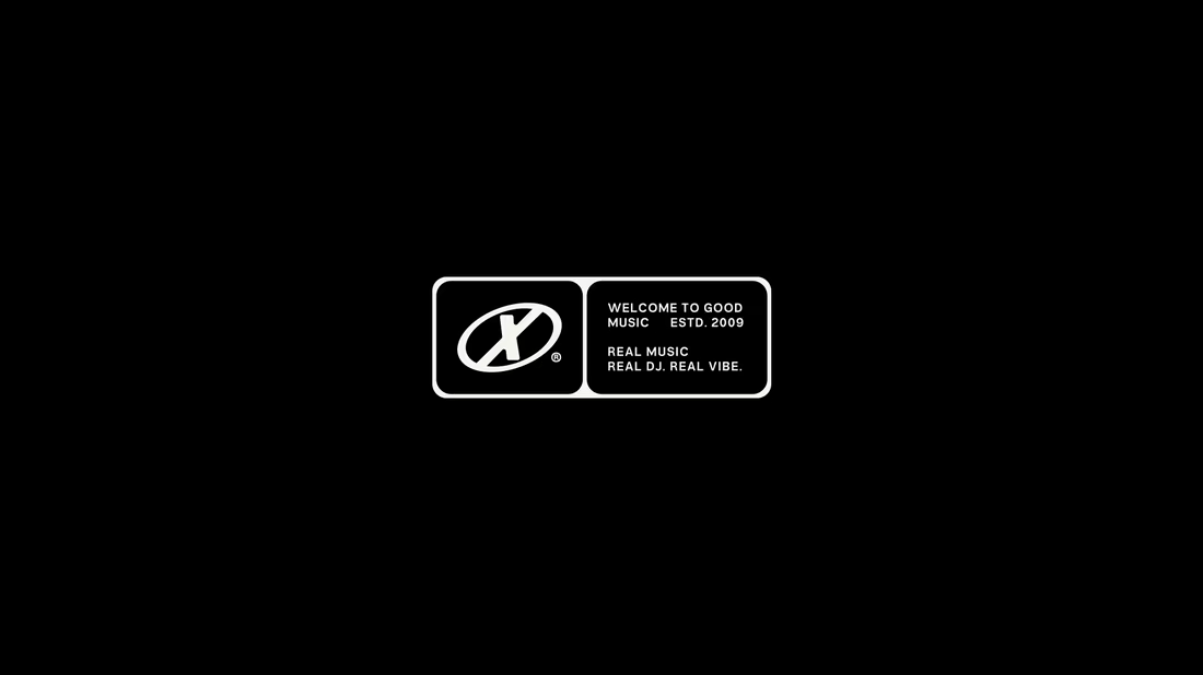
A bold visual identity created for DJ Bruno X, translating the energy of electronic music into a distinctive, dynamic and recognizable visual system.


The dark, almost coded typography treatment fits an electronic DJ identity so much better than anything overly glossy would have. Was translating "the energy of the music" into a static logo system the hardest part of the brief, or did that come naturally once you had the sound reference?
The network for creativity
Join 1.25M professional creatives like you
Connect with clients, get discovered, and run your business 100% commission-free
Creatives on Contra have earned over $150M and we are just getting started


Related posts

A 16-bit signal has 65,536 steps. No waveform in this brand is allowed to be a curve.
SINE/16: pixel type, a staircase slash, one cyan light per frame, hands on everything.
Full case study ↓

No curves allowed is such a fun rule to build a brand around. The staircase slash is clever.