The network for creativity
Join 1.25M professional creatives like you
Connect with clients, get discovered, and run your business 100% commission-free
Creatives on Contra have earned over $150M and we are just getting started
Back to feedPost

Millions of perfectly usable items spend most of their lives sitting unused like scientific calculators after exams, cameras after vacations, power tools after home repairs, and camping gear after weekend trips. Meanwhile, someone nearby is buying the exact same item for a single use.
I built Borrowly to solve this problem.
Borrowly is an AI-powered hyperlocal marketplace where people can rent everyday items from trusted community members. Renters save money by borrowing instead of buying, while owners earn passive income from items they already own.
To make listing effortless, Borrowly introduces an AI Room Scan experience. Users simply scan their room, and AI detects unused items, generates listing details, suggests rental pricing, estimates demand, and predicts potential earnings in seconds.
The prototype also includes secure booking, owner mode, AI-assisted listings, trust and verification, earnings dashboards, and a complete rental journey from discovery to return.
More than a rental marketplace, Borrowly encourages a shift from ownership to access helping communities save money, reduce waste, and make better use of the things they already have.
Nothing should sit unused.


The network for creativity
Join 1.25M professional creatives like you
Connect with clients, get discovered, and run your business 100% commission-free
Creatives on Contra have earned over $150M and we are just getting started







Related posts

Meriot personal portfolio Website Homepage showcase
A portfolio website designed to turn personal expertise into a strong digital presence.
The goal was to create a website that communicates experience, personality, expertise, and credibility within the first few seconds.
I focused on:
Clear positioning and personal branding
Strong visual hierarchy
Editorial-style typography
Project-focused storytelling
UX/Product Design service presentation
Testimonials and social proof
Clear CTA for potential clients
Responsive, conversion-focused layouts
The visual direction combines minimal typography, bold imagery, dark/light sections, and subtle interactions to give the portfolio a distinctive personality without making it difficult to navigate.


Top notch execution

Remove Liquidity component cards for a recent Web3 design project—what would be the best direction for readability and focus? Dark Mode or Light Mode? ⚡️
12 voted
40%
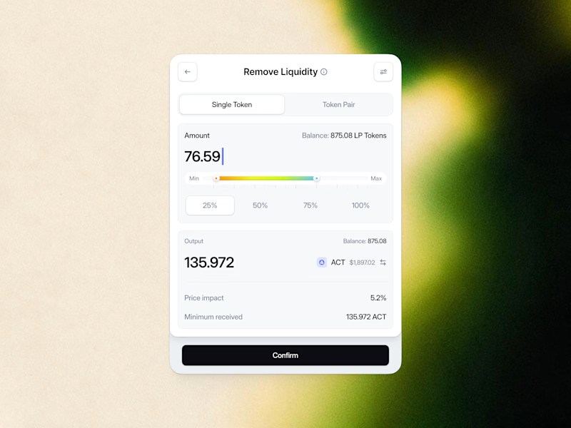
18 voted
60%
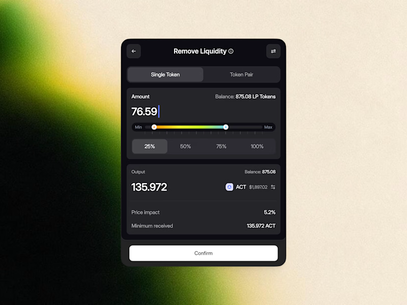
30 votes
Closed

White one need bit more darker bg on elements to make them visible like the dark more does.

Hello Everyone!
I have decided to create minimal friendly pet booking app MINTLEAF, in Lovable, user friendly simple and creative approach to collecting and solving major pet clinic problems in short time, both compatible as desktop app and mobile version.

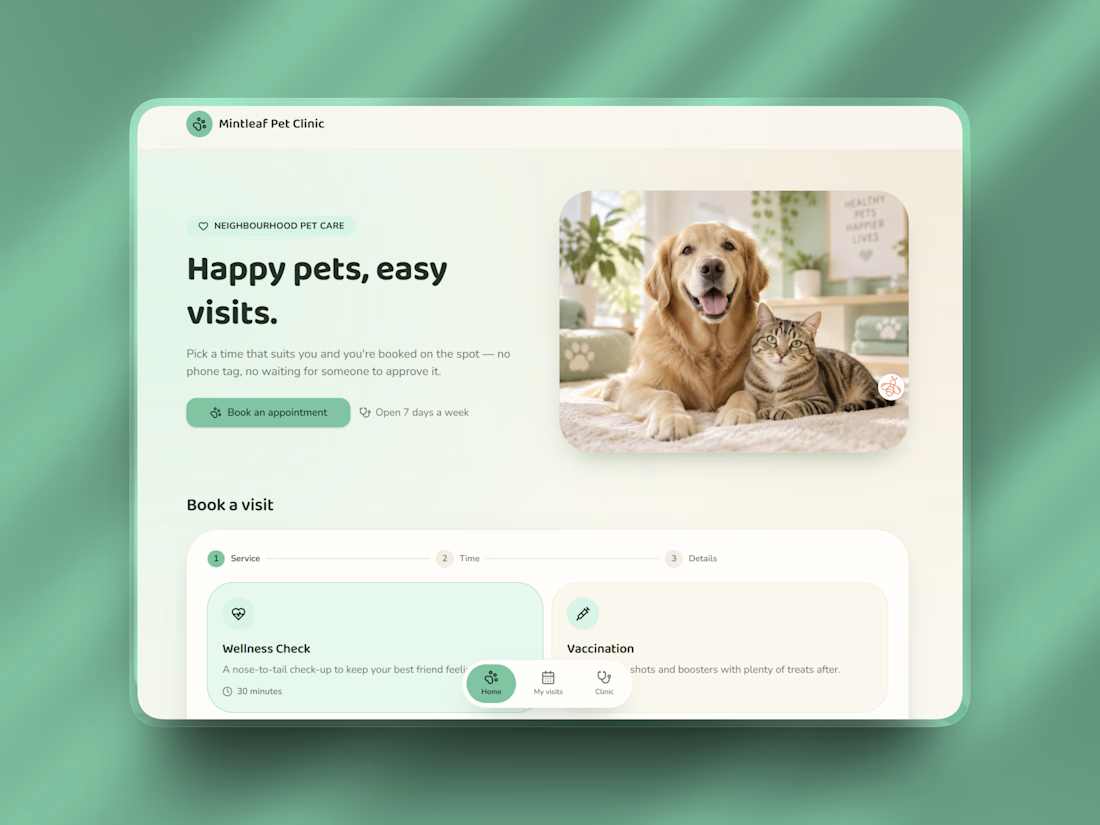
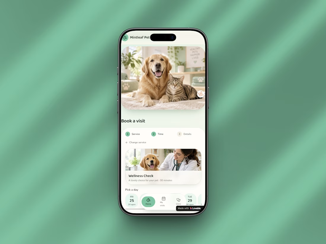

Nice direction, especially taking it mobile-first too. Curious, does the booking flow capture the reason for the visit or any pet context before confirming?
Vet clinics are one of those cases where not every available slot is necessarily the right slot.