The network for creativity
Join 1.25M professional creatives like you
Connect with clients, get discovered, and run your business 100% commission-free
Creatives on Contra have earned over $150M and we are just getting started
Back to feedPost

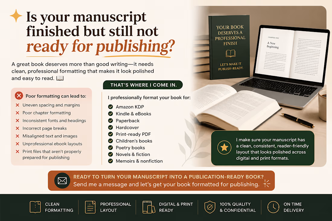
Is your manuscript finished but still not ready for publishing?
A great book deserves more than good writing it needs clean, professional formatting that makes it look polished and easy to read. 📚
Common formatting problems can include:
❌ Uneven spacing and margins
❌ Poor chapter formatting
❌ Inconsistent fonts and headings
❌ Incorrect page breaks
❌ Misaligned text and images
❌ Unprofessional ebook layouts
❌ Print files that aren’t properly prepared for publishing
I help authors professionally format their books for:
✅ Amazon KDP
✅ Kindle & eBooks
✅ Paperback
✅ Hardcover
✅ Print-ready PDF
✅ Children's books
✅ Poetry books
✅ Novels & fiction
✅ Memoirs & nonfiction
I make sure your manuscript has a clean, consistent, reader-friendly layout that looks polished across digital and print formats.
Your words deserve a layout that does them justice.
📩 Ready to turn your manuscript into a publication ready book? Send me a message and let's get your book formatted for publishing.
#BookFormatting #KDPFormatting #KindleFormatting #EbookFormatting #PaperbackFormatting #AmazonKDP #BookPublishing #Authors #SelfPublishing


The network for creativity
Join 1.25M professional creatives like you
Connect with clients, get discovered, and run your business 100% commission-free
Creatives on Contra have earned over $150M and we are just getting started





Related posts

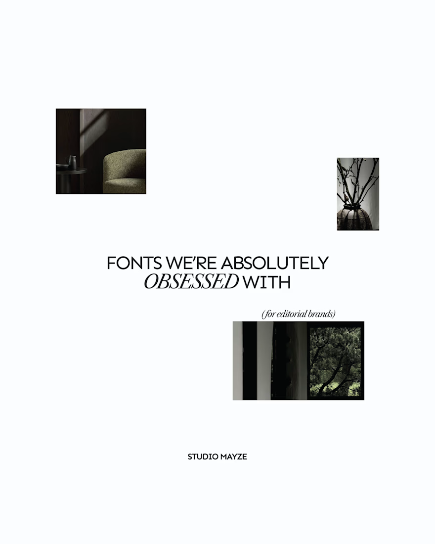
A few editorial typefaces we’re absolutely obsessed with right now.
These are some of the fonts we keep coming back to at Studio Mayze when we want a brand to feel considered, distinctive and a little more editorial without pushing the design too far.
Good type can do a lot of the heavy lifting. The right one can completely change how a brand feels before you’ve even added anything else.
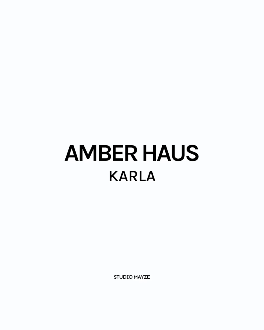
Each slide shows the typeface in use at the top, with the font name underneath, so you can see how it could look in context rather than just as a specimen.
These are three of our favourites at the moment. Want to see the full selection? We’ve shared all of our favourites over on Instagram.
Which one would you pick? 👀


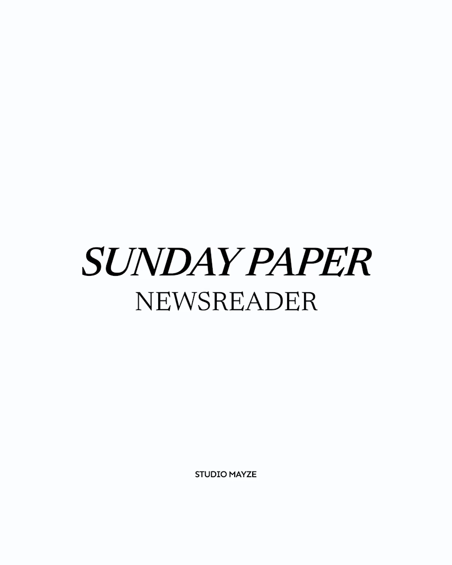
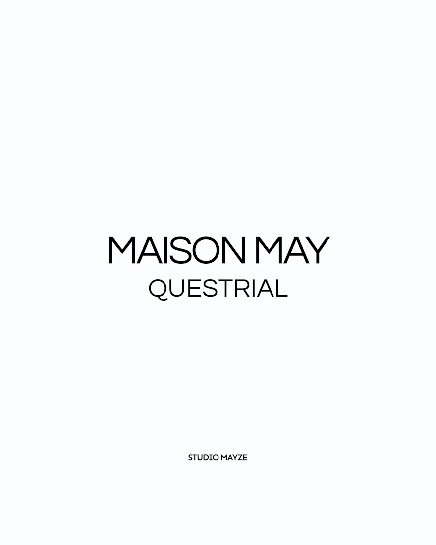

Showing each typeface in context rather than as a bare specimen is such a good idea, you can feel the mood before you even read the name. Sunday Paper in Newsreader is my pick, that slanted serif has real character. Do you tend to reach for one of these for the body of a brand, or are they mostly headline voices for you?

today i'm opening the waitlist for velde
it's an iphone app i'm building solo. it has an ai mentor, lumi, who helps people aged 18 to 29 figure out what to do with their lives, one small mission a day
coming to the app store in november
there's a mini quiz on the site to see where you're at: velde.app
would love honest feedback on the landing and the quiz. what would make you join or not?
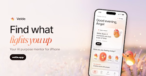
velde.app
Velde: find what lights you up
Your AI purpose mentor for iPhone. Find your light in a 60-second quiz, get your Light Map and let Lumi guide you one small step a day.

Great work